Top Gun Coolmadness Whoopi Goldberg As Guinan's Eyebrows

User avatar
scottc

07 Aug 2014, 23:00

BlueBär wrote:
SL89 wrote: As with most things Linux, it is subject to endless tweaking and whatnot. But only if you turn it on!
I tried a few Linux distros, and most of them seem to come with good settings out of the box now. My Arch installation is struggling with some fonts (the headers on Wikipedia are terrible) but everything else looks perfect, and I don't think I changed anything in that regard.
Check out infinality.

http://www.webupd8.org/2013/06/better-f ... -with.html

User avatar
7bit

07 Aug 2014, 23:01

No endless tweaking necessary!

Also: Tweaking is much easier with config files than with a GUI that tries to hide everything from the user.

Usually I run a lot of scripts after the installation and only a few things need additional work. Try this with a GUI!

User avatar
Daniel Beardsmore

07 Aug 2014, 23:17

webwit wrote: Anti-aliasing is just an artifact of low-res displays which will go away if you wait long enough. Then, finally, Linux will take over the desktop!
Years ago, when I worked for a school photography company, I ran an interesting test. I received a particular school's logo—which was "gold" (as in, tan) in colour—as EPS, and I rendered it to bitmap twice, once with anti-aliasing, and once without anti-aliasing, to 300 dpi. I sent off both images to the printers, and compared the results, which were printed using dye sublimation I think. I could clearly see the aliasing at 300 dpi, even with a fairly pale colour. I assume I used the anti-aliased copy for printing onto the photographs (we had a digital workflow with all dye-sub (I assume) printed photographs with school logo and names included).

I also remember looking at an early OLED phone—not retina or anything—and observing that it had a Bayer pattern instead of RGB subpixels, which sucked too.

Retina iPhones aren't bad, but they're certainly not anywhere close to looking at a printed page, even with antialiasing.

User avatar
Muirium
µ

08 Aug 2014, 01:12

What you saw on OLED was Pentile, which is a truly miserable technology for rendering text:

Image

Retina is definitely the future. My brother, who works for a certain mobile processor company (not Apple), thinks it's absurd that he's having to work on 4k video playback for phones. I think it's about time. Until screens beat print, they aren't finished yet.

User avatar
Daniel Beardsmore

08 Aug 2014, 01:28

I dunno, I thought it looked like my camera, which is Bayer (I can see the alternating red-green pixels, just about), but it was years ago.

User avatar
Muirium
µ

08 Aug 2014, 01:36

I was only kidding about Linux's text rendering earlier, as I'm aware that I'm ignorant about it. Aren't there whole new competitors to Xwindows now for the bit that renders type? Certainly, I don't like the way Windows has traditionally done it with Cleartype. Too much jamming fonts into awkward shapes produced by arbitrary pixels.

What I'm used to looks like this:
Yosemite Font Book.png
Yosemite Font Book.png (611.23 KiB) Viewed 4192 times
Webwit's right: antialiasing is a transitional technology, born of inadequate pixel pitch. Subpixel antialiasing is even more so! But I do like the result of both of them at Retina level DPI. We're getting there.

User avatar
Daniel Beardsmore

08 Aug 2014, 02:16

"Transitional" … ?

It's only "transitional" because mainstream systems suck so much.

Image Image

Observe the date. Both screenshots are from the same emulated system — I simply had AA switched on for one screenshot, and switched off for the other.

By ca. 1995, Apple were comfortable that Macs had enough colours to put a pre-rendered splash screen up with baked antialiasing; the RISC OS splash screen text was rendered on the fly. The text supports fractional character widths and spacing: observe that the two adjacent 9s are not rendered the same.

I forget when Microsoft finally add anti-aliasing, but all they managed was to use a hinting engine (which was Apple's, wasn't it?) to pull off spindly text. Apple also pumped out some garbage antialiasing some time in the late 90s that was spindly, and didn't work with the pixel-switching text highlight implementation.

By 2001, Apple finally had fractional character positioning and sizes. By 2014, Windows is still stuck with hinting and integral character co-ordinates, although ClearType forces them all into fractional offsets. (IIRC the new APIs support proper text rendering, but desktop apps don't understand it.)

It's not transitional by necessity, only by the eternal lameness of desktop graphical interfaces. We should have good antialiasing long, long, long before most of us actually got it.

User avatar
Muirium
µ

08 Aug 2014, 02:31

Transitional as in Webwit's point: once we hit some arbitrary pixel pitch, we won't need to antialias anything. The pixels will be too small to see any difference.

We're not there yet. I reckon we need another doubling from Retina again, maybe two. As Gruber put it in his review of the original Retina Mac:
One conclusion I’ve made in the weeks I’ve been using this machine: sub-pixel anti-aliasing matters. iOS doesn’t offer sub-pixel anti-aliasing; Mac OS X does. And I believe it’s one reason on-screen text looks even better on the retina MacBook Pro than it does on the ostensibly higher-resolution iPad and iPhone. There was an idea — espoused even by yours truly at one point — that with sufficient pixel-per-inch density, sub-pixel anti-aliasing would be superfluous. In practice, it’s the other way around. On the retina MacBook Pro, sub-pixel anti-aliasing no longer carries any trade-offs — no visible color fringes, no slight emboldening of letterforms. It’s just pure icing on the text rendering cake. To say that text is rendered at print quality is to imply that you have one hell of a professional-grade printer.
We all want that ideal screen, of course. For a while we were getting there quite slowly, a few dozen more PPI at a time, along with shrinking UI scale. Thankfully, mobile's really sped that up, so much so that resolution independent interfaces are a necessity.

User avatar
Daniel Beardsmore

08 Aug 2014, 09:27

The earliest known example I have (mainstream or otherwise) is 1992, which means that we could, and should, have had full fractional size and spacing for 22 years, and we'll have it for years to come. Ideally we would have had it since 1984 and before, but we simply didn't have enough colours or speed. A lack of fractional positioning caused real issues in Office for Mac (and presumably Windows) because documents would actually print differently owing to the on-screen copy rendering incorrectly from getting the size of words wrong.

I don't know if you both meant "transient" (temporary) instead of "transitional" (changing from one thing to another) but neither applies. It's pretty long-term.

User avatar
sth
2 girls 1 cuprubber

08 Aug 2014, 09:39

Holy platform wars and platitudes. I knew that would spark some conversation.

Heck! I agree with Daniel, pretty much entirely, except... breh. infiniality. looks great. at least as good as OS X which I didn't think was possible (except for the OS X rendering mode, go figure). a million times better than Microsoft's SUBMIT OR DIE font rendering.

I'm not really convinced we won't need, or at least that we can't still benefit from antialiasing on hi-dpi, because we're still talking about a bitmap representation of a vector glyph. but by the time we'll have all adopted those displays i'll probably be blind anyhow.

to-day! I compiled Babbys First Kernel. It took forever. but it worked! hurrah. ok now i'm trying another one.

User avatar
sth
2 girls 1 cuprubber

08 Aug 2014, 09:50

davkol wrote:
Muirium wrote: @Daniel: I'm quite pleased in general by the continuing work that Apple, MS and others (Canonical?) are putting into desktop OS design. They still think there's a future there, worth the effort. I wouldn't bet there is, not for the majority of users, apps, or hours in use. But I'll be there, and you and most everyone with an interest in keyboards!
Enjoy your metrosexual spyware, I guess.
i will kindly ask you not to behave in this manner on my blog, please, and thank you. :x

User avatar
sth
2 girls 1 cuprubber

08 Aug 2014, 09:53

7bit wrote: so why not higher resolution monitors?
why, because the buttlord companies that can make them won't make enough of them instead of the crap they put out to-day. something about profits and margins and stocks and other nonsense that only complete idiots care about outside of a theoretical model. dummies! :maverick:

User avatar
sth
2 girls 1 cuprubber

08 Aug 2014, 11:15

oh yeah! fuck that new intrusive giant spotlight menu too. if i wanted information about the stuff i was opening i would use a file manager.

User avatar
Muirium
µ

08 Aug 2014, 12:46

Nothing stopping you. I replace Spotlight with Quicksilver on my old PowerPC Macs:

Image

Light enough to be proper snappy even on sub 1 GHz machines. And, oddly enough, the new Spotlight UI reminds me of it, sitting big in the middle of the screen. (If not quite as frickin' big as the horizontal scaling makes that screencap above!)

User avatar
sth
2 girls 1 cuprubber

08 Aug 2014, 12:52

Muirium wrote: Nothing stopping you. I replace Spotlight with Quicksilver on my old PowerPC Macs:

Image

Light enough to be proper snappy even on sub 1 GHz machines. And, oddly enough, the new Spotlight UI reminds me of it, sitting big in the middle of the screen. (If not quite as frickin' big as the horizontal scaling makes that screencap above!)
I used to use quicksilver with the menu interface. Super lo-pro. But the spotlight got "just fine" so i stopped bothering with the extra software.

User avatar
Muirium
µ

08 Aug 2014, 12:59

Yeah, I run Quicksilver only as an app launcher anyway, so it's unnecessary on my faster machines. Spotlight never did run instantaneously fast on PowerPC. Especially with my huge archives of emails and text files all constantly matched while typing queries. I got into the habit of using Quicksilver to launch apps, muscle memory style, while Spotlight was a slow but methodical beast for more complex stuff.

No such tradeoffs with a quad i7…

User avatar
Daniel Beardsmore

08 Aug 2014, 19:19

I have Amar Sagoo's Namely on my G4 for starting applications instead of Spotlight.

That was something about the Mac that did always confuse me: the Start menu in Windows always sucked rocks (though when XP came out, loads of people decided they liked the ultimate suckage over the newer mild suckage and went back to the rubbish Start menu from 98/2000) — but at least you had something.

I adopted A-Dock in Mac OS 9, and by and large that was OK as Mac OS 9 was fairly light on programs and most stuff was in Control Panel anyway under the Apple menu.

I see people now with OS X with Dock icons so small they're approaching the size of subpixels. I guess they have to use that retarded mexican wave feature to find the icons, which is great because the icons run away the cursor when you try to aim at them. The rest of the programs on the Mac just "exist", and you have to rummage around Applications to remember what they're called and what's available.

My only problem with the Start screen in 8.1 is that I struggle locating objects in a grid (and the random coloured backgrounds that frequently match the icon colours, so that you can't see the icons, doesn't help). Same thing with the ribbon; it's much harder for me to scan a grid for something than just read down a list, but my continual shuffle each day between XP, 7, 8.1, Server 2003, 2008, 2008 R2, 2012 and 2012 R2 means that I waste time trying to search the Start screen for icons visually instead of just typing the program's name. (Alternatively I confuse XP by typing at the Start menu.)

The ribbon is worse, because it's not even a regular grid. It's a random higgledy-piggledy heap of random sized buttons of random types in random arrangements, along with commands buried in menus (if menus are so evil and undiscoverable, why on earth are there menus in the ribbon?), commands represented by the little corner arrow things, and no search.

Anyone here used Archy/THE? I never grasped Jef Raskin's idea that all programs could share the same command namespace, but whoever designed the ribbon should have at least tried THE, as then we'd be able to execute some random one-off command in Word or Excel by name instead of having a two-hour excursion through a twisty maze of tabs and panels, all alike. (At least OS X lets you search for menu items. Someone in a UI team was awake for a few minutes.)

User avatar
Muirium
µ

08 Aug 2014, 20:17

The rare times I ever use Windows, I'm all about the search there too. I always found the Start Menu horribly troublesome (I'd wind up constantly keeping it in order myself, back in the day) while all the apps would break whenever I moved them from their company named folders in the file hierarchy. Grr!

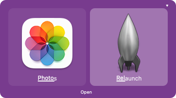
OS X has launchpad these days, just like iOS:

Image

So people who prefer icon picking have a familiar way to do that, with a dedicated function key even, not that I know anyone who actually does. It's one of those demo features, that looks better the first time you see it, like Dashboard was for most people. (Although I'm in the minority who does still use that one!)

User avatar
7bit

08 Aug 2014, 20:27

I will never understand why a new commercial OS version implies a new window manager.
From Debian 3 to Debian 7: All I ever used was the same, only slightly improving windowmanager with about the same icons, etc.

If there is a change it is because I wanted to change it.
:ugeek:

User avatar
ne0phyte
Toast.

08 Aug 2014, 21:35

I wonder what you all need icons for.
My window manager (dwm) doesn't show them anywhere, I don't have a desktop with icons and I always use detailed list views in file managers (pcmanfm) or simply ranger in xterm. There is so much work put into icons but I really prefer dmenu as application launcher with fuzzy search through all binaries in $PATH.
Icons are for people who use the mouse a lot, no? We don't click on icons with our awesome mechanical keyboards :?

JBert

08 Aug 2014, 22:02

I do like icons when I use Kupfer's fuzzy search. Icons are instantly recognizable, whereas text takes a bit more parsing.

I would agree with the file browsing though, but even then I'd like folders to be differentiated from files. An orthodox file manager GUI can be still a lot nicer with them.

User avatar
7bit

08 Aug 2014, 22:09

For filemanagement, I use the bash-filemanager which comes in a GUI called xterm. It provides commands like cd, ls, rm and many more ...
:o

User avatar
sth
2 girls 1 cuprubber

08 Aug 2014, 22:14

i have a totally non-mac style setup at work - openbox with no titlebars, no bar, no task list, no clock, nothin but stalonetray running in the dock and my terminal launch shortcut is bound to urxvt running tmux, so i got a clock up in thems. i have thunar for the rare occasions i really need a GUI file manager but you know... i like my keyboard more than my mouse.

lately i've been swapping my mouse to lefty mode and working at least 2 hours a day with my left hand. Feelsgoodman. It's for the good of my brain. The feel-good good feel.

in other news, holy god-damned hell. be careful with this.

User avatar
Madhias
BS TORPE

08 Aug 2014, 22:57

sth wrote: lately i've been swapping my mouse to lefty mode and working at least 2 hours a day with my left hand. Feelsgoodman. It's for the good of my brain. The feel-good good feel.
I also do this from time to time. What does not work is tooth brushing, i never get it right. It just does not work!

mr_a500

08 Aug 2014, 23:11

ne0phyte wrote: I wonder what you all need icons for.
My window manager (dwm) doesn't show them anywhere, I don't have a desktop with icons and I always use detailed list views in file managers (pcmanfm) or simply ranger in xterm. There is so much work put into icons but I really prefer dmenu as application launcher with fuzzy search through all binaries in $PATH.
Icons are for people who use the mouse a lot, no? We don't click on icons with our awesome mechanical keyboards :?
My favourite file manager didn't have any icons - and none of that bloody drag & drop nonsense:
ABCdirectory.png
(ABCdirectory on Amiga 500)

These days I use PathFinder on OSX and I set it up two-pane and use function keys to copy/move (instead of dragging), but it still can't beat that old Amiga file manager. There's no "move as" or "copy as", actions on multiple files aren't as easy, navigation isn't as quick. Selecting files and renaming is much faster & easier when you don't have to worry about accidentally dragging files, text or GUI elements.

User avatar
7bit

08 Aug 2014, 23:27

madhias wrote: ...
What does not work is tooth brushing, i never get it right. It just does not work!
I use a toothbrush for that. At least it works for me.
:roll:

User avatar
Muirium
µ

09 Aug 2014, 01:50

JBert's right about icons being faster to recognise than text. They aren't always something you're clicking or dragging. Sometimes they're as much a symbol for the next action with your keyboard as text itself, but better suited to our hunter's eyes.

Meanwhile, I left mouse for days at a time thanks to getting into space invaders lately. Lefty mouse is the only way I can live with a fullsize keyboard.

mr_a500

09 Aug 2014, 02:04

Muirium wrote: JBert's right about icons being faster to recognise than text. They aren't always something you're clicking or dragging. Sometimes they're as much a symbol for the next action with your keyboard as text itself, but better suited to our hunter's eyes.
Speak for yourself :P . I have synaesthesia: letters and words have colour. So I can identify text quickly by the colour. (numbers have colour too, which helped me memorize pi to 1111 decimal places)

Actually, I've got nothing against icons. I was an obsessive icon artist for many years.

User avatar
Muirium
µ

09 Aug 2014, 02:15

Your avatar would be quite ironic if you truly weren't iconic.

I'm atrocious at remembering numbers. They have no meaning for me. Dates, expenses, the number of times forgetting both of the above has landed me in trouble, nope, can't recall it beyond short term memory. I literally forget the very instant that I stop saying the digits to myself.

And thus I know pi to zero decimal places. "It's about 3." As my high school physics teacher said. Or "it's about 1" as my astrophysics tutor said, with his love for reducing things to orders of magnitude. I should have realised I was in the wrong class when I kept struggling even with that much leeway…

User avatar
SL89

10 Aug 2014, 04:00

BlueBär wrote: I tried a few Linux distros, and most of them seem to come with good settings out of the box now. My Arch installation is struggling with some fonts (the headers on Wikipedia are terrible) but everything else looks perfect, and I don't think I changed anything in that regard.
Most of them are pretty good and some of them put a focus on it. [Elementary is a good example.]
Arch is one of the ones that seem to need eternal tweaking (but its kind of designed to be tweaked with) but also has tons of support and versatility.
7bit wrote: No endless tweaking necessary!

Also: Tweaking is much easier with config files than with a GUI that tries to hide everything from the user.

Usually I run a lot of scripts after the installation and only a few things need additional work. Try this with a GUI!
editing configs is infinitely easier, i am still an acolyte and am unfamiliar with scripts but that seems like you have a much better system then most.

Post Reply

Return to “Off-topic”