vim flat icon & ramblings about a "made for vim" keycap set

User avatar
Laser
emacs -nw

25 Jul 2014, 21:03

Just found an interesting flat vim icon:

Image

(Source - as ico, PNGs : http://iconverticons.com/icons/92d8febce1d7a304/)

... This makes me dream again about a keycap set "made for vim" :D
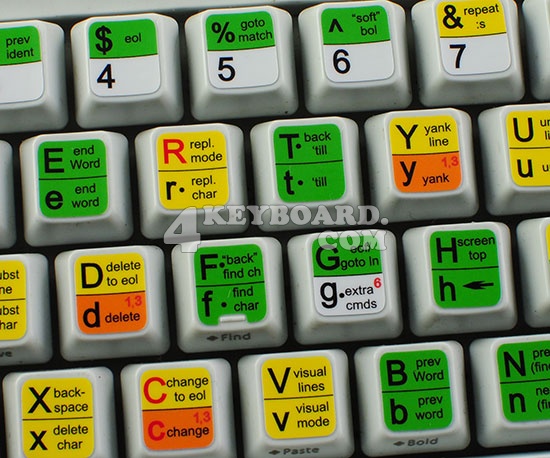
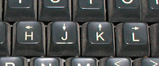
Would be nice to have more resources and ideas about what the keys of such a set should have printed on them (as the arrows on hjkl), what to print on their front ...

E.g.
Image

(Source: http://www.catonmat.net/blog/why-vim-us ... rrow-keys/)

---

Another, old discussion thread at GH: http://geekhack.org/index.php?topic=34775.0

Image

more links, cherry-picked from that thread:

User avatar
alinh

28 Jul 2014, 08:26

Of course I'd love a "vim set", but I wouldn't like the ultra colored version.
I'd go for something simple : main legend (letter) top left aligned and description text in lower right.

I'd pick the more important function of that key (h = <- instead of H = screen top), though the "more" part is subjective. Lowercase/uppercase versions of the same key usually offer the same functionality (w - next word vs W - next WORD) so we could choose either. For t/T (where the uppercase version is the reverse of the lowercase one) just 'till would be enough IMO. Also different mode functions text (not the main legend) should be in different colors - we could keep the same colors used in the cheatsheet.

I think the Vim keyset would look better on a "retro" scheme ( ADM-3A looks cool and all, but a bit too meh.. I'm sure we can find a cool color scheme here (HaaTa has some cool keyboards).

Unfortunately I suck at any kind of graphics so I couldn't offer any help, but I can criticize pretty well :evilgeek:

User avatar
Laser
emacs -nw

28 Jul 2014, 14:27

Yep, I agree with the "less is more" principle :) Perhaps a blue set a la solarized color scheme?: but frankly i'd go for a PBT DSA set (which would mean lighter base color and darker font AFAIK) ... as i have a Poker 2 (and a faceU replica ordered) and somehow this type of caps seem to go better with the "minimalist" approach of a 60% keyboard layout.

Starting from the same <-, -> etc. symbols under h, l ... perhaps a good idea would be to have relevant symbols to the lower right of each key letter, instead of small descriptive text: so, as you say, the capital letter aligned left and up, and the symbol, in a second color, to the lower right (like for greek, hebrew or russian keyboards), but with vim-functionality-symbols instead of country specific alphabet. Or, better, keep the small "function" text but also have some kind of additional symbol marker (a small square, or circle etc.) which would highlight the role of that key (as operator, motion etc.) basically the roles highlighted in the left description column of:

Image

User avatar
alinh

28 Jul 2014, 20:38

PBT DSA :mrgreen: , though I hate to say it, but SA would look best for this :)

Not sure I'd like the square, circle, etc. symbols to specify the mode; I'd just do the "description" text in a different color. Side (front) printing is also an option, but we'd lose a bit of the retro look.

Since we can only do dyesub, that means that the keys will be lighter than both the legends, so we're pretty much stuck with grey, white or some sort of creamy color (something like this )

User avatar
Daniel

28 Jul 2014, 21:01

Although I'm a daily vim user I wouldn't use a complete vim keycap set. While I see a certain optical appeal for the little arrows on hjkl the full set is just overkill as - at least I - memorized the key combinations which I use the most.

User avatar
alinh

28 Jul 2014, 21:45

Daniel wrote: Although I'm a daily vim user I wouldn't use a complete vim keycap set. While I see a certain optical appeal for the little arrows on hjkl the full set is just overkill as - at least I - memorized the key combinations which I use the most.
touch typists don't need to look at their keys; the keycap sets are just for the coolness factor ;)

User avatar
Laser
emacs -nw

28 Jul 2014, 23:19

alinh wrote:
Daniel wrote: Although I'm a daily vim user I wouldn't use a complete vim keycap set. While I see a certain optical appeal for the little arrows on hjkl the full set is just overkill as - at least I - memorized the key combinations which I use the most.
touch typists don't need to look at their keys; the keycap sets are just for the coolness factor ;)
There could be an option to have only a number of keys customized for vim; but then, they will have to match/fit some standard sets (e.g. Dolch), so there would be a splitting of interest (i.e. multiple such sets, in different colors, fonts etc. would be needed) ... while a full (standard) Vim set can be "only one", consistent with itself.

But a designer is badly needed (any tutorials?) - without images, no hook can be set ...

User avatar
zhasha

16 Aug 2014, 10:42

I'm not sure a Vim set is right for me. I'm more of a Notepad guy.
Spoiler:
h73644EB4.jpg
h73644EB4.jpg (28.86 KiB) Viewed 3712 times

Post Reply

Return to “Keyboards”