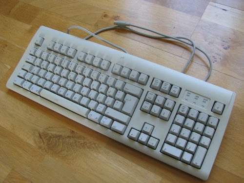
After a long(ish) wait, my Tactile Pro 4 for PC has finally arrived!
Here are some brief first impressions.
Firstly, it looks very black — I didn't realise how greasy the Quiet Pro had got (especially considering how little use it gets).
The switch feel is pretty similar to the Quiet Pro — around the same weight and the same level of tactility. The feel is a bit smoother.
What I do notice is that it's very rattly sounding. I've had it on a desk alongside a Dell AT102W with the switches converted to blue Alps, and the difference is very signficant. The Tactile Pro 4 sound is a dull, dry rattle together with a reduced level of the same ping that you got with the Forward (Fuhua) switches in the Tactile Pro 3. The TP3 sounds very loud and sharp — the TP4 sounds like the same thing, just damped to avoid the excess noise. The clicks of the TP4 are quiet, and drowned in the overall switch noise. It sounds like a really loud Quiet Pro with ping, not a clicky keyboard.
By comparison, the AT102W has clear, sharp, precise clicks exactly as you'd expect from a clicky keyboard. The AT102W with pseudo-blues sounds like a proper vintage clicky keyboard.
Also, just as with my Tactile Pro 3, it will swivel on the desk. The Quiet Pro doesn't do that on the same desk, so it seems to be specific to each individual keyboard.
The keycap factory really needs to do a better job with their laser foaming, too. The m in "num lock" has clearly uneven stroke widths, while the O key has aliasing and the U also has one upstroke thicker than the other. The lasering is really quite bad.
It's a pity, as I only bought this for review purposes and to give me knowledge and experience of the switches, and it's not really something I'd be anxious to sell on!
Actual typing experience is pretty reasonable though. It's not smooth like Cherry MX, but it's a good even weight that's not too light or too heavy. The atmospheric conditions are favourable right now for real Alps — I notice that my AT102W feels really good today, while on other days it feels too stiff, which some people attribute to the atmosphere. It would be more interesting to see how the Matias switches fair on a day when the Alps switches feel really balky, to see if they're prone to the same problem.
They do feel a bit balky, but then, I use Cherry MX red all day! At some point I'd also like to try a comparison with my Filco (MX blue) and TP3 (which I do use, but not for a couple of weeks or so, as it's attached to my Mac).
Matias Tactile Pro 4 (PC) first impressions
-
Daniel Beardsmore

- Location: Hertfordshire, England
- Main keyboard: Filco Majestouch 1 (home)/Poker II backlit (work)
- Main mouse: MS IMO 1.1
- Favorite switch: Probably not whatever I wrote here
- DT Pro Member: -
- Contact:
-
Muirium

- µ
- Location: Edinburgh, Scotland
- Main keyboard: HHKB Type-S with Bluetooth by Hasu
- Main mouse: Apple Magic Mouse
- Favorite switch: Gotta Try 'Em All
- DT Pro Member: µ
There's a Tactile Pro 4 for PC? I don't see it on Matias' site. Got some pics?
Good to hear you switched from MX browns to reds. I'm always dubious about those who find them bearable!
Good to hear you switched from MX browns to reds. I'm always dubious about those who find them bearable!
-
Daniel Beardsmore
- Location: Hertfordshire, England
- Main keyboard: Filco Majestouch 1 (home)/Poker II backlit (work)
- Main mouse: MS IMO 1.1
- Favorite switch: Probably not whatever I wrote here
- DT Pro Member: -
- Contact:
It's identical to the Quiet Pro for PC. Your dear friends the Keyboard Company sell a PC Tactile Pro in UK, German, Nordic and US layouts; you're correct that the Tactile Pro page on the Matias website doesn't mention that they exist, which is weird.
I don't dislike browns. It just happens that my Poker II has reds, so that's what I use — I bought it as a dual experiment to try both MX red and 60%, and I've just kept using it as it saves so much desk space, even though the 60% layout is a nightmare. I've discovered that linear is nice when it's a light weight, but MX brown still feels nice.
I almost took my camera with me to the office today (no idea why); I forgot that this keyboard might be coming. I doubt I'll bother with photos — the guy who took the incredible Quiet Pro photos has failed to put his on the wiki after all this time, and I really struggle with black keyboards. Maybe I'll just take a rear label shot as I did for the Quiet Pro. There are too many people here with great photography skills who are uncooperative, so screw it.
-
bhtooefr

- Location: Newark, OH, USA
- Main keyboard: TEX Shinobi
- Main mouse: TrackPoint IV
- Favorite switch: IBM Selectric (not a switch, I know)
- DT Pro Member: 0056
- Contact:
I wonder what's going on there. Looking at their Amazon UK product page for the US-layout one, I'm starting to wonder if it was either a custom-order or a mod.
-
jacobolus
- Location: geekhack ergonomics subforum
- Favorite switch: Alps plate spring; clicky SMK
- DT Pro Member: -
The AT102W is a pretty solid construction still, right? I’ve only tried the AT101 (and also the SGI version), which is very nice construction, but never the 101W. I think those are going to be hard to match in most new boards.Daniel Beardsmore wrote: ↑What I do notice is that it's very rattly sounding. I've had it on a desk alongside a Dell AT102W with the switches converted to blue Alps, and the difference is very signficant.
I personally find Matias clicky switches quite similar to white complicated Alps, though the sound is a bit different, they’re a bit more crisply tactile, and they wobble a bit more. Blue Alps is definitely more refined feeling and sounding than either.
I have a couple of old Apple AEKs with very beat up switches. I should put Matias switches in one and see what they’re like in a tank of a case with nice PBT keycaps.
-
Daniel Beardsmore
- Location: Hertfordshire, England
- Main keyboard: Filco Majestouch 1 (home)/Poker II backlit (work)
- Main mouse: MS IMO 1.1
- Favorite switch: Probably not whatever I wrote here
- DT Pro Member: -
- Contact:
Possibly a custom order from the Keyboard Company, I think, as they were in negotiations with Matias over it.bhtooefr wrote: ↑I wonder what's going on there. Looking at their Amazon UK product page for the US-layout one, I'm starting to wonder if it was either a custom-order or a mod.
Yes it is. It's "only" a Silitek, but it's sturdy. The keycaps are bland and uninspiring, and I don't care for the big banana design, but it's a decent keyboard otherwise (I've replaced most of the keycaps, but I have a few left to collect). It's not resonant like my Monterey K102, but it's got a very crisp, clear, precise sound with the pseudoblue switches (bamboo black lowers, blue springs and uppers). The original black Alps switches in the AT102W sounded pretty rough and scratchy — changing the springs gave the switches a much cleaner, purer sound.jacobolus wrote: ↑The AT102W is a pretty solid construction still, right?
The Matias switch feel isn't too bad, though it's still rough and crunchy, but the sound is really disappointing. They barely click at all, at least, not in a Tactile Pro. It's likened to a Gatling gun, but all I hear is a cheap, discordant plastic rattle instead of the clean, pure clicks of all my other Alps and clone boards (Silitek, Nan Tan, Datacomp, Monterey and KPT).
Matias switches were never going to be the next blue Alps, as they're a copy of an already cheapened switch.
-
Hypersphere

- Location: USA
- Main keyboard: Silenced & Lubed HHKB (Black)
- Main mouse: Logitech G403
- Favorite switch: Topre 45/55g Silenced; Various Alps; IBM Model F
- DT Pro Member: 0038
Sounds depressing. I was hoping for a more uplifting review, as I have just ordered a V60 with Matias Tactile Click switches.
-
seebart

- Offtopicthority Instigator
- Location: Germany
- Main keyboard: Rotation
- Main mouse: Steelseries Sensei
- Favorite switch: IBM capacitive buckling spring
- DT Pro Member: 0061
- Contact:
Ouch after reading this I would not buy the Tactile Pro 4. But still a very good short honest review.
-
Hypersphere
- Location: USA
- Main keyboard: Silenced & Lubed HHKB (Black)
- Main mouse: Logitech G403
- Favorite switch: Topre 45/55g Silenced; Various Alps; IBM Model F
- DT Pro Member: 0038
Looks like the Tactile Pro 4 was a disappointment. I just got my first Matias-switch keyboard (Matias Quiet Click). My experience has been more positive, but I have found that the feel and sound of the switch can be altered considerably by the choice of keycaps.
I've been rounding up replacement keycaps for my KBP V60 Matias Quiet Click Mini keyboard. I was able to replace all the mods except the spacebar with caps from a Dell AT101W. I like the convex mods on the bottom row that match the curvature of the spacebar. The stabilized keys work very smoothly -- crisp and even with no rattle at all.
At first, I used alpha keys from a Data General (Acer) 6311, because the Acer 6311 is reported to have dye-sub PBT. However, if they are PBT, they have visibly yellowed with age. I took these off and replaced them with some very white alphas from an Ortek MCK-84. These looked great, but I found that the "8" and "E" keys were sticking or binding. I tried removing the caps and reseating them, but I still got the binding. I found a post on this sort of issue:
http://deskthority.net/photos-f62/apple ... 75-30.html
The problem was attributed to keycaps whose stems are a bit too large for the switch slider, resulting in expansion of the slider and its binding in the switch housing.
I found a nice set of double-shots from a Suntouch Jr., and I am typing on them now. The binding problem has disappeared.
The board looks good, but I am still looking for some dye-sub PBT caps with a slight pumice-like texture to improve the surface feel. I like the feel of the switches, and the board is quiet.
I am awaiting the Click version of this keyboard. After it arrives, I may do a comparative review. So far, I like Matias Quiet Click switches in the V60 better than any Cherry mx switch I have tried (which include blue, green, red, black, brown, and clear).
-
Daniel Beardsmore
- Location: Hertfordshire, England
- Main keyboard: Filco Majestouch 1 (home)/Poker II backlit (work)
- Main mouse: MS IMO 1.1
- Favorite switch: Probably not whatever I wrote here
- DT Pro Member: -
- Contact:
I'll make some recordings with my camera tomorrow (in glorious 4 bit 8 kHz sampling rate or something) or Wednesday and compare it with my AT102W, Tactile Pro 3, Quiet Pro and maybe one or two others, and you can get a very rough idea.
The Tactile Pro 4 isn't terrible, but it's not what I was hoping for or expecting.
The Tactile Pro 4 isn't terrible, but it's not what I was hoping for or expecting.
-
jacobolus
- Location: geekhack ergonomics subforum
- Favorite switch: Alps plate spring; clicky SMK
- DT Pro Member: -
Daniel: if you want to do a cute experiment, you might try desoldering and swapping one switch on your AT102W with one switch on your Tactile Pro. I suspect you’ll find that the keyboard construction + keycaps make a pretty noticeable difference in the sound. (Obviously also feel free to skip this experiment if you want.  )
)
I suspect much of the part you dislike is just the thin-ish ABS keycaps on the Tactile Pro, and possibly a difference in resonance in the case/plate/pcb, vs. the AT102W.
I suspect much of the part you dislike is just the thin-ish ABS keycaps on the Tactile Pro, and possibly a difference in resonance in the case/plate/pcb, vs. the AT102W.
-
Daniel Beardsmore
- Location: Hertfordshire, England
- Main keyboard: Filco Majestouch 1 (home)/Poker II backlit (work)
- Main mouse: MS IMO 1.1
- Favorite switch: Probably not whatever I wrote here
- DT Pro Member: -
- Contact:
I was good at what my electronics teacher called "Dolly Partons" …
I wouldn't be surprised if it was the keyboard. Even so, here's what I'm comparing it against:
Filco Majestouch 1, metal plate, Cherry MX blue
KPT KPT-84, plastic plate, USw LABI01
NTC KB-6153EN, metal plate, alps.tw type OA2
NTC KB-6251EA, plastic plate, Alps SKCM White
Monterey K102, metal plate, Alps SKCM Blue
Dell AT102W (Silitek), metal plate, Alps SKCM Black–Blue hybrid
IBM Enhanced Keyboard, 1996
The Model M is the least clicky of the above, ironically. Of course, none of the above are a fraction as pure and clean as some of the relics that HaaTa finds, which are nearly 100% click!
It's not like I have a prestigious collection of top-quality keyboards or anything! The Matias is a long way down.
The Tactile Pro 3 is similar sounding, just louder and with more ping. The Tactile Pro 4 basically sounds the same as the TP3, just with less ping and less noise.
-
Muirium
- µ
- Location: Edinburgh, Scotland
- Main keyboard: HHKB Type-S with Bluetooth by Hasu
- Main mouse: Apple Magic Mouse
- Favorite switch: Gotta Try 'Em All
- DT Pro Member: µ
Despite their reputation, Model Ms vary quite a bit. As do Model Fs, but in a different range. I've a fair few of both now, and some click a lot more than others. The Fs are beastly compared to any M. The Ms, well, they're mostly good but my 122 key only really sang when I bolt modded it and took out the soft sheet! Probably not a good idea for the long-run, but it's not like I use that board at all anyway, with the terrible rollover and a size antithetical to my taste and practice.
In any case, I'd like to see switches as loud as the full voiced of these guys. Omrons could give them a match, I think, but a hearty M can drown MX greens in my experience.
In any case, I'd like to see switches as loud as the full voiced of these guys. Omrons could give them a match, I think, but a hearty M can drown MX greens in my experience.
-
Hypersphere
- Location: USA
- Main keyboard: Silenced & Lubed HHKB (Black)
- Main mouse: Logitech G403
- Favorite switch: Topre 45/55g Silenced; Various Alps; IBM Model F
- DT Pro Member: 0038
I'm finding the Matias Quiet Click switches quite acceptable in the V60 with the doubleshots from my Suntouch Jr. Perhaps Matias switches do better in non-Matias keyboards. I am eager to try the V60 with the Matias Click ("Tactile Click") switches for comparison.
-
Daniel Beardsmore
- Location: Hertfordshire, England
- Main keyboard: Filco Majestouch 1 (home)/Poker II backlit (work)
- Main mouse: MS IMO 1.1
- Favorite switch: Probably not whatever I wrote here
- DT Pro Member: -
- Contact:
Comparison recordings (more in the full topic):
Tactile Pro 3 not included, nor the KPT and Chicony keyboards, as I didn't bring the keyboard home with me. No Realforce either — fate was urinating on me.
Swapping keycaps between the Matias and Dell made very little difference.
- Matias Tactile Pro — Matias click
- Dell AT102W (hybrid blues) — hybrid SKCM blue/black
- AT102W vs Tactile Pro
Tactile Pro 3 not included, nor the KPT and Chicony keyboards, as I didn't bring the keyboard home with me. No Realforce either — fate was urinating on me.
Swapping keycaps between the Matias and Dell made very little difference.
-
Hypersphere
- Location: USA
- Main keyboard: Silenced & Lubed HHKB (Black)
- Main mouse: Logitech G403
- Favorite switch: Topre 45/55g Silenced; Various Alps; IBM Model F
- DT Pro Member: 0038
My KBP V60 Matias Click Mini keyboard arrived. It is much louder than the silent version. I've been experimenting with O-rings and EK soft landing pads. These actually work on Alps/Matias switches, but of course all they do is dampen the bottoming-out sound. The soft landing pads seem to have more effect than O-rings, but both devices shorten key travel somewhat. To me, O-rings or landing pads do not seem worth the trouble, although I might try them out on the spacebar. I think if I were building my own keyboard, I might have Click switches everywhere except the spacebar, where I would use a Quiet Click switch. The spacebar on my V60 Matias Quiet Click board is perhaps the quietest spacebar I have ever encountered.
-
Daniel Beardsmore
- Location: Hertfordshire, England
- Main keyboard: Filco Majestouch 1 (home)/Poker II backlit (work)
- Main mouse: MS IMO 1.1
- Favorite switch: Probably not whatever I wrote here
- DT Pro Member: -
- Contact:
Oops, I forgot the photos.
Here's the key I noticed first, the 'm' in "num lock":
This is how it looks on my Quiet Pro:
I imagine there's a fair amount of variation from keyboard to keyboard. You can see the aliasing (steps/jaggies) even in the words "num lock" on the Tactile Pro 4 for PC, but it's much more noticeable on the 'O' key:
It looks worse in person — I was having a hard time with those photos, trying to get enough light for the camera (under the really bright strip light bank) while trying to avoid the resulting glare. (The middle photo was taken under far less light, as I couldn't move that keyboard — too hard to get the cable out from the desk.)
The keycap printing is pretty shabby. On the one hand, many people accept that they'll be replacing all stock keycaps, but with an Alps clone keyboard this much less of an option right now!
Here's the key I noticed first, the 'm' in "num lock":
- Matias Tactile Pro 4 -- laser foaming.jpg (553.77 KiB) Viewed 7657 times
- Matias Quiet Pro -- laser foaming.jpg (561.45 KiB) Viewed 7657 times
- Matias Tactile Pro 4 -- O key.jpg (340.71 KiB) Viewed 7657 times
The keycap printing is pretty shabby. On the one hand, many people accept that they'll be replacing all stock keycaps, but with an Alps clone keyboard this much less of an option right now!
-
Muirium
- µ
- Location: Edinburgh, Scotland
- Main keyboard: HHKB Type-S with Bluetooth by Hasu
- Main mouse: Apple Magic Mouse
- Favorite switch: Gotta Try 'Em All
- DT Pro Member: µ
Christ, that's shitty. A nice sharp edge, but a nightmare distortion of the legend! So close to being a great technique, but only enough to highlight what a botched job it is!
By the way, I'd never heard of laser foaming, so I looked it up.
http://www.or-laser.com/en/laser-marking/laser-foaming/
Having read one page about it (and so therefore now clearly an expert) your pictures look surprisingly high contrast for this technique. Are they really that clear? And do you notice any inconsistency in the surface texture with the rest of the cap?
-
Daniel Beardsmore
- Location: Hertfordshire, England
- Main keyboard: Filco Majestouch 1 (home)/Poker II backlit (work)
- Main mouse: MS IMO 1.1
- Favorite switch: Probably not whatever I wrote here
- DT Pro Member: -
- Contact:
The legends are pure white and they're raised above the surface of the keycap — I was having trouble getting the right exposure with the limited indoor light and the glare off the shiny case. All the grey stains in the legends aren't visible normally; I was trying to illustrate the aliasing and malformed shapes, not the staining that doesn't really exist. The second photo is a lot closer to how the legends actually look, which is pure white.
The rest of the keycap looks fine.
Laser marking is one of those subjects that's not covered in great detail anywhere; there's a lot of brief information here, including what appears to a be confirmation that foaming can achieve pure white marking:
http://www.industrial-lasers.com/articl ... stics.html
-
Muirium
- µ
- Location: Edinburgh, Scotland
- Main keyboard: HHKB Type-S with Bluetooth by Hasu
- Main mouse: Apple Magic Mouse
- Favorite switch: Gotta Try 'Em All
- DT Pro Member: µ
Hmm. I like the sharpness and contrast. So I'm guessing the weak point is durability. Wonder if and how quick they wear off, exposed like that?
When I first got into keyboards, the term "lasered" actually sounded good to me. Frickin' lasers! But once I had a few lasered caps in hand, I saw why they are frowned upon. Lasering comes hand in hand with thin, cheap, crappy caps as a matter of cost saving principle. I don't think there's anything inherently shit about lasered legends, so long as they're not exposed to too much wear I suppose, but they're never a good sign about the manufacturer's broader intentions!
When I first got into keyboards, the term "lasered" actually sounded good to me. Frickin' lasers! But once I had a few lasered caps in hand, I saw why they are frowned upon. Lasering comes hand in hand with thin, cheap, crappy caps as a matter of cost saving principle. I don't think there's anything inherently shit about lasered legends, so long as they're not exposed to too much wear I suppose, but they're never a good sign about the manufacturer's broader intentions!
-
Daniel Beardsmore
- Location: Hertfordshire, England
- Main keyboard: Filco Majestouch 1 (home)/Poker II backlit (work)
- Main mouse: MS IMO 1.1
- Favorite switch: Probably not whatever I wrote here
- DT Pro Member: -
- Contact:
It's really quite simple. Lots of us like black keyboards. This just isn't viable right now.
Double-shot moulding is expensive. Tai-Hao do it comparatively cheaply, but quality control isn't perfect, as I've had some bad keys from them (distorted lettering). There's still the issue of MOQ needed to cover international layouts: Tai-Hao have got as far as the XP logo (!) and ISO return, but pushing their product range to cover French, German, Nordic etc would require capital outlay from a manufacturer as our group buys are too small. Once the tooling MOQ is reached, though, further batches should be a lot more accessible to everyone. (More people than GH/DT are buying their keycaps.)
Pad printing is awkward: Filco do it exquisitely, and if you have wussy fingers like mine, it's perfectly durable. However, some people can obliterate Filco legends.
And then we have laser. There's several ways to do laser marking on His Dark Materials. You can change the colour of the material by burning away one colourant and leaving others behind. You can also foam the plastic, to give you white legends — this might be what's always been done by some brands, but I don't know why pure white lettering was only available recently. You can also engrave the plastic and fill the troughs with infill.
Infill stains readily, as does the foamed surface. Das also infamously had the infill crack and fall out the keycaps.
Foaming should last forever, but it won't remain pure white. Double-shot legends however don't discolour, and neither does pad printing, as they're very smooth and don't pick up engrained dirt like lasered legends do. Old-school engraved and painted is also bad for picking up dirt.
Personally I'd always take good pad printing over laser, as it offers far higher resolution and thus 100% typeface coverage, good surface coverage (it's hard to shade solid areas with a laser beam), and the best white-on-black longevity for softer skin short of double-shot. I'm reluctant to replace my Filco keycaps as I actually like Futura italic and you can't achieve such a sharp typeface with double-shot tooling, although Tai-Hao's typography is decent (and far more elegant than Cherry's ghastly bloated "toddler's first A B C" typeface).
My beef with Matias isn't the printing method (as much as I hate all laser marking) but that the marking machinery is completely messed up, which seems at odds with their price point. (I've had the Quiet Pro for well over a year and since then their laser marking has either got worse, or it's always been wobbly.)
-
Muirium
- µ
- Location: Edinburgh, Scotland
- Main keyboard: HHKB Type-S with Bluetooth by Hasu
- Main mouse: Apple Magic Mouse
- Favorite switch: Gotta Try 'Em All
- DT Pro Member: µ
Come play with us, Danny.
Aftermarket caps group buys. Forever, and ever, and ever.
I wouldn't be into MX for anything else. And that's Alps mount's biggest problem right there. There's already one standard to rule them all. As awkward as it is for Alps clones to do a damn thing about.
Aftermarket caps group buys. Forever, and ever, and ever.
I wouldn't be into MX for anything else. And that's Alps mount's biggest problem right there. There's already one standard to rule them all. As awkward as it is for Alps clones to do a damn thing about.
-
bhtooefr
- Location: Newark, OH, USA
- Main keyboard: TEX Shinobi
- Main mouse: TrackPoint IV
- Favorite switch: IBM Selectric (not a switch, I know)
- DT Pro Member: 0056
- Contact:
The funny thing is that once upon a time, the one standard to rule them all was actually Alps mount. Even rubber domes used it, and Cherry even made Alps-mount MX switches!
-
Muirium
- µ
- Location: Edinburgh, Scotland
- Main keyboard: HHKB Type-S with Bluetooth by Hasu
- Main mouse: Apple Magic Mouse
- Favorite switch: Gotta Try 'Em All
- DT Pro Member: µ
Yup. That's the era of the source for the best Alps caps out there, even today. However did they fall? I'm guessing when Alps got bored of mechanical keyboards. Cherry's staying power won out in the intervening years.
-
Hypersphere
- Location: USA
- Main keyboard: Silenced & Lubed HHKB (Black)
- Main mouse: Logitech G403
- Favorite switch: Topre 45/55g Silenced; Various Alps; IBM Model F
- DT Pro Member: 0038
Now that I have Matias switches in a 60% keyboard, I have become a convert to this switch type. It would be convenient if there were good replacement keycap sets, especially in dye-sub and/or double-shot PBT, but with some exploration it is possible to find various reasonable alternatives in the wild.
Whatever process Dell used in its AT101 and AT101W keycaps looks rather good. I think that some of the earlier AT101 boards used dye-sub PBT and the AT101W used laser etching, but the result is not bad at all.
Whatever process Dell used in its AT101 and AT101W keycaps looks rather good. I think that some of the earlier AT101 boards used dye-sub PBT and the AT101W used laser etching, but the result is not bad at all.
-
Daniel Beardsmore
- Location: Hertfordshire, England
- Main keyboard: Filco Majestouch 1 (home)/Poker II backlit (work)
- Main mouse: MS IMO 1.1
- Favorite switch: Probably not whatever I wrote here
- DT Pro Member: -
- Contact:
Most AT101 were Alps-made with dye sub keycaps and salmon switches. The last AT101 batches, and all AT101W were made by Silitek with black switches and laser-charred keycaps. The Silitek keycaps look a bit rubbish to me.
Another problem I forgot to mention is material. However, Vortex have been working on that, and one day we should see a proper review of their PBT doubleshots. I don't off-hand know what they're going to be charging either.
We can get Tai-Hao sets for around $9, which—with bulk discount for much larger batches—seems a viable option to use as a stock keycap product. My concern is their QC; I've only had two group buy sets so far, and I've found one bad key (might have been left shift). Left shift on my OK-100M was also a bad moulding (the letter strokes are thinner on one side). I should really document that bad group buy keycap on the wiki.
Even so, one bad key from Tai-Hao is still far better than multiple bad keys on a Matias.
Depending on the price of the PBT sets and what Vortex's QC and manufacturing capacity is like:
Cheaper keyboards (sub-$100) — laser foaming
Quality keyboards (over $100) — Tai-Hao doubleshot
Premium keyboards and aftermarket — Vortex PBT doubleshot
OR
Cheaper keyboards (sub-$100) — laser foaming
Quality and premium keyboards (over $100) and aftermarket — Vortex PBT doubleshot
The bloody mess at the end seems like a fitting metaphor for something here … Just not sure what yet.Muirium wrote: ↑Come play with us, Danny.
It does make me wonder — there seem to be more group buy keycap sets bought that anyone has keyboards. I am not entirely sure what technology you think I've overlooked, either. As I said, I'm reluctant to swap out my Filco keycaps as I like Diatec's choice of typeface, and you can't reproduce that with doubleshot. There's no perfect solution to white-on-black.Muirium wrote: ↑Aftermarket caps group buys. Forever, and ever, and ever.
Another problem I forgot to mention is material. However, Vortex have been working on that, and one day we should see a proper review of their PBT doubleshots. I don't off-hand know what they're going to be charging either.
We can get Tai-Hao sets for around $9, which—with bulk discount for much larger batches—seems a viable option to use as a stock keycap product. My concern is their QC; I've only had two group buy sets so far, and I've found one bad key (might have been left shift). Left shift on my OK-100M was also a bad moulding (the letter strokes are thinner on one side). I should really document that bad group buy keycap on the wiki.
Even so, one bad key from Tai-Hao is still far better than multiple bad keys on a Matias.
Depending on the price of the PBT sets and what Vortex's QC and manufacturing capacity is like:
Cheaper keyboards (sub-$100) — laser foaming
Quality keyboards (over $100) — Tai-Hao doubleshot
Premium keyboards and aftermarket — Vortex PBT doubleshot
OR
Cheaper keyboards (sub-$100) — laser foaming
Quality and premium keyboards (over $100) and aftermarket — Vortex PBT doubleshot
-
Muirium
- µ
- Location: Edinburgh, Scotland
- Main keyboard: HHKB Type-S with Bluetooth by Hasu
- Main mouse: Apple Magic Mouse
- Favorite switch: Gotta Try 'Em All
- DT Pro Member: µ
Yup, I'd love to see some Vortex PBT doubleshots in person, but when I have looked them up they're quite expensive, and I'm too deep in caps already to justify another set. The lure of Signature Plastics GBs is strong! Especially when you're into customs like I am, and always have an eye on right Shift and short spacebars. We're agreed that fonts matter, of course. These Granites here are my favourites of all in that regard. Always helps to like light coloured caps!
-
deeyay
- Location: Örebro, Sweden
- Main keyboard: Varies
- Favorite switch: All clicky
- DT Pro Member: -
I recieved a Matias Tactile Pro 4 for PC just the other day. I am making myself acquainted with it at the momemt and it's my first experience with Alps at least that I can remember. I hear ya about the keycaps they feel cheap as heck. As a matter of fact the whole package gives a very plastic cheap feeling to be honest as it also sounds pretty "hollow" when typing. Like the chassis is making the sound worse.
What I have done to somewhat remedy some of this is to open up the whole package and taped some cloth onto the bottom part of the chassis to remove all the dead space and so that sound can not bounce around so much in the chassis. This has definitely helped making it sound at least a little bit more sturdy.
Second, I have already painted the whole chassis in retro gray color to get rid of that nasty glossy plastic. Next step is to recieve new keycaps for it in the next week that I found randomly on the net yesterday. I have bought two old keyboards just for the keycaps for my Matias. That I found them old keyboards was just plain luck and coinsidence without me looking for them specifically.

It's membrane keyboard but the keycaps are Alps mounts. I believe they will be thicker (hope so anyway) than the crap that is on from factory so I think that will further help with the sound of the board a little I believe.
All in all I like the keyboard a lot. After all it's the typing experience that matters mostly and I do think I'm going to like the Alps switches more than my Cherry MX Blue or even my Buckling Springs on my Model M which are a bit too stiff for my taste.
What I have done to somewhat remedy some of this is to open up the whole package and taped some cloth onto the bottom part of the chassis to remove all the dead space and so that sound can not bounce around so much in the chassis. This has definitely helped making it sound at least a little bit more sturdy.
Second, I have already painted the whole chassis in retro gray color to get rid of that nasty glossy plastic. Next step is to recieve new keycaps for it in the next week that I found randomly on the net yesterday. I have bought two old keyboards just for the keycaps for my Matias. That I found them old keyboards was just plain luck and coinsidence without me looking for them specifically.
It's membrane keyboard but the keycaps are Alps mounts. I believe they will be thicker (hope so anyway) than the crap that is on from factory so I think that will further help with the sound of the board a little I believe.
All in all I like the keyboard a lot. After all it's the typing experience that matters mostly and I do think I'm going to like the Alps switches more than my Cherry MX Blue or even my Buckling Springs on my Model M which are a bit too stiff for my taste.
-
bhtooefr
- Location: Newark, OH, USA
- Main keyboard: TEX Shinobi
- Main mouse: TrackPoint IV
- Favorite switch: IBM Selectric (not a switch, I know)
- DT Pro Member: 0056
- Contact:
And, while the past 10-15 years or so of computing design have gone strongly towards the white-on-black aesthetic, as a backlash against the beige box, there are other aesthetics that are black-on-white that are considered fashionable today (and, actually, the past decade of Apple keyboards on desktops have been black-on-white):

Let's face it, using Apple's unibody approach, we could make a mechanical with that exact aesthetic. And, it's also worth noting that sphericals even fit into that aesthetic - the (white-on-black) laptop keyboards actually use subtly spherical keys.
Let's face it, using Apple's unibody approach, we could make a mechanical with that exact aesthetic. And, it's also worth noting that sphericals even fit into that aesthetic - the (white-on-black) laptop keyboards actually use subtly spherical keys.
-
Daniel Beardsmore
- Location: Hertfordshire, England
- Main keyboard: Filco Majestouch 1 (home)/Poker II backlit (work)
- Main mouse: MS IMO 1.1
- Favorite switch: Probably not whatever I wrote here
- DT Pro Member: -
- Contact:
I tried a keycap swap with a keycap from my AT102W — it made very little difference. I don't think the keycaps are the problem. That first keyboard selected for donor caps is going to be a much higher quality product — most likely to be a genuine Alps Bigfoot!
For all I know, it's because Matias use polycarbonate for the shell instead of ABS.
As for dark-on-white (it's not: Apple use laser charring to give grey-on-white, which they pull off fairly well) it shows up stains far more readily, but it's better for dust :)
Strangely, I like the Matias gloss black, but mine came scratched from new (as did the Quiet Pro as I recall) and polycarbonate seems to scratch very readily. Even brushing off dust for a photo left scratches in the plastic! It's not like whatever my camera screen is shielded with, as that's glossy yet not terribly scratched after nine years. (It's scratched, but not like my brand new Matias!)