Page 27 of 76
Posted: 15 Nov 2014, 11:19
by Muirium
Sure, just try some crops yourself. I did enough yesterday… (I'd start playing the world's smallest violin, but there's a waiting list.)
Posted: 15 Nov 2014, 11:21
by ماء
yup, but win eror i cant open photoshop

if not i've crop it

yeah the header is depiction of muri now
Posted: 15 Nov 2014, 11:30
by webwit
Posted: 15 Nov 2014, 11:31
by ماء
thanks
Posted: 15 Nov 2014, 11:54
by matt3o
Posted: 15 Nov 2014, 12:04
by matt3o
I believe the worst keyboard on the planet deserves a place on the header


- zx.jpg (51.12 KiB) Viewed 4893 times
Posted: 17 Nov 2014, 12:23
by ماء
Very nice header need more water theme


Posted: 17 Nov 2014, 12:42
by matt3o
this last one is very nice
Posted: 17 Nov 2014, 17:04
by ماء
btw when i click images for header it automaticaly/preview the header changes, its new feature?
Posted: 17 Nov 2014, 17:07
by Muirium
Not quite:
http://deskthority.net/post34299.html#p34299
Although I see there is a wiki page for these I didn't even know about and haven't been updating. So join the TL;DR club!
Posted: 22 Nov 2014, 13:11
by Madhias
I made a header crop of the springs ماء mentioned, but from a similar picture, let's see how it looks:

- DT_Header_Springs.jpg (98.96 KiB) Viewed 4797 times
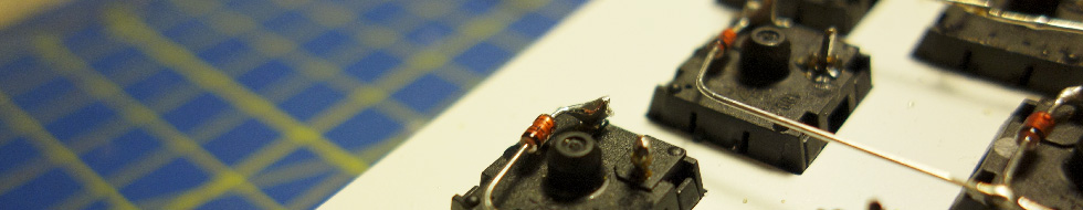
Some caps of the dirty beam spring keyboard i got recently:

- DT_Header_BeamSprings3.jpg (49.88 KiB) Viewed 4792 times
And an weird perspective of IBM caps:

- DT_Header_SSK.jpg (100.08 KiB) Viewed 4804 times
Posted: 22 Nov 2014, 13:23
by Muirium
Springs is nice. SSK could use darker area on the left behind the logo. (Try shooting again from the reverse angle. The function row looks a good choice.) And I've no idea what all that grey's about on the other one! Badly exported Photoshop layers?
Posted: 22 Nov 2014, 13:26
by matt3o
I like them all madhias, I don't mind if the contrast with the DT logo is low actually
Posted: 22 Nov 2014, 13:29
by Madhias
It is no problem with layers, didn't work here with layers! It should be a cropped image with lots of grey. Like this:
The SSK image i don't really like that much, it was some shot from a studio session, maybe i'll do it again, let's see!
Posted: 22 Nov 2014, 13:37
by ماء
madhias wrote: ↑I made a header crop of the springs ماء mentioned, but from a similar picture, let's see how it looks:
DT_Header_BeamSprings3.jpg
And an weird perspective of IBM caps:
i like this
like hidden keycaps
Posted: 22 Nov 2014, 13:44
by Muirium
Ah, looks more confused when you're an administrator…

- Screen Shot 2014-11-22 at 12.43.23 pm.png (625.44 KiB) Viewed 4774 times
Posted: 22 Nov 2014, 13:47
by Madhias
Well, that's the load an administrator has to carry
Posted: 24 Nov 2014, 14:51
by mr_a500
Oh, I see why this one was selected! The background looks like a Scottish tartan. In fact, it looks a bit like the tartan of...
the Muir clan!

Oh yeah... we're on to you,
Muirium.
(just kidding - I like the header

)
Posted: 24 Nov 2014, 14:53
by Muirium
My sect has additional duck motifs worked into the main clan pattern…
Posted: 01 Jan 2015, 17:30
by seebart
Posted: 01 Jan 2015, 17:43
by Muirium
#2 is okay. The Alps switches shot could use the focus on the right half of the picture, with blur behind the DT logo. Those work best.
I like #6: Cryillic AEK, but the colours are too grim. Needs a nicer light, or some tweaking I suppose.
Matt's Spectrum header would be better without the fake blur. (Blur is depth, and that's so flat it screams out fake to me!) I can play around with the original image if I lay my hands on it!
Posted: 01 Jan 2015, 17:46
by seebart
Muirium wrote: ↑#2 is okay. The Alps switches shot could use the focus on the right half of the picture, with blur behind the DT logo. Those work best.
I like #6: Cryillic AEK, but the colours are too grim. Needs a nicer light, or some tweaking I suppose.
Yup I´ll have to play around a little with those. Their not right yet!
Posted: 01 Jan 2015, 17:54
by mr_a500
#1 is awesome! Ceramic gold pin chip, nice wavy traces, nice lighting on the "naked cage" - I love it.
IMGP7650c.JPG
Posted: 01 Jan 2015, 17:58
by Muirium
Logo readability isn't great though. But might be worth it in this case. I really do prefer authentic images over gradients and other fakery.
The best formulas for great DT headers are: put something solid coloured at the left, like a desk or a shadow; or focus on the right of the picture and get a nice smooth blur on the left. You want a smooth, preferably dark background for the header text.
Posted: 01 Jan 2015, 18:10
by seebart
I agree, the DT logo is not singled out in those. But I can resize and recrop. Sorry mr_a500 the chip got cut for logo space!

Still needs some more work though.

Posted: 01 Jan 2015, 18:39
by Muirium
The Alps are much better!
Of course, you can simply make new posts to update the pictures. The thread remains easier to read that way. Not every image in here is guaranteed to make the cut. I'm the judge, after all!
Posted: 01 Jan 2015, 18:43
by seebart
Muirium wrote: ↑The Alps are much better!
Of course, you can simply make new posts to update the pictures. The thread remains easier to read that way. Not every image in here is guaranteed to make the cut. I'm the judge, after all!
right but those images in my first try were really useless. I´ll make new posts with new pictures from now on.
Posted: 01 Jan 2015, 19:37
by Muirium
I put the two I think are good enough into rotation now:
http://deskthority.net/headers.php
Not a bad attempt!
Re: Post your deskthority header images here
Posted: 01 Jan 2015, 20:11
by seebart
Hey thanks! There's always room for self improvement.
Posted: 01 Jan 2015, 20:13
by mr_a500
Arg. What happened to the one I liked?
I agree that the logo readability wasn't the best, but it had all the elements I liked. Can't we find another crop for it?
IMGP7650c.JPG