(asking it as an official club member
Vector Deskthority Logo
-
matt3o

- -[°_°]-
- Location: Italy
- Main keyboard: WhiteFox
- Main mouse: Anywhere MX
- Favorite switch: Anything, really
- DT Pro Member: 0030
- Contact:
Is it available?
(asking it as an official club member )
)
(asking it as an official club member
-
webwit

- Wild Duck
- Location: The Netherlands
- Main keyboard: Model F62
- Favorite switch: IBM beam spring
- DT Pro Member: 0000
- Contact:
I'm afraid not. Although it should be easy to recreate in Illustrator and export as svg or whatever you need. Font is Melbourne. Any volunteers? Sixty made the original, I think in Photoshop, but I only have the png.
-
matt3o
- -[°_°]-
- Location: Italy
- Main keyboard: WhiteFox
- Main mouse: Anywhere MX
- Favorite switch: Anything, really
- DT Pro Member: 0030
- Contact:
this would be it, but it's not a 1:1 replica. The original seems to be bold, variant that I wasn't able to find. So I added a thin border to the text losing a bit of character (you can see it from the Y).
Apart from that, it's pretty close. I'll review letter spacing a bit more and post the SVG
- deskthority.png (7.74 KiB) Viewed 13113 times
-
scottc

- ☃
- Location: Remote locations in Europe
- Main keyboard: GH60-HASRO 62g Nixies, HHKB Pro1 HS, Novatouch
- Main mouse: Steelseries Rival 300
- Favorite switch: Nixdorf 'Soft Touch' MX Black
- DT Pro Member: -
+1 to this (though it looks strange to me in inverted colours!)Muirium wrote:I actually prefer this one. That jaggy Y has been nagging me ever since I showed up…
-
matt3o
- -[°_°]-
- Location: Italy
- Main keyboard: WhiteFox
- Main mouse: Anywhere MX
- Favorite switch: Anything, really
- DT Pro Member: 0030
- Contact:
sorry, here it is. Original vs new.
- deskthority.png (22.46 KiB) Viewed 13098 times
-
Muirium

- µ
- Location: Edinburgh, Scotland
- Main keyboard: HHKB Type-S with Bluetooth by Hasu
- Main mouse: Apple Magic Mouse
- Favorite switch: Gotta Try 'Em All
- DT Pro Member: µ
Nice. I like the S and the R more now too. And being a very subtle difference, I doubt anyone would notice if this one started showing up in their browser!
-
matt3o
- -[°_°]-
- Location: Italy
- Main keyboard: WhiteFox
- Main mouse: Anywhere MX
- Favorite switch: Anything, really
- DT Pro Member: 0030
- Contact:
I believe this last one has a better kerning, too. I might just reduce the border a subpixel to give some character back to the typeface
-
Muirium
- µ
- Location: Edinburgh, Scotland
- Main keyboard: HHKB Type-S with Bluetooth by Hasu
- Main mouse: Apple Magic Mouse
- Favorite switch: Gotta Try 'Em All
- DT Pro Member: µ
If this does become the actual site banner logo (as we're all going to virtual pixels anyway with high DPI displays, so really need vector graphics), what do you think of a super thin black outline around the white, so that it's readable on a wider variety of backgrounds? Because right now, banner photography is as much about making sure the white logo is still readable on your photo as it is about the content.
-
matt3o
- -[°_°]-
- Location: Italy
- Main keyboard: WhiteFox
- Main mouse: Anywhere MX
- Favorite switch: Anything, really
- DT Pro Member: 0030
- Contact:
there's a very simple code I use on other projects that basically detects the contrast of a background and returns "black" or "white" as color to be used as foreground. Maybe that would be a nice touch.
Also a very very light drop shadow around the logo might help in readability.
Also a very very light drop shadow around the logo might help in readability.
-
matt3o
- -[°_°]-
- Location: Italy
- Main keyboard: WhiteFox
- Main mouse: Anywhere MX
- Favorite switch: Anything, really
- DT Pro Member: 0030
- Contact:
Stop the press! I found the bold version! updating...

-
matt3o
- -[°_°]-
- Location: Italy
- Main keyboard: WhiteFox
- Main mouse: Anywhere MX
- Favorite switch: Anything, really
- DT Pro Member: 0030
- Contact:
Test on light background
hairline
drop shadow
flat
- deskthority.png (35.89 KiB) Viewed 13053 times
drop shadow
flat
-
7bit

- Location: Berlin, DE
- Main keyboard: Tipro / IBM 3270 emulator
- Main mouse: Logitech granite for SGI
- Favorite switch: MX Lock
- DT Pro Member: 0001
-
matt3o
- -[°_°]-
- Location: Italy
- Main keyboard: WhiteFox
- Main mouse: Anywhere MX
- Favorite switch: Anything, really
- DT Pro Member: 0030
- Contact:
pretty much covered· Create and print documents, as well as static images (.jpeg, .tiff, .png), even if the images are used on the web or in a mobile app.
-
Muirium
- µ
- Location: Edinburgh, Scotland
- Main keyboard: HHKB Type-S with Bluetooth by Hasu
- Main mouse: Apple Magic Mouse
- Favorite switch: Gotta Try 'Em All
- DT Pro Member: µ
If it ever did come down to a replacement font, here's some promising open ones, via the Google Fonts repo, which catch my eye.
Heavy:
Narrow:
Really Narrow:
Light:
And then perhaps the most fitting of our image:
For comparison's sake:
Heavy:
- Anton.png (13.02 KiB) Viewed 12996 times
- Squada One.png (10.68 KiB) Viewed 12996 times
- Jockey One.png (12.77 KiB) Viewed 12996 times
- Oswald.png (15.08 KiB) Viewed 12996 times
- Crushed.png (17.76 KiB) Viewed 12996 times
- Bench Nine.png (13.99 KiB) Viewed 12996 times
- Six Caps.png (8.64 KiB) Viewed 12996 times
- Overclock.png (20.68 KiB) Viewed 12996 times
- Anaheim.png (14.65 KiB) Viewed 12996 times
- Smythe.png (19.5 KiB) Viewed 12996 times
- Rum Raisin.png (18.02 KiB) Viewed 12996 times
-
matt3o
- -[°_°]-
- Location: Italy
- Main keyboard: WhiteFox
- Main mouse: Anywhere MX
- Favorite switch: Anything, really
- DT Pro Member: 0030
- Contact:
-
rindorbrot

- Location: Bavaria, Germany
- Main keyboard: Phantom, GON NerD 2.0 TKL
- Main mouse: Zowie ZA11
- Favorite switch: MX Ergo-Clear, Nixdorf Soft-Touch
- DT Pro Member: 0029
Yes!7bit wrote:Now, should I add a DT key to Round 5?
-
webwit
- Wild Duck
- Location: The Netherlands
- Main keyboard: Model F62
- Favorite switch: IBM beam spring
- DT Pro Member: 0000
- Contact:
It's almost identical except the letter spacing of the original is more compressed.
I tried a lower case version once, which I think looks more friendly, but I didn't like Melbourne's lower case e.
I tried a lower case version once, which I think looks more friendly, but I didn't like Melbourne's lower case e.
-
7bit
- Location: Berlin, DE
- Main keyboard: Tipro / IBM 3270 emulator
- Main mouse: Logitech granite for SGI
- Favorite switch: MX Lock
- DT Pro Member: 0001
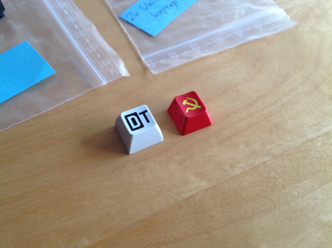
These kits contain a row 1 and a row 3 key:
HONEY/DT/GREY
HONEY/DT/WHITE
HONEY/DT/RED
HONEY/DT/BLACK
But someone must make the SVG and discuss with SP the details of that key. I can't do it.


HONEY/DT/GREY
HONEY/DT/WHITE
HONEY/DT/RED
HONEY/DT/BLACK
But someone must make the SVG and discuss with SP the details of that key. I can't do it.
-
mtl
- Location: USA
- Main keyboard: Custom
- Main mouse: IBM TrackPoint IV
- Favorite switch: Cherry MX Clicky
- DT Pro Member: -
Awesome. You guys rock. I can work it out with SP if it can wait until Wednesday. Been through the process once before and it wasn't hard. If anyone else wants to make a go for it, that's cool too.
-
matt3o
- -[°_°]-
- Location: Italy
- Main keyboard: WhiteFox
- Main mouse: Anywhere MX
- Favorite switch: Anything, really
- DT Pro Member: 0030
- Contact:
my version is more readablewebwit wrote:It's almost identical except the letter spacing of the original is more compressed.
I tried a lower case version once, which I think looks more friendly, but I didn't like Melbourne's lower case e.
well anyway at least it's svg now, compressing shouldn't be a problem
-
kint

- Location: northern Germany
- Main keyboard: g80-8200/ FK-2002
- Main mouse: genius netscroll optical gen1
- Favorite switch: MX clear/ Alps white comp
- DT Pro Member: -
nope. Those are engraved QWERkeys caps. IC thread here:Muirium wrote:I think I've seen your prior work:
http://deskthority.net/deskthority-rela ... t3209.html
poll here:
http://deskthority.net/deskthority-rela ... t3233.html
hashbaz did the svg here:
http://deskthority.net/deskthority-rela ... tml#p68615
then the whole thing got stuck over a group buy organizer and then Sleabo/ Qwerkeys just started production on their own:
http://deskthority.net/deskthority-rela ... tml#p74819
-
mtl
- Location: USA
- Main keyboard: Custom
- Main mouse: IBM TrackPoint IV
- Favorite switch: Cherry MX Clicky
- DT Pro Member: -
I rendered the vim logo as a key cap SVG. I tried to follow their rules but in the end, Melissa from SP said it was too big overall. They scaled it down 20% and said it would be fine, even though I think that would have made some of the lines too narrow.Muirium wrote:I think I've seen your prior work
Here are the instructions. They were posted on GH a while ago but may not have survived the big hack.
- instructions.png (195 KiB) Viewed 12892 times