Page 1 of 2
Post keycaps colors scheme!
Posted: 25 Jan 2014, 14:01
by ماء
Posted: 25 Jan 2014, 14:08
by matt3o
this is actually a very nice idea!
Posted: 25 Jan 2014, 14:12
by scottc
Nice.

Of course, I'm going to have to mention these guys:
IBM's Beam Spring 3277:
And of course, the ever beautiful Space Cadet:

Posted: 25 Jan 2014, 17:06
by ماء
IBM Beam Spring similar dolch,really nice with white case

what font used on beam spring,seems often seen?
Space-Cadet almost mainstream because 7bit

Posted: 25 Jan 2014, 17:07
by ماء
Posted: 25 Jan 2014, 17:14
by mr_a500
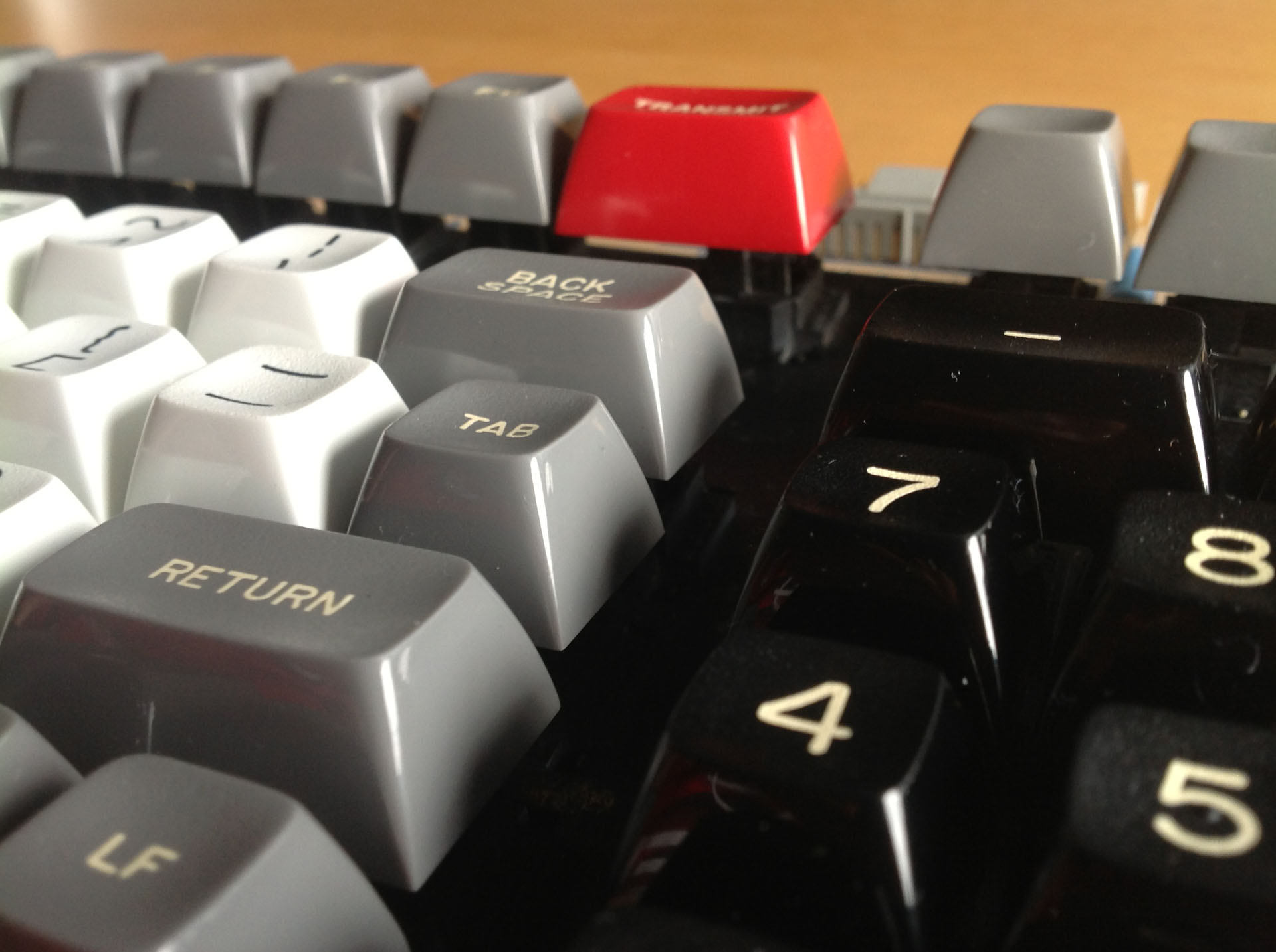
I'm kind of thrilled with this colour scheme:

It's like chocolate, blueberries and cream. (...with a bit of orange-yellow cheddar)
Posted: 25 Jan 2014, 17:36
by bazh
some one must do GB for these colors scheme, just beautiful
Posted: 25 Jan 2014, 17:59
by scottc
ماء wrote:IBM Beam Spring similar dolch,really nice with white case
what font used on beam spring,seems often seen?
Space-Cadet almost mainstream because 7bit
Not sure of the font, sorry!
Posted: 25 Jan 2014, 19:28
by nourathar
mr_a500 wrote:I'm kind of thrilled with this colour scheme:
It's like chocolate, blueberries and cream. (...with a bit of orange-yellow cheddar)
Hey mr_a500, what beauty is that thing you posted here ? Wow !
Posted: 25 Jan 2014, 19:59
by mr_a500
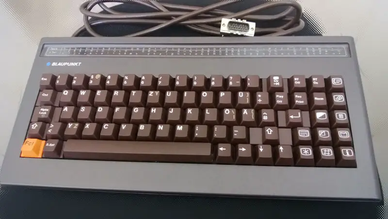
It's a DEC VT100 keyboard with unusual colours. I've never seen another one like it.
Posted: 25 Jan 2014, 21:07
by Kurk
ماء wrote:<snip>
<snip>
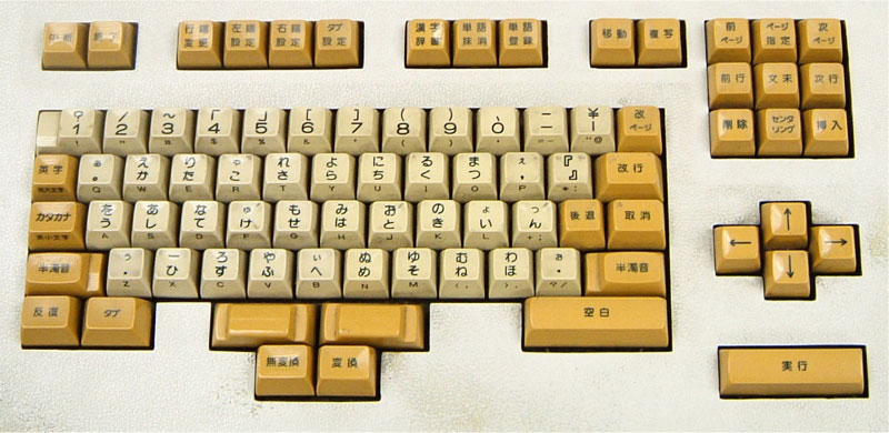
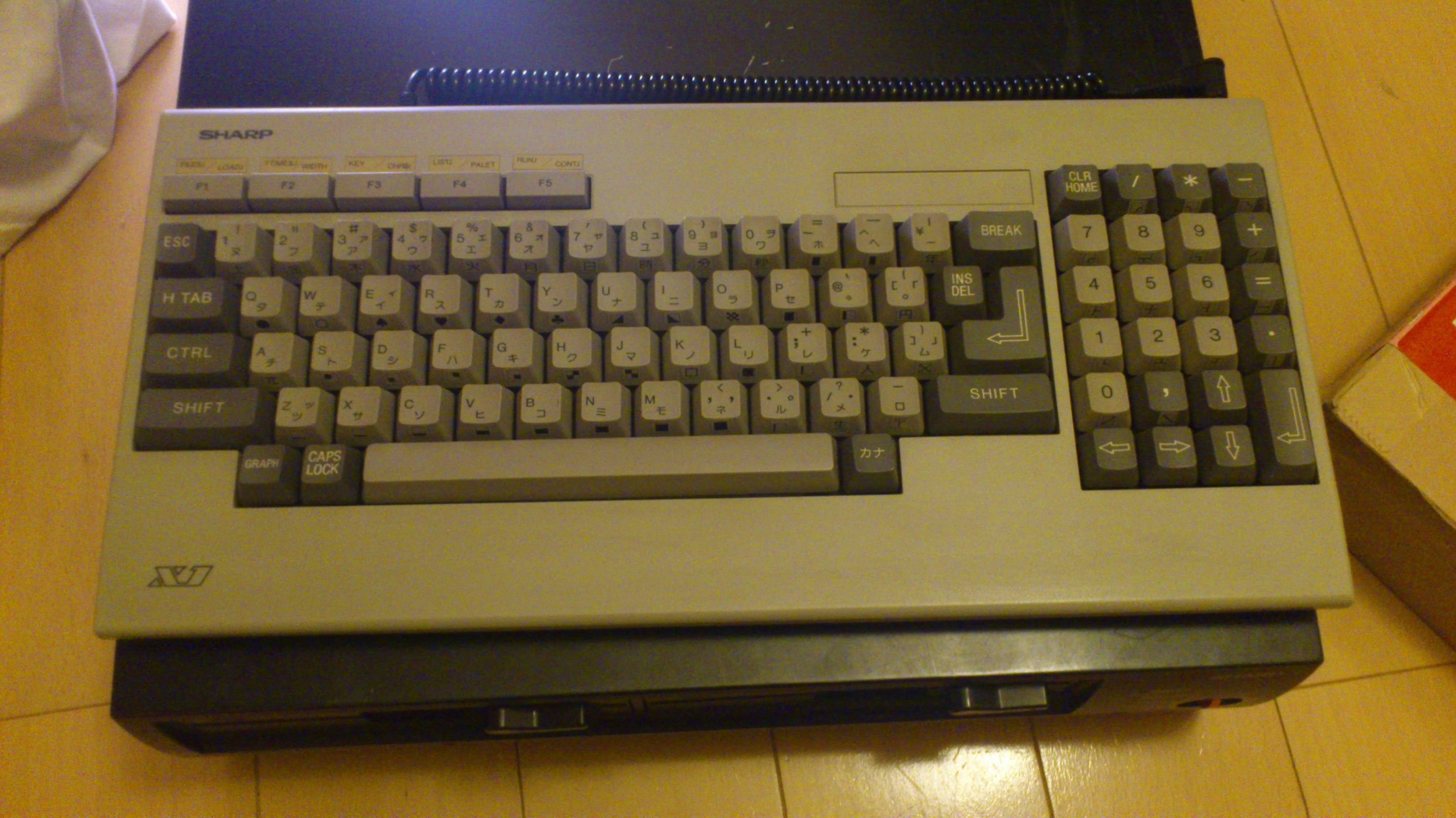
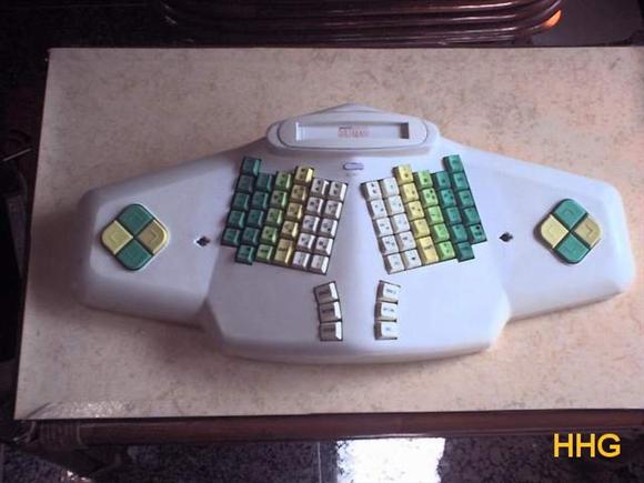
The most important thing here is - of course - the thumb shift layout. More thumb action!
Posted: 25 Jan 2014, 21:54
by 7bit
I also like the dirge-scheme:
All glories to the East Asians who where the first to get rid of overly long space bars!

Re: R: Post keycaps colors scheme!
Posted: 25 Jan 2014, 23:49
by pasph
bazh wrote:some one must do GB for these colors scheme, just beautiful
+1
Posted: 26 Jan 2014, 03:00
by Elrick
7bit wrote:
All glories to the East Asians who where the first to get rid of overly long space bars!
They are first in a number if things due to how slow our western-brains are in understanding anything.
I say more power to them
.
Posted: 26 Jan 2014, 11:20
by ماء
mr_a500 wrote:I'm kind of thrilled with this colour scheme:
It's like chocolate, blueberries and cream. (...with a bit of orange-yellow cheddar)
i like numpad colors scheme blue white
Kurk wrote:
The most important thing here is - of course - the thumb shift layout. More thumb action!
TEX Yoda have three button behind spacebar

7bit wrote:I also like the dirge-scheme:
All glories to the East Asians who where the first to get rid of overly long space bars!
you will make a GB, with the colors scheme....
Maybe,the Japanese/chinese people rarely use space bars!
the colors scheme is not important, what is important is
Symmetry
- xVe8nU4.jpg (316.28 KiB) Viewed 6379 times
Posted: 26 Jan 2014, 11:33
by Muirium
I kinda like this one. Can we maybe get a GB for it someday?
The caps I'm still most jealous of are (grr) Mr. A500's APL triple shots:

Black, white and red: with Greek legends! Well, some are Greek. I'd go for a Greek alphabet remake and forget the other APL specific symbols.
Posted: 26 Jan 2014, 12:22
by ماء
Muirium wrote:I kinda like this one. Can we maybe get a GB for it someday?
The caps I'm still most jealous of are (grr) Mr. A500's APL triple shots:
Black, white and red: with Greek legends! Well, some are Greek. I'd go for a Greek alphabet remake and forget the other APL specific symbols.
Space-Cadet again...
Alphabet ελληνικά like symbols
α β γ δ ε ζ η ι κ λ μ ν ξ ο π ρ σ τ υ φ χ ψ ω
Dark grays on light grays...
- gHlRu.jpg (433.8 KiB) Viewed 6459 times
Posted: 26 Jan 2014, 15:14
by facetsesame
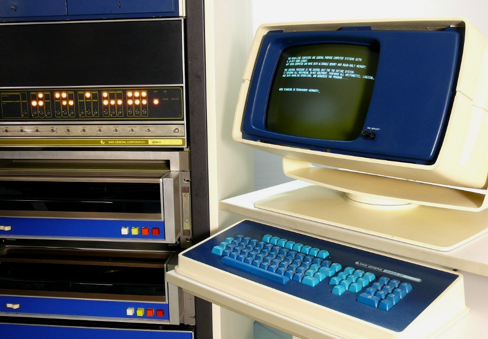
The earlier Data General Dasher terminals for their Nova minicomputers are the best:
I saw some other nice designs at
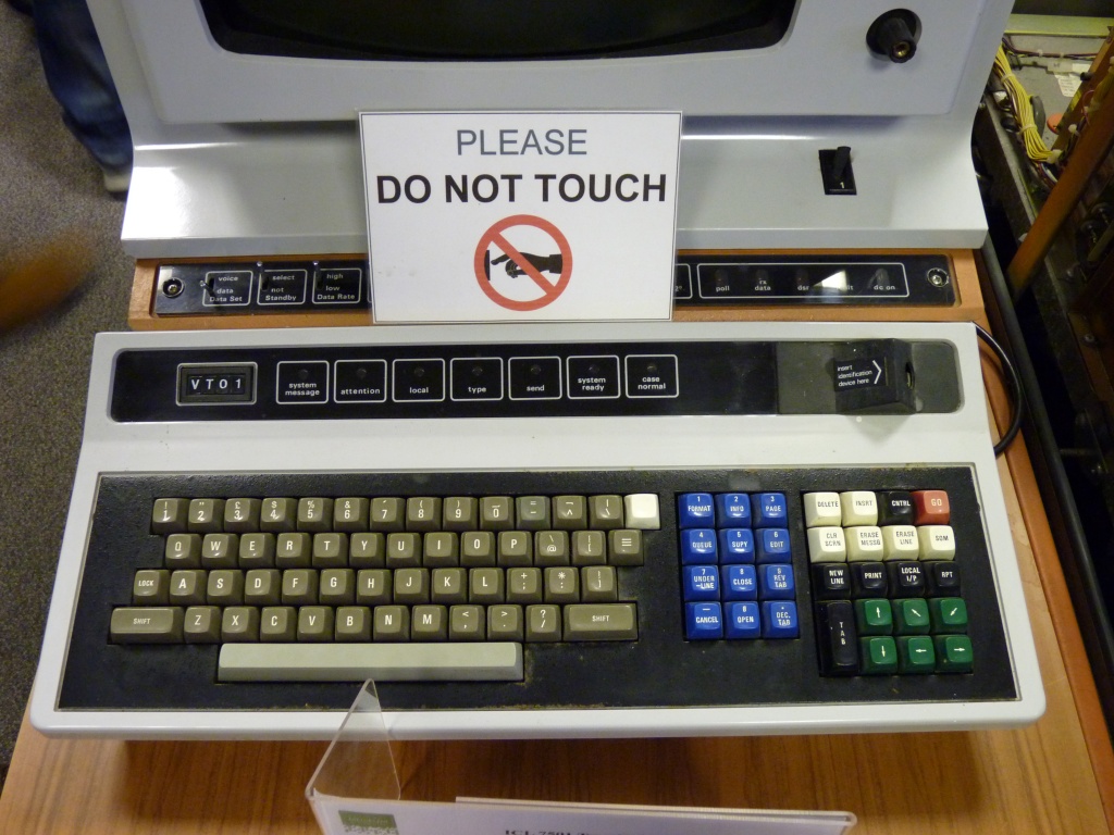
The National Museum of Computing yesterday:
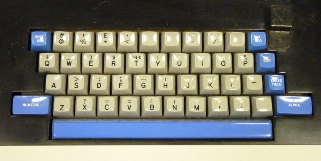
The varied keys for the white and orange ICL 2916 information processor terminal;
- ICL_2916_information_processor_terminal_keyboard.jpg (270 KiB) Viewed 6393 times
A rather interesting Olivetti DE523 twin tape data entry terminal;
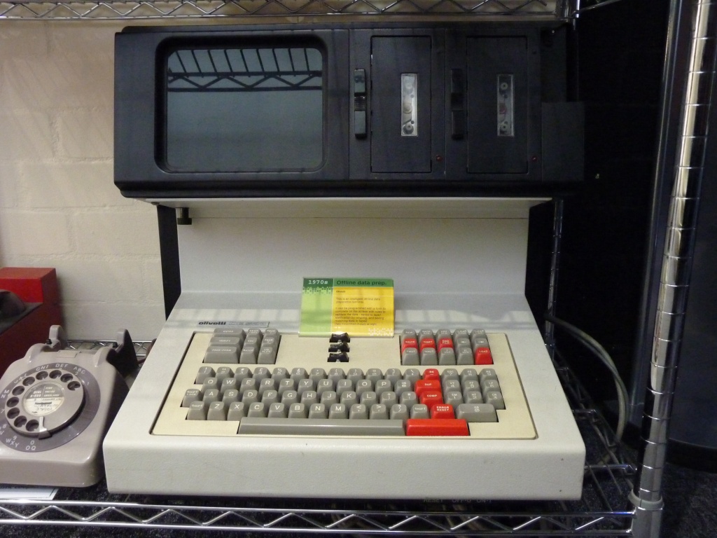
- Olivetti_DE523_twin_tape_data_entry_terminal.jpg (240.83 KiB) Viewed 6393 times
The fully integrated IBM 1130 Computing System keyboard;
- IBM_1130_Computing_System_keyboard.jpg (146.67 KiB) Viewed 6393 times
And the very familiar colours of the Merlin Tonto, British Telecom's version of the ICL OPD:
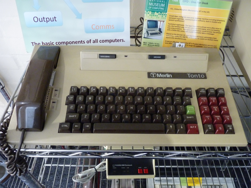
- Merlin_Tonto_aka_ICL_OPD.jpg (289.14 KiB) Viewed 6393 times
Posted: 26 Jan 2014, 15:22
by mr_a500
I like strange symbols. Why? Why not?

I
really wish there was a way to make doubleshot one-piece buckling spring keycaps - in interesting vintage colours, possibly even spherical. It's disappointing to have keyboards that
feel amazing, but look utterly boring.
Posted: 26 Jan 2014, 16:40
by mr_a500
Muirium wrote:I kinda like this one. Can we maybe get a GB for it someday?
I thought there already was a group buy for that. (...but maybe that was in the parallel universe I visited...)
That keyboard of yours inspired my planned Honeywell keypad swap with "Gerkonic" keycaps (assuming they fit):
keypad.png
(pathetic colour scheme layout done with Amiga PPaint)
Posted: 26 Jan 2014, 17:23
by mr_a500
I like the Kaypro II colour scheme too - black & light blue:
Kaypro II.JPG
(photo a bit warped... I think I was too close)
Posted: 27 Jan 2014, 11:33
by ماء
facetsesame wrote:The earlier Data General Dasher terminals for their Nova minicomputers are the best:
I saw some other nice designs at
The National Museum of Computing yesterday:
The varied keys for the white and orange ICL 2916 information processor terminal;
ICL_2916_information_processor_terminal_keyboard.jpg
A rather interesting Olivetti DE523 twin tape data entry terminal;
Olivetti_DE523_twin_tape_data_entry_terminal.jpg
The fully integrated IBM 1130 Computing System keyboard;
IBM_1130_Computing_System_keyboard.jpg
And the very familiar colours of the Merlin Tonto, British Telecom's version of the ICL OPD:
Merlin_Tonto_aka_ICL_OPD.jpg
Blue light on blue dark,no
i think if red on left modiefers ,i think nice like space cadet with red
i like white on blue
DSA Retro like matt30
mr_a500 wrote:I like the Kaypro II colour scheme too - black & light blue:
Kaypro II.JPG
(photo a bit warped... I think I was too close)
it if you has numpad! if not...it will just black
Posted: 27 Jan 2014, 12:17
by ماء
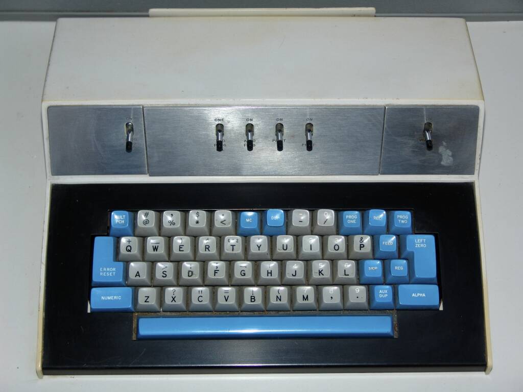
i think beam spring previous is best, gray on black

Beam spring again
Ying on yang
Simplicity color
- beaming.jpg (122.97 KiB) Viewed 6297 times
Blue on gray but not Space-cadet
- ibm_129c.jpg (61.76 KiB) Viewed 6294 times
Posted: 27 Jan 2014, 12:21
by Muirium
Not all beamsprings are alike. Here's the
Great White:


Also doable with Round 5, of course. Albeit costly!
Posted: 27 Jan 2014, 13:55
by rzwv
The label is attached.
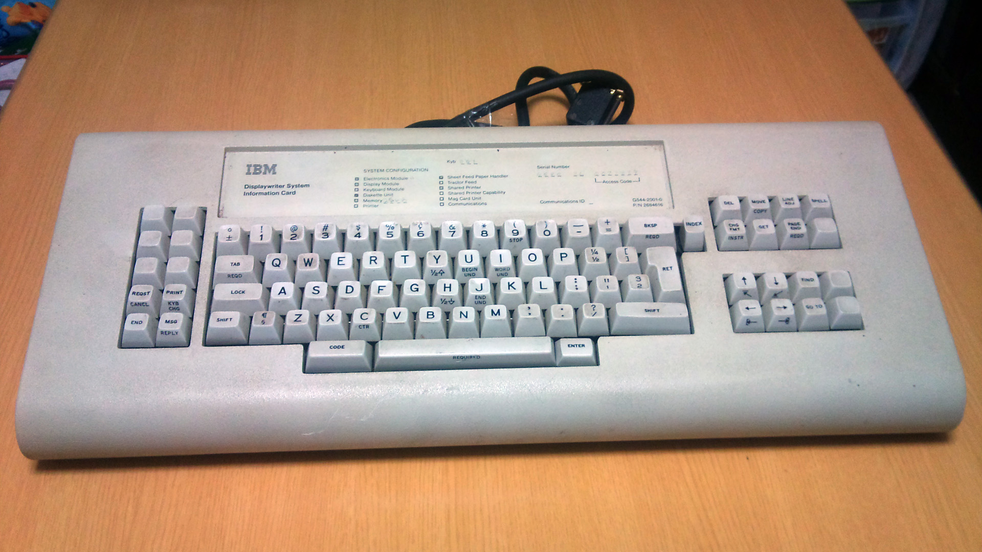
- DSC_1202.jpg (465.83 KiB) Viewed 6274 times
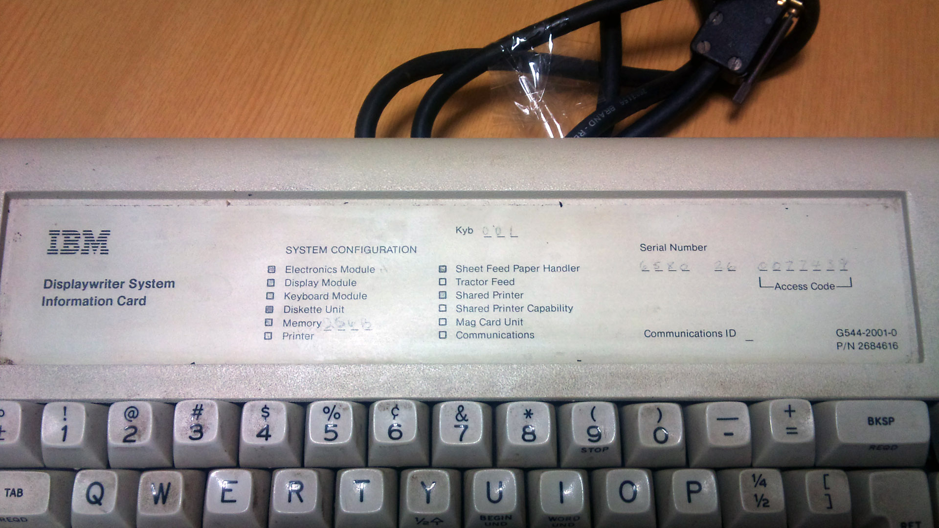
- DSC_1204.jpg (362.64 KiB) Viewed 6274 times
Thumb Shift, ADB
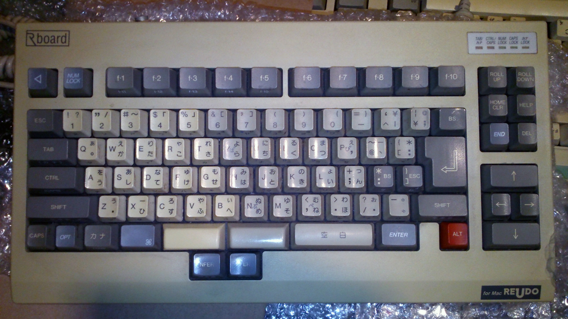
- DSC_2228.jpg (517.22 KiB) Viewed 6274 times
Posted: 27 Jan 2014, 14:17
by Findecanor
Daewoo "KOBO" gaming console. Keyboard "CPC-330K".
Apparently, the keyboard
is the console. There is a plastic box that looks like a main unit, but it is really only a "monitor stand".
- Daewoo_CPC-330K_KOBO_console.jpg (32.49 KiB) Viewed 6265 times
Posted: 27 Jan 2014, 14:26
by Muirium
You've got thumbs: use them!
Posted: 27 Jan 2014, 14:27
by mr_a500
Muirium wrote:Not all beamsprings are alike. Here's the
Great White:
White beamspring keys are more like whale teeth:

This guy looks like he's saying, "please... no more beam springs... I've only got a few teeth left".

Posted: 27 Jan 2014, 21:37
by facetsesame
No to the Dasher blues? I'll agree they're not general purpose and need the plate colour too, but they would be my first choice. Bring on the group buy.
A red version of the space cadet does sound pretty good actually, maybe I will have to see about those Round 5 grey alphas.
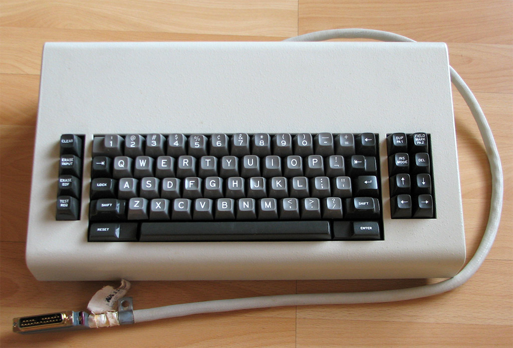
The IBM 1130 is grey and blue like the 129 card punch keyboard above. There is a numpad which looks to be triple shot (grey keys, black alpha legends, white numpad legends). Hey, if you got the red APLs on too you'd get all four Honeywell colours. I wonder if there is such a thing as an APL card punch.
Posted: 28 Jan 2014, 01:01
by nourathar
totally for the dasher blues !