Page 1 of 1
Getting ready for the holiday season
Posted: 20 Dec 2014, 23:05
by HAL
I found a new Realforce 87U 55g 10th anniversary edition on ebay.

And it arrived just in time for the holidays.
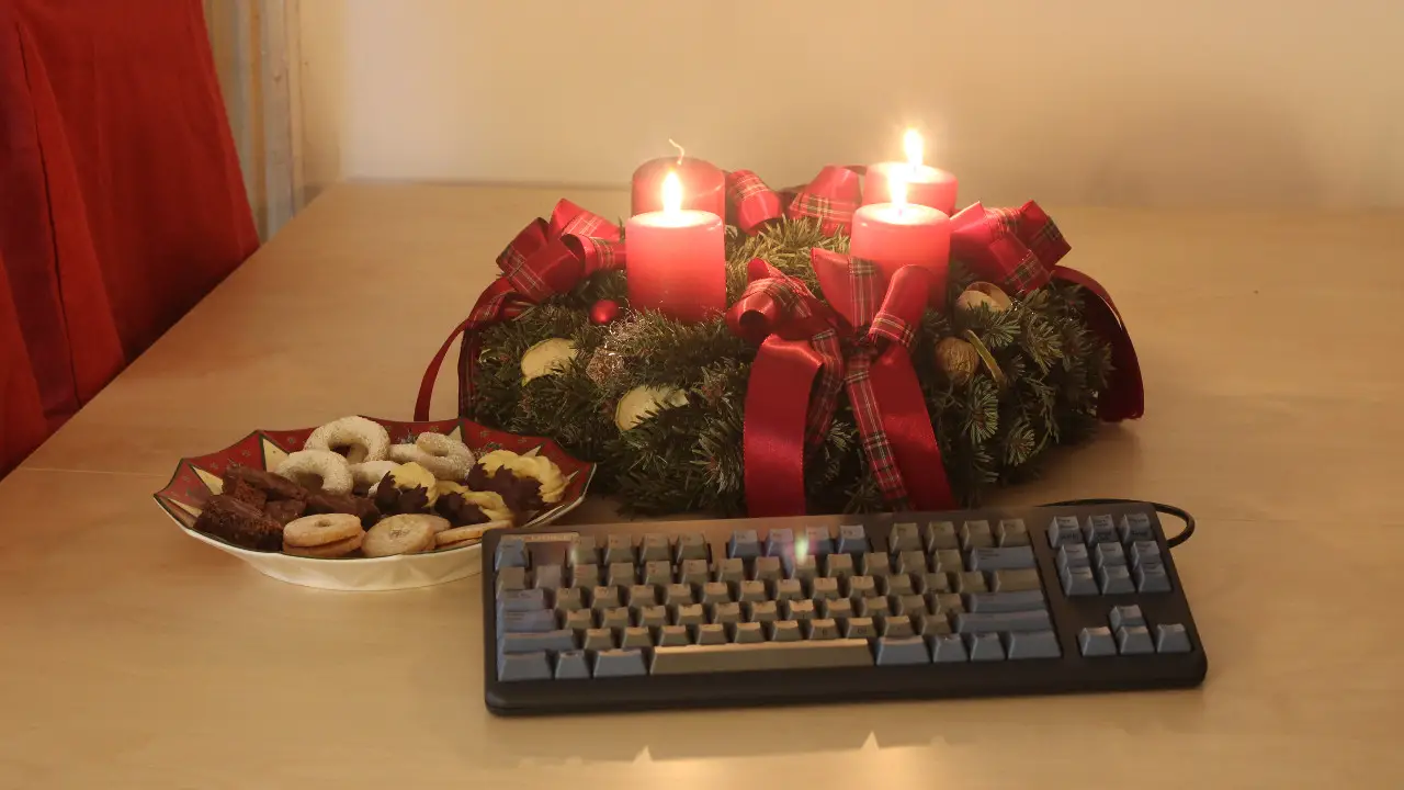
- Realforce 87U 55g 10th anniversary edition
- realforce_87u55_10th_anniversary_1280x720.jpg (195.19 KiB) Viewed 2523 times
Happy holidays everyone
Posted: 20 Dec 2014, 23:34
by 002
That is a very nice present for yourself

Happy holidays!
Posted: 21 Dec 2014, 01:36
by scottc
Wow, Santa has been good to you this year!
Posted: 21 Dec 2014, 12:07
by HAL
scottc wrote: ↑Wow, Santa has been good to you this year!
Inddeed, and Santa has been good to me last year as well:
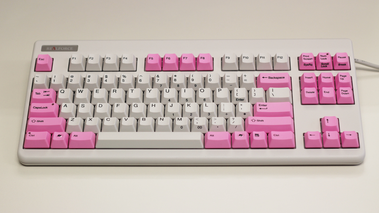
- Realforce_87U55_white_1280x720.jpg (329.13 KiB) Viewed 2434 times
During the year I collect IBM Model Ms and Model Fs.
But the holiday season seems to always bring Topres.
Posted: 21 Dec 2014, 13:01
by noobie94
Nice keyboards!
If you want to support an austrian fellow to increase his collection I am your man
Posted: 21 Dec 2014, 13:51
by Khers
I saw the anniversary Topres on ebay. Very nice boards! Are there any differences other than the rather pretty colourscheme?
HAL, I think that Santa is trying to tell you something

Posted: 21 Dec 2014, 14:16
by 002
Khers wrote: ↑Are there any differences other than the rather pretty colourscheme?
Nope
Caps, LED (red) and case colour are the only special thing about the Anniversary boards:

Posted: 21 Dec 2014, 14:28
by Muirium
Nice picture. Now line them up with the wood grain and try again!
The anniversary Space Cadet style caps are pretty sweet, but they don't really do it for me like the original doubleshots (or Round 4 SPH). Dyesub can't print light legends, so you get a more subdued look. Still, a nicer material of course.
Light coloured caps are where dyesub shines.
Posted: 21 Dec 2014, 14:52
by 002
Yesss that is one from the archives. I'd borrowed a Sony DSLR and was just experimenting. Really I just wanted to illustrate the difference in case colour, not aggravate anyone's OCD
Posted: 21 Dec 2014, 15:29
by Daniel Beardsmore
Black on charcoal is an interesting idea — arguably nicer than gold on charcoal. My white-on-black Filco looked positively garish compared to the gold-on-charcoal of my Realforce.
The one thing that I do notice about the keyboards above — I never cared for the sight of an unused cable channel at the side, and the one on the right shows that up rather clearly.
On the other hand, as part of their characteristic refinement and restraint, Topre do blue and grey in a subdued and professional way that looks more fitting in a professional environment than Space-cadet-inspired schemes. It's too bad that they expect a premium above their normal premium for that.
Posted: 21 Dec 2014, 15:45
by 002
Agreed on all fronts, except that I do actually really like the gold on charcoal caps. Like most lasered caps though, they just get manky and gross way too quickly

Posted: 21 Dec 2014, 16:28
by Daniel Beardsmore
That is something I may never get to experience now.
Posted: 22 Dec 2014, 18:32
by POTV
I really like the Realforce design and quality. So before I got all into buckling spring, I invested in a 87u version. But I couldn't read the text on the black keycaps - or get another pair of readable keycaps with nordic letters. Then I had to buy another white fullsize Realforce in Finland(!) and use it as a donor board. Status: I use neither of them and they both might end up on DT or eBay.
But again - great design and I understand why people like Realforce.
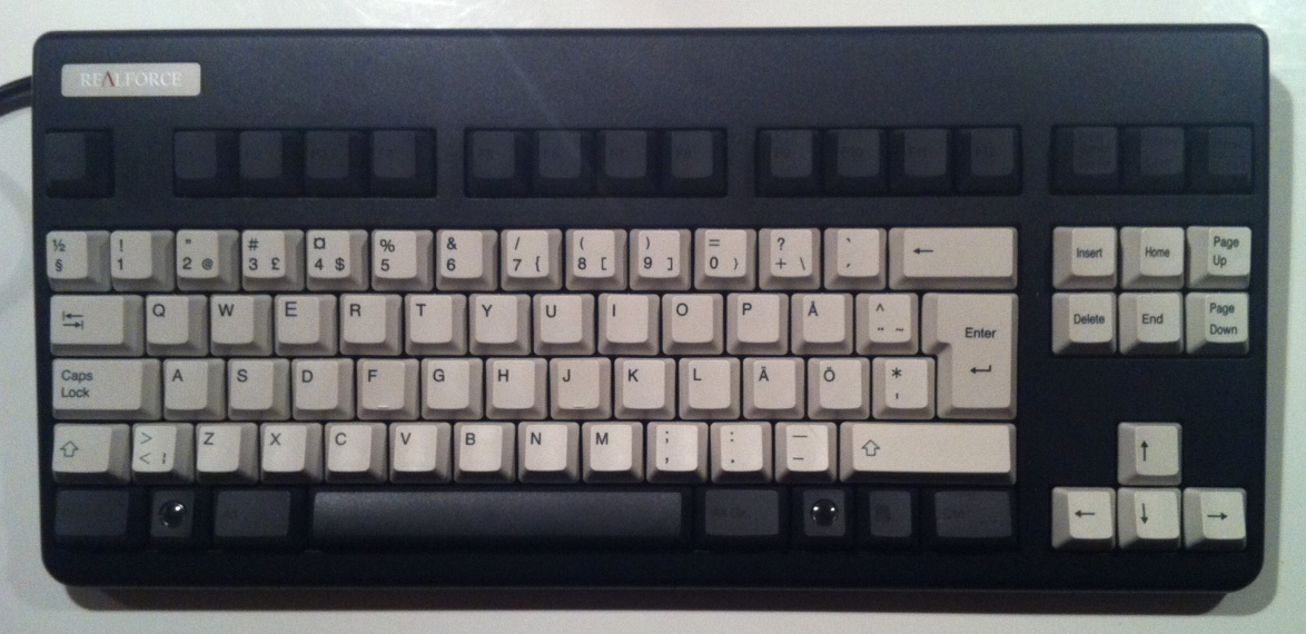
- Realforce.jpg (450.55 KiB) Viewed 2284 times