Typeface for keyboard

User avatar
matt3o
-[°_°]-

14 Oct 2014, 18:49

I'm designing a new set (I'll let you know more about it, but I can't really talk about it right now). I'm looking into various options for the typeface. One very easy choice would be Helvetica, but I'd like to give the set a more distinctive character so I'm toying with other options.
font.png
font.png (91.49 KiB) Viewed 5145 times
This is one that I kinda like, but I would like to get your input and suggestions. I'd like it to be slightly retro without being too much art-deco :)

Ideas?

User avatar
scottc

14 Oct 2014, 18:52

How about... Image

User avatar
matt3o
-[°_°]-

14 Oct 2014, 18:53

quoting myself...
without being too much art-deco
:D :P

User avatar
Muirium
µ

14 Oct 2014, 19:32

Gill Sans is the definitive art deco type. Those who copied it added too much flourish and distraction. Gill was the Helvetica of the age before!

Image

User avatar
Madhias
BS TORPE

14 Oct 2014, 21:20

It should be free to use or some not commercial format (CC, OFL)?

User avatar
Muirium
µ

14 Oct 2014, 21:23

Gotham is commercial, and that's what we used for Granite.

Any indication what colours we're thinking about here, Matteo? Background and legends…

pasph

14 Oct 2014, 21:26

Retro font for a retro set i suppose

User avatar
Madhias
BS TORPE

14 Oct 2014, 22:13

Muirium wrote: Gotham is commercial, and that's what we used for Granite.

These are some of my favourites, but not condensed as shown in your example, matt3o. Only a condensed typeface can go in the upper left corner i think. The normal or extended ones should go right in the middle, and we had that probably a lot in the past (Granite, all SA caps from SP). Nevermind, i quite like these:

A new and modern font i really like and use a lot, Brandon Grotesque:
Image

Avenir is very nice and quite popular:
Image

If you don't want to use Helvetica i like it's predecessor Akzidenz Grotesque which is one of my all time favourites:
Image

A rather new font which looks nice and has even some free font faces i think, Campton:
Image

And of course all these classics like Franklin Gothic, Trade Gothic, and much more of the Sans family. Maybe something oblique?

Image

User avatar
pyrelink

14 Oct 2014, 22:16

matt3o wrote: without being too much art-deco :)
Aww, I love everything Art-Deco!

In either case, I really quite like the font you already picked out.

User avatar
Muirium
µ

14 Oct 2014, 22:19

Oblique (or italic, to you plebs) could be an interesting, um, slant! I don't generally like the looks of capital italics, but the lowercase of many good fonts gets a cursive style I do quite like. Especially those single story a's. Ah, ɑ!

Avenir's a fantastic font, by the way. I use it extensively in Safari Reader, which strips ugly / user hostile formatting from the loaded page and replaces it with my own stylesheet, and saves me many a headache!

User avatar
Madhias
BS TORPE

14 Oct 2014, 22:27

Lots of Apple keyboards were with italic fonts, i remember some of these rubberdomes with grey, condensed oblique letters for example. And some of these similar caps i also saw on keyboards from Koreans, i think from user Sprit for example.

User avatar
Muirium
µ

14 Oct 2014, 22:33

Yup, I've typed a lot on italic legends on Apple boards. But my modern Mac right here has centred legends, just like all my MX sphericals!

Image

What comes around…

tragacuerdas

14 Oct 2014, 23:14

Oh man, I really appreciate this question. Most people pay very little attention to this, one of the most important details of a keyset design.

I truly recommend that you go ask the question at http://www.typophile.com/

Those guys are to typography what deskthority is to keyboards. When I worked as a designer they never failed to help me and provide valuable advice. I am sure they can point you in the direction of period appropriate fonts or anything else you need.

Be aware that typography addiction goes way deeper than keyboard addiction.

User avatar
Muirium
µ

14 Oct 2014, 23:18

Correct answers: IBM Model M and Helvetica. Glad I could help!

User avatar
matt3o
-[°_°]-

14 Oct 2014, 23:56

madhias wrote: It should be free to use or some not commercial format (CC, OFL)?
no it doesn't need to be, if it is would be better but not a requirement.
Muirium wrote: Gill Sans is the definitive art deco type. Those who copied it added too much flourish and distraction. Gill was the Helvetica of the age before!
Tomorrow I'll finalize the template and make some tests (with Gill as well).
Muirium wrote: Any indication what colours we're thinking about here, Matteo? Background and legends…
everything will be revealed soon, hint: start saving your money!
pasph wrote: Retro font for a retro set i suppose
no comment :)
madhias wrote: These are some of my favourites, but not condensed as shown in your example, matt3o. Only a condensed typeface can go in the upper left corner i think. The normal or extended ones should go right in the middle, and we had that probably a lot in the past (Granite, all SA caps from SP). Nevermind, i quite like these:
wow, those are all fantastic! Thanks madhias.

I'm still not set on center or top/left. I would like to make it top/left this time, but it's not set on stone. If you slip in other interesting fonts, please let us know.
tragacuerdas wrote: I truly recommend that you go ask the question at http://www.typophile.com/
thanks for your suggestion, but I can't really enter that world :) if you are already lost in it, please feel free to post the question for me if you fancy. With the granite set I believe we did pretty well at the end, so I hope we can replicate the success

User avatar
scottc

15 Oct 2014, 00:40

I'm imagining your tall spherical PBT dyesubs with an old-timey font... OMG. I'd better start finding buyers for my SSKs and HHKB!

User avatar
Muirium
µ

15 Oct 2014, 00:57

Or adapters!

User avatar
Flintfish

15 Oct 2014, 05:27

madhias wrote: Avenir is very nice and quite popular:
Image
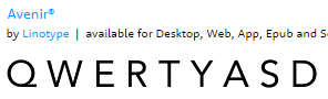
Avenir would have one of my votes as well. Similiar but nicer to the Futura Filco uses.

If your going for Italic upper left corner then Source Sans might work as well. It's a bit condesed in it self (at least compared to the likes of Gotham), but not sure how retro it is. It's also free from a pro company (Adobe)
source_sans.png
source_sans.png (20.52 KiB) Viewed 4962 times

jacobolus

15 Oct 2014, 09:45

This is hopefully going to be available as DCS dyesubs... sometime. (Guess: 3–4 months; damnit matt3o, you’ve blocked up SP’s capacity for months with the all those pretty Granite sets they need to make ::shakes fist::)
Image

It might be worth expanding to cover a range of different keyboards, though personally I’d rather just make separate designs for other layouts.

User avatar
matt3o
-[°_°]-

15 Oct 2014, 12:22

base.png
base.png (108.18 KiB) Viewed 4921 times
This will be the overall look and feel. The font is called COM4t, it is nice, but now looking at it on a keyboard I'm less enthusiastic about it.

I'll make some more tests. Please keep the suggestions going because this set is going to be legend-ary (pun intended!)

User avatar
matt3o
-[°_°]-

15 Oct 2014, 15:31

Another test with Ubuntu Condensed (which I kinda like)
base-ubuntu.png
base-ubuntu.png (111.49 KiB) Viewed 4900 times

User avatar
Muirium
µ

15 Oct 2014, 18:25

Hmm. I'm not a fan. But maybe that's a good thing, because I'll have way too many caps!

User avatar
matt3o
-[°_°]-

15 Oct 2014, 18:28

believe me, you can't really miss this one :)

User avatar
Muirium
µ

15 Oct 2014, 18:35

Greek, you say?

User avatar
matt3o
-[°_°]-

15 Oct 2014, 19:20

Avenir is definitely in another league!
base-avenir.png
base-avenir.png (137.11 KiB) Viewed 4853 times
probably this is the one I like the most

User avatar
Madhias
BS TORPE

15 Oct 2014, 20:23

Is this the absolutely classic color theme - or just a template?

User avatar
matt3o
-[°_°]-

15 Oct 2014, 23:48

just template (but that's what I would like it to be :) )

User avatar
Eszett

16 Oct 2014, 01:10

Dim light, shadows, ... a keyboard isn’t illuminated that good. So, in my opionion, a keyboard typeface should be sans serif, pretty bold, even (no mixture of thin and thick lines), wide. Most fonts are too boney, too narrow, too high contrast. But a fleshy font which is elegant at the same time? Hard to find! I browsed some archives and one of the more agreeable fonts was Josefin Sans Bold:
Josefin.jpg
Josefin.jpg (5.43 KiB) Viewed 4812 times
But some shapes appear abit sharp, e. g. the Ampersand :-(

How about Paradigm Bold.
paradigm.jpg
paradigm.jpg (25.79 KiB) Viewed 4746 times
Paradigm is (together with Aeris and a bunch of others) on top in terms of fleshy unobtrusive-elegant sans serif fonts.

User avatar
matt3o
-[°_°]-

16 Oct 2014, 09:08

Paradigm is really nice, I love it!

I'm not sure how it is going to be on a keyboard though. So far the best I tried is Avenir, I can try the bold version to make it a little bit stronger but if sublimation is done right I don't think it is needed.

User avatar
Eszett

16 Oct 2014, 09:56

Hi matt3o. Avenir works, yes, pretty standard. What do you think of something more fleshy? Check out this font called Eveleth in it’s “clean” version without textures. With Eveleth, even such a tiny thing as an apostrophe doesn’t get lost on a keyboard.
Eveleth.jpg
Eveleth.jpg (3.94 KiB) Viewed 4692 times
Eveleth.jpg
Eveleth.jpg (1.91 KiB) Viewed 4691 times
Here some similar fonts
similar.jpg
similar.jpg (9.72 KiB) Viewed 4688 times
Problem is, that some glyphs are missing in all of these. What a pity.

Post Reply

Return to “Workshop”