Page 72 of 76
Posted: 15 Jan 2017, 09:26
by seebart
matt3o wrote: ↑the solitary alps switch is not bad
None of those are worthy IMO. It's more routine.
Posted: 15 Jan 2017, 22:01
by Scarpia
The fourth one (keycaps and bare yellow switches) is really nice IMO.
Posted: 28 Jan 2017, 21:08
by mike52787
I really like the first one and the last one. Really great looking.
Posted: 28 Jan 2017, 21:16
by seebart
mike52787 wrote: ↑I really like the first one and the last one. Really great looking.
Thanks, the last one and the Goupil work the best I think.
Posted: 28 Jan 2017, 23:49
by matt3o
I actually like this one
Posted: 29 Jan 2017, 11:06
by seebart
matt3o wrote: ↑I actually like this one
Posted: 29 Jan 2017, 11:16
by matt3o
I believe that would be perfect if just shifted 10-20 px to the bottom so that the copper leaf is not hidden by the top menu
Posted: 29 Jan 2017, 11:22
by seebart
matt3o wrote: ↑I believe that would be perfect if just shifted 10-20 px to the bottom so that the copper leaf is not hidden by the top menu
I like it even less now...

- Unbenannt.jpg (141.16 KiB) Viewed 12234 times
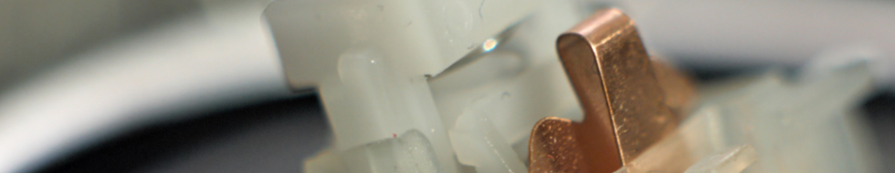
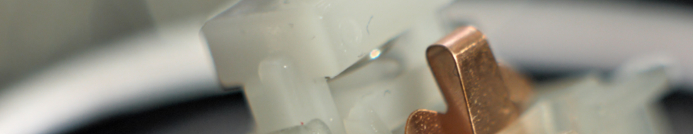
But the Kailh Cherry ML shot.

Posted: 29 Jan 2017, 11:42
by matt3o
yeah nothing special.
the kailh shot... I dunno, my finger bothers me
Posted: 29 Jan 2017, 11:48
by seebart
matt3o wrote: ↑yeah nothing special.
the kailh shot... I dunno, my finger bothers me
You're only bothered because it's
your finger! With my modest header experience I say that one is a final pick. I can photoshop your finger a bit darker if you like...

Also this one works very well IMO, Madhias strikes again:
- madhiasdesk.jpg (156.27 KiB) Viewed 12253 times
Posted: 29 Jan 2017, 12:17
by matt3o
yes, that is very nice, but I really had enough of wingnuts
Posted: 29 Jan 2017, 14:11
by seebart
matt3o wrote: ↑yes, that is very nice, but I really had enough of wingnuts
Ugh, a little "grumpyness" I detect there...

Posted: 29 Jan 2017, 16:26
by Daniel Beardsmore
This is my current Stylish ruleset:
Code: Select all
@namespace url(http://www.w3.org/1999/xhtml);

@-moz-document domain("deskthority.net") {
  #site-description p {
    text-shadow: 0px 0px 3px black;
  }

  .postprofile-more {
    box-shadow: 3px 3px 3px rgba(0, 0, 0, 0.25);
  }
}
The second one deals with the fact that the little profile pop-up in forum topics uses grey for the shadow instead of black, which is wrong and looks weird. (Using grey for a shadow will actually brighten any darker shades!)
The first one puts a subtle black glow around "mechanical keyboards extraordinaire" to make it stand out more from heading images that are too pale.
Some time back, I created a Photoshop overlay to help create banners, so that you can adjust the image to stay clear of all the header components. This needs adjusting for the new subheading, but since most people are likely to prefer something libre, I've recreated it as an SVG file, attached.
Too many of the banner attempts get tangled up with the logo and links within the header and this should help with that. If anyone does prefer Photoshop (or has something that will read layered PSDs but not SVGs) I can tweak that, too.
Posted: 30 Jan 2017, 14:49
by Mr.Nobody
Here are mine:
shadow mask and scanline should be viewed under the right resolution :980x190
1.shadow mask

2.Scanline

3.

my version film photo:

4.

my version,tweak it a little bit:

5.

This one is too blury,well try my best:

6.

try to bring the texture back:

7.

the last one for today:

Posted: 31 Jan 2017, 02:06
by Mr.Nobody
8.

sharpen it, and LAB color correction.

Posted: 31 Jan 2017, 18:00
by matt3o
DT logo is not very readable in these last few headers
Posted: 31 Jan 2017, 18:03
by seebart
matt3o wrote: ↑DT logo is not very readable in these last few headers
You're right, the Goupil and the last Madhias desk are still my favorite. I do like Mr.Nobody's own two efforts as well.
Posted: 31 Jan 2017, 23:01
by Mr.Nobody
IMHO, pics about vintage stuff are all worth collecting and restoring, they conveys some sort of warmness and sense of leisure like vinyl or tape cassette...
Posted: 31 Jan 2017, 23:02
by seebart
Mr.Nobody wrote: ↑IMHO, pics about vintage stuff are all worth collecting and restoring, they conveys some sort of warmness and sense of leisure like vinyl or tape cassette...
Sometimes yes. I have some links for you I need to find first...
Posted: 31 Jan 2017, 23:09
by Daniel Beardsmore
For warmth, I'd suggest not converting yellow tones to blue tones. Photo 8 (the Zenith case) has gone from looking warm and cheery to cold and gloomy due to the colour corrections. For documentation purposes, I try to ensure neutral colour balance, but for a header, a yellow colour cast isn't a bad thing!
Posted: 31 Jan 2017, 23:35
by Mr.Nobody
@seebart, I am about to read all your threads and posts...you have tons of goodies...it couldn't be better to have some sort of index...
@beardsmore
Agree, just hate to see the beige yellowing

Posted: 16 Feb 2017, 17:55
by seebart
Posted: 16 Feb 2017, 18:24
by Engicoder
You beat me too it
- header.jpg (37 KiB) Viewed 12016 times
I think I like yours better
Posted: 16 Feb 2017, 18:27
by seebart
Engicoder wrote: ↑You beat me too it
header.jpg
I think I like yours better
It's a great shot, not sure which one works better. I placed the dark area where the phone goes so that our text is more visible. I played around with it and tried to get all of "deskthority" in the header but it looks strange.
y11971alex's two 5251's and Harshmallow's portable IBM are my favorite beside your TDD.
Posted: 28 Feb 2017, 12:05
by mecano
Daniel Beardsmore wrote: ↑This is my current Stylish ruleset:
Code: Select all
@namespace url(http://www.w3.org/1999/xhtml);

@-moz-document domain("deskthority.net") {
  #site-description p {
    text-shadow: 0px 0px 3px black;
  }

  .postprofile-more {
    box-shadow: 3px 3px 3px rgba(0, 0, 0, 0.25);
  }
}
Wait… wait… Are you really saying you are loading this in your browser to override the forum rules because it lacks skeuomorphism?
Posted: 28 Feb 2017, 18:39
by Daniel Beardsmore
The bottom one makes shadows not look stupid. The top one makes "mechanical keyboards extraordinaire" more readable.
I don't know that I'd call the shadows skewermorphic — real shadows are complex. Curiously, Psion EIKON did attempt a compromise:
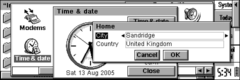
- Decor--window-shadow-1.png (3.61 KiB) Viewed 11924 times
- Decor--window-shadow-2.png (2.96 KiB) Viewed 11924 times
(4 bits/pixel was apparently quite battery intensive, hence the 2 bpp standard display mode. Using all 4 bpp would have yielded more interesting shadows (depth-determined opacity) but it really wasn't worth it.)
Posted: 02 Mar 2017, 18:07
by Harshmallow
seebart wrote: ↑Engicoder wrote: ↑You beat me too it
header.jpg
I think I like yours better
It's a great shot, not sure which one works better. I placed the dark area where the phone goes so that our text is more visible. I played around with it and tried to get all of "deskthority" in the header but it looks strange.
y11971alex's two 5251's and Harshmallow's portable IBM are my favorite beside your TDD.
taylorswifttttttIBMhaul.jpg
Thanks for banner-ising some of my photos Seebart! I agree, I really like the 5155 portable in banner form. I also like the simplicity of the bright green SMK PCB as well.
Posted: 05 Mar 2017, 13:20
by Slom
- banner.JPG (97.52 KiB) Viewed 11827 times
- banner2.JPG (93.96 KiB) Viewed 11816 times