deskthority - Suggestions and Changelog
-
webwit

- Wild Duck
- Location: The Netherlands
- Main keyboard: Model F62
- Favorite switch: IBM beam spring
- DT Pro Member: 0000
- Contact:
Geil = Horny.
-
sixty

- Gasbag Guru
- Main keyboard: DKSaver
- Favorite switch: Cherry MX Black
- DT Pro Member: 0060
lol. I guess you must have been disappointed.Brian8bit wrote:I was on holiday years ago and got very excited when I was propositioned by a young dutch lady. Asking if I wanted shag I was disappointed to discover it's what they call rolling tobacco.
-
sixty
- Gasbag Guru
- Main keyboard: DKSaver
- Favorite switch: Cherry MX Black
- DT Pro Member: 0060
Custom profile fields have been added to the board, you can set them in your user control panel. They will then show up in your detailed profile accordinigly:

Edit: Also alignment is pretty messed up, we should fix that too sometime.
Edit: Also alignment is pretty messed up, we should fix that too sometime.

-
webwit
- Wild Duck
- Location: The Netherlands
- Main keyboard: Model F62
- Favorite switch: IBM beam spring
- DT Pro Member: 0000
- Contact:
What browser do you use? Works fine here.
-
sixty
- Gasbag Guru
- Main keyboard: DKSaver
- Favorite switch: Cherry MX Black
- DT Pro Member: 0060
More changes: The wiki now uses the unified login with the forum. Cookies are not shared, so you have to login to the wiki separately. However, you do not need two accounts anymore and can just login with your forum account.
-
7bit

- Location: Berlin, DE
- Main keyboard: Tipro / IBM 3270 emulator
- Main mouse: Logitech granite for SGI
- Favorite switch: MX Lock
- DT Pro Member: 0001
A propos profile:sixty wrote:Custom profile fields have been added to the board, you can set them in your user control panel. ...
How to get useless things like 'Seeker of the Grail' or 'Wild Duck' underneath the avatar?
-
bugfix

- Location: Weilerswist, Germany
- Main keyboard: Realforce 105GR
- Main mouse: Logitech G9x
- Favorite switch: BS and Topre
- DT Pro Member: -
I shall get to work thensixty wrote:More changes: The wiki now uses the unified login with the forum. Cookies are not shared, so you have to login to the wiki separately. However, you do not need two accounts anymore and can just login with your forum account.
-
sixty
- Gasbag Guru
- Main keyboard: DKSaver
- Favorite switch: Cherry MX Black
- DT Pro Member: 0060
Right now, we set them in the admin panel.. there is a mod to give users access to it. If enough people actually want one, I'll install it later. For now if you want a custom title, PM me.7bit wrote:A propos profile:sixty wrote:Custom profile fields have been added to the board, you can set them in your user control panel. ...
How to get useless things like 'Seeker of the Grail' or 'Wild Duck' underneath the avatar?

-
7bit
- Location: Berlin, DE
- Main keyboard: Tipro / IBM 3270 emulator
- Main mouse: Logitech granite for SGI
- Favorite switch: MX Lock
- DT Pro Member: 0001
It gives the impresion you get a full profile view of that duck underneath the window.sixty wrote:Set text-align to left in the CSS (not live yet, just on the dev version), looks much better imo:sixty wrote:Edit: Also alignment is pretty messed up, we should fix that too sometime.
Thoughts?
SCNR.
To me it looks perfect.
-
webwit
- Wild Duck
- Location: The Netherlands
- Main keyboard: Model F62
- Favorite switch: IBM beam spring
- DT Pro Member: 0000
- Contact:
The thing it only shows one in Opera, I'm planning to redo it with jquery so I wouldn't put too much time in that part.
-
webwit
- Wild Duck
- Location: The Netherlands
- Main keyboard: Model F62
- Favorite switch: IBM beam spring
- DT Pro Member: 0000
- Contact:
Mockup time.
Two ideas in one.
I want to get rid of that gray background around the user info..too much gray on the page. Here a black border instead.
Also experimenting with user info on the right. I like how the actual content is better aligned, but it is also a bit disorienting. Instead of "Simon says: ..." it sort of becomes "..., Simon said".
- mockup_topic.png (87.82 KiB) Viewed 4027 times
-
Brian8bit

- DT Pro Member: -
I think the black border is to much of an isolating stamp. The grey and white tends to flow naturally into the other. Perhaps instead of throwing everything to the right, you could simply give the user info area a 1 pixel border in a slightly darker grey than than user info background, just to break it up. But not as in your face as the black.
-
sixty
- Gasbag Guru
- Main keyboard: DKSaver
- Favorite switch: Cherry MX Black
- DT Pro Member: 0060
I kinda agree, I prefer it in gray rather than black. Also I hate forums with right aligned user info!Brian8bit wrote:I think the black border is to much of an isolating stamp. The grey and white tends to flow naturally into the other. Perhaps instead of throwing everything to the right, you could simply give the user info area a 1 pixel border in a slightly darker grey than than user info background, just to break it up. But not as in your face as the black.
-
7bit
- Location: Berlin, DE
- Main keyboard: Tipro / IBM 3270 emulator
- Main mouse: Logitech granite for SGI
- Favorite switch: MX Lock
- DT Pro Member: 0001
I wondered why sixty only shot the left-hand side of this keyboard:
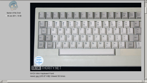
It is not possible to scroll to the right to see the rest of the picture.
It is not possible to scroll to the right to see the rest of the picture.
- Attachments
-
- scaling_bug.png (132.21 KiB) Viewed 4103 times
-
webwit
- Wild Duck
- Location: The Netherlands
- Main keyboard: Model F62
- Favorite switch: IBM beam spring
- DT Pro Member: 0000
- Contact:
What browser are you using 7bit?
bugfix: Looks fine in Opera for me?
bugfix: Looks fine in Opera for me?
-
7bit
- Location: Berlin, DE
- Main keyboard: Tipro / IBM 3270 emulator
- Main mouse: Logitech granite for SGI
- Favorite switch: MX Lock
- DT Pro Member: 0001
LOL, some things work in opera and some in firefox;-)
Yes, JavaScript is not necessary!
ps: same with Konqueror. Opera is not debian free, so I can't test it.
Yes, JavaScript is not necessary!
ps: same with Konqueror. Opera is not debian free, so I can't test it.
-
webwit
- Wild Duck
- Location: The Netherlands
- Main keyboard: Model F62
- Favorite switch: IBM beam spring
- DT Pro Member: 0000
- Contact:
Lol, hating Javascript is sooo 2003  I blame sixty. But perhaps we should make a simple template set for those haters of javascript, background graphics and what's more to come (such as fixed width). And, uhm, test in Opera.
-
Minskleip

- Location: Norway
- Main keyboard: HHKB Pro 2
- Main mouse: CM Sentinel Storm
- Favorite switch: Buckling spring
- DT Pro Member: -
I use noscript in Firefox so I don't get all the shit from Google. I still have all my email there though, so I'm kind of a dumbass.
My Norwegian webbank works in Elinks, which is very cool.
My Norwegian webbank works in Elinks, which is very cool.
-
sixty
- Gasbag Guru
- Main keyboard: DKSaver
- Favorite switch: Cherry MX Black
- DT Pro Member: 0060
I see no reason for having js disabled since about 10 years or so as well. Back then the web was full of stupid popups, no rightclick scripts and all that type of lame bullshit. Nowadays that is not the case, and some of the most impressive web technologies rely on it. I have no more reason to blame js.
The current image resizer (that you guys don't see because you are script nazis) obviously works by js so the page does not create really hideous scrollable divs inline. If anyone finds a decent way to properly resize images to a set size in posts that entirely operates without js, I'll be glad to implement it.
Otherwise you guys will have to live with it until we come up with a "light" version theme.
...we already have such a simple layout and theme and its still not light enough. Haters gonna hate!!