Page 1 of 1
site layout
Posted: 03 Feb 2011, 21:14
by 7bit
Not really a bug, but it bugs me:

- site_layout_001.png (84.81 KiB) Viewed 6526 times
To start with the most annoying one:
There is a simple solution to have background icons for Edit, Reply, Delete, etc and text for those who don't like background graphics:
Code: Select all
<div class="back2top topicbg2">
  <div class="topicbg1" style="float: right; width: 733px; padding: 0 0 0 15px">
    <div style="float: right">
      <ul class="profile-icons" style="float: left">
        <li class="edit-icon"><a href="" title="Edit post"><span>Edit post</span></a></li>
        <li class="delete-icon"><a href="" title="Delete post"><span>Delete post</span></a></li>
        ....
The text is already there, but it is too much hidden. It would be sufficient to have things like E D R next to the icons, in the same color as the background, so these are not visible. If color is switched off, these links become visible!
Posted: 03 Feb 2011, 21:21
by sixty
Your habbit of blocking pretty much every other part but text and generic images are to be blamed for that. You could use a userscript to reduce the gap between the logo.... oh wait!

Wait for the even more simplified style sometime in the future.
Ediit: I agree about the avatar column, we can save a few m ore pixels there.
Posted: 03 Feb 2011, 21:29
by 7bit
sixty wrote:Your habbit of blocking pretty much every other part but text and generic images are to be blamed for that. You could use a userscript to reduce the gap between the logo.... oh wait!
Wait for the even more simplified style sometime in the future.
Ediit: I agree about the avatar column, we can save a few m ore pixels there.
It makes no sense to have these tiny avatars and such a wide column which is even too wide for 150x150 avatars on that other website.
Those many links between DESKTHORITY and the thread title could be in one column, to start with.
Same for the stuff above DESKTHORITY.
Posted: 03 Feb 2011, 22:33
by webwit
This is about the avatar's column minimal size, due to that it must also be able to show longer names up to the maximum allowed name length, in 3 font sizes.
Posted: 03 Feb 2011, 22:36
by webwit
First plan was to have the name and date next to the avatar, but this is also troublesome because of various reasons. This would also have been better for less vertical white space between people posting one liners. But if you actually have background graphics and stuff on, it's not much of a problem now because of the colors, and the white space provides some more balance actually. Very wide columns of text are less readable.
Posted: 03 Feb 2011, 23:31
by 7bit
<1' ago
I like that format

EDIT: Oh fuck, I edited your message instead of quoted it. Let me see if I can fix it lol. -webwit
Posted: 03 Feb 2011, 23:43
by webwit
Same problem with date. You can set different date formats in the user control panel, and it will have to support various languages and the largest font size you can set. We can move stuff, but that would effectively be a new design, so I think that's more something for the basic style we will make at some point. Personally, I'd like a setup where the original poster is shown with a bigger version of his avatar, say 100x100, and their signature, and the replies after that just an icon version of 20x20 or 32x32 (and sig hidden just like now), with allows the user names to be placed to the right of the icon. Kbdmania style I guess. This would allow for much more replies on screen. But I already had to talk the other guys in these puny 64x64 avatars, and I don't wanna take away people's flairs

Moreover, it would be something for another time anyway because the forum software can't make different sizes of one avatar by default, and it isn't a priority right now in regard to the time needed to fix that.
Posted: 03 Feb 2011, 23:48
by webwit
I destroyed your message by accident, sorry about that. Can you repost it?
Posted: 03 Feb 2011, 23:59
by 7bit
webwit wrote:I destroyed your message by accident, sorry about that. Can you repost it?
No, but does not matter!
I don't want to flame about the site's design. I just had some ideas how to improve the whole thing:-)
Posted: 04 Feb 2011, 00:01
by sixty
7bit wrote:The text is already there, but it is too much hidden. It would be sufficient to have things like E D R next to the icons, in the same color as the background, so these are not visible. If color is switched off, these links become visible!
Pretty good idea actually!
Posted: 04 Feb 2011, 00:06
by webwit
7bit wrote:webwit wrote:I destroyed your message by accident, sorry about that. Can you repost it?
No, but does not matter!
I don't want to flame about the site's design. I just had some ideas how to improve the whole thing:-)
I never thought it was a flame, keep the comments coming
I wanted to react to part of your message, hit the quote button, removed the other text, put in my comment, and hit submit. Except I hit the edit button.

Posted: 04 Feb 2011, 00:08
by 7bit
webwit wrote:7bit wrote:webwit wrote:I destroyed your message by accident, sorry about that. Can you repost it?
No, but does not matter!
I don't want to flame about the site's design. I just had some ideas how to improve the whole thing:-)
I never thought it was a flame, keep the comments coming
I wanted to react to part of your message, hit the quote button, removed the other text, put in my comment, and hit submit. Except I hit the edit button.
This should be the best argument to put text into the links, instead of senseless graphics!
; - )
Posted: 04 Feb 2011, 00:10
by sixty
Well played sir, well played.
Posted: 04 Feb 2011, 00:10
by webwit
I hope sixty won't take away my admin rights!
Posted: 04 Feb 2011, 00:17
by webwit
I don't mind making an option at some point in the user control panel like "Show text instead of topic icons" or something like that. Reminds me of my father (RIP). He was not afraid of computers, but hated icons. He found them an extra layer of abstraction. He had to think too often what a certain icon was trying to illustrate, they often failed at the abstraction. He had a point. Something about a throwback to Egyptian hieroglyphics.
Posted: 04 Feb 2011, 00:19
by 7bit
sixty wrote:Well played sir, well played.
Thanks!
Now about that problem with images whcih are wider than 734 pixels:
I know that you want to restrict the text width, which is much appreciated.
I'm not sure, but there might be a way to let images exceed the text frame and allowing to scroll to the right edge of the images.
Posted: 04 Feb 2011, 00:33
by 7bit
webwit wrote:I don't mind making an option at some point in the user control panel like "Show text instead of topic icons" or something like that. Reminds me of my father (RIP). He was not afraid of computers, but hated icons. He found them an extra layer of abstraction. He had to think too often what a certain icon was trying to illustrate, they often failed at the abstraction. He had a point. Something about a throwback to Egyptian hieroglyphics.
There exist some icons I could never figure out. Why on earth is a 3.5" floppy associated with Save?
In Emacs, I swapped that with the Gnu head. Now,
that makes sense for me!
I don't object icons in general. The reason why I can't see the icons, is because Firefox does not only switch off the site's colors, but all background graphics as well. The reason why I switch off the colors, is to get a better readability of many websites.
Posted: 05 Feb 2011, 18:12
by 7bit
It would be great to have a Save or Submit button both above and below the post-edit-window.
Posted: 05 Feb 2011, 19:15
by daedalus
7bit wrote:
site_layout_001.png
Dear Lord, it's MW!
/runs to the armory
Posted: 05 Feb 2011, 23:16
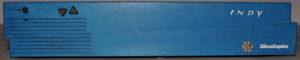
by 7bit
daedalus wrote:7bit wrote:
site_layout_001.png
Dear Lord, it's MW!
/runs to the armory
But, no! --- It's even worse!!!

- indy_006.jpg (80.23 KiB) Viewed 6450 times
/running to the armory as well ....
Posted: 05 Feb 2011, 23:34
by Minskleip
You only have three keys; ctrl, alt and delete?
Posted: 05 Feb 2011, 23:41
by bugfix
Minskleip wrote:You only have three keys; ctrl, alt and delete?
Enough for the task manager.
Posted: 05 Feb 2011, 23:44
by Minskleip
You don't need keys at all if you can log into windows and use the software keyboard. It sucks; only one-step shift lock..
Posted: 05 Feb 2011, 23:46
by 7bit
Minskleip wrote:You only have three keys; ctrl, alt and delete?
No, from left to right:
Power, volume down, volume up.
Posted: 06 Feb 2011, 00:03
by Minskleip
7bit wrote:Minskleip wrote:You only have three keys; ctrl, alt and delete?
No, from left to right:
Power, volume down, volume up.
It's the side of the board, then? Looks enormous.
Posted: 06 Feb 2011, 00:10
by 7bit
Minskleip wrote:7bit wrote:Minskleip wrote:You only have three keys; ctrl, alt and delete?
No, from left to right:
Power, volume down, volume up.
It's the side of the board, then? Looks enormous.

- indy_012.jpg (92.68 KiB) Viewed 6431 times

- indy_007.jpg (95.6 KiB) Viewed 6431 times

- indy_011.jpg (71.77 KiB) Viewed 6431 times
The attachment sgi_granite_001.jpg is no longer available
To be on-topic again:
This attachment stuff really has got to be fixed!