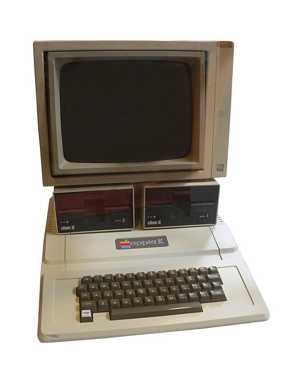
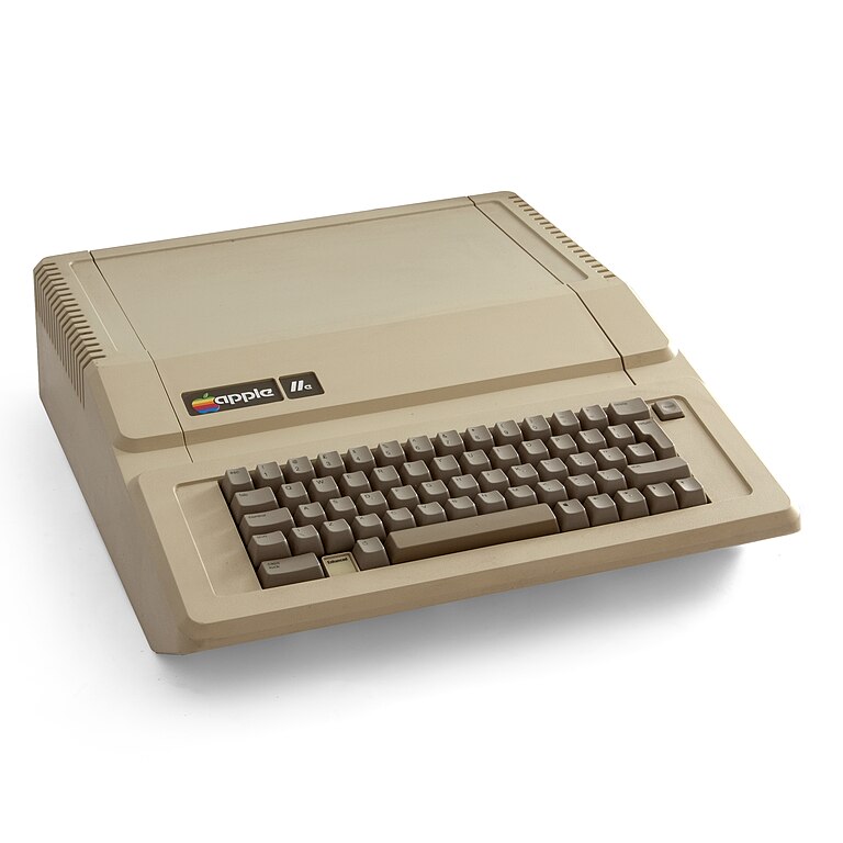
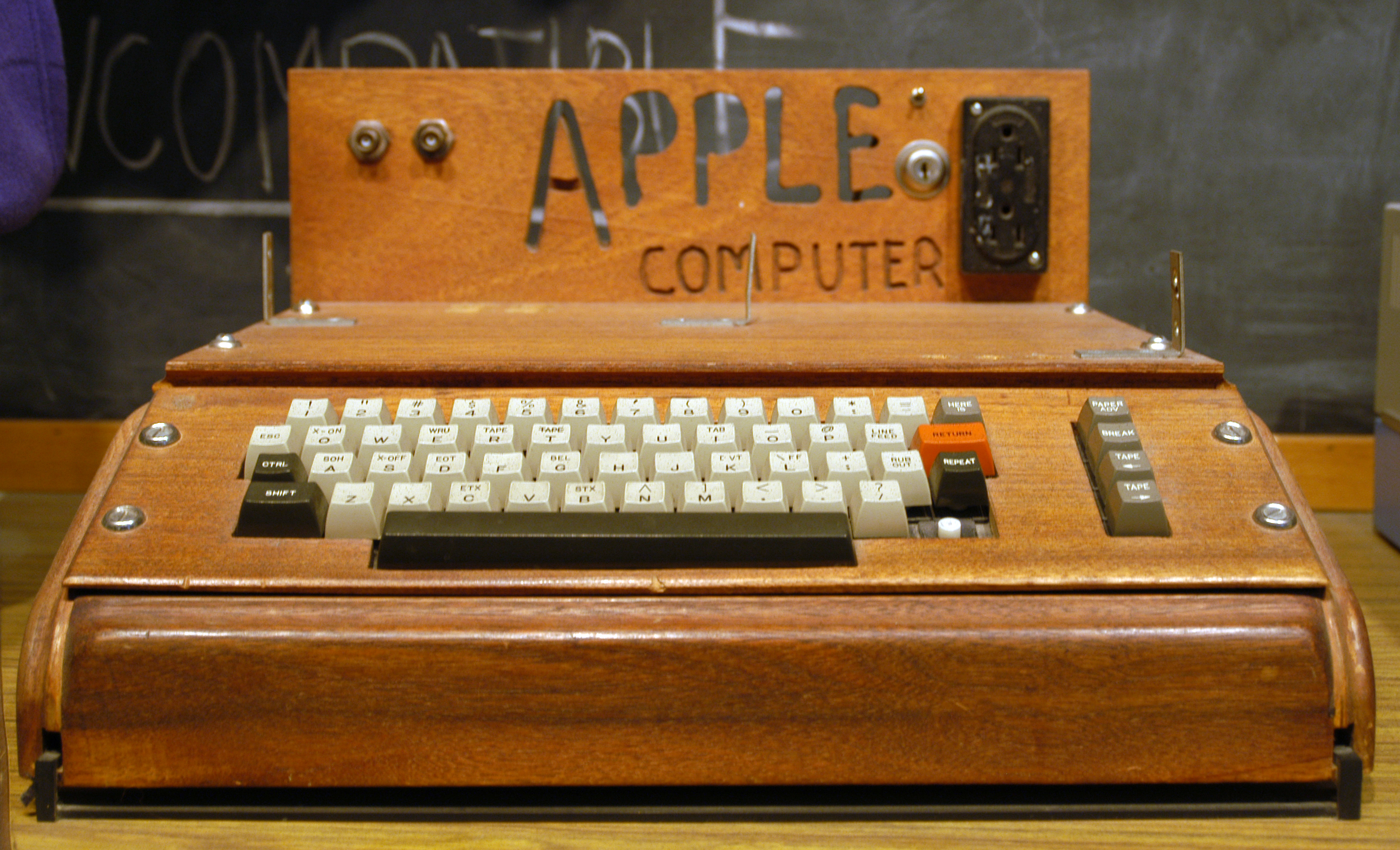
I used to think that IBM was responsible for the boring beige of the mid-80's to late 90's and cylindrical keycaps - but one look at a 1977 Apple II and you see that Apple was boring beige years before the PC. The Apple II also had cylindrical keycaps (double-shot*) when IBM at the time still had spherical double-shot keycaps on their terminals. IBM went beige, cylindrical and dyesub with the PC in 1981, PC clones copied this and by the mid-80's TI, Commodore, Atari, Tandy, DEC, nearly everybody else had beige, cylindrical keycaps. Spherical double-shots disappeared completely. IBM was a major influence obviously, but it appears that Apple started the trend. (just as Apple started the annoying trend of totally flat keys)
Anybody else have thoughts about this? I'm interested in any views on keyboard design change, however trivial. What about "the mysterious disappearance of the flat-topped 3"?
*(Apple went dye-sub with the IIc and Macs, then changed to pad printing in the 90's)


