[citation needed]Daniel Beardsmore wrote:I just encountered, on Wikipedia, "Coincident with sublimation printing, which was first used in high volume by IBM on their keyboards, was the introduction by IBM of single-curved-dish keycaps to facilitate quality printing of key legends by having a consistently curved surface instead of a dish."
Apparently it was done to make dye sub printing work. If that's true then, yes, it was indirectly as result of cost, to avoid the need to use doubleshots
Trends in keyboard design: Who started what?
-
Halvar

- Location: Baden, DE
- Main keyboard: IBM Model M SSK / Filco MT 2
- Favorite switch: Beam & buckling spring, Monterey, MX Brown
- DT Pro Member: 0051
-
Daniel Beardsmore

- Location: Hertfordshire, England
- Main keyboard: Filco Majestouch 1 (home)/Poker II backlit (work)
- Main mouse: MS IMO 1.1
- Favorite switch: Probably not whatever I wrote here
- DT Pro Member: -
- Contact:
You'll have to take that up with Mr Wales. It stands to reason though — it would be pretty hard to print onto the surface of a spherical keycap! (Many sphericals aren't, either, if you look carefully …)
-
Muirium

- µ
- Location: Edinburgh, Scotland
- Main keyboard: HHKB Type-S with Bluetooth by Hasu
- Main mouse: Apple Magic Mouse
- Favorite switch: Gotta Try 'Em All
- DT Pro Member: µ
Indeed. I should have thought of this. It probably still applies to dyesub today.
So much for my dreams of dyesub black Helvetica on white PBT SA…
So much for my dreams of dyesub black Helvetica on white PBT SA…
-
Halvar
- Location: Baden, DE
- Main keyboard: IBM Model M SSK / Filco MT 2
- Favorite switch: Beam & buckling spring, Monterey, MX Brown
- DT Pro Member: 0051
I didn't mean you with [citation needed] of course, but the wikipedia claim. A very diverse group of people write the wikipedia, and it's very easy for "factoids" (made up "facts") to sip in when they are just coherent and convincing enough. Anecdotal knowledge like this needs citations on Wikipedia for me to believe it. Otherwise, it could just have been written by some 13-year-old who "figures it must have been this way".Daniel Beardsmore wrote:You'll have to take that up with Mr Wales. It stands to reason though — it would be pretty hard to print onto the surface of a spherical keycap! (Many sphericals aren't, either, if you look carefully …)
not a thirteen yr old though. his name is samee shaik from pakistan, trainee at comstar karachi. i guess at five hundred twelve pages with most referenced materials from wikipedia, is somewhat reckless to say the least.
- complete_computer_hdwr.png (22.4 KiB) Viewed 5359 times
- computer_hdwr_p160.png (256.73 KiB) Viewed 5359 times
-
Muirium
- µ
- Location: Edinburgh, Scotland
- Main keyboard: HHKB Type-S with Bluetooth by Hasu
- Main mouse: Apple Magic Mouse
- Favorite switch: Gotta Try 'Em All
- DT Pro Member: µ
Indeed. And when Wikipedia cites things which themselves came from Wikipedia…
There's a lot of facts stated without references in just that one screenshot alone. [Original research?] [Citation Needed.]
There's a lot of facts stated without references in just that one screenshot alone. [Original research?] [Citation Needed.]
right. most citations in that book are from wikipedia. it seems to me that at five hundred plus pages in a final printed form, and at twenty nine dollars and fifty cents, is either because shaik is stupid and wanted to make a quick buck, or has edited the articles in question in wikipedia.
-
nathanscribe

- Location: Yorkshire, UK.
- Main keyboard: Filco tenkeyless w/blues
- Main mouse: Kensington Expert
- Favorite switch: MX Blue
- DT Pro Member: -
The bane of academic life: students citing Wikipedia. Noooooooooooooooooooooooo.
One of the things about the keyboard on the Spectrum is that even though it was awful, it was a step up from the ZX-81:

Which was about the same as the ZX-80. From memory, I *think* the ZX-81 may have been very slightly larger than the ZX-80, which was so tiny it looks ridiculous. Of course a child's fingers fit fine, but for an adult it's more of a challenge (and a poke-y* frustration)
I mean there was no feedback at all on those things. You could almost just look at a key and it would register a couple of hits, or you could smack it and get nothing.
Sinclair's attempt at a "better" keyboard with the + model was not much good either. I think the best keys the Speccy ever came with out of the factory was when Amstrad took over and chucked out the +2. Hmm
But then, this was definitely a fight for market share in cheap 8-bit machines when everybody wanted one and everybody was making one. We almost ended up with an Aquarius, FFS. Or was it an Oric? Anyway, there was a whole bunch of terrible keyboards on cheap 8-bit micros back then. Many felt more like calculators than keyboards.
It makes me chuckle to think that typing on phones/tablets now feel almost as bad as those early flat Sinclairs...
*pun apologetically intended
One of the things about the keyboard on the Spectrum is that even though it was awful, it was a step up from the ZX-81:
Which was about the same as the ZX-80. From memory, I *think* the ZX-81 may have been very slightly larger than the ZX-80, which was so tiny it looks ridiculous. Of course a child's fingers fit fine, but for an adult it's more of a challenge (and a poke-y* frustration)
I mean there was no feedback at all on those things. You could almost just look at a key and it would register a couple of hits, or you could smack it and get nothing.
Sinclair's attempt at a "better" keyboard with the + model was not much good either. I think the best keys the Speccy ever came with out of the factory was when Amstrad took over and chucked out the +2. Hmm
But then, this was definitely a fight for market share in cheap 8-bit machines when everybody wanted one and everybody was making one. We almost ended up with an Aquarius, FFS. Or was it an Oric? Anyway, there was a whole bunch of terrible keyboards on cheap 8-bit micros back then. Many felt more like calculators than keyboards.
It makes me chuckle to think that typing on phones/tablets now feel almost as bad as those early flat Sinclairs...
*pun apologetically intended
-
Muirium
- µ
- Location: Edinburgh, Scotland
- Main keyboard: HHKB Type-S with Bluetooth by Hasu
- Main mouse: Apple Magic Mouse
- Favorite switch: Gotta Try 'Em All
- DT Pro Member: µ
Yeah. But if you really think about it, what is "citation"? Man. I mean, isn't everything "citing" something else, round and round? Into forever! <bong noises> It's like there's this whole "reality" we're imposing on, uh, reality. Who needs that? The Man, man. Only the Man.
-
nathanscribe
- Location: Yorkshire, UK.
- Main keyboard: Filco tenkeyless w/blues
- Main mouse: Kensington Expert
- Favorite switch: MX Blue
- DT Pro Member: -
More 80s keyboard awfulness:
Oric-1:

Micro-Professor II (with optional "full size" keyboard attachment):

-
Muirium
- µ
- Location: Edinburgh, Scotland
- Main keyboard: HHKB Type-S with Bluetooth by Hasu
- Main mouse: Apple Magic Mouse
- Favorite switch: Gotta Try 'Em All
- DT Pro Member: µ
The Oric gets points for looking pretty mean, though. The designers really gave their ruler a workout.
Personally, I don't mind a bit of folklore, but it should be clearly written as such.
Upped sticks! Uh oh, sounds like more "original research" / personal storytelling getting into Wikipedia.On 13 October 1983 the factory of Kenure Plastics in Berkshire, where the Oric-1 was manufactured, burnt to the ground. The factory was rebuilt, minus a considerable stock of bits (including 15,000 old ROMs) that went to make up the Oric-1. In the meantime production was said to have restarted within 24 hours in a new factory.[citation needed] Just a day later, a neighbouring warehouse went up in flames. Police were said at the time to suspect that the arsonist got the wrong place first time round.[citation needed] It was about this time, too, that Tansoft upped sticks and moved to co-exist with Oric Research at the Techno Park, Cambridge.
Personally, I don't mind a bit of folklore, but it should be clearly written as such.
-
nathanscribe
- Location: Yorkshire, UK.
- Main keyboard: Filco tenkeyless w/blues
- Main mouse: Kensington Expert
- Favorite switch: MX Blue
- DT Pro Member: -
Ah, I got into conversation with one of my previous students about old tech once, and he told me he'd recently thrown away his Microtan. I wept a little inside. It would have looked good in my study...
OK, so I'm going a little off-topic here, but I sometimes wonder if Tangerine CS were related in some way to Tantek, who made recording/studio tech in the mid-80s. I have a modular processing rack by them:
According to the previously linked Wikiepdia article, they hooked up with HH at one point, so I wonder if the Tantek stuff might have been some kind of offshoot by one or more of the people involved. I've not researched it, just a thought really.
OK, so I'm going a little off-topic here, but I sometimes wonder if Tangerine CS were related in some way to Tantek, who made recording/studio tech in the mid-80s. I have a modular processing rack by them:
- 2013-04-11 12.01.25.jpg (386.84 KiB) Viewed 5384 times
-
nathanscribe
- Location: Yorkshire, UK.
- Main keyboard: Filco tenkeyless w/blues
- Main mouse: Kensington Expert
- Favorite switch: MX Blue
- DT Pro Member: -
Back to keyboards, there was the Sord M5 from around 1983/4 or so, which had flat keys, again at least visually like the recent Apple boards. Though I don't know what technology was under the Sord's keys a contemporary review I have here says it is "reminiscent of the Spectrum's but with a much better feel ... positive in action, there is a satifsying click". I don't know whether they refer to a physical action or a computer-generated audio click. I'd have otherwise suspected this to be conductive rubber or membrane under plastic tops.
Interesting shape, not sure how useful.
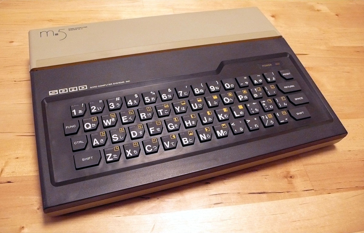
Interesting shape, not sure how useful.
-
Muirium
- µ
- Location: Edinburgh, Scotland
- Main keyboard: HHKB Type-S with Bluetooth by Hasu
- Main mouse: Apple Magic Mouse
- Favorite switch: Gotta Try 'Em All
- DT Pro Member: µ
They had a good visual style going on, whatever's under the caps. Could be an interesting switch, along the lines of Acer's spring over membrane design. I've used those: they are indeed clicky, if not exactly high end. Something thinner maybe? Or the reviewer was just spouting nonsense at his first impression of scissor switches vs. Sinclair style naked membranes.
-
nathanscribe
- Location: Yorkshire, UK.
- Main keyboard: Filco tenkeyless w/blues
- Main mouse: Kensington Expert
- Favorite switch: MX Blue
- DT Pro Member: -
I'd be surprised if it were anything as complicated for the thickness as an Alps-style mechanism. I don't know when scissors became popular. It may even be just a stiff rubber dome of sorts... not seen any internals of the keyboard yet, only the main board. I've had stuff before which just used a conductive coating on the underside of a moulded rubber sheet, shorting out interlaced forks on a PCB beneath. Using one's imagination a little, they could be said to "click", though it's more of a "pock" really. 
-
Findecanor
- Location: Stockholm, Sweden
- DT Pro Member: 0011
It looks great, though. Why isn't there a modern chiclet keyboard in beige and brown colour scheme? ...nathanscribe wrote:Micro-Professor II (with optional "full size" keyboard attachment):
-
Findecanor
- Location: Stockholm, Sweden
- DT Pro Member: 0011
Vintage TI calculators have really thin keypad switches that are made from bubbles of sheet metal. They click. Maybe this is something similar.nathanscribe wrote:"reminiscent of the Spectrum's but with a much better feel ... positive in action, there is a satifsying click". I don't know whether they refer to a physical action or a computer-generated audio click.
From http://www.classiccmp.org/calcmuseum/tisr.htm:
- TI59kbd.jpg (13.19 KiB) Viewed 5252 times
-
nathanscribe
- Location: Yorkshire, UK.
- Main keyboard: Filco tenkeyless w/blues
- Main mouse: Kensington Expert
- Favorite switch: MX Blue
- DT Pro Member: -
Hmm, I've not seen that type of keypad on anything bigger than a calculator. My Casio FX 730P Pocket Computer has a membrane; the springy metal bubbles would not particularly be easy to type on, I think.
-
mr_a500
- DT Pro Member: -
Hey! I remember those springy metal bubbles! I can't remember which keypad or keyboard I saw them on, but I definitely saw them on some late 70's electronics I disassembled back then. I had forgotten all about those things.Findecanor wrote:Vintage TI calculators have really thin keypad switches that are made from bubbles of sheet metal. They click. Maybe this is something similar.nathanscribe wrote:"reminiscent of the Spectrum's but with a much better feel ... positive in action, there is a satifsying click". I don't know whether they refer to a physical action or a computer-generated audio click.
From http://www.classiccmp.org/calcmuseum/tisr.htm: I used to have this keypad.. then I trimmed it down for a project that required only three buttons.
-
dorkvader

- Main keyboard: Unicomp
- Main mouse: CST 1550
- Favorite switch: Buckling Spring over Capacitave. (Model F)
- DT Pro Member: -
They are common on some POS keyboards, and there's some "industrial" keyboards I've seen on ebay that look like they have them. I think of these switches as "metal contact dome". You can protect them pretty well against environments, but they are horrible to type on. Not sure when they originated, though.nathanscribe wrote:Hmm, I've not seen that type of keypad on anything bigger than a calculator. My Casio FX 730P Pocket Computer has a membrane; the springy metal bubbles would not particularly be easy to type on, I think.
-
daedalus

- Buckler Of Springs
- Location: Ireland
- Main keyboard: Model M SSK (home) HHKB Pro 2 (work)
- Main mouse: CST Lasertrack, Logitech MX Master
- Favorite switch: Buckling Spring, Beam Spring
- DT Pro Member: 0087
The first cylindrical keycaps IBM made (at least AFAIK) were on the Selectric III, which were most likely double shot. These were introduced in 1980, a year before the first Model Fs became available. Of course, the decision to introduce cylindrical keycaps for sublimation purposes could have been made before these were designed, but it seemed that for one reason or another, IBM thought it was worth their time to change their typewriter keycaps to be cylindrical too.Daniel Beardsmore wrote:I just encountered, on Wikipedia, "Coincident with sublimation printing, which was first used in high volume by IBM on their keyboards, was the introduction by IBM of single-curved-dish keycaps to facilitate quality printing of key legends by having a consistently curved surface instead of a dish."
Apparently it was done to make dye sub printing work. If that's true then, yes, it was indirectly as result of cost, to avoid the need to use doubleshots


-
Muirium
- µ
- Location: Edinburgh, Scotland
- Main keyboard: HHKB Type-S with Bluetooth by Hasu
- Main mouse: Apple Magic Mouse
- Favorite switch: Gotta Try 'Em All
- DT Pro Member: µ
Throws a spanner in the theory.
Note the Helvetica legends. Did IBM move to Helvetica simultaneously with cylindrical profile, or are there Helvetica sphericals out there!? (Or vice versa.)
The only spherical caps with Helvetica that I've seen are by HP. I'll dig out the photo.
Note the Helvetica legends. Did IBM move to Helvetica simultaneously with cylindrical profile, or are there Helvetica sphericals out there!? (Or vice versa.)
The only spherical caps with Helvetica that I've seen are by HP. I'll dig out the photo.
-
kps

- Location: Waterloo, Ontario, Canada
- Main keyboard: Kinesis contoured
- Main mouse: Kensington Slimblade trackball
- DT Pro Member: -
What did happen on the Selectric III was the concurrent move to cylindrical caps and ISO 9995 corner legends (see earlier in the thread). I do suspect that making room for the legends was part of the motivation for the flatter corners.
IBM dates the Selectric III to 1980 and highlights the “larger, non-glare keys”.
I had a Selectric III-based terminal until recently, but foolishly forgot to check whether they keycaps were double shot or printed.
IBM dates the Selectric III to 1980 and highlights the “larger, non-glare keys”.
I had a Selectric III-based terminal until recently, but foolishly forgot to check whether they keycaps were double shot or printed.
-
daedalus
- Buckler Of Springs
- Location: Ireland
- Main keyboard: Model M SSK (home) HHKB Pro 2 (work)
- Main mouse: CST Lasertrack, Logitech MX Master
- Favorite switch: Buckling Spring, Beam Spring
- DT Pro Member: 0087
A terminal based on the Selectric III.... was this an IBM product?
I believe 'non glare keys' was one of the marketing points they had for the Displaywriter keyboard, even though it had cylindrical caps.
I believe 'non glare keys' was one of the marketing points they had for the Displaywriter keyboard, even though it had cylindrical caps.
-
bhtooefr

- Location: Newark, OH, USA
- Main keyboard: TEX Shinobi
- Main mouse: TrackPoint IV
- Favorite switch: IBM Selectric (not a switch, I know)
- DT Pro Member: 0056
- Contact:
I'm gonna go ahead and use this thread for some other stuff.
I need to nail a few other things down, but check this out:
Selectric III 92-char US: http://www.keyboard-layout-editor.com/# ... 4435843da4
Selectric III 96-char US: http://www.keyboard-layout-editor.com/# ... bc60696bdb
I haven't quite figured out where the ISO enter came from originally (I think it predates the 96-character Selectric III by a lot), but I think the 92-character Selectric III keyboard was where ANSI came from. The L-shaped enter (as popularized by the PC-AT keyboard), I think, came from the Selectric II, and the DisplayWriter adopted it.
Also note that the Selectric III's main area (ignoring the switches and keys on the left and right) is 14.75 U, not 15 U.
Edit: The plot, it thickens. The DisplayWriter's layout, despite it being a beam spring with sphericals, appears to be based on that of the Selectric III, not the II. (Or vice versa.) The L-shaped enter is because of the lack of an express backspace key. However, the Selectric II is also a 14.25 U wide layout (the top of the L-shaped enter is 0.75 U wide).
It looks like Selectric IIs in ISO countries had the ISO left shift, but not original Selectrics. And, original Selectrics actually had a 1.75 x 2 x 1.5 x 1 enter (instead of the Selectric II's 0.75 x 2 x 1.5 x 1), but they had missing keys relative to ISO or ANSI, too.
Edit 2: Oh, and your cylindrical ISO/IEC 9995-compliant keys are actually quite a bit older than the Selectric III - I think their first appearance was in 1978, on the Electronic Typewriter 50 and 60. Looks like this is the first implementation of a full-on Big-Ass Enter, too (although .25 U narrower than the AT's enter), and they had the 92/96 character split as well. And, the 96-character element was designed for the ET50/ET60, and later used on the Selectric III.
-
AlainSouloumiac
- Location: France
- Main keyboard: Quintel
- Main mouse: Quintel
- Favorite switch: Switchop
I participated in many ways in keyboard designs.
In an official report to the French Government published in 1983, I recommended to standardize keyboard layouts and study the adoption of a universal keyboard based on Dvorak or Marsan layout. The major purpose of this reform was to diminish users' stress, facilitate the training and diminish the colossal losses related to typing mistakes.
In January 1984, two working groups were established by AFNOR to prepare the new standards. As French Manufacturer were hostile to such changes, I convinced the Ministry of Industry and the Ministry of Labor to launch a pilot standard plan. Mr. Yves Neuville, was appointed expert to study the real needs of the users. The report made by the expert was rejected by AFNOR because "not compatible with ISO standards". Mr. Neuville and I were sent by the Ministry of Industry to attend the ISO meeting which took place in Berlin in 1985. The Neuville layout was immediately adopted by most keyboard manufacturers and later became the ISO 9995 standard.
In the meantime, I founded QUINTEL SA company to create a more efficient technology for keyboard avoiding the use of electrical contacts. Patents were deposited and delivered concerning various models of optical keyboards (Keytop), optical switches (Switchop) and optical connectors (Clickop). We received the support from the Ministry of Defense to develop a Tempest keyboard.
Our technology was stolen by a bigger company. After intense lobbying, Defense ministry agreed to lead stringent Tempest on the keyboard designed by our company and by our fraudulent competitor. We succeeded in 100%. They failed 100%. We were rejected. Justice refused to judge the case and led us to an "arrangement". Our company was bankrupt.
We had designed a new technology called "Optocontrol" with highly efficient optical switches (billion maneuvers, no radio waves, very low cost...), plugs, and also microphones. This was rejected by a corrupted society opposed to disruptive innovations.
We are now implementing the Creafree Standard (2013 - onwards) to free disruptive innovations and to bring about the resurrection of this technology and many others that would serve humankind's progress.
-
vometia

- irritant
- Location: Somewhere in England
- Main keyboard: Durrr-God with fancy keycaps
- Main mouse: Roccat Malarky
- Favorite switch: Avocent Thingy
- DT Pro Member: 0184
Random comment about spherical vs. cylindrical which is that it may have been at the behest of the typists. I've mentioned on my MX Black Impressions topic that the gf borrowed my keyboard with the SA profile and didn't care for it. The main reason is because she has long nails which would catch on the top edge, something that seems to happen less with cylindricals. I keep my nails short so it doesn't bother me; I'm also clumsier than her so I prefer the more bowl-shaped keys!
Completely anecdotal so it may have absolutely nothing whatsoever to do with the rationale of the design. But it's good enough to put it on Wikipedia.
Completely anecdotal so it may have absolutely nothing whatsoever to do with the rationale of the design. But it's good enough to put it on Wikipedia.