Billiards GB

User avatar
i3oilermaker

10 Jul 2012, 16:13

didja wrote:Got my sets and love them. The only thing I wish they would have done better was centering the numbers more consistently but it's not too bad. Thanks for doing these, very creative idea and they look eye catching on my white otaku filco.

Oh, in the future I would consider putting them in a baggy inside the bubble mailer rather than lose. That way when a corner gets ripped by the post office you reduce your odds of losing keys. It happens because they are machine sorted, though being in a bubble mailer helps reduce the odds of problems.

Thanks again.
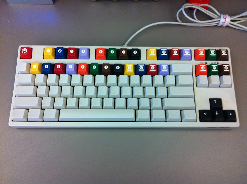
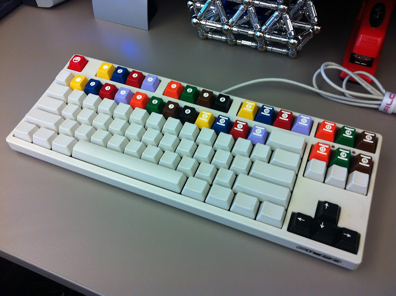
I just ordered a lot of bags for future orders, good suggestion.

I would have to disagree with you on the centering of the numbers, I spent hours with the SVGs meticulously centering them and they appear to have come out extremely close to that.

ripster

10 Jul 2012, 16:19

ALL my i3oilermaker keys were impressively PERFECT!

The Sickle handle came out better than expected.

The numbers are fine.

The Pi key is simply stunning.

I call McRip effect.

User avatar
didja

10 Jul 2012, 16:27

I don't have a micrometer with me but spacing from key edge to graphic edge is about 2.75mm on the right and 3.25mm on the left. Most noticeable on the 5 and 9 keys to my eyes. Again, it's not bad and I debated on even mentioning it. It's not your SVG file, it's manufacturing tolerances and all manufacturing processes have some variation in them. The worst ones are still only off center by about .4-.5mm and I'm positive most keys have this same variation in them, you just don't notice because characters are not generally round, perfectly centered graphics like these keys. I'm very happy with them.

User avatar
didja

10 Jul 2012, 16:46

This was hard to capture accurately with my phone in the lighting here but this shows the difference. My eyes in person show just under .5mm difference between the two sides. Not a big deal but I just got called out so here you go.
Next I'll post visual wav graphs proving my filco pings. :)

Image

User avatar
i3oilermaker

10 Jul 2012, 16:52

That picture actually convinced me that is just about perfect. Top photo looks to me like exactly 3mm (center of the line) and the second looks like just just a micron under 3mm to me. Maybe its the photo...I'm sure everyone will pull out their microscopes now to check, but in reality, you look at these from a few feet away and that type of tolerance is not even noticed.

User avatar
didja

10 Jul 2012, 16:56

i3oilermaker wrote:That picture actually convinced me that is just about perfect. Top photo looks to me like exactly 3mm (center of the line) and the second looks like just just a micron under 3mm to me. Maybe its the photo...I'm sure everyone will pull out their microscopes now to check, but in reality, you look at these from a few feet away and that type of tolerance is not even noticed.
I agree it's not noticeable to most people and at this point I regret mentioning it. It's hard to get the ruler and my camera lined up as well as you can do with eyeballing it, I tried to go on the edge of the line rather than middle of the line but it didn't work. My eyes are very sensitive to symmetry and ears to sound so I notice things like filco ping plate reverb and off center graphics but it's well within a tolerable level on your caps. Sorry, I wasn't meaning to tarnish it in any way and I don't think my mention of it has.

ripster

10 Jul 2012, 17:00

I do have a micrometer.

P.S. McRip effect INCLUDE things blown way out of fucking proportion.

Common to hobbyist forums.

<Waits one hour to continue debate since I am throttled.>

ripster

10 Jul 2012, 18:03

1 hour later....

About .1mm off I'd say.

Like I said, PING!

User avatar
i3oilermaker

10 Jul 2012, 18:18

http://www.newgrounds.com/portal/view/525347

For comparison:
Grain of salt = .5mm
Computer Pixel = .3mm
Width of a human hair = .1mm

User avatar
didja

10 Jul 2012, 18:33

Damn, my visual acuity is amazing. :)

For the record, these are the best aftermarket caps I've ever seen and I'm very pleased with my purchase. Thanks for doing it.

Image

Image

ripster

10 Jul 2012, 18:34

Nice stapler.

User avatar
MagicMeatball

10 Jul 2012, 18:41

ripster wrote:Nice stapler.
Image

User avatar
didja

10 Jul 2012, 18:55

Yep, it's the Swingline issue of Milton's red stapler (which was never actually made in red before the movie, it was a prop) but Swingline chose to make a red version of their higher end 747 stapler at the request of Office Space fans. Lifetime warranty.
http://www.swingline.com/swingline/us/u ... ranty.aspx

User avatar
TexasFlood

10 Jul 2012, 20:10

I have the red one swingline made like the above in your picture. I'm cheap and got it on a deal, $9.99 shipped. It's cool if not quite as nice as the one in the movie. I tried to buy a really nice one from a model maker who was making essentially duplicates of the one in the movie by doing a custom paint job with the right color tint and gloss on the right model, as was done for the movie. But he never replied to my emails so... I do like the swingline just would be that much cooler (geekier?) to have the real, uh, or rather the right fake, deal, :D

User avatar
didja

10 Jul 2012, 22:43

The one in the movie is a lower end model. Most were plastic shells on the top but still very good. I have that model in Black. The 747 is superior to it and is the same profile from the side, so you aren't missing anything.

Now about those key caps, they made me want to go play pool so I did. First time in many years. Same music playing on jukebox as 10-15 years ago (Tool, Guns N Roses, etc.) Good times.

User avatar
hashbaz

10 Jul 2012, 22:50

Got my billiard order a few days ago, and pi+sickle today. All of them look amazing. Thanks again boiler!

User avatar
TexasFlood

10 Jul 2012, 22:51

didja wrote:The one in the movie is a lower end model. Most were plastic shells on the top but still very good. I have that model in Black. The 747 is superior to it and is the same profile from the side, so you aren't missing anything.
You're probably right about the stapler, but the one in the movie had a heck of a paint job. Milton was pretty funny...

And I said, I don't care if they lay me off either, because I told, I told Bill that if they move my desk one more time, then, then I'm, I'm quitting, I'm going to quit. And, and I told Don too, because they've moved my desk four times already this year, and I used to be over by the window, and I could see the squirrels, and they were married, but then, they switched from the Swingline to the Boston stapler, but I kept my Swingline stapler because it didn't bind up as much, and I kept the staples for the Swingline stapler and it's not okay because if they take my stapler then I'll set the building on fire...

User avatar
didja

10 Jul 2012, 23:30

Great, now I'm out looking at pool cues again. I swore I wouldn't do that until after I have a pool table, which has to come after a bigger house.
Meucci
Image

User avatar
dorkvader

11 Jul 2012, 02:33

didja wrote:Yep, it's the Swingline issue of Milton's red stapler (which was never actually made in red before the movie, it was a prop) but Swingline chose to make a red version of their higher end 747 stapler at the request of Office Space fans. Lifetime warranty.
http://www.swingline.com/swingline/us/u ... ranty.aspx
I'm glad other people know this. Most seem to think swingline had a red stapler when the movie came out, but this was never the case.

I love my shiny non-red 747, though it takes second place to my ancient swingline #13 (which uses those thicker industrial staples. It was patented in 1938).
---
On topic, I really like using these keycaps on the number row, but continuing across, covering the [] keys and the insert, home and pageup. I think I'll change that now.

While I'm at it, I think I'll randomly insert Pi and sickle keycaps just to mess with DT'ers :p

User avatar
TexasFlood

11 Jul 2012, 02:42

dorkvader wrote:I'm glad other people know this. Most seem to think swingline had a red stapler when the movie came out, but this was never the case.

I love my shiny non-red 747, though it takes second place to my ancient swingline #13 (which uses those thicker industrial staples. It was patented in 1938).
Besides the special edition red 747, I have a well worn old black glossy 747 that I use an awful lot. I also have a heavy duty industrial but haven't used it for a long time, kinda forgot about it. I'm not even sure where it is, will have to dig it out and see what make/model it is...

User avatar
didja

11 Jul 2012, 03:49

I have wanted the silver 747 (it's matte silver) for quite a while... but I just searched and there's one that's frickin CHROME!
http://www.amazon.com/Collectors-Editio ... B00016UVKW
Image

On topic comment: The Chrome stapler above would show these billiards caps in it's reflection better than any other stapler made.

User avatar
TexasFlood

11 Jul 2012, 04:46

Cool, but think of the fingerprints!

Wonder what they taste like? (don't ask me)
This is from the thinkgeek web site "customer action shots" captioned "She did say she loved it..."
Don't think I have anything else to add, it kinda speaks for itself, :twisted:
Image

Here are the ones from the dude I tried to contact, I like the white script name on the side.
Image

I might be able to paint them like he does, but not sure how to do that white script.
Image

ChoiYoungGyoo

11 Jul 2012, 08:37

I got my 4 billiards keycap sets today in South Korea. (priority mail)

User avatar
noobandroid

11 Jul 2012, 11:37

my keyboard has been HULKED!!
Spoiler:
Image

bpiphany

11 Jul 2012, 11:46

noobandroid wrote:my keyboard has been HULKED!!
Which keyboard is that? The case looks very interesting, like a modified Filco...

User avatar
noobandroid

11 Jul 2012, 11:51

PrinsValium wrote:
noobandroid wrote:my keyboard has been HULKED!!
Which keyboard is that? The case looks very interesting, like a modified Filco...
it's actually a ducky shining, backlit keyboard

bpiphany

11 Jul 2012, 12:05

noobandroid wrote:it's actually a ducky shining, backlit keyboard
The distances between the different sections look very similar to the Filco, and it has the extra keys above the numpad. Could be very interesting for the Phantom PCB if it fits in other regards..

User avatar
noobandroid

11 Jul 2012, 12:07

PrinsValium wrote:
noobandroid wrote:it's actually a ducky shining, backlit keyboard
The distances between the different sections look very similar to the Filco, and it has the extra keys above the numpad. Could be very interesting for the Phantom PCB if it fits in other regards..
it is nice and all, but the height of the keycaps WASD made was not consistent, some are higher than the others

bpiphany

11 Jul 2012, 20:44

PrinsValium wrote:The distances between the different sections look very similar to the Filco, and it has the extra keys above the numpad. Could be very interesting for the Phantom PCB if it fits in other regards..
Umm, a little bit embarrassing... The Phantom of course is tenkeyless =P But let's pretend I was thinking of the Phantom II...

User avatar
dorkvader

12 Jul 2012, 00:39

noobandroid wrote: it is nice and all, but the height of the keycaps WASD made was not consistent, some are higher than the others
What do you mean by this? All my WASD keycaps height is consistent.

Do you mean that The SP-profile keycaps aren't the same? (A fn# row filco/WASH is taller than a Fn# row SP keycap). This is, unfortunately one of the drawbacks of SP. They also don't match with cherry.

Post Reply

Return to “Geekhacker refugee camp”