I just got a set in.
My four cents (due to inflation):
I like the diversity of stuff in the box. It feels like I'd have to go out of my way to come up with something it doesn't support in a US layout, even though it's not quite as vast as, say, the Akko 170+ key sets. There's not much for internationalization, but they covered all the important modifier options, including the rare-for-ALPS-but-crucial-for-me straight-ANSI enter and backslash and stepped caps lock.
The value for money is reasonable. There are some slightly better values in the MX ecosystem-- some of the offbrand "not quite SA" profiles off of eBay or AliExpress deliver a similar or larger amount of keycap coverage for $10 less or so, but I suspect the economies of scale for an ALPS product are far, far lower. The shipping price feels a bit high, coming from spoiled-American "everything-over-a-token-amount-ships-free" perspectives, but they got them in my hands within like four days of ordering, which even domestic vendors can barely manage half the time (ask me how many times my backordered 39SF010 flash-ROM chips have been delayed

)
The texture is nice. It's a much finer grain than many vintage caps, so there's still some grip to the keys, but it doesn't *look* bumpy like some caps to. It will be interesting to see how it wears. At first touch, it feels more "dry" and PBT-like than some ABS caps I've used.
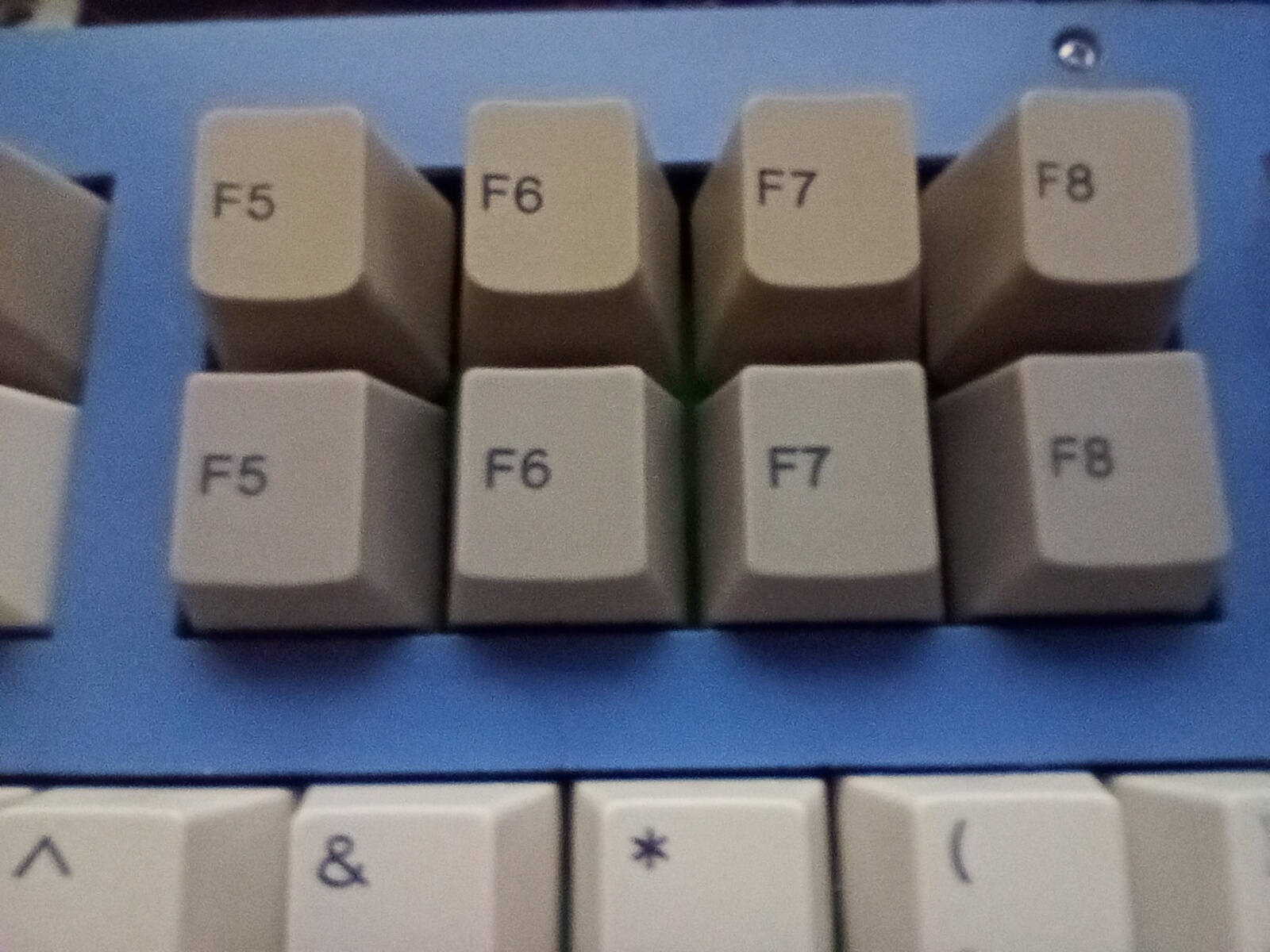
The sharper profile evokes a feeling of streamlining while still feeling somewhat vintage-- like what someone would draw in 1985 if asked to sketch out what they thought the "IBM AT/486 in 1993" will look like. I have a photo to show the colour and profile difference.
The vintage colours look *appropriate, but this tends to be subjective. I've had, for example, a variety of different Focus boards over the years. Their beige tends to err more on the "reddish" side and these are a bit more "bluish", but I suspect once you subtract 20 years of sun-bleaching and yellowing, they may be a lot closer. It's a definite improvement over the Olivetti colour wave they sold a while back, which always had this weird "bloom" that made the caps look almost dyesub.
- IMG_20221026_215639.jpg (542.34 KiB) Viewed 5613 times
(The top row is the rare "Row 0" function keys from a Focus FK-9000, and the bottom are the new Tai-Haos)
I wish the contrast were a bit better, but I think I'm in a very dim room too.
The thing I'm most annoyed about is the typography. By most standards, Tai-Hao does clean, legible, and technically excellent typography. You can see how close the lettering is on the old Focus caps and the new Cubics. It doesn't look like they chose a font based on "it's easy to make double-shot moulds for it" like some vendors clearly did. This is probably what makes the fact the "Win" and "Menu" keys look so out of place-- they used a font a couple points bigger, and it's immediately noticeable. I liked the icons on the classic-profile sets better.
Part of me wishes there were more options in the ALPS space-- I'd be quite happy to throw on some sphericals-- but on the other hand, if this is what's available, it's still a sane and reliable choice, and avoids too much of a money-burning rabbit hole.
I hope to be finished with my 130% ALPS build in a week or so-- new top plate is on the way from the laser cutter, so paint and final fitment of it is all that's needed. I'm thinking I might go for a beige colour to go with the caps.