Hi-Profile PBT Dye-sub (the time has come)
-
matt3o

- -[°_°]-
- Location: Italy
- Main keyboard: WhiteFox
- Main mouse: Anywhere MX
- Favorite switch: Anything, really
- DT Pro Member: 0030
- Contact:
I will keep working on this and post updates when I have some, if you have anything interesting to say I'll be reading this. See you around, I'm too tired for the drama right now.
-
zslane

- Location: Los Angeles, California, USA
- Main keyboard: RealForce RGB
- Main mouse: Basic Microsoft USB mouse
- Favorite switch: Topre
- DT Pro Member: -
Yeah, I'm aware of the thread title. It's what drew my attention in the first place.snuci wrote: ↑Please note the title of this thread.
My posts have been a not-so-subtle attempt to try and get this train switched onto a different track while there might still be time to do so. It may have been a futile gesture, but I at least felt I had to try. If nothing else, exposing an emperor's new duds always has merit.
-
matt3o
- -[°_°]-
- Location: Italy
- Main keyboard: WhiteFox
- Main mouse: Anywhere MX
- Favorite switch: Anything, really
- DT Pro Member: 0030
- Contact:
no worries, that was totally not directed to you.niomosy wrote: ↑Sorry, matt3o, was originally a curiosity question that apparently snowballed.
I'm sorry zslane, it's not that I don't like discussing about keyboards and switches and keycaps, but it seemed like you really didn't want to listen. Double shot PBT is not an option at this time, for the reasons that you seemed to have ignored in my previous post. Double shot ABS would be doable and it is likely that we will have that as well in the future, but between double shot ABS and dyesub PBT I personally prefer the latter, the fact that it is also cheaper it is a pleasant side effect.zslane wrote: ↑If nothing else, exposing an emperor's new duds always has merit.
This is just gratuitously insulting and doesn't bring anything to the discussion. We are just brainstorming, if you have better alternatives I'm all ear.snuci wrote: ↑Can we move on talking about how matt3o thinks the "Monopoly game" font is sexy and how Mu likes these thin-ass fonts that will require reading glasses to see the fonts (I know, nobody looks at their keyboards but some of us don't touch type)?
C'mon Muirium, you know better than feeding the troll...Muirium wrote: ↑Having read your opening sentence, I know we'd wind up in a bare knuckle fight if we met face to face…
Oookay guys. Can we now move on and pretend we are intelligent people?
-
snuci

- Vintage computer guy
- Location: Ontario, Canada
- DT Pro Member: 0131
- Contact:
I do apologize for that comment. It was meant to convey a light-hearted poke at the font alternatives to try to get the discussion going back on track. Sometimes the written word does cause mis-communication so sorry about that. It did occur to me shortly after that maybe that font is not used on Monopoly games in Europe but it was meant to remind readers where they might have seen that font before.matt3o wrote: ↑This is just gratuitously insulting and doesn't bring anything to the discussion. We are just brainstorming, if you have better alternatives I'm all ear.
I did have an apology typed up after seebart replied to my earlier rant but I deleted it so as not to continue with non-related discussion in this thread. It just bothers me when someone like you is willing to put up time, resources and funding to build one thing and suggestions turn to continual criticism for why they are not building another; even after the rationale has been explained.
What you are doing is something that is often done in the vintage computer community. Projects come up where someone decides to build a new device to extend the life of a vintage computer system. They will often sell a small number to help out others in the community and assist with their costs. Those that appreciate the effort and could use the item will buy one. Those that think it should be done another way learn from the first project and build their own and if the community thinks the alternative is worthwhile, they may invest in that too.
I, for one, appreciate what it takes to create these key caps for this community so let's get back to the topic at hand. No smart-ass comments to try to do this this time
-
Muirium

- µ
- Location: Edinburgh, Scotland
- Main keyboard: HHKB Type-S with Bluetooth by Hasu
- Main mouse: Apple Magic Mouse
- Favorite switch: Gotta Try 'Em All
- DT Pro Member: µ
Surveys the battlefield through the dying dust.
Gentlemen, I think we won. Dyesub, onwards!
There's more than enough doubleshots to go around, fellas. In that one goofy font you insist you all like, and in every unicorn puke combo imaginable. Have at it. And keep it off this thread.
Gentlemen, I think we won. Dyesub, onwards!
There's more than enough doubleshots to go around, fellas. In that one goofy font you insist you all like, and in every unicorn puke combo imaginable. Have at it. And keep it off this thread.
-
zslane
- Location: Los Angeles, California, USA
- Main keyboard: RealForce RGB
- Main mouse: Basic Microsoft USB mouse
- Favorite switch: Topre
- DT Pro Member: -
Sorry for the derailrant, it's just that I really wanted to see Matt3o use his powers for good, not for Just Another Dye-sub PBT Set. Who else is better positioned to cultivate a relationship with a new manufacturer willing to work on perfecting double-shot PBT sphericals? Who, I ask you! 
Anyway, if we're voting for typefaces and colorways I vote for Optima and a biege/brown colorway. We're still talking DSA, right?
Anyway, if we're voting for typefaces and colorways I vote for Optima and a biege/brown colorway. We're still talking DSA, right?
-
matt3o
- -[°_°]-
- Location: Italy
- Main keyboard: WhiteFox
- Main mouse: Anywhere MX
- Favorite switch: Anything, really
- DT Pro Member: 0030
- Contact:
Thanks, snuci.snuci wrote: ↑I, for one, appreciate what it takes to create these key caps for this community so let's get back to the topic at hand. No smart-ass comments to try to do this this time
Let's move on to more interesting things
"just another dye-sub"? How many high-profile PBT sets have you seen in recent years!?zslane wrote: ↑not for Just Another Dye-sub PBT Set
I'll make some more digging on typeface. We ultimately found the right one for granite, we'll find the perfect one for this too.
-
zslane
- Location: Los Angeles, California, USA
- Main keyboard: RealForce RGB
- Main mouse: Basic Microsoft USB mouse
- Favorite switch: Topre
- DT Pro Member: -
Yeah, sorry, you're right. A high profile spherical set in PBT is definitely a worthy goal, even if dye-subbed.
What ended up being the model for their shape? Beamsprings?
I'm hoping it's not Realforce Hi-Pros because I'm not in love with their steep dishing and ridge crease sharpness, or the precipitous drop in height between rows 1/4 and row 3. And SP's SA is nice and all, but it could definitely benefit from deeper dishing in general and slightly more rounded corners.
-
photekq

- Cherry Picker
- Location: United Kingdom
- Main keyboard: Various Cherry Corp keyboards
- Main mouse: Razer Deathadder (1st gen)
- Favorite switch: Nixdorf 'Soft Touch' MX Black (55g springs)
- DT Pro Member: -
- Contact:
IBM 3278.zslane wrote: ↑ What ended up being the model for their shape? Beamsprings?
-
zslane
- Location: Los Angeles, California, USA
- Main keyboard: RealForce RGB
- Main mouse: Basic Microsoft USB mouse
- Favorite switch: Topre
- DT Pro Member: -
Sweeeeeeet.
Okay, I'm sold...subject to colorway of course.
I'm not worried about the typeface; I have faith that Matt3o will pick something good (especially with Muirium standing overwatch). Besides, like I said before, I won't really notice it much in actual use anyway.
-
Touch_It

- Location: Nebraska, United States.
- Main keyboard: Unicomp Classic USB 103 key (work) IBM F 4704 107
- Main mouse: Logitech g502 Proteus Core
- Favorite switch: Buckling spring (yet to try Beam Spring)
- DT Pro Member: -
Ok so probably a question (dumb) that has been answered, but are these caps going to be cherry mx? Tired and on my phone, so it's hard to browse.
Sent from my iPhone using Tapatalk
Sent from my iPhone using Tapatalk
-
matt3o
- -[°_°]-
- Location: Italy
- Main keyboard: WhiteFox
- Main mouse: Anywhere MX
- Favorite switch: Anything, really
- DT Pro Member: 0030
- Contact:
yes, cherry mx
-
infodroid

- Location: London
- Main keyboard: V60 Matias QC
- Favorite switch: Matias Quiet Click
- DT Pro Member: -
This is the 21st century.
A modern approach to keycaps should be based around a fully modular keycap system.
This would allow the same keycap to be used on a variety of keyboard mounts through the use of adapters: Cherry MX, Alps, Topre, IBM.
This would guarantee keycaps are forward and backward compatible with most keyboards.
Sadly I cannot imagine existing keycap vendors adopting such a system, due to the cost of re-tooling that is required. If nothing changes, the best-case scenario is that this idea might be adopted by artisans.
But this is depriving the keyboard community of an innovation that can reap massive benefits for everyone.
If you are going to commission the tooling from scratch, then this is a unique opportunity to get the tooling right.
And I think you should consider modular keycaps as part of the plan.
It is not only the community that will benefit. The keycap manufacturer will do well out of it because such keycaps will be in high demand, and there will be virtually no competition.
I think it's a win-win, provided we are up for the challenge.
I know that nubbinator has been working on such a project dubbed the Modular Cap System.
-
ramnes

- ПБТ НАВСЕГДА
- Location: France
- Main keyboard: 35g BKE FC660C
- Main mouse: SteelSeries Kana v2
- Favorite switch: Beamspring
- DT Pro Member: -
I'm sorry to inform you that we are aware of today's date, and that what year we are in doesn't change anything.infodroid wrote: ↑This is the 21st century.
I'm not convinced by nubbinator attempt (I'm pretty sure that matt3o will tell that it complexify things too much and adds fragility), but what might be more realistic is a Topre + MX stem, like RAMA and Brocaps did recently.
-
matt3o
- -[°_°]-
- Location: Italy
- Main keyboard: WhiteFox
- Main mouse: Anywhere MX
- Favorite switch: Anything, really
- DT Pro Member: 0030
- Contact:
all these "universal" stems fall short when it comes to stabilizers. All ≥2u keys would need to be done twice (or some kind of modular system found). Not saying that it wouldn't be possible, but a set would end up pretty expensive.
-
matt3o
- -[°_°]-
- Location: Italy
- Main keyboard: WhiteFox
- Main mouse: Anywhere MX
- Favorite switch: Anything, really
- DT Pro Member: 0030
- Contact:
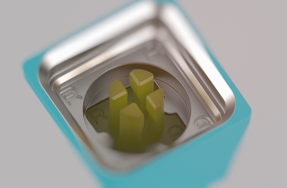
I should finally get the 3d printed prototypes in a week or so! Crossing fingers! Huge thanks to photekq for his help!
It is happening!
It is happening!
-
photekq
- Cherry Picker
- Location: United Kingdom
- Main keyboard: Various Cherry Corp keyboards
- Main mouse: Razer Deathadder (1st gen)
- Favorite switch: Nixdorf 'Soft Touch' MX Black (55g springs)
- DT Pro Member: -
- Contact:

-
stuplarosa

- AltGr
- Location: United States
- Main keyboard: backlit pok3r, filco majestouch
- Main mouse: microsoft sidewinder x3
- Favorite switch: cherry brown
- DT Pro Member: 0133
I know the Adler keycap shape was rejected, but what about the font? Does anyone know what that Adler font is? They seemed to use it on a number of machines.
- adler.jpg (418.33 KiB) Viewed 4307 times
-
Muirium
- µ
- Location: Edinburgh, Scotland
- Main keyboard: HHKB Type-S with Bluetooth by Hasu
- Main mouse: Apple Magic Mouse
- Favorite switch: Gotta Try 'Em All
- DT Pro Member: µ
That's a doubleshot font if I ever saw one.
And no, I don't mean that as a compliment! Way too much like Gorton Dummified for me.
And no, I don't mean that as a compliment! Way too much like Gorton Dummified for me.
-
mohitgarg
- Main mouse: R.A.T 7
- Favorite switch: Blue
- DT Pro Member: -
I was away for a while, so sorry for not knowing, but weren't you a huge fan of SA keycaps from some 7-bit Round, I remember you placing you a huge order. Seen you dissing MX, double-shot, SA more often now. Drastic change in taste? HHKB enlightenment?
-
stuplarosa
- AltGr
- Location: United States
- Main keyboard: backlit pok3r, filco majestouch
- Main mouse: microsoft sidewinder x3
- Favorite switch: cherry brown
- DT Pro Member: 0133
Ya. I definitely was not advocating doubleshot. Just looking at the font. I like the bigness and the boldness. For what it's worth, I think that's what draws people to Granite.
-
matt3o
- -[°_°]-
- Location: Italy
- Main keyboard: WhiteFox
- Main mouse: Anywhere MX
- Favorite switch: Anything, really
- DT Pro Member: 0030
- Contact:
I believe what Mu is saying is that often the boldness and roundness of double-shot legends are due to the intrinsic limitation of the technology more than an artistic choice. what we could do with dye-sub is much more diverse and intricate.
-
nateth

- Location: United States
- Main keyboard: Ultimate Hacking Keyboard
- Main mouse: Logitech MX & Apple Magic Trackpad
- Favorite switch: Zeal Clickiez
- DT Pro Member: -
Any thoughts on something out of the box like Hoefler & Co.'s new Operator font?
http://www.typography.com/blog/introducing-operator
http://www.typography.com/blog/introducing-operator
-
zslane
- Location: Los Angeles, California, USA
- Main keyboard: RealForce RGB
- Main mouse: Basic Microsoft USB mouse
- Favorite switch: Topre
- DT Pro Member: -
It's a bloody shame Granite didn't end up with a grown up typeface...Muirium wrote: ↑Jackpot!
Real, grown up type, rather than goofy round edged stuff just to suit molding.