Page 4 of 7
Posted: 08 Jun 2015, 22:09
by jacobolus
Cool general idea, and great renders. What does SCM mean?
Is there a clear set of design goals for this project? If the goals are functional, rather than aesthetic, then I think this design is worse to type on than standard sculpted cylindrical/spherical profiles.
In particular:
* Theres much too little height step from the back of one keycap to the front of the next on the top 3 rows; especially row 2 keys are going to be really annoying to press
* There’s no functional advantage in tilting the tops of the keycaps for number row and F row so dramatically
* The spacebar would benefit from being a bit taller
* Row 6 is supposed to be a compromise between something good for a finger to reach down and press / something for a thumb to press, I take it? It’s not an especially good shape for either of those alone
I’d advocate:
* slightly reduce the height of row 3 and row 5, and make row 4 much lower, as low as you can
* reduce the tilt on rows 1, 2, and 3 until row 3 is approximately flat, and rows 1 and 2 are at most slightly tilted (at most like -8° for row 1)
* bump the height on the spacebar and on row 6
* consider making at least some row 6 keycaps in spacebar profile, to be nice to press with a thumb
* consider adding a low-profile convex keycap shape, to be placed in front of the spacebar in layouts like
https://www.flickr.com/photos/triplehaa ... 408828231/
I’m also not sold on the shape of the top of the keycaps, but that’s a pretty subjective preference sort of thing, and would take testing in person to judge properly.
Posted: 08 Jun 2015, 22:33
by chzel
rsbseb wrote: ↑chzel wrote: ↑BTW, what does SCM stand for? Spherical Cap Madness?
My initial inspiration was a set of Smith Corona keys I have. There really is nothing left of them in the design at this point but SCM was (Smith Corona Modified). It is just an arbitrary nod to my original inspiration.
I'd guess the goal is both functionality and aesthetics..?
I think the key shapes play a big role in deciding a favorite, but not too significant from a functionality standpoint (pathological conditions excluded). I believe most of us can easily switch from DSA to Cherry to IBM BS to whatever with just minutes of acclimatization and use it efficiently, even if we don't really like the shape.
BTW that is one crazy keyboard! I love it!
Posted: 08 Jun 2015, 22:41
by Muirium
What I'm crazy for in this project is the chance to get some tall spherical goodness on Topre mount. Rsbseb's testing the water for his manufacturing process, and I advised him to aim tall and go Topre.
Admittedly, the word ergo never even came up (despite my typing on the Matias Ergo Pro throughout!) as I'm with Chzel on the form vs. function argument. I find caps vary much more dramatically in looks than in usability. And I've quite a thing for vintage sphericals.
Bear in mind that Rsbseb is just getting started. If there's demand for ergonomic caps and a consensus about their design, he's just the guy to make them reality. I suspect the demand would be fairly MX heavy though thanks to the likely users being into the ErgoDox and their own custom boards.
Meanwhile, for everyone whose favourite switch is anything other than MX, we have a caps shortage of our own!
Posted: 08 Jun 2015, 22:42
by jacobolus
chzel wrote: ↑I think the key shapes play a big role in deciding a favorite, but not too significant from a functionality standpoint (pathological conditions excluded). I believe most of us can easily switch from DSA to Cherry to IBM BS to whatever with just minutes of acclimatization and use it efficiently, even if we don't really like the shape.
Nominally usable? Sure. But in my opinion DSA/SA on a flat keyboard sucks to type on, noticeably slower, less accurate, and less comfortable than other profiles for me. Same story for many cheap rubber dome keyboards with nearly flat profiles, or for those “Cherry MX Board” monstrosities or for laptop boards (though those have a slightly different character since switch travel is so low).
Posted: 08 Jun 2015, 22:48
by chzel
Sure, DSA is indeed crap on a flat board, and that's why I wouldn't use them on a keyboard I'd take to work.
I'd love to have a GMK or original Dolch, but I have to settle for DSA... I use them when typing for "recreation" and I can live with them just fine.
I haven't tried SA yet, but I guess an all R3 set would be much like DSA ergonomics wise.
Posted: 08 Jun 2015, 22:51
by Muirium
Depends on the way you type. I'm a hoverer, with far from formally trained technique, and I don't find much of a difference. I don't stay good and low on homerow, which slows me down I'm sure, but I don't get RSI either so I can live with it!
DSA's flat function row is the one that bothers me when I'm moving up there. Otherwise even those flat guys are okay, if not great. I wouldn't call them crap. So much nicer to use than the stock OEM caps on my NovaTouch for instance. Because I'm talking about nice PBT DSA. Material makes a difference too. For some of us.
Posted: 08 Jun 2015, 22:52
by jacobolus
My point is just: if the inspiration here is tall vintage spherical keycaps, like those on a Selectric 2 typewriter or many computer keyboards from the 70s, it’s worth figuring out what features of those are important and the reasoning behind them from first principles, critically examining that reasoning and either either accepting it to guide new work or rationally rejecting it with some thoughtful alternative.
If the only goals are aesthetic, then sure, do whatever you think looks prettiest. If the goal is to be nice to type on, then it’s worth thinking a bit about the biomechanics of the hand and fingers, and trying to place the keycap tops where they’ll be easiest to strike.
Anyway, I’m not likely to ever use the output of this project, so it doesn’t ultimately matter one way or another to me or affect me in any way. I’m just offering advice based on my own thinking about the subject. Take it or leave it.
Posted: 08 Jun 2015, 23:02
by rsbseb
@jacobolus That's a lot to digest, but digest I will. The 2-3 step has been a bit of a concern for me as well and is the result of of an attempt to keep the profile height down a bit and is being refined as I type. In fact the over all height across the top 4 rows in the profile are being refined and it looks like there will be some adjustment in some of the tilt as a result, although not as much as you are recommending.
Height of the space bar is not something I had taken a second look at but will do so. Convex caps for the lower row in several sizes has been requested and will ultimately be made available.
As far as height for potential caps in front of the space bar I don't know where to even begin. I have never seen such a board in use let alone talk to any one about a preference for such a key. If you have any recommendations on that detail I would be very interested to hear it.
Aesthetics certainly a part of the design goal as well is functionality. The perfect profile is not. I believe that there is an aspect of personal preference in every detail of keyboarding that would make that an unrealistic venture. The alternative is to provide options to better suit a variety of users not just in profile but in available mounts. This initial set is intended to be a launch pad for further refinements and options. Alternate row profiles or even an entirely different profile are almost a certainty over time.
Thanks for your input
Posted: 08 Jun 2015, 23:15
by jacobolus
My recommendation: try to get prototypes made of 4–5 different sets in different profiles (via 3d printing or milling them out of some material, or heck, even by just piling clay on the top of existing keycaps) and try typing on them, before you make an expensive investment in injection molding tooling. If you spend a few days exclusively typing on each one, and then at the end spend a day or two switching between different ones every 30m or so, stopping in those breaks to reflect on how fluid, comfortable, and accurate your typing seems, you should be able to get a pretty good feel for what features you want in practice.
You can somewhat approximate this experimentation by using existing keycap sets, but some of the comparisons will be slightly tricky because so many other features of the keycaps (top shape, material, cap thickness, type of switches it fits on) vary.
Or if you don’t want to think about it that much, just copy SP’s SS or DSS profiles, which they are no longer producing.
Posted: 09 Jun 2015, 00:04
by rsbseb
Personally I am not much of a typist so all the evaluation outside of observation has to be done by others. I have 8 individuals on 3 different continents will be receiving prototypes with some options to evaluate. The design work may not be completely optimal but it has not been conducted in a total void and some preliminary (admittedly biased) testing has been done. Again I thank you for your thoughtful evaluation and welcome your continued input in open forum or by PM.
Scott
Posted: 09 Jun 2015, 01:20
by Findecanor
jacobolus wrote: ↑... like those on a Selectric 2 typewriter ...
I noticed that the keys on the numeric row on a Selectric are almost parallel to the frame around the keys...
So from what I can see, the angles of the keys
look quite similar to how they are on a "standard" set of cylindrical keys but maybe there is a little bit more curve. I think that cylindrical keys often have a too small angle on the bottom-row alphabetic row.
I don't know the angles of the type arms though...
It has also been theorized that SP's SA profile wasn't originally meant for straight-up key switches but for key stems that are tilted a number of degrees toward the top.
I have also laid forward the theory that cylindrical keys got angled slightly more to make up for the front edge being less sharp than on spherical key tops.
Posted: 09 Jun 2015, 01:50
by jacobolus
Findecanor wrote: ↑jacobolus wrote: ↑... like those on a Selectric 2 typewriter ...
I noticed that the keys on the numeric row on a Selectric are almost parallel to the frame around the keys... So from what I can see, the angles of the keys
look quite similar to how they are on a "standard" set of cylindrical keys
That’s correct. All the sculpted keycap profiles since the 70s are in one way or another descended from the Selectric 2 profile.
IBM’s cylindrical caps in the early 80s were based on a uniform keycap shape but curved switch plate, but other companies who made cylindrical keycaps for flat keyboards based the profile on the steps and angles from sculpted spherical keycaps.
I have also laid forward the theory that cylindrical keys got angled slightly more to make up for the front edge being less sharp than on spherical key tops.
I’m not sure what you mean by “angled slightly more”.
Historically, the tilt of the home row keycaps has been chosen such that the tops will be parallel to the table when placed on a keyboard, which is typically tilted up at the back, and other rows’ keycap tops slope downward on the side of the home row. Personally I think this is an arbitrary and not very effective criterion, based mostly on aesthetic rather than ergonomic considerations.
Posted: 09 Jun 2015, 04:07
by Findecanor
jacobolus wrote: ↑Historically, the tilt of the home row keycaps has been chosen such that the tops will be parallel to the table when placed on a keyboard, which is typically tilted up at the back[...}
Hmm.. You made me look through some of my keyboard collection to see if the cylindrical home rows are parallel to the desk. Damn you.

On most keyboard types the home-row keys are slanting forwards ... except when the legs are up. When the legs are up almost all of these are practically parallel to the desk. This includes the IBM Model M.
However, the home row on my Cherry Corp. keyboards and my Dell AT101W are parallel to the desk when the legs are down.
The odd ones that slant towards the user are the Apple Standard Keyboard and the IBM Model M2 with legs up.
The DEC LK201 had been designed after a bit of study and it became influential in many ways. I don't have one but there are very good images in the Wiki. It has a curved backplane with tilted keys, except for the function-key row.
I would say that IBM copied much of the design when they designed the Model F/M, except that the tops of the LK201's keycaps are spherical and IBM's are cylindrical.
I have had the successor: LK401, though. It appears to have the same kind of slant and also spherical keycaps. I remember only that I did not like it because the slant of the keycaps was too large - the slant is increased by the surface being spherical.
Posted: 09 Jun 2015, 08:39
by jacobolus
DEC LK201 definitely postdates the first Model Fs. I’m not sure if IBM was the absolute first to make a curved plate design. Certainly there were several types of rubber dome boards with curved plates around the same time at the beginning of the 80s. HaaTa might know what the earliest ones were.
(BTW, those DEC keyboards are all pretty unpleasant to type on.

)
Posted: 09 Jun 2015, 13:52
by Findecanor
jacobolus wrote: ↑DEC LK201 definitely postdates the first Model Fs.
Aww.. OK then. I stand corrected.

The DEC LK201 does have home-row-keys that are slanting forwards. The keys on the QWERTY row are closer to being parallel with the desk.
Posted: 10 Jun 2015, 05:34
by rsbseb
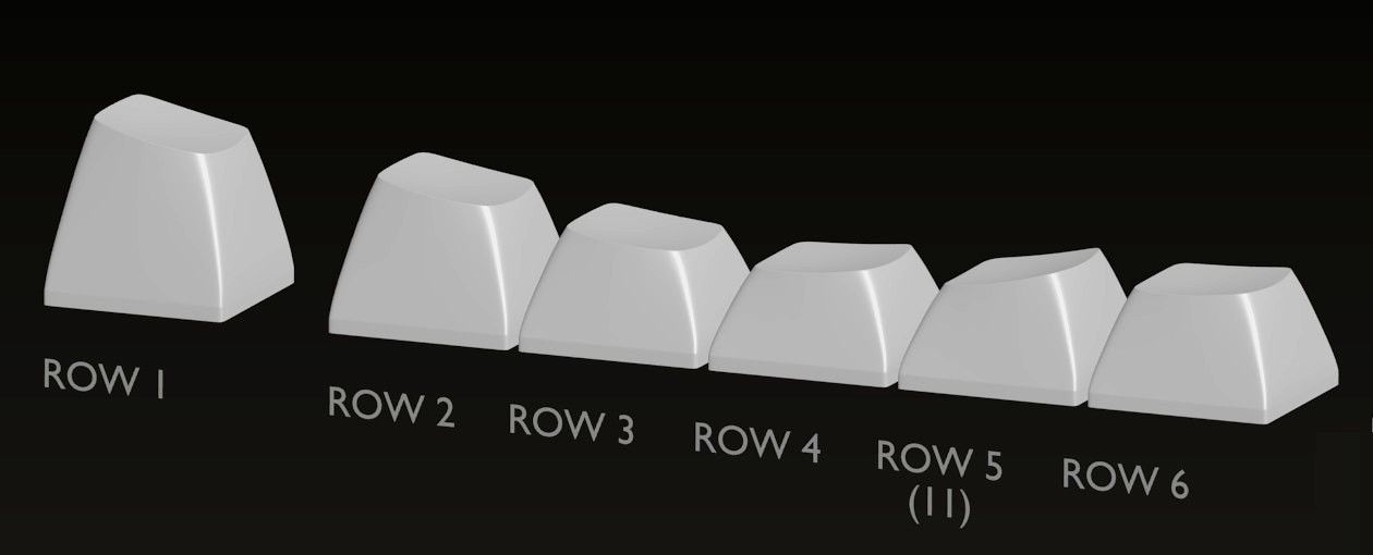
SCM has been cleaned up and the transitions are smoother. The tilt in rows 1-3 have been reduced and the overall height of row 3 has been reduced providing more predictable stepping. I have updated the profile image and specs in the original post.
The space bar has also been raised as recommended by jacobolus. The top of the convex surface sits slightly above the average height of the face on the concave caps of the same row. While there wont be any row 6 keys in the initial prototype sets that are going out, I do have a question about them. There has been requests for both concave and convex in that row (6). I am not against providing both but may need to select one for initial production. If only one were to be available which should it be, and why?
Most of the material for the molds made it to the shop today. Mold work should commence sometime next week.
Re: SCM Profile
Posted: 10 Jun 2015, 05:50
by Techno Trousers
I'd vote for concave for row 6. Convex on the Dell AT101s just feels odd to me. I think the main purpose of the convex space bar is so it feels smoother on the thumb, which is hitting it at an angle instead of straight down. I don't think most people are pushing the other row 6 mods with the side of their thumbs.
Posted: 10 Jun 2015, 10:13
by jacobolus
Techno Trousers wrote: ↑I don't think most people are pushing the other row 6 mods with the side of their thumbs.
On a standard keyboard (e.g. on a laptop), I mostly use my thumb for command and option keys (though when pressing both at once I use another finger for option), and I put the control key where caps lock is on many keyboards. A significant percentage of other people also use their thumbs for bottom row modifiers.
This is one reason I personally think a spacebar on a standard-ish-layout keyboard (i.e. not a split column-staggered board) should be split with each side 2–2.5 units wide, so that neighboring bottom-row modifier keys can be closer / more accessible to the thumbs.
Like:
or:

Re: SCM Profile
Posted: 10 Jun 2015, 11:26
by chzel
Yeah, thumb user here too (side mostly) Don't mind if it's a bit concave, but too much of an edge might be problematic.
Posted: 10 Jun 2015, 13:31
by Muirium
Another thumber. I'd really like to see convex. But I can live with testing concave if that's the majority wish.
Posted: 10 Jun 2015, 14:21
by Findecanor
I press both Alt keys with my thumbs. But hey, all concave would be better than all convex: The arrow keys are not used with the thumbs - the hand is usually moved down a bit to use them.
Japanese Topre Realforce with cylindrical keys have convex Henkan and Muhenkan keys: the two keys to the left and right of the space bar, but the other modifiers on the bottom row are not convex. The Japanese Topre Realforce HiPro has all concave modifiers though.
chzel wrote: ↑[...] too much of an edge might be problematic.
BTW. Many users of Topre Realforce and HHKB (and of Signature Plastics SP profile) rotate their Space Bars 180° because the front edge is otherwise too sharp for them.
Posted: 10 Jun 2015, 15:57
by SL89
I know it sounds odd, but mark me down for concave. I really use both thumbs and pinkies to hit Row 6 and tend to use the convex feeling of the spacebar to know which is space and which isnt.
Posted: 10 Jun 2015, 16:24
by Muirium
Reversed spacebars are a sacrilege and a scourge! There's nothing "too sharp" about Realforce spacebars, or any others I have ever tried, frankly. They're nicer on the thumb than concave keys on the bottom row, and those aren't exactly vicious either.
Beamsprings have convex mods on the bottom row. Although only a precious few, as was the vintage style. Concave mods seem to be a buckling spring, cylindrical-age thing.
Posted: 10 Jun 2015, 17:07
by SL89
I use the edge, I wouldnt know what to do with a reversed spacebar.
Ik this is random but how convex were the mods on the beamspring?
Posted: 10 Jun 2015, 17:11
by pyrelink
I have never understood the complaint of any spacebar being "too sharp" and I always found myself flipping my space bar back around every time I tried it flipped.
I spacebar predominately with my left thumb in the center, and would probably put my vote in for convex. While my favorite spacebar ever is a concave honeywell, I feel like my space-barring would be suited to a convex cap. Although, I could certainly live with a concave space bar. And I would also really like to see the space bar taller as well.
Posted: 10 Jun 2015, 17:35
by Muirium
The spacebar will be convex for sure. We're talking about the adjacent mods, like Ctrl and Alt.
@Sleighty: Pretty convex. Mine are on their way to Matteo.
 http://deskthority.net/post235494.html#p235494
Posted: 10 Jun 2015, 17:44
by DanielT
The Dell Alps boards have convex mods, I have this on my Alps 60% and I must say the feeling is great. I love the convex bottom row.
Flipping spacebars is ugly and a profanity

Re: SCM Profile
Posted: 10 Jun 2015, 17:46
by SL89
Hmm now I'm torn. If only just to try them. I have a Dell board with ALPS maybe I can dig t it up.
Posted: 10 Jun 2015, 19:05
by Muirium
Convex mods are well worth a try for anyone. Very different. And potentially awesome.
Posted: 10 Jun 2015, 19:38
by facetsesame
Half height convex mods (as on the Wang 724 and beam springs) are nice, incentivising use of the thumbs while being distinct from the space bar. This negates a tooling advantage of convex mods though - if the mods aren't the same as the space bar, you don't get to increase your portfolio of space bar sizes.
It seems I'm a hybrid case - I use fingers for Control but thumbs for Alt. If I were to encourage the habit perhaps I'd want both on the same board...
As my user self, if I had to pick one it'd be convex. If I were a toolmaker, if I had to pick one it'd depend how I'd support arrow keys and the numpad - if I'm already making concave 1 and 2 unit keys in row 6, the incentive is to make 1.25 and 1.5 unit keys the same. If the toolmaker me was intent on convex throughout, I'd like to see what the numpad vertical enter would look like!