Page 12 of 58
Posted: 22 Feb 2014, 00:06
by matt3o
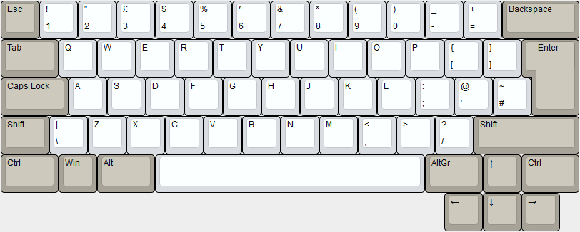
can I haz more keys horizontally?

Posted: 22 Feb 2014, 00:08
by matt3o
Muirium wrote:Speaking of which: what's the plan for the lower layers of the cases? My 60%'s a stepped design as you can see: thicker at the back than the front. I'm thinking of trying some more of that this time.
I'd say the case will be a plain old box¸ but I have to find a way to fit the teensy and the usb port.
Posted: 22 Feb 2014, 00:11
by sean4star
jdcarpe wrote:I was thinking something like this? With a full tenkey on the right...

What a monster! What would you put in the big block on the left? It's pretty big for just navigation. F-keys and nav? I can't seem to picture how it would all go together.
Posted: 22 Feb 2014, 00:21
by Muirium
Well that's the thing: you've got a lot of customisable keys there in a nice logical layout, like a Tipro on the side. All these keyboards are Teensy powered, remember: so fully customisable logic.
Re: case shape, what I like about a stepped design versus a flat box is that the case sits closer to the desk (instead of raised at the back as much on its feet) so it has a lower centre of gravity, and feels more stable. I'm considering a multiple step design (my god, it's made of mezzanines!) to enhance this effect.
It also has the side effect of greatly increasing free space inside the keyboard body for, oh, say Bluetooth mods and such!
Posted: 22 Feb 2014, 08:42
by matt3o
we will have "wedding cake" feet design, and being PCB based we can keep the height under control (should be 12mm top to bottom). The mezzanine solution is nice but too complex if it has to be done on N case designs and it doesn't give any functional advantage.
Posted: 22 Feb 2014, 13:36
by rapax24
i use the numpad a lot at work and i must say i think it's totally worthless if you only have numbers insted of the full version;when you have to deal with numbers you need also operetors most of the time.
anyway i'm not interested in that kind of layout for this groupbuild but i thought i could just give this advice (also other people could have different opinions)
Posted: 22 Feb 2014, 14:03
by Muirium
Other people always have different opinions…
I use a numpad infrequently, but quite intensely when I do. For me it's numbers only. And I'd rather have it on a layer anyway, with something else up front. The idea of sharing the space with the navigation keys is what's attracting my interest. Yet there's no elegant way not to throw off overall symmetry without adding two blocks.
Posted: 22 Feb 2014, 15:21
by matt3o
Playing with the idea of placing a stepped control on the last row just before the arrow cluster...


Posted: 22 Feb 2014, 15:34
by rindorbrot
That could be an interesting idea.
But where would we get a fitting cap for it? Would it be the same profile as normal capslock in round5?
Edit: Ah right, bottom row is also Row3 at R5 so it would fit I guess.
Posted: 22 Feb 2014, 15:36
by matt3o
rindorbrot wrote:That could be an interesting idea.
But where would we get a fitting cap for it? Would it be the same profile as normal capslock in round5?
Edit: Ah right, bottom row is also Row3 at R5 so it would fit I guess.
DSA is the best profile for custom keyboards. No rows, mix and match in any way you want!
Posted: 22 Feb 2014, 16:00
by Muirium
Perhaps. But SA is the best profile, period. Well, to me.
DSA has stepped caps lock / control? How deep is the step? And does the same noncentred stem rule apply?
Posted: 22 Feb 2014, 16:14
by matt3o
Muirium wrote:Perhaps. But SA is the best profile, period. Well, to me.
SA is peachy, but being into custom keyboards, nothing beats DSA.
Muirium wrote:DSA has stepped caps lock / control? How deep is the step? And does the same noncentred stem rule apply?
of course it has. same rules apply. no idea about the depth, I'd say half of the key. I'll check later.
EDIT: I checked, it's more at 1/3
Posted: 22 Feb 2014, 16:22
by Muirium
Same rules = both are possible with the same layout. Good news to me! Because that's actually quite a nifty idea you've got there.
I'd say that DSA was better if it weren't for 7bit's work in making so many options available in Round 5. Follow his lead and make a TENKLESS kit when you run DSA PBT beige dyesub: one to rule them all!
Posted: 22 Feb 2014, 16:33
by matt3o
Muirium wrote:I'd say that DSA was better if it weren't for 7bit's work in making so many options available in Round 5. Follow his lead and make a TENKLESS kit when you run DSA PBT beige dyesub: one to rule them all!
you definitely don't remember DSA Retro
we were even selling single blank keys...
Posted: 22 Feb 2014, 16:38
by Muirium
I just missed it like I missed Round 4. Then ironically bought my beloved SPH set from you, while I still don't have any DSA caps. Although it feels like I've been in Hannibal's army long enough to sack Rome, this is actually my first caps group buy with 7bit too!
Posted: 22 Feb 2014, 16:57
by Findecanor
matt3o wrote:Playing with the idea of placing a stepped control on the last row just before the arrow cluster...
Like older Goldtouch. They had a stepped Shift key also.
rindorbrot wrote:But where would we get a fitting cap for it?
If you make it 2.5u wide you could steal the keycap from
this.
Posted: 22 Feb 2014, 18:17
by Nuum
Maybe its a little late for suggestions, but how about something like this:
- Shifted Arrows
- KeyboardLayoutShiftedArrows.PNG (19.17 KiB) Viewed 4244 times
This way its not as wide as with integrated arrow keys and you could easily use some old Alps keycaps with it. Its not exactly easy to find a 1.75u Shift key for Alps. I would like it for Cherry MX, too.
Posted: 22 Feb 2014, 19:34
by matt3o
I don't like the long row of unused space though
Re: Group Build prototyping phase
Posted: 22 Feb 2014, 20:39
by Broadmonkey
Plus it's not very comfortable to reach for the arrows that far down.
Posted: 22 Feb 2014, 21:54
by shrapneL
Definitely like the Matt-1. Minimal for me please
Posted: 23 Feb 2014, 11:12
by Muirium
I like the look of a 40%, too, but the asymmetry puts me off. Thinking of which: here's a chart of the designs I've proposed so far, all lined up so you can see where their home rows are.
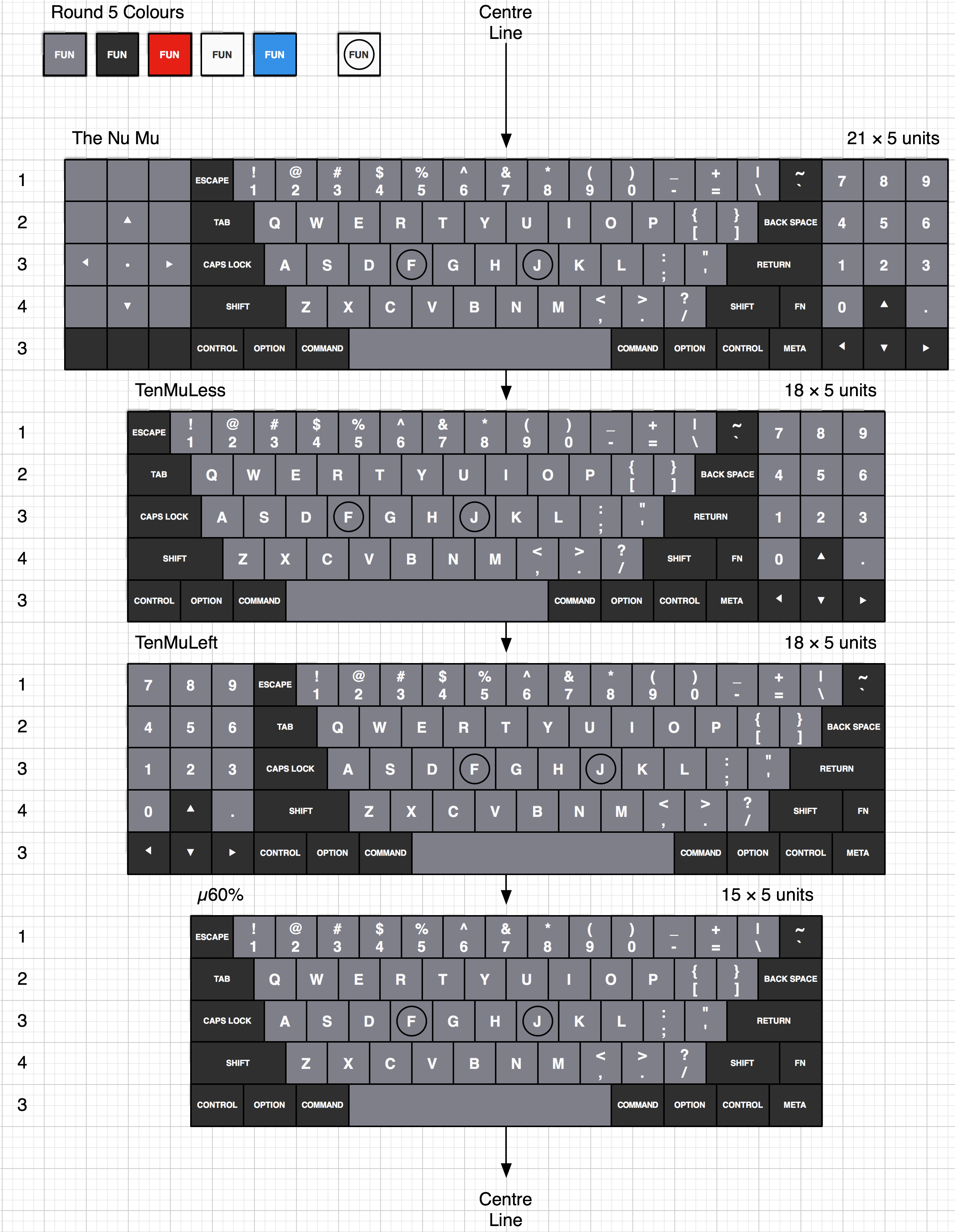
- The Family Mu.png (820.27 KiB) Viewed 4175 times
The classic TKL is an inherently asymmetric beast. Not as bad as a traditional full size keyboard, but now I can see why I'm shuffling my SSK and Ducky sidewards. Trouble is, it's actually quite a challenge to lay out a keyboard with home row plumb in the middle. Adding spacing between the functional islands only makes things worse.
Posted: 23 Feb 2014, 12:06
by matt3o
I don't really share the love for symmetry, but I like all your designs Muir. Maybe the first one is a bit too much though.
What do you think of adding a 0.25 gap between the main board and the side pads?
The 60% is a little out of standard, it might be a problem to source the backspace in future GBs
Posted: 23 Feb 2014, 13:03
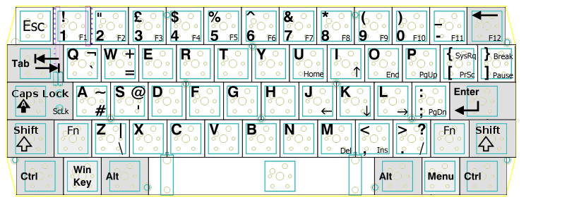
by matt3o
PS: if you like symmetry... why not something like this

Posted: 23 Feb 2014, 13:41
by Muirium
You turned off your unit markings. I can't quite see what you did there.
Actually, what I really need to do is design with a smaller space bar again. I will have a few! And maybe think 40-60%.
Posted: 23 Feb 2014, 13:43
by matt3o
I just redistributed 0.50u among 10 keys (increasing the gap between keys slightly). I doubt you can actually tell the difference.
Posted: 23 Feb 2014, 14:10
by Soarer
More symmetry:
Posted: 23 Feb 2014, 14:29
by matt3o
I might end up doing the mirror layout...
Posted: 23 Feb 2014, 19:12
by Madhias
What is the mirror layout?
Posted: 23 Feb 2014, 19:16
by matt3o
madhias wrote:What is the mirror layout?
Posted: 23 Feb 2014, 19:54
by olive
How about this minor change in the mirror layout, which I quite like by the way: put the ~/` key between Esc and 1.
I realise it's not a big deal if a Teensy pilots the keyboard anyway