SA would be double shot hence ABS.
for DSA I don't know what surface tooling they have available.
Anyway it seems the needle is slightly bent toward DSA. I'll try to make some layouts and ask for a quote.
The good news about dyesub is that blanks make the legended price go down. So if we sell 100 blank set and 100 legended, the tier is 200.
IC/Discussion on beige set
-
matt3o

- -[°_°]-
- Location: Italy
- Main keyboard: WhiteFox
- Main mouse: Anywhere MX
- Favorite switch: Anything, really
- DT Pro Member: 0030
- Contact:
-
Muirium

- µ
- Location: Edinburgh, Scotland
- Main keyboard: HHKB Type-S with Bluetooth by Hasu
- Main mouse: Apple Magic Mouse
- Favorite switch: Gotta Try 'Em All
- DT Pro Member: µ
And with dyesub you (the organiser) design your own legends? Because I have a font suggestion for you…
I hope Helvetica legends don't become my unattainable dream, like Dirge's saffron function row!
I hope Helvetica legends don't become my unattainable dream, like Dirge's saffron function row!
-
matt3o
- -[°_°]-
- Location: Italy
- Main keyboard: WhiteFox
- Main mouse: Anywhere MX
- Favorite switch: Anything, really
- DT Pro Member: 0030
- Contact:
not sure sharp edged fonts are the good choice for dye sub
-
Muirium
- µ
- Location: Edinburgh, Scotland
- Main keyboard: HHKB Type-S with Bluetooth by Hasu
- Main mouse: Apple Magic Mouse
- Favorite switch: Gotta Try 'Em All
- DT Pro Member: µ
Any way to see a sample? Other than the PBT dyesub Helvetica that's all over the HHKB!

Best of all for retro key styles, it's authentic. The font of choice for many 80s (and earlier) keyboards, not least IBM.
Best of all for retro key styles, it's authentic. The font of choice for many 80s (and earlier) keyboards, not least IBM.
Last edited by Muirium on 02 Jul 2013, 11:55, edited 1 time in total.
-
matt3o
- -[°_°]-
- Location: Italy
- Main keyboard: WhiteFox
- Main mouse: Anywhere MX
- Favorite switch: Anything, really
- DT Pro Member: 0030
- Contact:
I'd go with a slightly rounded type, similar to the one used by Apple. But indeed helvetica is a safe bet.
-
Grond

- Location: Milan, Italy
- Main keyboard: Keychron K2
- Main mouse: Kensington Slimblade
- Favorite switch: Cherry MX Blue
- DT Pro Member: -
Model Ms have PBT dye subs with Helvetica.
Also, another plus of dye subs over doubleshots is that legends can be thinner. So maybe we could even go Helvetic Neue Ultra Light, I guess that could be elegant.
Also, another plus of dye subs over doubleshots is that legends can be thinner. So maybe we could even go Helvetic Neue Ultra Light, I guess that could be elegant.
Last edited by Grond on 02 Jul 2013, 12:01, edited 2 times in total.
-
Muirium
- µ
- Location: Edinburgh, Scotland
- Main keyboard: HHKB Type-S with Bluetooth by Hasu
- Main mouse: Apple Magic Mouse
- Favorite switch: Gotta Try 'Em All
- DT Pro Member: µ
The particular type Apple uses on keyboards is VAG Rounded, the Volkswagen font!

It's okay but not nearly as classic as Helvetica.
It's okay but not nearly as classic as Helvetica.
-
matt3o
- -[°_°]-
- Location: Italy
- Main keyboard: WhiteFox
- Main mouse: Anywhere MX
- Favorite switch: Anything, really
- DT Pro Member: 0030
- Contact:
I find CoreHumanistSans very nice, if we want to go with a more modern fonttype.
Please note that SP is not a typography, they do dyesub but we have to be careful with the legends (eg: not too thin, not too sharp, etc...)

Please note that SP is not a typography, they do dyesub but we have to be careful with the legends (eg: not too thin, not too sharp, etc...)
-
Muirium
- µ
- Location: Edinburgh, Scotland
- Main keyboard: HHKB Type-S with Bluetooth by Hasu
- Main mouse: Apple Magic Mouse
- Favorite switch: Gotta Try 'Em All
- DT Pro Member: µ
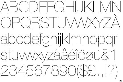
Indeed, thin is beautiful but also a tough order to always get right. Round is safer, albeit not as sweet to my eye. Here's a quick sampler I put together of the other already mentioned versions of Helvetica:
It's one of the most adaptable fonts ever made.
Helvetica Neue, a very well considered remake of the 1950s original with an emphasis on consistency across symbols and non-Roman characters, isn't "too neue" for classic purposes, either: released in 1983. I'd go for Helvetica Neue in its purest regular weight, no smoothing, no thinning. It's just magic!
Anyway, good to see you fellow font nerds today!
- Helveticas.png (81.84 KiB) Viewed 11332 times
Helvetica Neue, a very well considered remake of the 1950s original with an emphasis on consistency across symbols and non-Roman characters, isn't "too neue" for classic purposes, either: released in 1983. I'd go for Helvetica Neue in its purest regular weight, no smoothing, no thinning. It's just magic!
Anyway, good to see you fellow font nerds today!
-
Grond
- Location: Milan, Italy
- Main keyboard: Keychron K2
- Main mouse: Kensington Slimblade
- Favorite switch: Cherry MX Blue
- DT Pro Member: -
I like both rounded and not rounded, but frankly I don't think there's any issues with sharp typefaces. Legends on the black on light blue set made by SP weren't rounded and there was no problem with them.
-
matt3o
- -[°_°]-
- Location: Italy
- Main keyboard: WhiteFox
- Main mouse: Anywhere MX
- Favorite switch: Anything, really
- DT Pro Member: 0030
- Contact:
I'll tune up with SP to pick the best solution.
I find that centered legends are better rounded (actually are there any spherical with sharp types?) but I'll take no decision without community support, don't worry.
I find that centered legends are better rounded (actually are there any spherical with sharp types?) but I'll take no decision without community support, don't worry.
-
Elrick

- Location: Swan View, AUSTRALIA
- Main keyboard: Alps - As much as Possible.
- Main mouse: MX518
- Favorite switch: Navy Switch, ALPs, Model-M
- DT Pro Member: -
Because the magic three letter word "DSA" has me reaching for my wallet already. I couldn't care less what type font is used but knowing you, it will be very suitable and "retroesque" (if such a word exists)matt3o wrote:I find that centered legends are better rounded (actually are there any spherical with sharp types?) but I'll take no decision without community support, don't worry.
Getting a DSA PBT set, that would be highly desirable, beyond words.
-
rindorbrot

- Location: Bavaria, Germany
- Main keyboard: Phantom, GON NerD 2.0 TKL
- Main mouse: Zowie ZA11
- Favorite switch: MX Ergo-Clear, Nixdorf Soft-Touch
- DT Pro Member: 0029
I want a Backspace key with this Schadenfreude on it!matt3o wrote:I find CoreHumanistSans very nice, if we want to go with a more modern fonttype.
Please note that SP is not a typography, they do dyesub but we have to be careful with the legends (eg: not too thin, not too sharp, etc...)
-
matt3o
- -[°_°]-
- Location: Italy
- Main keyboard: WhiteFox
- Main mouse: Anywhere MX
- Favorite switch: Anything, really
- DT Pro Member: 0030
- Contact:
Also... would be nice to have 1 proxy per continent or at least 3 (US, EU, Asia/Australia).

-
Muirium
- µ
- Location: Edinburgh, Scotland
- Main keyboard: HHKB Type-S with Bluetooth by Hasu
- Main mouse: Apple Magic Mouse
- Favorite switch: Gotta Try 'Em All
- DT Pro Member: µ
It's nice, but a bit similar to the (SP standard) DSA retro font. Not quite sold on the numbers, either. They look jumpy to me: up and down.
Schadenfreude backspace is a smart idea!
Schadenfreude backspace is a smart idea!
-
matt3o
- -[°_°]-
- Location: Italy
- Main keyboard: WhiteFox
- Main mouse: Anywhere MX
- Favorite switch: Anything, really
- DT Pro Member: 0030
- Contact:
numbers can be fixed.
I'll make some mockups with both fonts.
I'll make some mockups with both fonts.

-
matt3o
- -[°_°]-
- Location: Italy
- Main keyboard: WhiteFox
- Main mouse: Anywhere MX
- Favorite switch: Anything, really
- DT Pro Member: 0030
- Contact:
I was expecting squirrels.
-
Muirium
- µ
- Location: Edinburgh, Scotland
- Main keyboard: HHKB Type-S with Bluetooth by Hasu
- Main mouse: Apple Magic Mouse
- Favorite switch: Gotta Try 'Em All
- DT Pro Member: µ
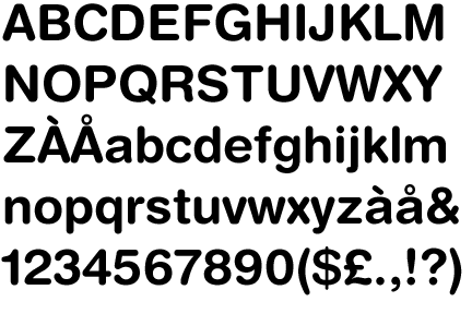
Core Humanist Sans uses "old style numbers" by default. Those are the ones where 7 and 9 hang down like a g while 6 stands tall like a b. Nice enough on door numbers, but not the best for keys. Fortunately, the font also contains an alternate set of regular numbers. Comparison:
They're still a little wonky and I plain dislike the 8, but a fair improvement. Just definitely try Helvetica Neue too!
- Core Humanist Sans.png (37.21 KiB) Viewed 11266 times
-
matt3o
- -[°_°]-
- Location: Italy
- Main keyboard: WhiteFox
- Main mouse: Anywhere MX
- Favorite switch: Anything, really
- DT Pro Member: 0030
- Contact:
you will never ever have a windows logo on a keyboard designed by medirge wrote:squirrel instead of a windows key for a laugh.matt3o wrote:I was expecting squirrels.
A couple of very rough tests. They are just to get a feeling on the typeface, they are not final by any means.
varela+humanist
- varela-mod.png (50.8 KiB) Viewed 11242 times
- helvetica-neu.png (48.29 KiB) Viewed 11242 times
-
Muirium
- µ
- Location: Edinburgh, Scotland
- Main keyboard: HHKB Type-S with Bluetooth by Hasu
- Main mouse: Apple Magic Mouse
- Favorite switch: Gotta Try 'Em All
- DT Pro Member: µ
Boring and authentic! The first mock looks like DSA Retro II: Beige. The second looks like the keyboards many of us used twenty something years ago.
Try a white legend on the mods. And Win? I think you misspelled Meta…
Try a white legend on the mods. And Win? I think you misspelled Meta…
-
matt3o
- -[°_°]-
- Location: Italy
- Main keyboard: WhiteFox
- Main mouse: Anywhere MX
- Favorite switch: Anything, really
- DT Pro Member: 0030
- Contact:
I think we will go DSA, so no white with PBT.Muirium wrote:Boring and authentic! The first mock looks like DSA Retro II: Beige. The second looks like the keyboards many of us used twenty something years ago.
Try a white legend on the mods. And Win? I think you misspelled Meta…
"WIN" actually should read "SUPER" (it was a layout I did for GMK so...)
Edit: I might be wrong, but all old spherical keyboards I've seen have rounded typeface...
-
Muirium
- µ
- Location: Edinburgh, Scotland
- Main keyboard: HHKB Type-S with Bluetooth by Hasu
- Main mouse: Apple Magic Mouse
- Favorite switch: Gotta Try 'Em All
- DT Pro Member: µ
I'll rummage about at the museum to see if I can find the spherical Helvetica to convince you!
Any chance of OPTION and COMMAND keys (1.25u will do) this time? COMMAND is the one I want most. WIN? NEVER!
Any chance of OPTION and COMMAND keys (1.25u will do) this time? COMMAND is the one I want most. WIN? NEVER!
-
matt3o
- -[°_°]-
- Location: Italy
- Main keyboard: WhiteFox
- Main mouse: Anywhere MX
- Favorite switch: Anything, really
- DT Pro Member: 0030
- Contact:
Please!Muirium wrote:I'll rummage about at the museum to see if I can find the spherical Helvetica to convince you!
Muirium wrote:Any chance of OPTION and COMMAND keys (1.25u will do) this time? COMMAND is the one I want most. WIN? NEVER!
Mac keys will be available. Blanks in all colors and variants too.Grond wrote:+1 for command, though blank will also be ok.
What about textless modifiers/nav?
-
phinix

- Location: Scotland - Glasgow
- Main keyboard: CM QuickFire Rapid MX Blacks -- Realforce R1 55g
- Main mouse: Logitech Pro Superlight
- Favorite switch: Topre, MX Blacks
- DT Pro Member: -
DSA PBT is the best choice I think.matt3o wrote:I think we will go DSA, so no white with PBT.Muirium wrote:Boring and authentic! The first mock looks like DSA Retro II: Beige. The second looks like the keyboards many of us used twenty something years ago.
Try a white legend on the mods. And Win? I think you misspelled Meta…
"WIN" actually should read "SUPER" (it was a layout I did for GMK so...)
Edit: I might be wrong, but all old spherical keyboards I've seen have rounded typeface...
Matt, are these the colors you want to go with? Not cream/beige? (or like those WCK and GAW)