I just got my
QWERkeys dye-sub group buy keycaps yesterday. This topic serves as both a photo gallery and a review.
My complete order of keycaps; I was actually wondering where these had got to:
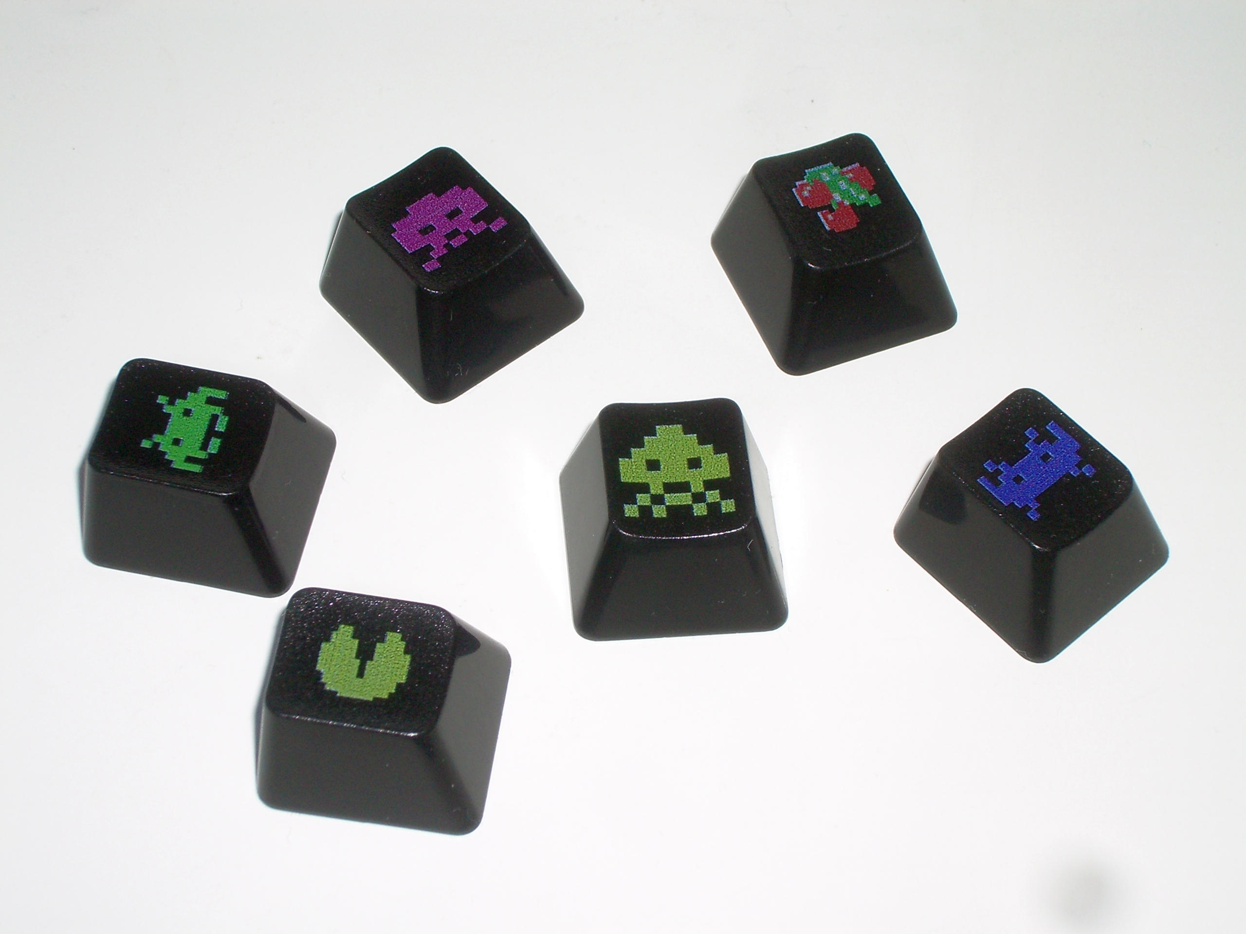
- Assorted keycaps.jpg (286.95 KiB) Viewed 2659 times
I am not entirely clear on how the legend is generated. One possibility is a white pad-printed base, dye sublimated image, and finally a carefully-cropped selective image UV lacquer. However, there appears to be signs of lacquer running down the sides, suggesting that the thickness of the highly raised printing is down to the pad-printed base, which is topped with all-over coating.
You can see how thick and shiny the legends are:
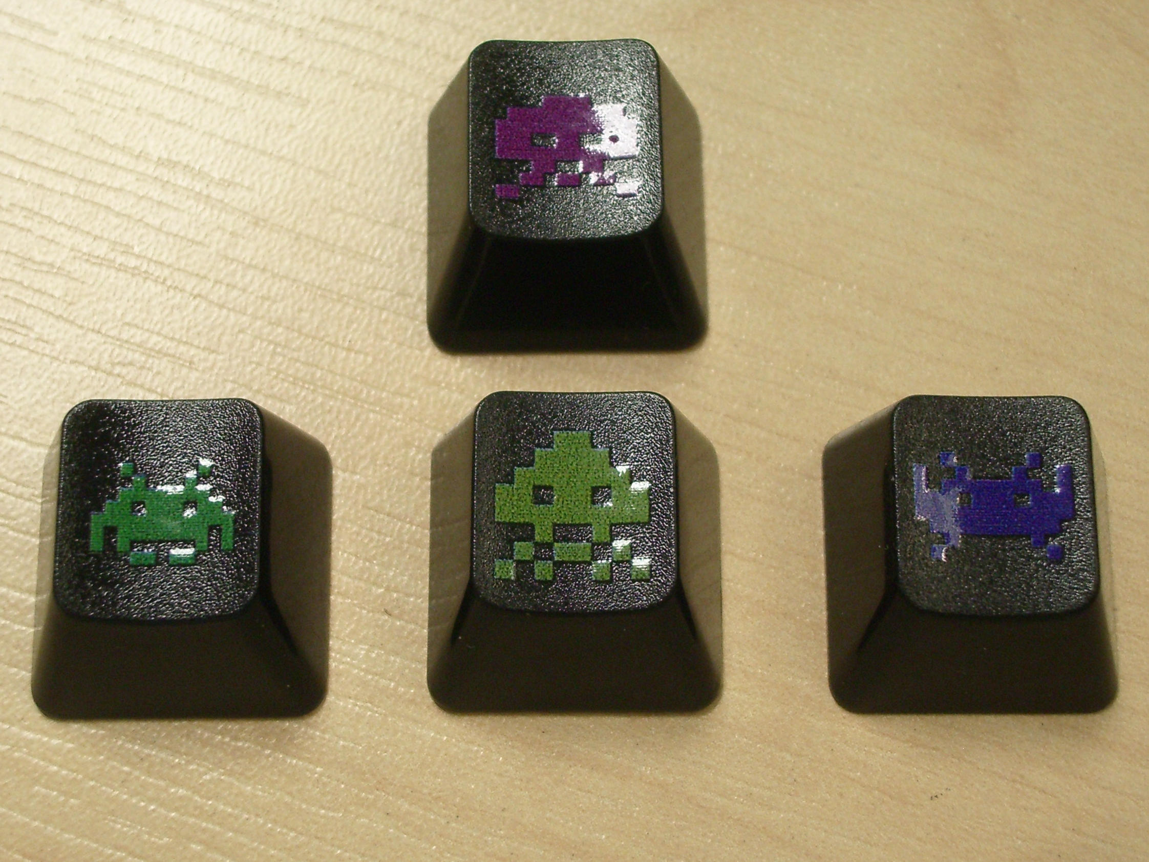
- UV lacquer thickness and shine.jpg (516.96 KiB) Viewed 2659 times
The walls are around 1.5 mm thick at the base, and appear to get thinner towards the top:
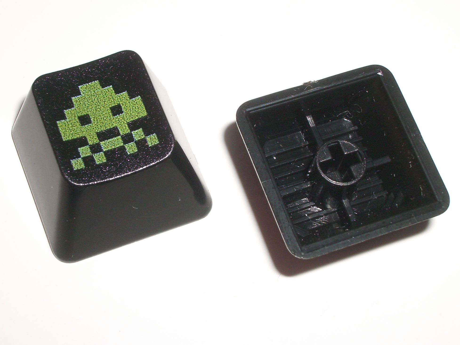
- Exterior and interior.jpg (208.27 KiB) Viewed 2659 times
The sprue mark is at the rear, where it belongs:
- Sprue mark at rear.jpg (103.93 KiB) Viewed 2659 times
The dot pitch of the dithering from the colour printing is particularly coarse, being readily visible with the naked eye:
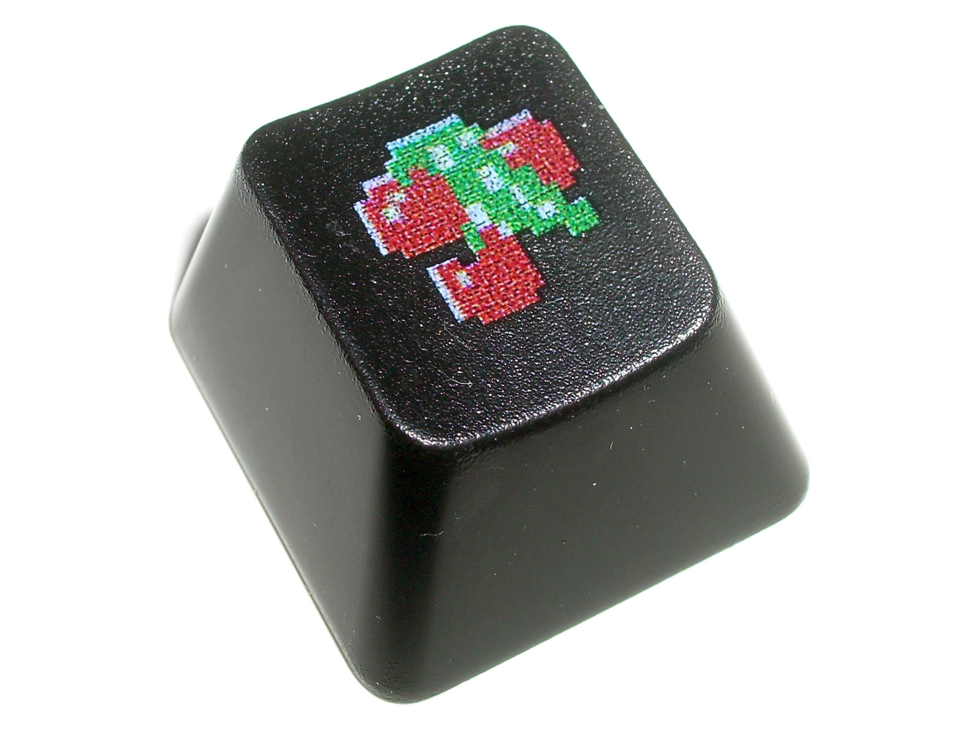
- Surface printing detail.jpg (275.07 KiB) Viewed 2659 times
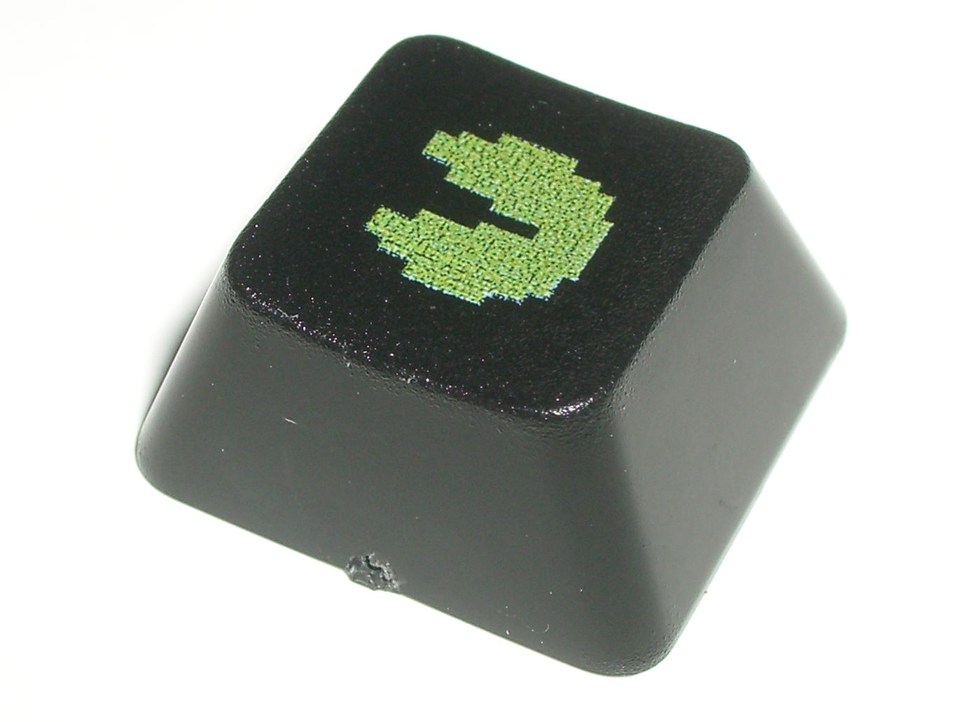
The most noticeable characteristic is that the printing is really dark. The following picture compares a QWERkeys dye-sub Pac-Man keycap side-by-side with a Signature Plastics double-shot "nuke" keycap; even if we ignore the fact that QWERkeys forgot what colour Pac-Man is (both of mine that should be yellow, are green) you can just how dark the colours are:
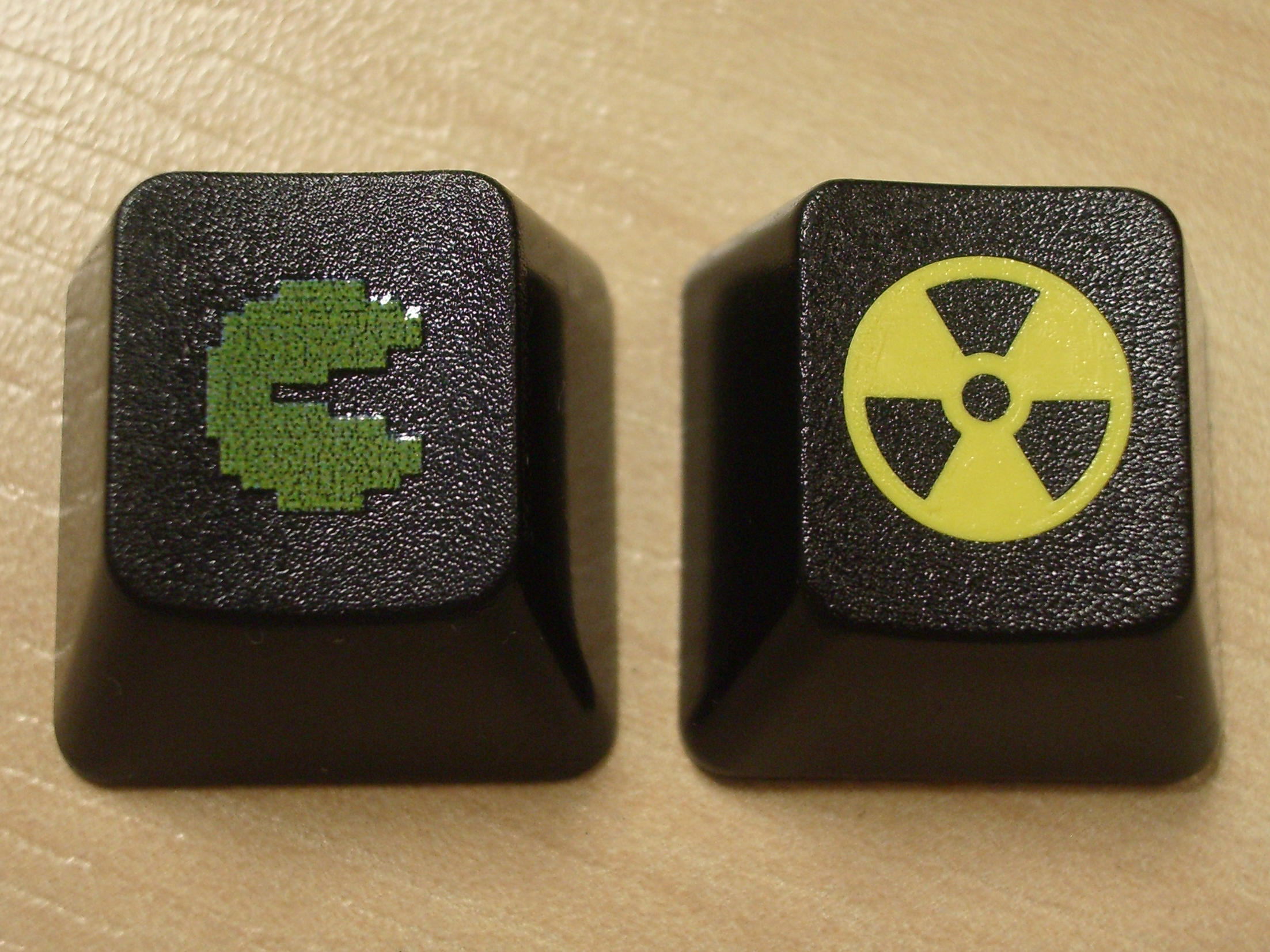
- Comparison with doubleshot.jpg (529.09 KiB) Viewed 2659 times
Here's an overall shot comparing Filco pad printing, QWERkeys dye-sub and Signature Plastics double-shot; these photos taken without the flash (on the fake wood background) are far more indicative of the dull colours than those taken with the flash (white background):
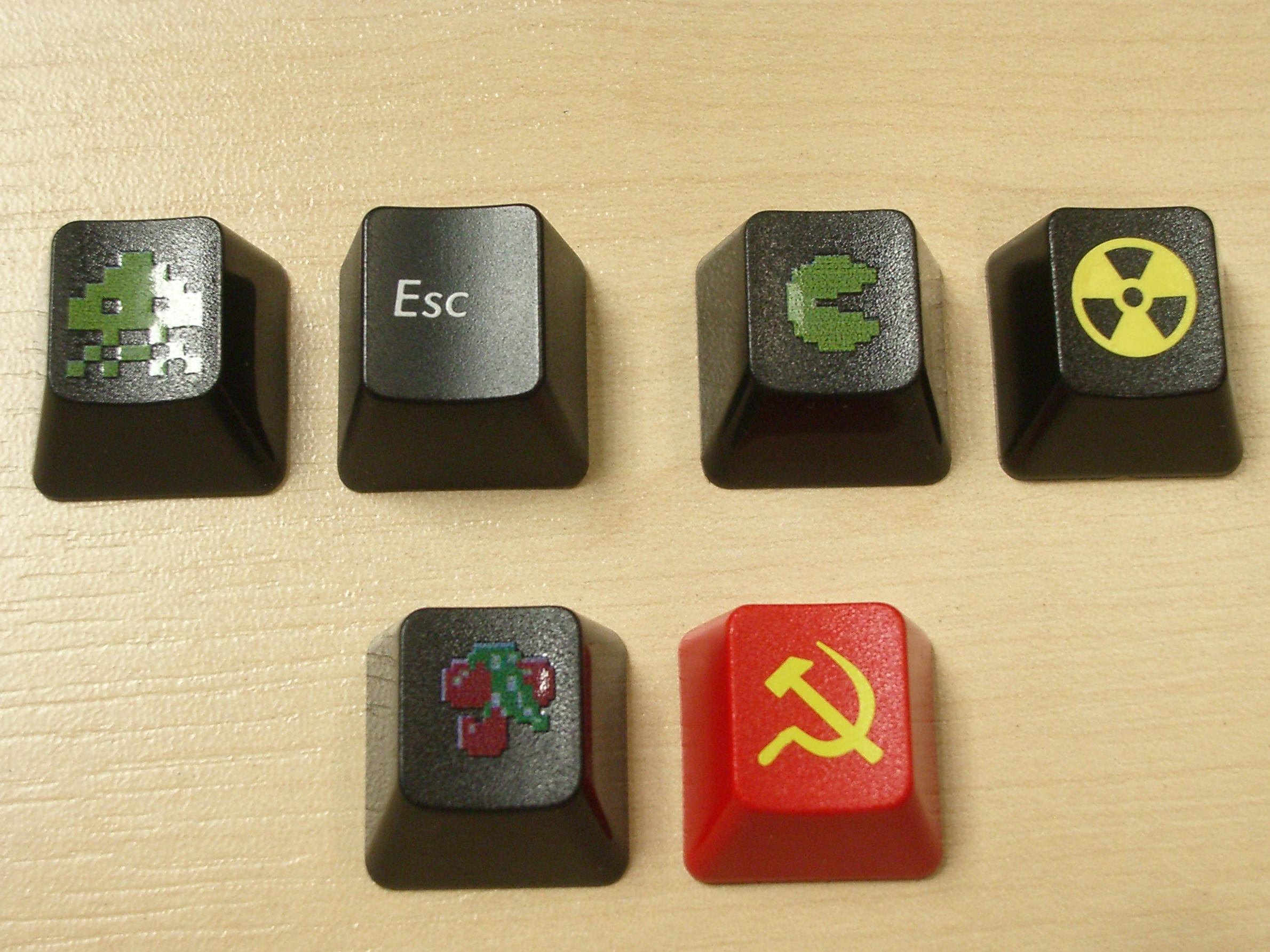
- Comparison with doubleshot II.jpg (544.47 KiB) Viewed 2659 times
I knew from the outset that the final product would not be as bright and sharp as the mock-up photos. The yellow colour in the samples nubbinator received isn't too bad, except I got green instead.
The technology is new, and hopefully in the future we will see it improve to the point that it can start to approach the vibrant colours offered by double-shot moulding, and without the painful distraction of the ultra-gloss printing.
As they stand, I've written them off as a dud, and they won't be going on my Poker II when it arrives, as I was planning. The legends are just too hard to see under normal lighting, and far too blotchy.
(Note: I would have liked to have used different SP comparison keycaps, but I have so few novelty keycaps that I had to dig out the same ones I've already used on the wiki! They're not normally my cup of tea (nor is tea, for that matter) but I was really enthused by Space Invaders keycaps ......)


