The other one still had a certain something-or-other. Though even if it existed I'm not sure I'd have the nerve; not even to annoy my gf. Which sort of proves that either it's quite questionable or that I'm a wimp.depletedvespene wrote: ↑Sadly, I know a couple women who'd happily use it. And another woman who'd happily use the other one
Post the ugliest keyboards you've seen!
-
vometia

- irritant
- Location: Somewhere in England
- Main keyboard: Durrr-God with fancy keycaps
- Main mouse: Roccat Malarky
- Favorite switch: Avocent Thingy
- DT Pro Member: 0184
-
fohat

- Elder Messenger
- Location: Knoxville, Tennessee, USA
- Main keyboard: Model F 122-key terminal
- Main mouse: Microsoft Optical Mouse
- Favorite switch: Model F Buckling Spring
- DT Pro Member: 0158
I would not use the G-Point mouse because it would probably not be very efficient, but if it actually existed and was not absurdly expensive I might buy one, as a "conversation piece" and because I really do think it is beautiful.
And to Elrick's point, no, I would probably keep it stored out of sight.
And to Elrick's point, no, I would probably keep it stored out of sight.

-
Blaise170

- ALPS キーボード
- Location: Boston, MA
- Main keyboard: Cooler Master Quickfire Stealth
- Main mouse: Logitech G502
- Favorite switch: Alps SKCM Blue
- DT Pro Member: 0129
- Contact:
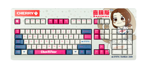
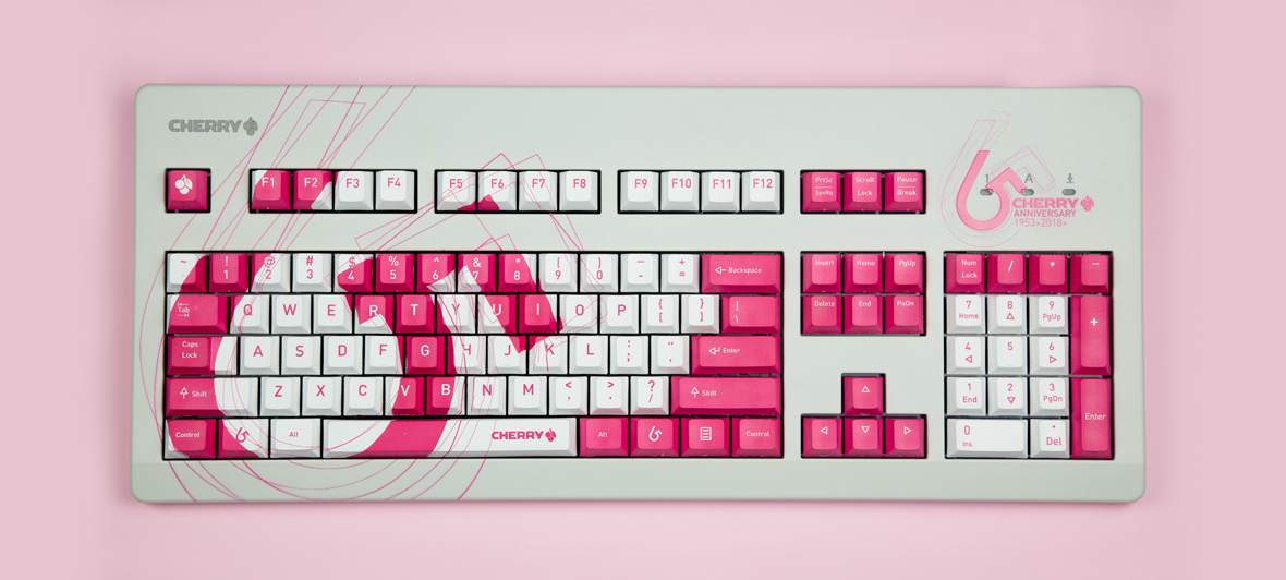
Those custom dyesub Cherry boards could be really cool if you chose a tasteful design. Though tasteful these are not.


-
Dingster

- Location: Slovenia
- Main keyboard: Novatouch
- Main mouse: MX518
- DT Pro Member: -
-
mike52787

- Alps Aficionado
- Location: South-West Florida
- Main keyboard: G80-5000HAAUS
- Main mouse: Zowie EC1-A
- Favorite switch: Vintage MX Black
- DT Pro Member: 0166
-
depletedvespene

- Location: Chile
- Main keyboard: IBM Model F122
- Main mouse: Logitech G700s
- Favorite switch: buckling spring
- DT Pro Member: 0224
- Contact:
Heck, I thought my XXK keyboard was hostile — clearly I had it the wrong way around...Drclick wrote: ↑
-
SwissArmyTin

- Location: Greenville, SC
- Main keyboard: Custom tenkeyless with Box Jades
- Main mouse: generic Dell
- Favorite switch: Blue Alps
- DT Pro Member: -
Not the ugliest board I've ever seen, but here's a cheapy Chinese clone board I recently picked up for $15:

The backlighting makes it infinitely worse though
The backlighting makes it infinitely worse though
Spoiler:

-
snacksthecat

- ✶✶✶✶
- Location: USA
- Main keyboard: SSK
- Main mouse: BenQ ZOWIE EC1-A
- DT Pro Member: 0205
- Contact:

This reminds me of something you’d find on an alien spacecraft; where it resembles something human but everything is just a bit foreign.
-
depletedvespene
- Location: Chile
- Main keyboard: IBM Model F122
- Main mouse: Logitech G700s
- Favorite switch: buckling spring
- DT Pro Member: 0224
- Contact:
Were it not for the woodgrain, I'd discard this a warped picture and not give it a second thought.
Dat Backspace... not to mention the other absurdly enlarged keys (and I can't figure out a comfortable way of actually using the center Enter key — wide enough but not tall enough; would have it been better if the center Backspace+Enter had been split vertically instead?).
Dat Backspace... not to mention the other absurdly enlarged keys (and I can't figure out a comfortable way of actually using the center Enter key — wide enough but not tall enough; would have it been better if the center Backspace+Enter had been split vertically instead?).
-
davkol
- Location: CZ
- Main keyboard: Kinesis Advantage2, JIS ThinkPad,…
- Main mouse: I like (some) trackballs, e.g., L-Trac
- Favorite switch: #vintage ghost Cherry MX Black (+ thick POM caps)
- DT Pro Member: -
You can press that Enter just like the B key on a regular keyboard, that's not a big deal, but I don't like how they've made some distant keys absurdly large (although it makes sense in a way: less precision, when moving a longer distance outside the focus area) and insisted on keeping the layout _somewhat_ similar to the standard… Truly Ergonomic or Atreus layout might be _too_ intimidating though.
-
AMongoose

- Location: Portugal
- DT Pro Member: -
That's an amazing 4th generation ergonomic layout mate.snacksthecat wrote: ↑This reminds me of something you’d find on an alien spacecraft; where it resembles something human but everything is just a bit foreign.Spoiler:
-
livingspeedbump

- Not what they seem
- Location: North Carolina, USA
- Main keyboard: Realforce 87u 55g
- Main mouse: CST Trackball
- Favorite switch: 55g Topre
- DT Pro Member: 0122
- Contact:
I can't find anything redeeming about this one.
-
SwissArmyTin
- Location: Greenville, SC
- Main keyboard: Custom tenkeyless with Box Jades
- Main mouse: generic Dell
- Favorite switch: Blue Alps
- DT Pro Member: -
What the...are those legends hand-written or something? Jeezumslivingspeedbump wrote: ↑I can't find anything redeeming about this one.Spoiler:
-
codemonkeymike
- Location: New Jersey
- Main keyboard: Ergodox
- Main mouse: Razer Naga
- Favorite switch: Box Jade
- DT Pro Member: -
Must have ordered a bunch of custom shit from WASD, those caps are complete shit.
-
depletedvespene
- Location: Chile
- Main keyboard: IBM Model F122
- Main mouse: Logitech G700s
- Favorite switch: buckling spring
- DT Pro Member: 0224
- Contact:
It's... it's a TKL, so there's no numpad brutalized here.livingspeedbump wrote: ↑I can't find anything redeeming about this one.

-
Haaaaaandrew

- Location: Minnesota
- DT Pro Member: -
My hhkb at one point. I've come a long way since then 

-
vometia
- irritant
- Location: Somewhere in England
- Main keyboard: Durrr-God with fancy keycaps
- Main mouse: Roccat Malarky
- Favorite switch: Avocent Thingy
- DT Pro Member: 0184
It has personality; it's not beige; it has a proper return key...livingspeedbump wrote: ↑I can't find anything redeeming about this one.
Admittedly it's dressed like that guy from Aerosmith but y'know.
-
depletedvespene
- Location: Chile
- Main keyboard: IBM Model F122
- Main mouse: Logitech G700s
- Favorite switch: buckling spring
- DT Pro Member: 0224
- Contact:
It's ugly, yet fully functional. A perfect fit for this thread, then. 
-
snacksthecat
- ✶✶✶✶
- Location: USA
- Main keyboard: SSK
- Main mouse: BenQ ZOWIE EC1-A
- DT Pro Member: 0205
- Contact:

-
depletedvespene
- Location: Chile
- Main keyboard: IBM Model F122
- Main mouse: Logitech G700s
- Favorite switch: buckling spring
- DT Pro Member: 0224
- Contact:
Did I say "fully functional"? I take that back. I just realized that the Pause key has a SWORD sticking out.
Also, "weird" is misspelled twice. ಠ_ಠ
Also, "weird" is misspelled twice. ಠ_ಠ
-
eekee

- Location: UK
- Main keyboard: A slim Logitech; nice action but getting creaky
- Main mouse: SpeedLink SL-630001-BK - lovely feel
- Favorite switch: No rebound; click; other TBA
- DT Pro Member: -
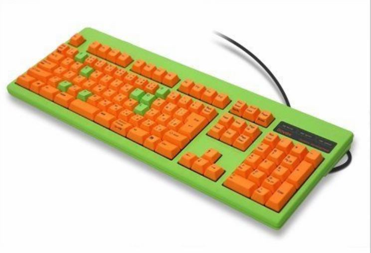
+1,000,000. In my teenage years, it seemed everyone with any amount of responsibility and sense -- anyone worth looking up to at all -- hated color and nice shapes as if they came from the Devil! I even heard of one guy who, on having to spend time at home due to illness, made his wife remove the flowers and other nice things from their home! It was also that no-options phase Japanese car manufacturers went through. The Nissan Micra looked nice in blue over silver, but when it looks like every fifth car on the road is one of them... and most of the rest are depressingly dark or extremely muted... I'm not even...vometia wrote: ↑So yeah. All those gaudy keyboards out there. Their contribution to good taste may be subjective, but at least they aren't beige.
Then, well, it was the 90s. I had little money for the entire decade, and I still lived in ENGLAND. There were brief flashes of color at the beginning of the decade and a handful of other times, but because it was ENGLAND, they didn't sell. By the time anything got to a price I could afford, "you can have any color you like so long as it's [beige!]"
In 2000, I managed to pick up a couple of cases with a bit of color on them, but I didn't get a keyboard that wasn't BEIGE until after 2005. I didn't want to get a cheap one, and I guess I'd more than half-way given up. Oh... even then, it was one of only a few which wasn't beige or greige from that seller, and all those 'few' were black, if I remember right. Strange, because their site was yellow, with grey borders. There may have been one exception which was too far the other way. It was also the first non-full-size keyboard I'd ever seen at a bearable price, but I effectively paid extra in the form of RSI! (Not to mention the seriously rattly keys, the right control key only working with some operating systems, or the loose bit of metal inside!
Aaanyway, this thread's a good laugh! It's fascinating for various reasons, ranging from the obvious, "What were they THINKING?" to one or two posts which leave me thinking, "What was the poster thinking, that's gorgeous!"
My reaction? "OM NOM NOM ORANGE LIME CANDY!"
-
eekee
- Location: UK
- Main keyboard: A slim Logitech; nice action but getting creaky
- Main mouse: SpeedLink SL-630001-BK - lovely feel
- Favorite switch: No rebound; click; other TBA
- DT Pro Member: -
I don't often double-post and I obviously don't often complain about bright colors, but this Amazon find just caught me the wrong way:

https://www.amazon.co.uk/UrChoiceLtd%C2 ... 3NJDBQSAG3
https://www.amazon.co.uk/UrChoiceLtd%C2 ... 3NJDBQSAG3
-
fohat
- Elder Messenger
- Location: Knoxville, Tennessee, USA
- Main keyboard: Model F 122-key terminal
- Main mouse: Microsoft Optical Mouse
- Favorite switch: Model F Buckling Spring
- DT Pro Member: 0158
I like beige, it is the proper color for a computer. I also like square shapes, domed tops on boxes that you can't stack papers on are a waste of space.
-
depletedvespene
- Location: Chile
- Main keyboard: IBM Model F122
- Main mouse: Logitech G700s
- Favorite switch: buckling spring
- DT Pro Member: 0224
- Contact:
Card readers on the keyboard? Done. Pen holders? Done. Phone holders? Done. A lighter holder is most definitely a new concept... although it begs the obvious question: where is the cigarette holder?eekee wrote: ↑[img]https://images-na.ssl-images-amazon.com ... L1000_.jpg[/img
(don't get me started on the ash tray — I still get mad at the memories of that)