Page 42 of 53
Posted: 20 Mar 2014, 20:25
by scottc
Ps. I don't see any errors and the kits look gorgeous, thanks a lot matt3o

Posted: 20 Mar 2014, 20:28
by Muirium
No indeed! Gotham is a fine font, and I still wholeheartedly support it.
The one thing I don't like the look of is PGUP and PGDN (go two line on those, like the keys above them!) but I'm all about the symbolic mods anyway, so unless it bothers others…
As for Pause / Break: I'm sure your lady would support a paw print!
Posted: 20 Mar 2014, 20:30
by scottc
Muirium wrote:No indeed! Gotham is a fine font, and I still wholeheartedly support it.
The one thing I don't like the look of is PGUP and DGDN (go two line on those, like the keys above them!) but I'm all about the symbolic mods anyway, so unless it bothers others…
Oh, that's a fair point. But would it be:
or maybe
?
Posted: 20 Mar 2014, 20:31
by Muirium
The latter, of course.
Posted: 20 Mar 2014, 20:35
by matt3o
PGUP/PGDN are in a cluster of keys where no one else is on 2 lines. Honestly I like them on 1 line like the others... but if you can't live with it I'll revert to PAGE UP/DOWN
Posted: 20 Mar 2014, 20:37
by Muirium
Everyone else should weigh in on this one, as I'm opinionated but not actually relevant on that kit!
Anyway, I see why you're doing it. I think it's the wrong choice between two sensible options, that's all. The closeness of those wordy keys in the upper island push it right off for me.
Posted: 20 Mar 2014, 20:40
by scottc
I think PG UP PG DN makes sense as INS and DEL are in the same cluster and they couldn't possibly fit on one line.
Posted: 20 Mar 2014, 20:41
by kakarlsen
I vote for keeping the current font.
Also, on your previous "mock ups", there were no space between "Alt" and "Gr" on the Alt Gr key. If there is enough space on the cap, the space between the words should also be there.
Posted: 20 Mar 2014, 20:43
by fifted
If we're going for full legends on those, why not "insert" and "delete" as well?
I think the visually disturbing thing is the different font size on those relative to their neighbors.
Placing them next to other mods (like will need to happen on an Ergodox) will accentuate this difference.
(My vote is to leave them as pgup and pgdn.)
Posted: 20 Mar 2014, 20:54
by scottc
fifted wrote:If we're going for full legends on those, why not "insert" and "delete" as well?
I don't think they'll fit... It would be nice, but I don't think it will work.
Posted: 20 Mar 2014, 22:35
by Muirium
Hmm. Seems to be missing a 7 BIT MODE key. Or indeed FIRMWARE. Surely a mistake…
Posted: 20 Mar 2014, 22:43
by drrtyrokka
Now look at this beauty
Now really, i like both ways..
Posted: 20 Mar 2014, 22:52
by scottc
I actually have to agree. It reminds me a lot of Bioshock Infinite.

Posted: 20 Mar 2014, 23:03
by matt3o
they called from the 20s, they want their font back!
Posted: 20 Mar 2014, 23:13
by jdeblese
I dunno... it's got charm, but the varying proportions of the letters bug me. Potential, but it's not there yet.
Posted: 20 Mar 2014, 23:15
by matt3o
it's really nice, but a bit too much for a general purpose set.
Posted: 20 Mar 2014, 23:15
by scottc
I agree, let's just keep the set as it is now that it's all wrapped up.
Posted: 20 Mar 2014, 23:19
by fifted
"Nice keyboard, old sport!" Needs a bakelite case to go with it...
Posted: 20 Mar 2014, 23:24
by Muirium
Brass will do. And circular keycaps!
Posted: 20 Mar 2014, 23:29
by Eszett
Maybe I can help you guys, since I’m into font editing. Muirium, this @ sign looks nice indeed, but the rest of the font is abit filigrane, don’t you think so? I think each of us likes one or another excentrical font (for me:
Fixedsys Excelsior,
Eldorado Micro,
Aeris, and tons of others …) but this isn’t quite compatible for the masses, since taste differs alot from person to person. I think the most accepted compromise is something like, “no fancyness”, “sans serif”, “semibold or bold”, and with a huge character set. Which ends up with something like Segoe UI semibold / bold. Boring, yes, but rocksolid and not too ugly either.
Posted: 20 Mar 2014, 23:38
by matt3o
Eszett wrote:Maybe I can help you guys, since im into font editing. Muirium, the @ sign of that font looks nice indeed, but the rest of the font is abit filigrane, don’t you think so? I think each of us likes one or another excentrical font (for me:
Fixedsys Excelsior
Fixedsys Excelsior... OHMY! I love that font! Let's use it, I mean for everything
RE Segoe, you have to pass over my dead body

Posted: 20 Mar 2014, 23:44
by Eszett
@matteo Well, as I said, you’ve got some nifty kind of taste. I would order a full cap set with Fixedsys Excelsior. But then again, some other guys will wrinkle their nose

Posted: 20 Mar 2014, 23:47
by Muirium
Caviar's no pick of mine. I'd go Helvetica (of course) first, or Eurostile if I had the skill myself to wield it well. But Gotham is absolutely the right choice for this kit. In Matteo's hands it looks fantastic.
Posted: 20 Mar 2014, 23:47
by matt3o
I totally have to try to make a mock up with Fixedsys excelsior... actually I might have SP run one special edition kit for me
Posted: 20 Mar 2014, 23:49
by scottc
Terminus all the way!
Posted: 20 Mar 2014, 23:51
by Muirium
Come on guys: Font Friday is TOMORROW!
And the only mono width font worth two damns is Inconsolata!
Posted: 20 Mar 2014, 23:53
by scottc
I recently swapped from Inconsolata to Terminus. Bitmap fonts: never look back!
Posted: 20 Mar 2014, 23:54
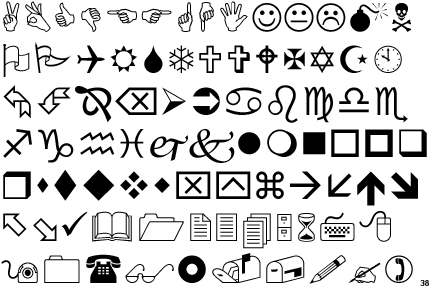
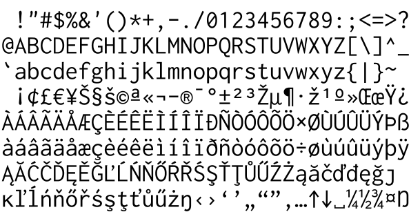
by matt3o
Posted: 21 Mar 2014, 00:00
by Muirium
Source Pro is a pretty good one too. And I am rather attached to hokey old Monaco. But keep these off our keyboards, please!!!
Posted: 21 Mar 2014, 00:02
by scottc
I'm sorry but I'm gonna have to be that guy: