Page 43 of 76
Posted: 04 May 2015, 12:31
by scottc
Agh! So close but not what I want. Thanks anyway!
Posted: 04 May 2015, 12:43
by webwit
That keyboard looks like it was assimilated by the Borg.
Posted: 04 May 2015, 13:04
by scottc
RESISTANCE IS TACTILE.
Posted: 04 May 2015, 13:14
by seebart
scottc wrote: RESISTANCE IS TACTILE.

very good scott.
Posted: 04 May 2015, 13:19
by Madhias
The corrugated sheet metal area on the top right corner is interesting!
Posted: 04 May 2015, 14:29
by Khers
Madhias wrote: The corrugated sheet metal area on the top right corner is interesting!
It's plastic though

Posted: 05 May 2015, 23:18
by Anticube
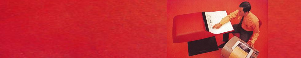
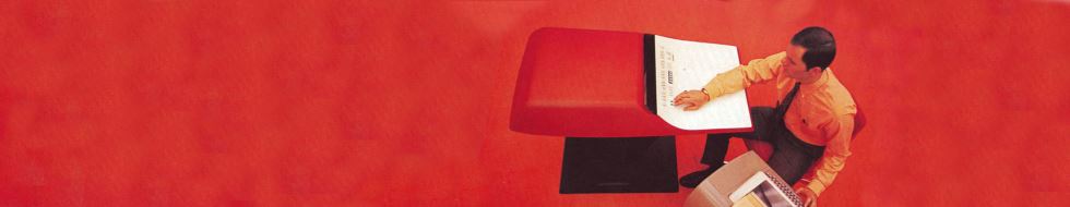
hello, saw this archaic desk-keyboard/cpu (Honeywell 316)
and I wish to see how this thing works and if there's interest,
image editing is minimal for testing.
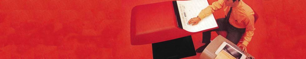
- hwk.jpg (21.87 KiB) Viewed 6981 times
... ok I see, I don't like, but I understood how it works...
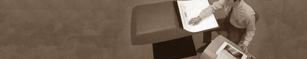
- hwk-sepia.jpg (19.7 KiB) Viewed 6970 times
Posted: 05 May 2015, 23:22
by mr_a500
Awesome. It would nicely complement the blue Sanders header. It needs a better crop though. His head is too cut off.
Size should be 980x190. Edit: Ah, I see you fixed it.
Posted: 05 May 2015, 23:34
by facetsesame
Honeywell 316... isn't that desk version the notorious Kitchen Computer?
Posted: 05 May 2015, 23:43
by Anticube
mr_a500 wrote: His head is too cut off.
found another source without the cutted head

- kc-teletype-redux-crop.jpg (19.33 KiB) Viewed 6970 times
facetsesame wrote: ...Kitchen Computer?
yes
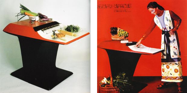
- Honeywell-316-tt.jpg (31.62 KiB) Viewed 6970 times
Posted: 05 May 2015, 23:46
by mr_a500
What a coincidence... just as I was looking over an old post where I said I liked seebart's "naked cage" header:

... the current Deskthority header just happened to change to the other (inferior) version that was chosen:
I want the other one!
Posted: 05 May 2015, 23:49
by mr_a500
Anticube wrote: mr_a500 wrote: His head is too cut off.
found another source without the cutted head
I think slightly larger (cutting off some of the teletype) or shifted left a bit and fix the red cloned bits and it should work nicely.
Posted: 06 May 2015, 00:11
by Anticube
So that was a serious palm rest!
Bloody red do not follow DT style anyway that's how the original was.
I can make bit clones smoother if it works.
- kc-teletype-redux-crop2.jpg (18.25 KiB) Viewed 6941 times
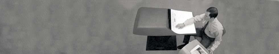
- kc-teletype-redux-crop2-white.jpg (18.85 KiB) Viewed 6941 times
Posted: 06 May 2015, 00:20
by mr_a500

I love it! Now we just need to wait for our Scotsman's approval.
Posted: 14 May 2015, 23:32
by Muirium
Aye. It is done. A bit blurry for my taste, but a fine colour and fantastic computer.
The alternate naked cage you like is a bit busy for my eye. I prefer the symmetry and pattern of the version I chose. To quote the venerable Dr. Katz: it's not so much that I'm arguing with you, but just agreeing with what I said.
Posted: 25 May 2015, 21:33
by idollar
It is difficult to crop ...
Posted: 26 May 2015, 00:53
by Muirium
I like the colours and the patterns. But I can't handle the focus. Ah well.
Posted: 01 Jun 2015, 23:49
by chzel
Posted: 02 Jun 2015, 00:35
by Muirium
I like the first one best. But no decisions are final on iPhone! The composition's nice. The others are a bit mega bokeh macro to me.
Posted: 02 Jun 2015, 00:42
by chzel
Yeah, the second and third are indeed mega bokeh! The second's bokeh is too busy and ring-like, but the third's is rather smooth!
I seebarted them a couple of times

Posted: 02 Jun 2015, 01:59
by webwit
You should put your favourite on top.

Posted: 02 Jun 2015, 02:36
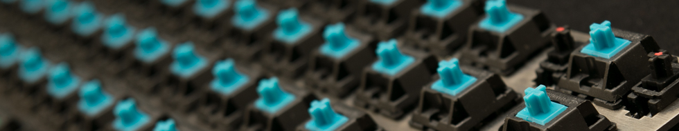
by Mal-2
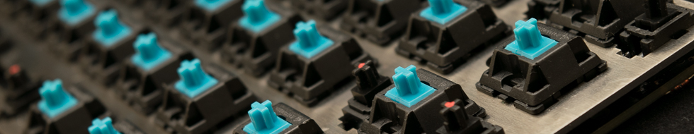
chzel wrote: Just a couple of tests,
I finally finished the Nerd60 and these are some crops to see how the work, more photos in a couple of days!
I like the angles of the middle two, but it might be nice if the focal plane were at the second or third switch away instead of the first. Then it would have more visible detail and not be quite so mega-bokeh. Stopping down one from F/1.4 or whatever you shot at might help too.
Posted: 02 Jun 2015, 07:10
by idollar
I like the second. The angle in the switch ....
Posted: 02 Jun 2015, 08:39
by seebart
idollar wrote: I like the second. The angle in the switch ....
Yes the second one is my pick too.
mr_a500 wrote: What a coincidence... just as I was looking over an old post where I said I liked seebart's "naked cage" header:
... the current Deskthority header just happened to change to the other (inferior) version that was chosen:
I want the other one!
well like I said before as far as I`m concerned you can have any of my headers or the original files...but as you know I don`t pick the headers!
Posted: 02 Jun 2015, 13:06
by Muirium
@Chzel: The second one's growing on me, but the bokeh is no okay. So, um, if you care to shoot it again but at like f/5.6 or something, do update! It's a pretty board.
Posted: 02 Jun 2015, 13:13
by Khers
I kind of like the fourth one, but would it be possible to make a slightly tilted crop of it so that the area behind the logo is a bit blurrier? As it is now, I think it's a tad too sharp in that area to really work.
Posted: 02 Jun 2015, 16:17
by chzel
Mal-2 wrote: Stopping down one from F/1.4 or whatever you shot at might help too.
Muirium wrote: So, um, if you care to shoot it again but at like f/5.6 or something, do update! It's a pretty board.
As a matter of fact, the second and third both are shot at 55mm f/5.6...On a crop sensor no less...
Maybe I'll try another session later, f/22, all the way into diffraction!
@Khers Is this what you mean?
- DSC_1019-4.jpg (141.42 KiB) Viewed 6666 times
- DSC_1019-5.jpg (126.02 KiB) Viewed 6664 times
Posted: 02 Jun 2015, 18:37
by Khers
Second one is exactly what I was looking for, I think it works really well!
Posted: 02 Jun 2015, 18:42
by Muirium
Yeah. Looks nice. I just might let it in.
So. What's with the red dots on the stabs?
Posted: 02 Jun 2015, 19:08
by chzel
I clipped the damping "legs" from some stabs and marked them for easy identification!