Page 49 of 76
Posted: 30 Jul 2015, 12:07
by Muirium
Actually, good point. Right now we have over 80 headers.
When Webwit put me in charge is was maybe half as many. I retired several of the old ones in that time. As new submissions keep on coming, and many of them are very good indeed.
So far I've not been too concerned with having "too many headers". It's hard to pick a few old ones to retire every time a new batch hits.
I'm pretty happy with the big rota we have now. Sure, people have to wait longer (several days) for their favourite picture to roll around. But overall I think the site looks better with more variety, more photographers and subjects of interest.
So what do you guys think: more headers is good?
Posted: 30 Jul 2015, 12:12
by seebart
Sure more variety is better. I'm pretty sure the quality has improved too.
Posted: 30 Jul 2015, 15:17
by klikkyklik
I vote for more variety, yes!
Posted: 30 Jul 2015, 15:22
by Muirium
Really the only downside is that when you get your first image accepted by that mean spirited jerk who's in charge of these, you have to wait ages to see it in action at the top of the site.
A weaksauce argument if ever I heard one. Shoot harder! Get more in there.
Posted: 30 Jul 2015, 20:42
by macmakkara
More headers, more variety! Could it be possible to shorten timespan of header image change?
Posted: 30 Jul 2015, 20:46
by Muirium
I guess Webwit could tweak that. I assume it's a simple variable in the site's design somewhere.
But of course you'd first have to talk him into it!
Personally, I like the hourly rotation. The same frequency as I've had my desktop wallpaper cycle through for 10 years on the Mac. They both change on the dot!
Posted: 30 Jul 2015, 22:02
by macmakkara
Yeah thats nice timing there, Im also running timed wallpaper changes at 1pic/hour. But if we get more headers there we could do 30min rotation or even 15min so we get more pics in same timespan!
Posted: 09 Aug 2015, 17:28
by Muirium
Not bad! We've got a lot of PCB ones already — much to that perennial grumbler Mr A500's complaint — but perhaps I could knock one out. The blue one lines up quite nicely with the header UI, and the last one's great.
Actually, have you got a bigger version of the blue picture? Something about 30 pixels wider on all four sides ideally. That way I can nudge it around and please my OCD! I'd like to track the baseline on the logo…
Re: Post your deskthority header images here
Posted: 09 Aug 2015, 18:15
by seebart
Yeah I'll post that blue one again later tonight, got to get on my bike now.
Posted: 09 Aug 2015, 18:24
by idollar
I like this one
Re: Post your deskthority header images here
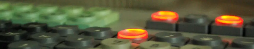
Posted: 09 Aug 2015, 19:00
by seebart
The compudent LEDs. They got a nice little effect due to the round transparent plastic on top.
Posted: 11 Aug 2015, 22:08
by facetsesame
Muirium wrote: All right, some crops from recent submissions to the
Cappening thread…
Thanks Mu, I'm really flattered!
I thought I was still dreaming when I saw it this morning (not that I dream about DT or anything...)
Posted: 20 Aug 2015, 01:05
by Prelim
Posted: 20 Aug 2015, 01:18
by Muirium
Astroturf or green shag?
Posted: 20 Aug 2015, 01:21
by Prelim
ikea shag :p
Posted: 20 Aug 2015, 01:27
by Muirium
I quite like it. Good and sharp anyway.
Focus is what's held me back from Seebart's. The glowing orange caps shot is way too fuzzy, the LOWER shot is much better but some of it looks a little off, just much less so. The PCB's sharp, but we've lots of those. The one I like the best actually is the blue panel. But I want to align the keys with the site logo. Any deviation in symmetry throws me off!
Re: Post your deskthority header images here
Posted: 20 Aug 2015, 09:40
by seebart
Now that I look at my shots again I don't like any of them that much anymore. The blue Key Tronic even looks a tad out of focus. If you want that one let me have another go at it when I'm back at my desk.
Posted: 20 Aug 2015, 13:06
by Muirium
Sounds good to me. And post an oversized version (high res and lots of room on all the edges) so I can pan it around a bit to make my own crop. That one's asking for OCD level accuracy in alignment.
Glad to hear my image snobbery is rubbing off on you. I don't see things no one else can. I just home in on most mistakes quicker. Practice increases that speed.
Posted: 20 Aug 2015, 21:02
by Prelim
Mu, I've updated my pic to a better version

Posted: 25 Sep 2015, 21:04
by Muirium
Just trying something with a great old
Univac promotional shot…
- Univac Perspective.jpeg (60.62 KiB) Viewed 6076 times
Man, this is going to be an awkward one.

- Univac Box.jpeg (22.37 KiB) Viewed 6072 times
Posted: 28 Sep 2015, 18:45
by snoopy
idollar wrote: I like this one
I also like that one
Posted: 28 Sep 2015, 19:08
by OleVoip
+1, gorgeous!
Posted: 28 Sep 2015, 19:10
by ramnes
Prelim wrote: 
I like it!
Posted: 28 Sep 2015, 20:36
by Prelim
Posted: 28 Sep 2015, 21:10
by zuglufttier
- dashboard166.jpg (109.67 KiB) Viewed 5996 times
Posted: 28 Sep 2015, 21:28
by tigpha
Posted: 28 Sep 2015, 21:31
by seebart
tigpha wrote: May I join in?
Of course you may. Good effort. I like the first and second a lot. Both work well with our logo, which is not a easy compromise trust me!

Posted: 28 Sep 2015, 21:31
by zslane
I call this Muirium pandering. Well done, sir.
Posted: 28 Sep 2015, 21:35
by tigpha
Dang! You saw right through me! It's that Helvetica thing again...