Page 55 of 76
Posted: 28 Nov 2015, 18:16
by seebart
Yes, both that one and the blue key tronic need to be replaced.
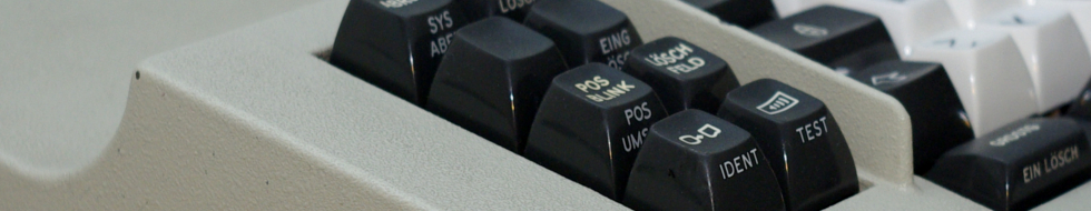
From the Oak Full-Travel Membrane wiki picture:
- Oaksoftfocus.jpg (30.6 KiB) Viewed 6748 times
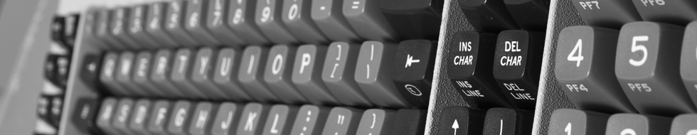
terrycherry's Futaba:
- Futaba.jpg (30.73 KiB) Viewed 6718 times
Posted: 08 Dec 2015, 18:07
by chzel
Posted: 08 Dec 2015, 18:38
by seebart
Uhh nice chzel, first, fourth and fith are my pick! The first one is awesome.
Ahh of course it's from
that Hi-Tek.

I totally forgot.
Posted: 08 Dec 2015, 18:40
by chzel
Thanks!
Posted: 08 Dec 2015, 19:00
by 7bit
You should mirror or rotate the 2nd one!

The last of the keyboard photos works best with the logo.

Posted: 08 Dec 2015, 19:13
by chzel
Added a flipped version of the second, the DIP footprint matches the logo quite well!
Good call 7bit!
Posted: 08 Dec 2015, 19:15
by seebart
chzel wrote: Added a flipped version of the second, the DIP footprint matches the logo quite well!
Good call 7bit!
That's almost like christmas deco for the DT logo.

Posted: 31 Dec 2015, 01:01
by ramnes
Posted: 31 Dec 2015, 01:29
by Muirium
The first and second are quite nice. The third needs more depth of field. There's an art to macro!
Posted: 31 Dec 2015, 01:30
by ramnes
Yeah, that was just a test. I prefer the first and second also.
Posted: 31 Dec 2015, 01:33
by Muirium
I'm long overdue a big update on these headers. Any of you with requests (especially those involving an upgrade to a previous picture of yours) speak up! I'll be back.
Posted: 31 Dec 2015, 23:36
by seebart
Muirium wrote: I'm long overdue a big update on these headers. Any of you with requests (especially those involving an upgrade to a previous picture of yours) speak up! I'll be back.
I'd like any of these two:

- MicroColorsNew.jpg (41.11 KiB) Viewed 6482 times
- microcolors2.jpg (219.58 KiB) Viewed 6482 times
to replace this which is in rotation now:

- microcolors.jpg (205.22 KiB) Viewed 6482 times
Also this needs to be taken out of rotation, it's horrible. I don't have an alternate shot of it right now.
- keytronic2.jpg (244.52 KiB) Viewed 6482 times
I can try to reshoot it if you like or replace it with something else like this (which I will still tweak):
- Reed.jpg (210.32 KiB) Viewed 6482 times
Nice work BTW ramnes, first and second one are great!
Posted: 31 Dec 2015, 23:45
by Muirium
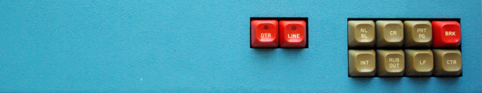
No dice. I prefer the third shot to the two you're offering to replace it with. The first one's okay but the second looks dead to me. The reflection on the third shot makes it much more pleasant to look at, even if there are other things wrong with it. It's not one of my favourite headers, but I'll only replace it with one I like!
The blue panel shot, meanwhile, is one of your best, I think. I like the aesthetic. The lighting there, again, looks more lively. The shadows and highlights are pure midnight in the archives, as is the sense that the scene is lit from directly above. Feels as vintage as the keyboard.
That last shot though, hmm, I don't instinctively like it. Try shooting it in daylight. The subject's good but the lighting isn't. I can handle after dark / diffuse, sure. Look at Madhias work for how sweet that can look. There's some effort involved in pulling it off. Otherwise do as I do and shoot in direct daylight! Easier to make something nice that way.
Posted: 31 Dec 2015, 23:51
by seebart
Alright the orange-red shot I see your point, the reflection of the caps is nicer in the third one. But the blue KeyTronic? Come on?!? OK I'll reshoot it then if you like it so much. It's not the image I don't like, but the fact its crappy out of focus and otherwise technically shitty. Forget the last one, work in progress.
Posted: 31 Dec 2015, 23:54
by Muirium
Sometimes composition wins out! Definitely reshoot that blue one. It will be glorious.
Meanwhile, the new batch, compressed and ready for upload:
- D72_1843.jpg (25.61 KiB) Viewed 6460 times

- DSC_1506-crop3.jpg (15.89 KiB) Viewed 6460 times
I'm also testing this one. With levels tweaked to give a moodier look:

- MicroColorsNew.jpg (18.61 KiB) Viewed 6460 times
Posted: 31 Dec 2015, 23:56
by seebart
I'm also testing this one. With levels tweaked to give a moodier look:
Hmm, OK.

Love the other two.
Posted: 01 Jan 2016, 00:08
by Muirium
Yeah, levels can't fix it. Needs shot in better light.
Somehow while setting Chzel's shot as the active header, I managed to get another perma-dupe perma-added to the perma-useless perma-inactive folder. Spent the last few minutes reaquainting myself with the inscrutable uselessness of ftp. Buggered if I can figure out how to delete the bastards! There's three dupes at the bottom of the "inactive" tab on the
header page, if you can see them yourself. I want to erase them before I forget and promote any back to the active stack in future. Or
Mr_A500 will be on my case again.
Needs delete button!
Posted: 01 Jan 2016, 00:19
by seebart
I'm sure you'll figure it out eventually. I'd say we have more than enough header material, just now I was browsing the last three pages of our "[Photos] Post your keyboard/keycaps!" thread and saw approx. ten great images as headermaterial. But I'll stick to my own shots for a change, getting them perfect is not easy.
Posted: 01 Jan 2016, 00:36
by Muirium
Did you see anything I missed? Check the active headers list for whether I've added them or not.
But beware, I like to mix things up, so that list is far from date sorted!
Posted: 01 Jan 2016, 00:43
by seebart
Muirium wrote: Did you see anything I missed?
No, but Chzel's new shot is in both the active and inactive section. That's quite a list of inactive headers by now, including a french fries header I had never seen before.

Check the active headers list for whether I've added them or not.
Yes you did add them.
Posted: 01 Jan 2016, 01:04
by Muirium
Dupes in the inactive section are the problem I'm grumbling about. I'd zap them, if it were easier to do.
The fries are for SmallFry. Feels like a long time ago now when he got wiped out in an accident. Maybe just before your time.
Posted: 01 Jan 2016, 01:35
by ramnes
Awesome, thanks µ!
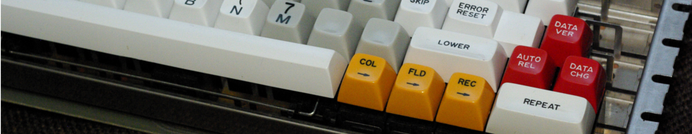
And I really like that one, seebart:

Posted: 01 Jan 2016, 17:38
by seebart
ramnes wrote: Awesome, thanks µ!
And I really like that one, seebart:
I like it also, but Mu's argument is valid. A big part of the "charm" of Micro Switch sphericals is the "gloss" on the keycaps which does not show in that shot. I can try and reshoot that one also, not a big deal. Doesen't mean I'll get it perfect though. That particular shot I did a long exposure, whilst the one in rotation now was shot with flash.
Work in progress don't use Mu!

- microfade.jpg (221.28 KiB) Viewed 6359 times
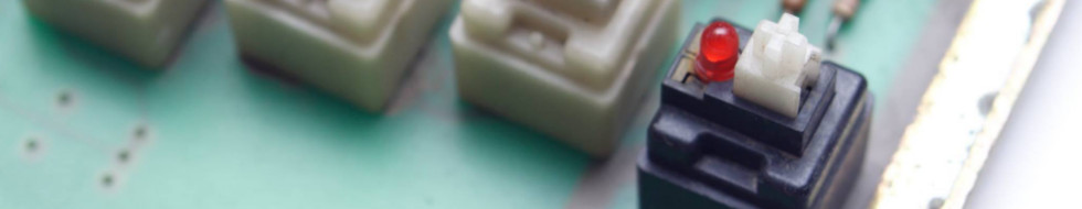
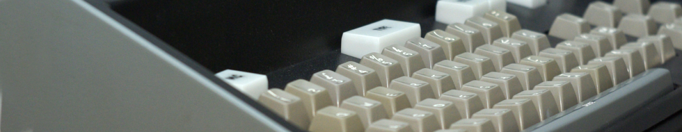
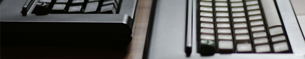
- keytronicnew.jpg (265.1 KiB) Viewed 6358 times
- reed1.jpg (202.18 KiB) Viewed 6359 times
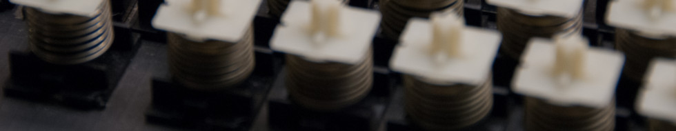
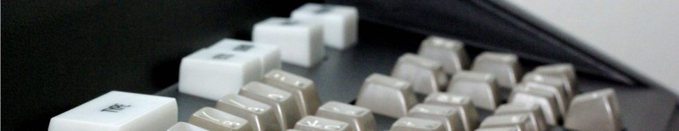
- beamsp1.jpg (178.9 KiB) Viewed 6359 times
Posted: 02 Jan 2016, 17:19
by seebart
snoopy's kishy madness with a bonus:
- twokishys.jpg (142.09 KiB) Viewed 6346 times
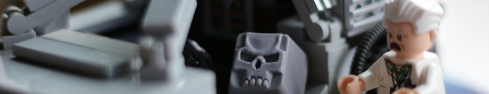
- docbrown.jpg (133.96 KiB) Viewed 6346 times
Posted: 02 Jan 2016, 17:25
by Madhias
The Lego crop is great! Should be added:)
Posted: 02 Jan 2016, 17:26
by Muirium
Try a zoomed out crop, if you can. And don't delete the original! I choose by comparison. The more options, the more likely to make the cut.
Edit: Oh, that is the full width of the original scene. Ah well. I don't like it. Looks way too close for a header. Needs reshot!
Posted: 02 Jan 2016, 18:03
by snoopy
Muirium wrote: Try a zoomed out crop, if you can. And don't delete the original! I choose by comparison. The more options, the more likely to make the cut.
Edit: Oh, that is the full width of the original scene. Ah well. I don't like it. Looks way too close for a header. Needs reshot!
yeah, it was just a quick shot and light was bad... it overall came out more blurry then expected. Maybe F1.8 was a bit too much. But I still think it looks funny as header. Thanks seebart! Always great to see when my pics appear here.
Can try to reshot it with better light soon. Maybe I need a lightbox...
Posted: 02 Jan 2016, 18:12
by Muirium
The light's fine. Even at a tack sharp f/16 I wouldn't like that crop because it's too close. There needs to be more height on it. Which means a wider shot of the scene.
Posted: 02 Jan 2016, 18:20
by seebart
Posted: 24 Jan 2016, 12:19
by chzel
Beamspring teaser...
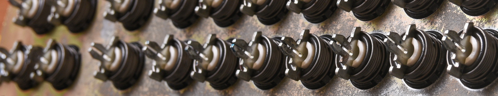
- D72_2151.jpg (173.67 KiB) Viewed 6451 times
- D72_2176.jpg (94.51 KiB) Viewed 6434 times