Page 58 of 76
Posted: 13 Feb 2016, 15:30
by Muirium
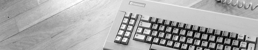
Well, so long as it's a symmetrical gap. The slight mismatch in angles is obscured by the Y's thickness. When separated it would be much more obvious.

Posted: 13 Feb 2016, 16:13
by seebart
Test.
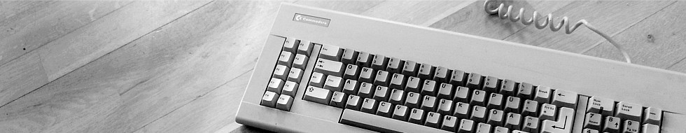
- Cherry G80-0499new.jpg (53.61 KiB) Viewed 8534 times
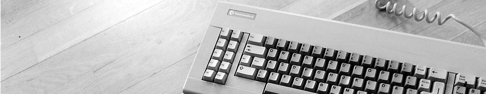
As usual there's not enough room on the left for the logo, so without cheating this is the only way:
- Cherry G80-0499wide.jpg (54.28 KiB) Viewed 8508 times
Posted: 13 Feb 2016, 16:20
by Muirium
seebart wrote: Test.

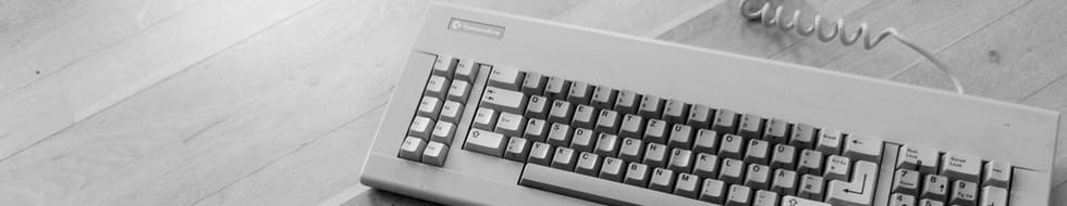
Failed! Quit messing with the floor. I like it as it was!
seebart wrote: 
The second one is better. There's no need to see the whole keyboard.
Posted: 13 Feb 2016, 16:22
by seebart
Muirium wrote: Failed!
Quit messing with the floor. I like it as it was!
Haha I was hoping you wouldn't notice. But the postion is good in the last one. And yes I did some "logo background contrast improvment".

Posted: 13 Feb 2016, 16:24
by Muirium
If I don't notice the cheat, then it was done artfully! That one was not…
Comparing them all again just now, I still prefer your first attempt.
Posted: 13 Feb 2016, 16:25
by seebart
Come on, the second one is good. It's got much less cheating too.
Muirium wrote: Comparing them all again just now, I still prefer your first attempt.
What?

Oh well I'm done with it now. Take your pick.
Posted: 13 Feb 2016, 16:28
by Muirium
The first one (which I reposted at the top of this page) is more organic. You know, what with the absence of later cheating. And I like the subtle way the logo shows up on it. We don't always need max contrast. The DT graphic shows well on many pale backgrounds, so long as they aren't highly patterned.
Posted: 13 Feb 2016, 16:35
by seebart
Fine.

Reminds me to get my Cherry G80-0499 out. Time for some vintage MX action.

Posted: 13 Feb 2016, 16:40
by Prelim
Muirium wrote: seebart wrote:
The second one is better. There's no need to see the whole keyboard.
I prefer this last one
Posted: 13 Feb 2016, 16:41
by seebart
So do I, but the dictator has spoken. No use to fight it.

Posted: 13 Feb 2016, 16:42
by Muirium
You'll have to try harder to convince that mean spirited bastard in charge of picking headers. Reasons why, to balance against his own vile sense of aesthetic purity. The demon!
Posted: 13 Feb 2016, 22:33
by seebart
Posted: 13 Feb 2016, 22:42
by Madhias
I am feeling guilty for never doing any crops!
Posted: 13 Feb 2016, 22:43
by seebart
Madhias wrote: I am feeling guilty for never doing any crops!
No because you took the picture! That's the harder part IMO. This image also has great header potential.
Posted: 15 Feb 2016, 00:01
by Muirium
Uploading these:
- Cherry%20G80-0499.jpg (26.47 KiB) Viewed 8360 times
Or how about my own simple shrink of
Slom's original pic?
- g80-0530 crop 1.jpg (20.18 KiB) Viewed 8331 times
Aha. I see the angle was just a happy accident after all!
Which crop do you guys prefer of
Madhias' sunset HHKB?

- HHKB sunset 1.jpg (21.78 KiB) Viewed 8342 times

- HHKB sunset 2.jpg (21.62 KiB) Viewed 8342 times
The first works better now I test it. They're both my own crops, after none of Seebart's looked quite right to me!
And
still more Madhias?

- HHKB Silver Skull 1.jpg (22.6 KiB) Viewed 8337 times
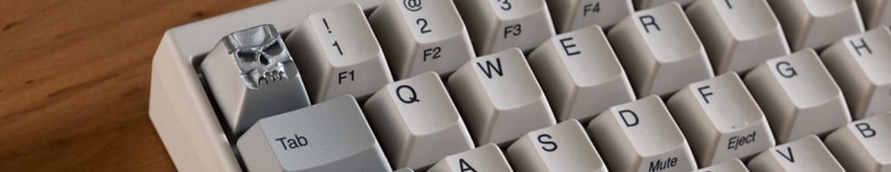
- HHKB Silver Skull 2.jpg (21.93 KiB) Viewed 8337 times
Ooof! I'm out of practice! Need so much more desk space on the left of these. Denied!
Will update with more as I process them.
Posted: 15 Feb 2016, 07:52
by Khers
I think those G80-0499 pics are too noisy, grainy and poorly focused, but maybe that's just me?
Posted: 15 Feb 2016, 07:58
by ohaimark
I see a slight lack of Depth of Field (inconsequential, and maybe it's just confirmation bias), but not really any serious grain... The header resolution is so low that seeing grain would be difficult in a downsampled photo anyways.
Still worth using as a header in my opinion.
Posted: 15 Feb 2016, 10:47
by Prelim
Khers wrote: I think those G80-0499 pics are too noisy, grainy and poorly focused, but maybe that's just me?
true!
Posted: 15 Feb 2016, 13:54
by seebart
Khers wrote: I think those G80-0499 pics are too noisy, grainy and poorly focused, but maybe that's just me?
You're right, compare the two in Mu's last post, I already did some GIMP magic on that top one. I don't mind if we do not use it. I think that picture is aesthetically pleasing, the image quality itself is poor though.
Posted: 15 Feb 2016, 14:00
by Khers
I agree that it is aesthetically pleasing, but it cries out for a reshoot!
Posted: 15 Feb 2016, 14:14
by seebart
Khers wrote: I agree that it is aesthetically pleasing, but it cries out for a reshoot!
I agree, ask him for a reshoot if you like:
slom-u5173/
Since I own a G80-0499 I could reshoot it myself but I would find that somewhat rude towards Slom.
Posted: 15 Feb 2016, 14:55
by Muirium
Everyone's going the full µ! I'm so proud!
Posted: 15 Feb 2016, 15:03
by seebart
Well you know Mu we all have to look at those headers too every once in a while, some of us on a daily basis. Of course it can't hurt to look smart for the rest of the planet.
Posted: 15 Feb 2016, 15:33
by Muirium
I'm honestly pleased some of my dictatorial nitpicking is spreading to you guys. While I like Slom's composition, the original image is pretty crap, as I found out when editing it myself. So close to greatness!
Anyway, I'll wait for new submissions before upping another batch. Wound up falling asleep last night instead of finalising those. Needs a clear eye to make the final call, not a dozy one.
Posted: 17 Feb 2016, 17:41
by lolpes
What do you guys thinks about these?


Posted: 17 Feb 2016, 17:46
by lolpes
and this one:

Posted: 17 Feb 2016, 18:02
by seebart
Last one is nice lolpes. On the other two I'd move the keyboard to the right to make room for the DT logo.
Posted: 17 Feb 2016, 18:11
by lolpes
seebart wrote: Last one is nice lolpes. On the other two I'd move the keyboard to the right to make room for the DT logo.
I agree, I tried the preview and I liked the third one.
I will try to move the board to the right on the other 2 and see if it works out
Posted: 17 Feb 2016, 18:12
by Muirium
Yup. The action has to be on the right. Just see how broken my own crops earlier (of Madhias' HHKB) look because I didn't compensate enough for the logo. Ouch!
Posted: 17 Feb 2016, 18:15
by lolpes
Yeah I see what you mean muirium :/, I was trying to show the constrast of the cyan enter, but because it is located at the right of the board, in order to show background on the right I probably would have to take a far away pic in order to get the board rotated and still have enough background to show the DT logo...hum I'll give it a try, tomorrow, ligh here is going away now xD