Page 59 of 76
Posted: 18 Feb 2016, 07:11
by Muirium
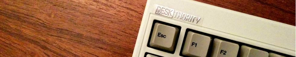
Posted: 18 Feb 2016, 08:57
by matt3o
maybe the last one of the three
Posted: 18 Feb 2016, 08:59
by Muirium
Maybe. I'm just starting to learn flash photography. Wanted to see how those looked with the logo.
I'll start a separate photo thread for my experiments. I'm pleased with how some of the first set came out.
Posted: 18 Feb 2016, 08:59
by Khers
I also think the last one looks best, but why are the legends on control and shift so damn blurry?
Posted: 18 Feb 2016, 09:01
by Muirium
Mysterious! I'll check against the original image. That might be a compression artifact. I made the orange so dark there's mostly chroma between the two colours on those keys, rather than luma. And chroma is always the first one to get compressed.
Posted: 18 Feb 2016, 09:34
by Khers
Looking at it at a larger screen (and zooming in) it does look over compressed in general, with pixel noise around most of the legends. Too heavy on the compression tool Mu?
Posted: 18 Feb 2016, 22:35
by seebart
Posted: 18 Feb 2016, 23:03
by Muirium
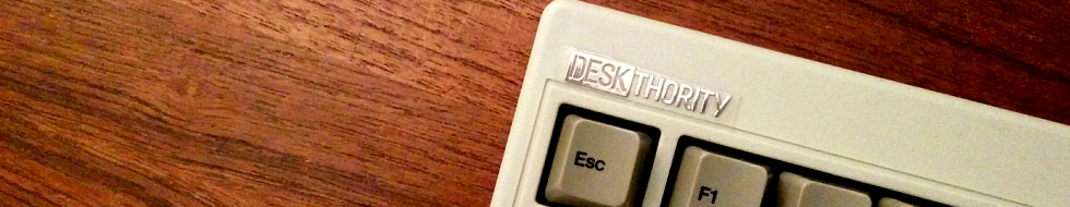
Way to curry favour with the judge! I think you're right about the first one. The extreme closeup shots don't work as well as wider "keycap landscapes".
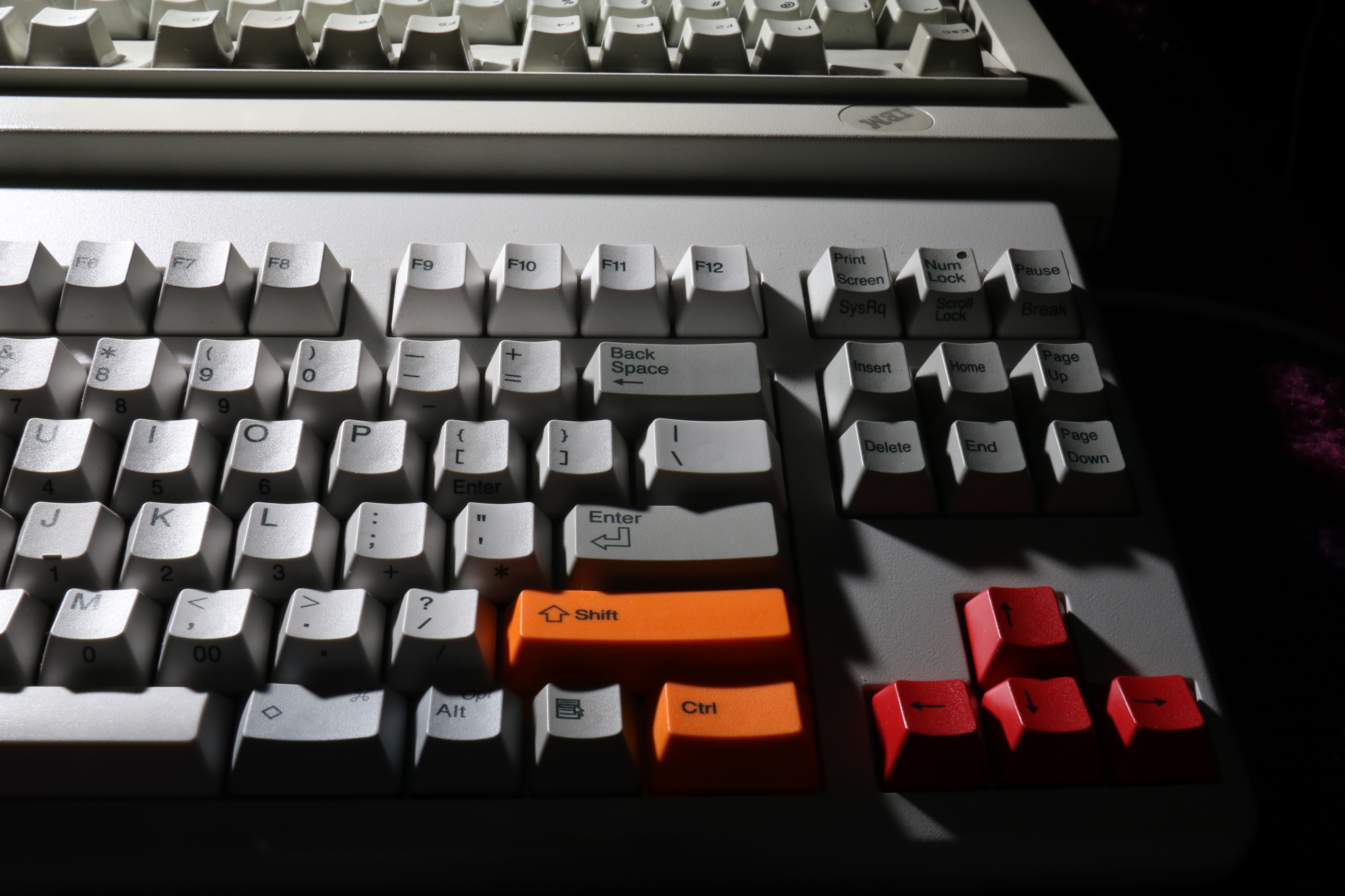
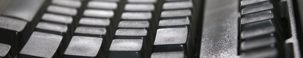
Now, about that blurry orange Shift legend. Check this sequence out.
The 980x190 pixel 22 kilobyte header I cropped and upped earlier:

The 1600 pixel 259 kilobyte shrink I upped in the
Learning the Art of Flash thread:

And back to the original 24 megapixel jpeg, all 5.7 megabytess of it because I got privilege, innit:
- IMG_7227.JPG (5.48 MiB) Viewed 5609 times
Is it just me, or are those legends on the orange keys getting hit badly by the various stages* of compression? Wonder what I can do to get the filesize down to header proportions, *without* mussing up the orange dyesubs?
*Naturally, I made the little header version from the full resolution original, directly. I'm just making a point about compression in general, rather than a direct illustration of a highly dubious workflow!
Posted: 19 Feb 2016, 00:59
by Muirium
Hmm…
- Orange 1.JPG (49.81 KiB) Viewed 5591 times
- Orange 1 copy.JPG (18.79 KiB) Viewed 5591 times
One of these two is shrunk (via ImageOptim) by 60%. Not bad. Hard for me to spot the difference, and this is when they're side by side.
But I'm not sold on that shot. I should have cleaned my Realforce first! Been using it for days by then. So on to my duplicates of Seebart's crops!
Marquardt:
- IMG_7211.JPG (60.17 KiB) Viewed 5578 times
Shiny, Shiny SSK:
- IMG_7185.JPG (55.98 KiB) Viewed 5576 times
Ooh, I Iike that one. Who could ever guess what it is?
Posted: 19 Feb 2016, 01:11
by chzel
On the bottom one the compression is crushing the texture and is giving artefacts on the edges of the letters.
It's quite visible at 150% on my Dell U2515H, and at 110% on the Eizo S1910.
Are we so short on space that we need to compress that much?
I export my headers from LR at 980px with best compression and the biggest I've got is 190kb.
Posted: 19 Feb 2016, 01:16
by Muirium
Hmm… lossless. Another rabbit hole I'm to dip more than one accidental foot in! I've parked that shot anyway. There's dirt on and around the left arrow key and since it's my board, I've no excuse not to simply reshoot!
Anyway, I'm quite chuffed with the last pic I posted. What do you make of that SSK?
Posted: 19 Feb 2016, 01:22
by chzel
Don't really like the way the light reflects off the cap tops...a bit too harsh. The right half with the F row and the part of the case are more pleasing to me.
Posted: 21 Feb 2016, 21:05
by matt3o
How to test banners without posting in the thread, nice for development
Upload the banner you want to test somewhere accessible to the web. Open the debug console of your browser (on chrome ctrl+shift+i)
paste the following and hit return:
Code: Select all
document.getElementById('dashboard').style.backgroundImage='url(http://path-to-your-image.jpg)'
profit.
cheers!
Posted: 21 Feb 2016, 21:12
by Muirium
Well, the rest of you can do that. I'll stick to clicking. Rather enjoy the ability to iterate between versions inline.
Posted: 21 Feb 2016, 21:18
by Engicoder
Why don't we make a separate threads....one for testing, one for results
Posted: 21 Feb 2016, 21:20
by Halvar
Ignore this post.


Posted: 21 Feb 2016, 21:29
by Engicoder
Engicoder wrote: Why don't we make a separate threads....one for testing, one for results
Test you deskthority header image here
and
Post you deskthority header images here
Posted: 21 Feb 2016, 21:49
by Muirium
That would likely confuse me. And piss me off when people don't subsequently repost the more promising of their submissions in the real thread. Because, believe me, given time that will definitely happen. Interruptions, timezones, etc…
Better to keep this one thread. If you really don't like how your test image looks, delete it. Seebart's already the master at that!
Posted: 22 Feb 2016, 04:13
by Engicoder
Muirium wrote: That would likely confuse me. And piss me off when people don't subsequently repost the more promising of their submissions in the real thread. Because, believe me, given time that will definitely happen. Interruptions, timezones, etc…
Better to keep this one thread. If you really don't like how your test image looks, delete it. Seebart's already the master at that!
Your right, that would definitely be a problem with time. I'll get some lessons from Seebart

Posted: 25 Feb 2016, 19:32
by Prelim
purple on dolch (Decepticon style)

Posted: 25 Feb 2016, 19:35
by Muirium
I know a harsh flash when I see it. Try again in daylight! Also: darker desks make better headers.
Posted: 25 Feb 2016, 19:43
by Prelim
indeed, flash it is

I really like how flash photos highlight the caps texture... using flash parsimoniously can result in even better photos than sunlight IMHO
Posted: 25 Feb 2016, 19:46
by Muirium
True. But not that one!. You could try the flash during daylight. And a darker background. That white worktop muffles the Deskthority logo severely.
Posted: 25 Feb 2016, 20:17
by Madhias
No, it has not to be all the time a dark background for the DT logo! That one is too light, but in general a light background can be nice together with the white DT logo - has style and looks fresh then.
Posted: 25 Feb 2016, 20:20
by Muirium
We're on the same frequency. Prelim's is *way* too bright. But plenty of good headers have fairly bright backgrounds for the logo:
headers.php
When it works: it works.
Posted: 25 Feb 2016, 20:30
by Madhias
We need more though as I looked right now! But an impressive collection, good work Muirium!
Flash can also be sexy:

Posted: 25 Feb 2016, 21:55
by seebart
NTC KB-6851EA with tiny DT sticker:
- ntcDTsticker.jpg (241.03 KiB) Viewed 5404 times
- ntcDTsticker2.jpg (250.15 KiB) Viewed 5398 times
Posted: 25 Feb 2016, 22:02
by Muirium
I'm jealous of your desk. Nice texture, nice colour, and not as scuffed up as mine.
Posted: 25 Feb 2016, 22:10
by seebart
Oh the desk is OK but what about the header? The second one works a little better. But wait for it I'm working on a DT mugshot header now...
Here's the first preliminary mugshot, this will take some more tweaking since the mug does not lend itself to 980x190.

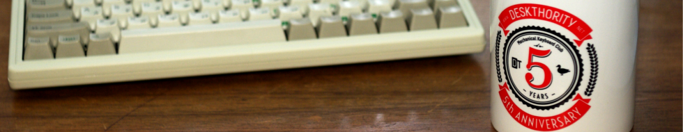
- mugshot1.jpg (209.85 KiB) Viewed 5369 times
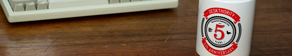
- mugshot2.jpg (252.05 KiB) Viewed 5368 times
Posted: 25 Feb 2016, 22:20
by Halvar
Some old Micro Switch electronics
EDIT: I guess 2 needs a reshoot (blurry, bad crop), 1 and 3 need a recrop to work with the logo...