Page 61 of 76
Posted: 27 Feb 2016, 13:11
by 7bit
Posted: 27 Feb 2016, 13:23
by Muirium
Nice enough idea, but that picture looks like shit. Denied!
matt3o wrote:
(and relax, man. don't act like I haven't told you about the flag)
Other people don't know that, though. Which is why I explained my position here in public.
Posted: 27 Feb 2016, 14:10
by matt3o
too subtle but fair enough

Just for today (morning).
Posted: 27 Feb 2016, 14:53
by seebart
Even without all the Portoguese implications it's a nice header. I'd have to agree with Mu though, no flags or national (or international for that matter) symbols as headers please. Let's keep DT sovereign. Just use my brilliant headers instead.


Posted: 27 Feb 2016, 16:04
by Muirium
My sneaky suggestion was to make the Portuguese flag header visible all day long — but only to the Portuguese!
The trouble with flags is there's a lot of them, everyone has the same right to demand theirs has a turn, and then we get to this:

Or indeed this:

Keyboards plz!
Posted: 27 Feb 2016, 20:34
by Spikebolt
Didn't actually see the Portuguese header but I was amazed it happened either way! Thanks a lot matt3o!
Posted: 27 Feb 2016, 21:02
by Prelim
here it is @Spikebolt, I took some printscreens hehehe

Posted: 28 Feb 2016, 00:00
by matt3o
sorry I couldn't keep it any longer, the current software doesn't let me set a fixed banner. But anyway it was there the whole morning (I personally pushed it every hour

).
Posted: 28 Feb 2016, 00:11
by seebart
Posted: 28 Feb 2016, 00:11
by Prelim
no problem at all! Today was the day
Posted: 28 Feb 2016, 17:34
by zuglufttier
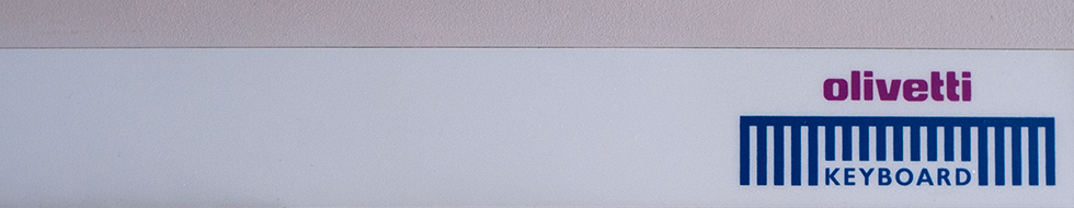
- header_olivetti_2.png (261.78 KiB) Viewed 6156 times
The attachment header_olivetti.png is no longer available
Closeup of the Olivetti logo.
Posted: 28 Feb 2016, 17:41
by Muirium
I like that. We could use some more logo shots.
Seebart's are colorful, and I'll likely use one of the trace shots, but I'm not sure about the theme…

Posted: 28 Feb 2016, 17:55
by seebart
zuglufttier wrote: header_olivetti_2.png
header_olivetti.png
Closeup of the Olivetti logo.
Really nice.
Posted: 05 Mar 2016, 23:46
by matt3o
zuglufttier wrote: header_olivetti_2.png
header_olivetti.png
Closeup of the Olivetti logo.
absolutely gorgeous
Posted: 07 Mar 2016, 00:56
by seebart
Posted: 07 Mar 2016, 01:00
by Redmaus
Please don't the jealousy will reach my heart and give me cardiac arrest
Posted: 07 Mar 2016, 01:02
by seebart
Relax and don't look at them then. These headers won't make the cut anyway.
Posted: 11 Mar 2016, 00:56
by snuci
Here's a logo header...
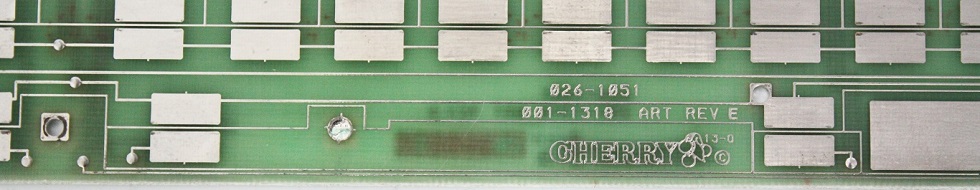
- Cherry Solid-state Capactive foam and foil
- Cherry Capacitive header.jpg (104.38 KiB) Viewed 6022 times
Posted: 11 Mar 2016, 11:22
by matt3o
seebart wrote: E3E's Alps SKCM Neon Green:
really like the first one seebart
Posted: 11 Mar 2016, 12:37
by seebart
Thanks matt3o, of those three the first one is the only one that works with the logo. Nice Cherry PCB header snuci!
Posted: 11 Mar 2016, 13:53
by ramnes
seebart wrote: E3E's Alps SKCM Neon Green:
SKCM Neon Green3.jpg
Love that one.

Posted: 13 Mar 2016, 14:48
by zuglufttier
A take on the IBM logo found on some rubberdomes.

- header_ibm.png (267.17 KiB) Viewed 5968 times
Get's all messed up with the logo...
Some photoshopping will take care of this:
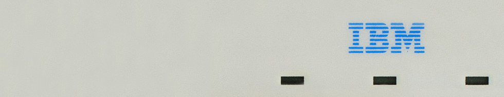
- header_ibm_2.png (243.12 KiB) Viewed 5958 times
Posted: 13 Mar 2016, 15:14
by seebart
The second one works well zuglufttier, really nice header!
Posted: 13 Mar 2016, 16:11
by matt3o
it's a bit too much logo-centric but we had other branded headers... so...
Posted: 13 Mar 2016, 16:20
by seebart
... so...it's in rotation already, that was fast?!
Posted: 13 Mar 2016, 16:22
by scottc
Really! Something tells me Mu's header dictatorship has ended...
Posted: 13 Mar 2016, 16:25
by seebart
scottc wrote: Really! Something tells me Mu's header dictatorship has ended...
That would suprise me Scott!
Posted: 13 Mar 2016, 16:37
by matt3o
I haven't seen him around these days, so I'm enjoying some random headers

Posted: 13 Mar 2016, 16:41
by seebart
matt3o wrote: I haven't seen him around these days, so I'm enjoying some random headers
Well you're the only one around here that can do that and get away with it.
Posted: 13 Mar 2016, 16:57
by matt3o
okay added some great headers from the previous pages and removed some old ones. Hope Mu will agree with my selection.
edit: someone is playing with my headers! who is it!? come out if you dare!
