Page 2 of 4
Posted: 27 May 2016, 12:14
by lot_lizard
Muirium wrote: The smaller font in Compgeke's draft is Helvetica. I can always get behind that!
I'd still prefer a fully centered IBM though. With Capsense on the upper side and Keyboard below, perhaps.
I'd like to see 3-5 mockups of various layouts if Compgeke is game for doing. I have a feeling we would like end up liking parts of a couple and ask him for one final. For sure... "IBM" is too small, the subtext font is great (using the smaller size), and our wording is junk. We need to give him a phrase to work with. I have always agreed with you that using an even longer acronym than SSK is a bit much
EDIT... At least with something like RISC, I would say "risk". I wouldn't ever call this project "fisk", so we need something else. Four consecutive letters doesn't roll off the tongue. It's fine to use FSSK as the project name, but it doesn't belong on the badge
Posted: 27 May 2016, 12:34
by Muirium
Hear hear.
The twelve year old in me wants to see The For Fuck Sake Keyboard spelled out on the badge. Because that's how FSSK forever strikes my eyes. OMFK! Argh. Make him stop!
Anyway, I like "Capsense", if we want wordy. It's a cleaner looking word than Capacitative, whichever way you spell it.
Posted: 27 May 2016, 12:44
by lot_lizard
Does "Capacitive Model M" suck? I'm not in love with it, but it at least describes what this is accurately, and even a Cherry/Topre lover would see it and follow.
Certainly up for suggestions, but would prefer something I can let my 4 year old daughter use in the next coming years as I teach her to type. Otherwise I have to wait until she drops her first F bomb before I can break it out of the closet. "Thank God... You finally swore... Hey, check out Daddy's keyboard we made that I've been hiding"

EDIT: just saw your "Capsense" edit below. Chewing on it. Initial thought is it feels like a Cologne line (Eternity, Invictus, etc), but maybe that's a good thing
Posted: 27 May 2016, 13:02
by Muirium
It's a much cooler word. I first heard it in the community and soon dropped ugly capacitatitatatiaticitiativitvitizitateritive completely. Blech!
What does Model F and Topre have in common? Many things, like dyesub caps in Helvetica!, but the big one: they're capsense. Boom.
Posted: 27 May 2016, 13:22
by lot_lizard
Finished chewing and swallowed. I like it. I'll ping I$ and get his take too. I realize this is just the badge, but still. In the meantime Compgeke, we would love a few mockups if you are up for it. I would probably make a version(s) with "Capsense SSK" as well. I think the 101-key could just be "Capsense" (lives on its own). If others have ideas or comments, chime in please
EDIT: Let's see a mockup for "Capsense Model M" as well. For visual spacing on the badge as much as anything
Posted: 27 May 2016, 14:42
by idollar
lot_lizard wrote: Compgeke wrote: 
The more I look at this, the more I like it. Especially the font type for the subtext. It reminded of the old RS/6K badges (and basically anything with a model on the badge), so looked it up.
image.jpeg
I am personally minimalist in my approach to logos/badges. One of my ever favorite ones was the SUN logo ...
I would keep away IBM from the logo to avoid possible legal conflicts.
My opinion is that a logo with an smaller "F" followed by "SSK" or "EXT" all in IBM-logo fonts will look nice. Iy could be written in a badge as the original "IBM" posted above. We could keep and smaller "F" at the beginning and use a different group of three letters for other variants. It would something like the i-<whatever> from apple.
I am sorry to come with new ideas now, but the legal issue is important in my opinion.
Posted: 27 May 2016, 14:49
by Muirium
So long as OSH Park (or whoever it is, I honestly can't tell their names apart) is fine manufacturing an IBM logo for us, I see no problem in it. Personally, I will not use any replacement badge without the IBM logo graphic. Removing the original and replacing it with something lacking that, well, would feel like castrating my boards to me! It'd be like scratching the Apple off one of theirs. Petty vandalism.
Posted: 27 May 2016, 15:10
by lot_lizard
idollar wrote: I would keep away IBM from the logo to avoid possible legal conflicts.
This is actually one of the reasons I like the idea using some marketing friendly term for the badge that technically has nothing directly to do with the project (just through inference)
Then let this group buy exist on its own. Then the only issue (assuming it ever did actually arise) would be of the badge itself and not the project it is tied to. I do agree with Muirium. I like seeing the IBM logo on the case, and wouldn't want to give that up. If we did, I would likely just keep the existing badge on my stuff.
EDIT: Also, we do need to start thinking about a sticker for the back of the assembly (think the piece we always fought to get off during a bolt-mod), and would contain "serial numbers", born on dates, etc. I will post something in the "Remodeling" thread to call on volunteers (doesn't belong here). That would be more pressing since it would go out with the drop-in assembly, and I would definitely like that to keep all the original monikers (to me... the FSSK and FEXT are the project), but I still don't think they belong as the "sexy marketing" (the brand police in me)
Posted: 27 May 2016, 16:23
by clickykeyboards
Speaking from experience and having spoken with litigation attorneys at a New York intellectual property (IP) law firm, IBM has teams of lawyers that are tasked in protecting IBM's intellectual property including their trademarked logo.
http://www-03.ibm.com/ibm/history/exhib ... ogo_8.html
This is part of the reason why Unicomp is careful in their marketing of their keyboards and provides some spare parts but not others. Unicomp's redesigned Ultra Classic Model M keyboards inspired by IBM's original design is one thing.. but I would advice careful consideration to anyone producing and using IBM's 8-bar corporate logo on their own unlicensed product
Posted: 27 May 2016, 16:38
by wcass
When restoring a classic car, there is no law against using reproductions of original logos. You might run into problems if you change the logo or use the logo on a different car. In short, I think that there would be less legal issues by keeping the badge very close to the original. The keyboard is still 90% IBM parts.
Those in the know would see a badge made from PCB and would ask, feel, or make an assumption.
Posted: 27 May 2016, 16:51
by fohat
Minting coins has always been the strictly regulated area, but exact reproductions of rare coins can be made as long as they are permanently stamped "copy" or "replica" and are sold as such and not passed off as counterfeits.
Posted: 28 May 2016, 13:29
by lot_lizard
I smurfed with this a little this morning. It could certainly use work (spacing, font size, alignment, etc), but welcome some thoughts of maybe just heading in another direction altogether. Certainly the subtext could be anything else. The main logo was the real suggestion
EDIT: Make black with silver text for my own brain to process, and cleaned up a bit
Posted: 28 May 2016, 19:57
by lot_lizard

The silence is deafening
... I think I have my answer
Posted: 28 May 2016, 20:09
by Muirium
What's a DTK?
Also: weekend.
Posted: 28 May 2016, 20:15
by lot_lizard
Muirium wrote: What's a DTK?
Also: weekend.
Desk Thority Keyboard... And totally follow. I'm boating down the river myself at the moment
Posted: 28 May 2016, 20:22
by Ray
I don't think the stripes look good on "DTK". And as Muirium pointed out, it isn't a meaningful acronym.
If I wanted a DT reference on a logo, I would prefer the actual DT logo!
Posted: 28 May 2016, 20:37
by lot_lizard
Ray wrote: I don't think the stripes look good on "DTK". And as Muirium pointed out, it isn't a meaningful acronym.
If I wanted a DT reference on a logo, I would prefer the actual DT logo!
Don't disagree in any way, but if we are going to use DT by itself, it would need to be the full version. I actually tried just the DT logo this morning, and it looked very off (if tilted)... needs to be more rectangular to support the badge dimensions. That was my first attempt (couldn't sleep). I tried a few different things to comfort everyone on the legality problem, and about the only attempt I came up with that seemed to hold water was this... So posted
On the 'meaningful acronym' part... nothing is meaningful until you make it so

. Only a few years ago, if you said "Kishsaver", I would have asked "who saved Mesopotamia?!?", and "Bigfoot" only applied to the North American Yeti... But I follow.
Posted: 28 May 2016, 21:50
by ramnes
I really don't think IBM would care about a custom old school logo replica... And I really would love Compgeke badge myself!
Posted: 28 May 2016, 21:54
by lot_lizard
This was meant to just kick off the idea of other configurations (wasn't assuming this was golden by ANY stretch). I also tried i$'s suggestion of the fXXX setup, and it just looked off as well. I really like the tilted text of "IBM" since it doesn't draw my attention to read it like horizontal text would (tilted is elegant). If we do go with "DT", it needs to be flat horizontal.
I am VERY comfortable using just "IBM" with the "Capsense Keyboard", "Capsense Model M", or "DT (maybe even the logo) Capsense" subtitle. But wanted everyone to be comfortable with this legality stuff if we proceeded. Again, I vote this is a separate group buy from the project regardless, but linked by inference.
For legal reasons, there is a massive loophole called "Nominative Use". Essentially, you can use the exact logo of basically anything if you can show that you are comparing something you have to whatever it is that uses the logo you have copied. So we would be comparing our solution (which is VERY different from their model M) to the original. We are using "IBM" to show the comparison. Having it printed on PCB is actually BRILLIANT on WCass's part for this reason, since it is primary reason for the difference in the first place (WCass is either a GENUIS or very lucky
). I do think calling out the difference in subtext makes a ton of sense to further back the argument (plus it is sexy). What would even strengthen the point further would be if WCass added some faux copper pattern in the PCB for texture (might look good anyway), noting the PCB even more... as long as it still looked good.
Post your thoughts, but know... Marketing and Legal SUCK balls. There is NEVER group consensus putting stuff like this together. More "This is the best bad idea we have, sir. By far" (the movie Argo)
EDIT: Boating session number 2 of the day is commencing, but will have my phone to read responses (no replies though)
Posted: 29 May 2016, 14:44
by lot_lizard
If everyone was actually comfortable using the IBM logo, something like this would be MORE in the direction of my vote for several reasons (most mentioned in the previous post, but appearance as much as any of them)
Posted: 29 May 2016, 14:56
by Muirium
Nah. While I'm all for using IBM's logo—in tribute of the fact this their vintage technology we're retrofitting inside their own keyboards!—I don't think mixing logos is a good idea. Would much rather see a short and pithy description of the work we've done rather than loading it up with our ID.
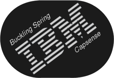
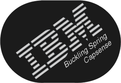
How about Buckling Spring on the upper left of the IBM and Capsense Keyboard on the lower right?
Or Capsense and Upgrade?
How small can the Helvetica text get with the manufacturer's process? Mind we want it all good and uniformly shiny.
Our own name, along with links and credits, can go on the underside label of the case and/or the inner assembly. There's enough space there to spell out where the IBM ends and we begin!
Posted: 29 May 2016, 15:33
by lot_lizard
Muirium wrote: How about Buckling Spring on the upper left of the IBM and Capsense Keyboard on the lower right?
See attached below. I really don't think anything can live above (to the left) of the IBM logo myself. Gives me veritgo. I added the same phrase all to the right since i figured that might be next. I like it as well
Muirium wrote: How small can the Helvetica text get with the manufacturer's process?
Not my knowledge area... WCass would have to step in
Muirium wrote: Or Capsense and Upgrade?
That could be interesting, but we need to be careful that we are suggesting it is a better version
Muirium wrote: I don't think mixing logos is a good idea.
The one real upside to having the logo (not for bragging) is the argument that we are making it obvious that we are not attempting to pass off as IBM. Similar to "Powered by Whatever" nomenclature. If we can make a badge aesthetically desirable while being differentiated, that is prudent
- badge_IBM_BS_Black.png (60.46 KiB) Viewed 6010 times
- badge_IBM_BS2_Black.png (60.52 KiB) Viewed 6010 times
Bringing along the attempts for comparison later (keeping things tidy)
Posted: 29 May 2016, 16:23
by Muirium
Maybe you're right about the top left.
Here's an idea: one word. Try centring Capsense under the M. And I'd also like to see a non italic version for comparison.
Posted: 29 May 2016, 16:53
by lot_lizard
Muirium wrote: Maybe you're right about the top left.
Here's an idea: one word. Try centring Capsense under the M. And I'd also like to see a non italic version for comparison.
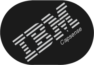
- badge_IBM_Capsense_Black.png (53.65 KiB) Viewed 5975 times

- badge_IBM_Capsense_NI_Black.png (53.82 KiB) Viewed 5975 times
Previous images
I'm going dark for most of the day. Others chime in too please
Posted: 29 May 2016, 17:10
by Muirium
I like the last one. Non italic Capsense. Got a file with layers we can edit? I'm tempted to nudge the Capsense over a little, as kerning is a psychovisual art rather than a strict geometric science. But it's just a little…
Posted: 30 May 2016, 00:48
by lot_lizard
Muirium wrote: I like the last one. Non italic Capsense. Got a file with layers we can edit? I'm tempted to nudge the Capsense over a little, as kerning is a psychovisual art rather than a strict geometric science. But it's just a little…
I preferred the non-italic with any single word as well. I like it offset slightly right from M's center myself. Happy to send them over the wall when I get home in a few hours. Appreciate the help. I use Gimp (xcf extension). I can convert to PSD, but I don't care to clean up any layer loss (though these are super simple, and likely would be fine). Just let me know if PSD (proprietary fluff) is desirable as well... Or something like tiff that doesn't rasterize
Also, I think I'm going to try printing the end result as well. I would like to see defined raised texture in each letter. Then paint (or something) the raised text silver (should be pretty simple, and will at least give it a go). I still like the PCB for this project though (as a group buy), regardless of how the print works out
Posted: 30 May 2016, 02:22
by Chyros
I guess if you want them as authentically as possible, you can base it off the IBM PS/2 badge:
Posted: 30 May 2016, 03:33
by Redmaus
How about IBM and then having DT under it?
Posted: 30 May 2016, 03:41
by lot_lizard
Redmaus wrote: How about IBM and then having DT under it?
If you go back 5 or so posts, there is a spoiler with all the images up until that point that I threw together. Like that, or you are thinking bigger?
Posted: 30 May 2016, 04:39
by lot_lizard
Muirium wrote: Got a file with layers we can edit?
Zip includes the xcf (Gimp), psd (Photoshop), and the tiff. Several layers are disabled (DT logo, etc.) if you want to experiment further. Look forward to the updates.


