Page 19 of 53
Posted: 03 Mar 2014, 13:43
by Muirium
Yes!
I'll see what I can do to help you out with a good set of stylish symbols. Because I will take both!
By the way: those arrow keys. If it's not too much of a stretch, could we could go with two styles? I really like chevrons like those, but I also like IBM style black headed arrows, or indeed black triangles.
Posted: 03 Mar 2014, 13:44
by 7bit
If done right (no too thin), the symbols of Round 4 look much better!

Posted: 03 Mar 2014, 13:48
by matt3o
Muirium wrote:By the way: those arrow keys. If it's not too much of a stretch, could we could go with two styles? I really like chevrons like those, but I also like IBM style black headed arrows, or indeed black triangles.
I'd say chevron on symbols-only and UP/DOWN/LEFT/RIGHT on text-only?
7bit wrote:If done right (no too thin), the symbols of Round 4 look much better!
are those cherry-ish style? Are they available somewhere? Actually... I think I should have them already...
Posted: 03 Mar 2014, 13:50
by Muirium
The Round 4 SPH arrows are a bit thin for my preference. I use UP DOWN etc. instead. But IBM arrows and filled triangles are a whole other story…
Posted: 03 Mar 2014, 13:53
by 7bit
This is precicely what I said:
"If done right (no too thin)"

They did them not right.

Posted: 03 Mar 2014, 13:57
by matt3o
well, you know we are sublimating, so we can have them right. The only problem is the time needed to make the final design. I really have a lot of work to do for this set.
Posted: 03 Mar 2014, 14:01
by Muirium
Indeed.
UP/DOWN/LEFT/RIGHT on text-only is a good safe option, if text arrows are popular enough with everyone. I think they're okay, but not brilliant. I'd rather filled triangles or chevrons
and arrows of IBM or 7bit's advised style.
7bit wrote:This is precicely what I said:
"If done right (no too thin)"
They did them not right.
Oh, right. I read it as a warning, not an apology…
Posted: 03 Mar 2014, 20:41
by matt3o
Working on the icon set, there's really a lot of work to do. Some are too thick other too thin, some rounded other squared... gosh

Posted: 03 Mar 2014, 21:12
by Muirium
I'll have a go. You want an .svg you said?
Posted: 03 Mar 2014, 21:47
by woody
matt3o wrote:okay, now, for the mods:
FULL CAPS
Camel Case
lowercase
only symbols
symbol + text
?!
Being like originally suggested was almost perfect.
My personal preference is against symbols, arrows excluded.
I'd like to see a consistent approach - either all labels are abbreviated in a common way ("CTRL"), or they stay full ("CONTROL"). This is where "INS" and "PAGE UP" clash a bit.
Posted: 03 Mar 2014, 23:32
by matt3o
I prefer consistency in font size/spacing.
@muirium, yes SVG
Posted: 04 Mar 2014, 05:32
by stoic-lemon
I like what you've done with the symbols, and I'll add my support to having all symbols. I'm not against text, and I also prefer consistent font size and spacing.
Posted: 04 Mar 2014, 18:09
by matt3o
A more rational icon kit

Posted: 04 Mar 2014, 18:15
by Muirium
Improved. Caps Lock especially. I still want chevrons for Control, but you've almost got it now.
(And I failed to find anything with .svg output I could use yesterday, but will look again.)
Posted: 04 Mar 2014, 18:18
by matt3o
if you have high res images I can try to trace them
Posted: 04 Mar 2014, 18:20
by 7bit
What is the old-school STOP sign doing (top right)?
Posted: 04 Mar 2014, 18:23
by matt3o
According to this
http://xahlee.info/comp/unicode_computing_symbols.html it's a "break key". I like the mug better, but it looks a bit out of place
Posted: 04 Mar 2014, 18:29
by jdeblese
Chevron as in caret, right? Isn't that a bit too similar to the caret key? I didn't like the ctrl symbol in my image from earlier, but the one above is not bad - clean and minimal.
Matt3o, are you planning to offer all mod keys in a symbol version, or just those from the base set?
Posted: 04 Mar 2014, 18:30
by Muirium
Mug and Keyboard Runner can go in the fluff kit, as usual…
Posted: 04 Mar 2014, 18:31
by matt3o
jdeblese wrote:Matt3o, are you planning to offer all mod keys in a symbol version, or just those from the base set?
yes, almost all mods will be available in icon version.
Posted: 04 Mar 2014, 18:31
by jdeblese
Awesome, thanks!
Posted: 05 Mar 2014, 02:20
by Muirium
So, the symbols. I've rendered OS X's set. I'm not demanding that this GB be entirely in the Apple style, but there's a good full set here for us to cherry pick.
Waging battle with Adobe Illustrator (CS1, the version that I have, on my old G4 iMac) I made an .svg file that's attached to this post; in zip form thanks to allowed formats. Doubt it's too useful, as I couldn't convince Illustrator not to embed the fonts themselves.
So here's a high res image version of the symbols, as seen in Lucida Grande: OS X's one and only menu font, where they all so often appear:
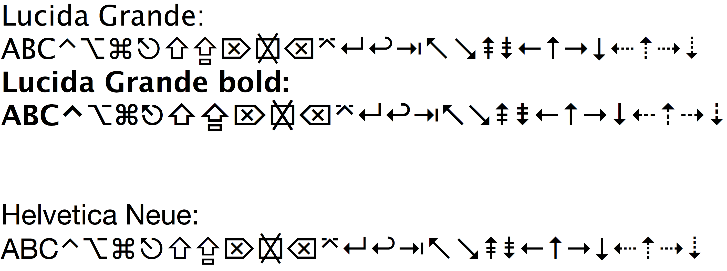
- Symbolic Legends.png (172.49 KiB) Viewed 5278 times
I can make it bigger, much bigger, if required. Helvetica Neue is just to show that, actually, these symbols are Lucida Grande exclusives. They're passed right on over.
The order of symbols in that image is:
ABC (just for alignment comparison) Control, Option, Command, Escape, Shift, Caps Lock, Delete, Clear, Backspace, Enter, two versions of Return, Tab, Home, End, Page Up, Page Down, Left, Up, Right, Down, and alternate arrows.
Clear is the key that Macs have instead of Num Lock. It's yet another kind of Delete. I think the official Return symbol on the Mac is in fact the curly arrow, but I prefer the right angled one. And those dotted arrows are the ones Apple put on its keyboards for a while:
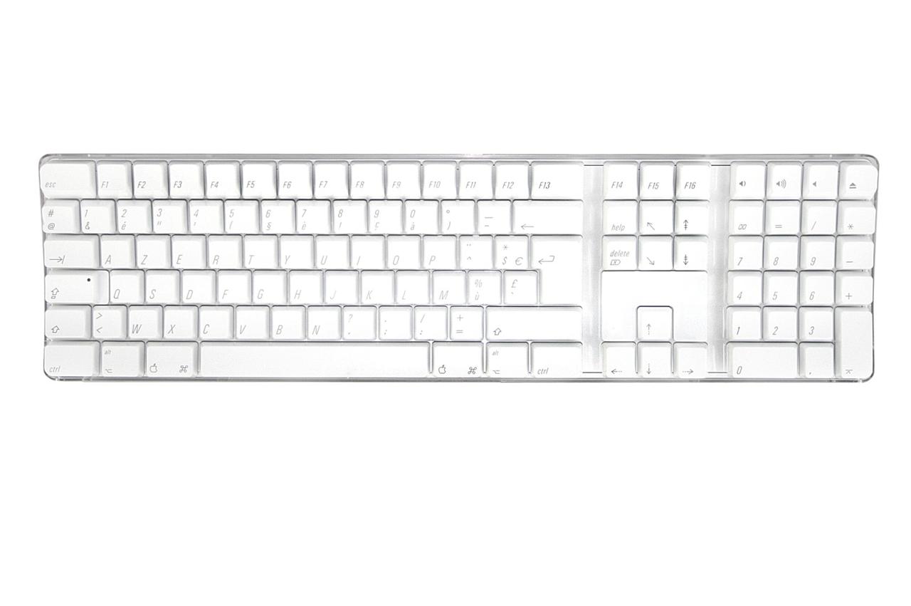
Crap keyboard, but lots of symbols. Don't know why they're italic, though…
These days, Macs have solid triangle arrow keys:

Symbolic mods and Arabic.
Posted: 05 Mar 2014, 08:57
by DanielT
For the Nerdom kit there should be also a
Vim key

Posted: 05 Mar 2014, 08:59
by matt3o
well, actually the symbols I made are very close to the ones you posted Muir. Which one do you suggest to use?
My set is pretty rational. I started from the arrow cluster and built all the other symbols starting from the chevron. Same line width, same angle. Of course I can't use the up arrow for control.
Remember that Gotham is rounded, so the symbols are rounded as well. I also like the filled arrow, but having 2 sets of symbols for arrows seems a bit overkill
Posted: 05 Mar 2014, 09:06
by DanielT
I meant something like this :
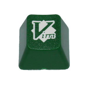
- vim_large.jpg (20.07 KiB) Viewed 5254 times
Posted: 05 Mar 2014, 09:08
by matt3o
yes, I evaluated the Vim key. I'm going to review the nerdom kit a bit. If I can find a spot for Vim I'll add it
Posted: 05 Mar 2014, 10:59
by Muirium
matt3o wrote:well, actually the symbols I made are very close to the ones you posted Muir. Which one do you suggest to use?
My set is pretty rational. I started from the arrow cluster and built all the other symbols starting from the chevron. Same line width, same angle. Of course I can't use the up arrow for control.
Remember that Gotham is rounded, so the symbols are rounded as well. I also like the filled arrow, but having 2 sets of symbols for arrows seems a bit overkill
Indeed. Could you post your .svg instead so I can compare here? I'm into details now.
A compromise on chevrons would be to go for the classic arrow shape on the cursor keys and use chevron on Control. Whereby "compromise" I mean exactly what I want! Your chevrons are nice, but given the clash I think arrows are better.
Who else prefers arrows over chevrons for cursor keys?
Posted: 05 Mar 2014, 11:05
by fart_toast
100% arrows with text mods.
For the symbol mods being canvassed here I think the chevrons kind of go with the symbols....but gave it another 5 minutes thought. Joining team arrows again

.
Posted: 05 Mar 2014, 11:11
by imbattable
Chevrons with icons, arrows with text, sounds good to me.
Posted: 05 Mar 2014, 12:39
by matt3o
Slightly revised version based on recent inputs.
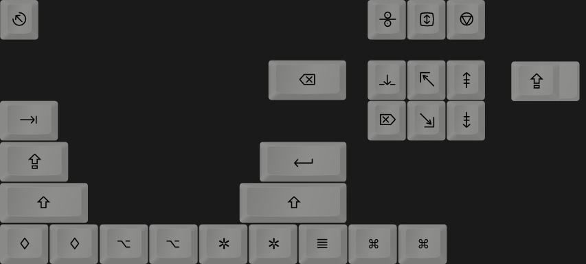
- icons.png (47.53 KiB) Viewed 5283 times
Attached the SVG. I kinda like them. I might try a different style, but it's not vital for the sake of the quote from SP.