Page 29 of 76
Posted: 19 Jan 2015, 11:36
by snoopy
nice!
it's not a clack, it's a brobot. so everything ok.

Posted: 19 Jan 2015, 12:05
by Halvar
Oh. For me, I actually don't like too many novelty caps in the header rotation...
But since we have only four Clacks in the rotation right now, and three of them are Wingnuts, I'm fine with a nice brobot cap like this. On a BS keyboard, too.

Posted: 19 Jan 2015, 12:06
by scottc
Me neither. I feel like too many would cheapen it and make it feel tacky. The vintage keyboards are a lot more interesting!
Posted: 19 Jan 2015, 12:29
by snoopy
Muirium wrote: Aye, chief. I still haven't come up with an adequate way to preview these before making them live. (Anyone got a layer of the site logo in its accurate size and position?) Let's see if this is any better:
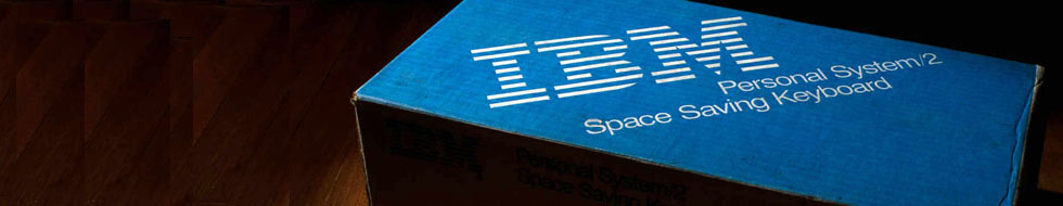
Chzel SSK box - Wider Right.jpg
Looks good to me. The box corner slides right in front of the bowl of the R in DESKTHORITY, which is a nice accident. Anyone got better ideas or do I make this live?
You and your post editing, Seebart. I only spotted that last bit of advice a touch too late… look at the top of the page!
I like this one
Posted: 19 Jan 2015, 12:47
by seebart
Muirium wrote:
You and your post editing, Seebart. I only spotted that last bit of advice a touch too late… look at the top of the page
true, I do quite a bit of post editing. I know it can be slightly unclear at times, sorry!

Posted: 20 Jan 2015, 11:13
by 7bit
Cleaned that for you:
- dashboard141_cleaned.jpg (33.92 KiB) Viewed 6226 times

Posted: 20 Jan 2015, 13:34
by Muirium
Faker! The repeating pattern on the (faked) left is what really needs sorted out.
I might take a new crop to position the logo more in line with ours as well. But I'm not on my Photoshop machine. (A mighty PowerPC, because I use it oldschool, dawg.)
Posted: 20 Jan 2015, 13:58
by seebart
good enough dawg?


- dashboard141_cleaned.jpg (33.49 KiB) Viewed 6202 times
and while we're at it what about my super duper snoopy brobot header from yesterday?
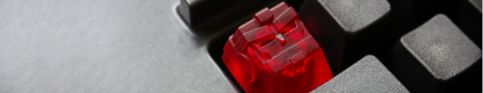
- snoopy_clack.jpg (150.3 KiB) Viewed 6200 times
Posted: 20 Jan 2015, 14:21
by Muirium
We're getting there. But I'm still going to recrop from the original and get an artful placement of the IBM text in our header's context.
Snoop's Kish looks so bright in that shot. And wide! I'm imposing an informal Clack cap on Clack caps in headers — otherwise we really will mislead people showing up at the site wondering where all the auctions are — so it has to be a 10/10 shot. I'll have a go at those when I'm Photoshopping too. But I think most of the shots were way too stingy for our required left space.
Posted: 20 Jan 2015, 17:57
by snoopy
yeah, these shots were made with the brobot in focus and as the main part of the pic, cause I promised Bro Caps to do some shots of it. So sadly far away from being good base material for header images, cause everything around the brobot is too blurred and in some cases overexposed to make it even more outstanding.
Posted: 27 Jan 2015, 16:22
by Halvar
vswv had a quite good week:
http://deskthority.net/post206070.html#p206070
(testing -- doesn't work at all unfortunately, and the original is too small for a better crop)
Posted: 27 Jan 2015, 16:39
by Muirium
Trickier than it looks! Let's try it rotated instead:

- Vswv Horizon.jpg (45.1 KiB) Viewed 6121 times
I'd never let it in otherwise, but that green background is a nice pairing! Tempted…
Posted: 30 Jan 2015, 21:21
by vsev
Hi there,
I can say I'm very glad my pics are discuss this way..
I promess I'll give up better ones within the coming week, contribute to this site would be an honor to me !
Posted: 30 Jan 2015, 21:56
by seebart
the caps need to be moved to the right and them some of that green background cloned to the left for the logo area! I´ll try it later.
Posted: 30 Jan 2015, 23:56
by idollar
Does anyone like this one ?
Posted: 31 Jan 2015, 00:14
by ramnes
And this one?
Posted: 31 Jan 2015, 00:18
by idollar
I like it !
Posted: 31 Jan 2015, 01:26
by Muirium
Yup. Ramnes' monochrome one is pretty cool. And a bit of a keyboard nerdery test: what the hell is that anyway?
i$: sharper focus please! Especially at the right side of the picture, as the one of the three LEDs that's okay sharp is hiding behind the DT logo.
Posted: 31 Jan 2015, 18:56
by idollar
It is ok. I will not dismount again the IBM AT to take the picture.
There was no light and therefore the dof was short. This is the reason for the difference in focus.
Posted: 31 Jan 2015, 21:31
by Madhias
Nice one, ramnes! Fits very well. Also: what is the subject?
Posted: 31 Jan 2015, 22:37
by seebart
I like both idollar`s and ramnes because their not the typical keyboard shots! This is what we need, this is what I should be taking pictures like!

Posted: 01 Feb 2015, 01:23
by ramnes
C'mon guys, it's a model M !
Posted: 02 Feb 2015, 23:46
by Muirium

- G81-3081SAF + G81-3077SAU.jpg (43.07 KiB) Viewed 5936 times
http://deskthority.net/photos-f62/cherr ... t9771.html
Hmm… I'll try another crop.
Posted: 02 Feb 2015, 23:55
by Halvar
I like it! Good lighting, and the AZERTY makes it subtly special.
Posted: 02 Feb 2015, 23:59
by photekq
Thanks for the crop Mu
Since the left side is basically pitch black in the photo, could always move the board over to the right so the DT logo isn't blocked. I'll try that now.
Posted: 03 Feb 2015, 00:03
by photekq
Testing
Posted: 03 Feb 2015, 00:24
by Muirium
That's better. I like the mods unobscured. Great shot!
Posted: 03 Feb 2015, 00:51
by ramnes
/me likes
Posted: 06 Feb 2015, 19:48
by Muirium
As people should know by now, I love a good pattern. But will it clash with the logo…
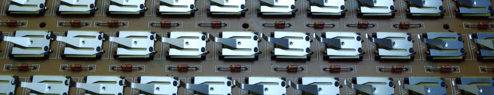
- 2nd Generation leaf springs 1.jpg (77.74 KiB) Viewed 5866 times
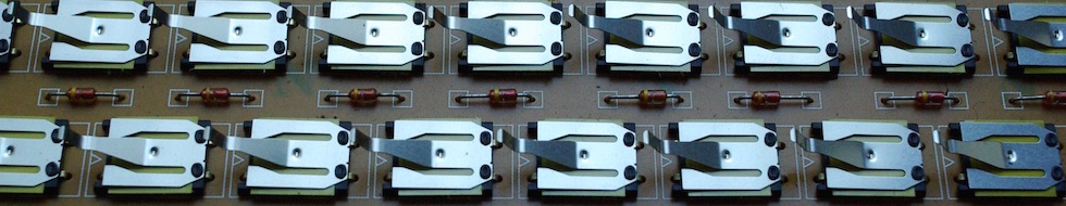
- 2nd Generation leaf springs 2.jpg (80.13 KiB) Viewed 5866 times
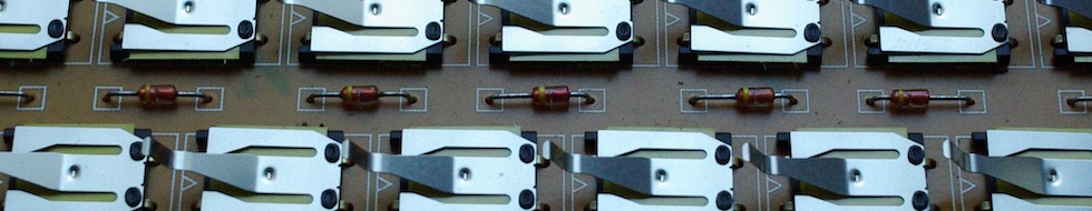
- 2nd Generation leaf springs 3.jpg (65.95 KiB) Viewed 5866 times
Phew. Not all of them do!
Crops from
Seebart's original picture, of course.
Posted: 06 Feb 2015, 22:23
by Stabilized
Maybe it would be beneficial to add a gradient to the left hand side to not interfere with the DT logo; something like this:
