Page 1 of 1
Microsoft has taken over Google!!!
Posted: 01 Sep 2015, 21:52
by 7bit
Posted: 01 Sep 2015, 21:56
by ramnes
This is a revolution.
Posted: 01 Sep 2015, 22:11
by webwit
7bit wrote: Please suggest alternatives!

Posted: 01 Sep 2015, 22:16
by Khers
Posted: 01 Sep 2015, 22:26
by 7bit

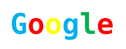
- google_001.png (21.16 KiB) Viewed 3981 times
Posted: 01 Sep 2015, 22:28
by chzel
Γοογλε;;;;
Γκουγκλ sounds closer phonetically!
Posted: 01 Sep 2015, 22:31
by Muirium
They went gone did get all growed up!
In crayon, no less.
Anyway, nothing I need give a flying
duck about. Google's too big, self entitled, and (most troublesome of all) everyone has total trust in them. I ain't using that!
Posted: 01 Sep 2015, 22:36
by 7bit
Posted: 01 Sep 2015, 22:41
by Muirium
Google's old logo was hideous! They were such a 1990s child, like eBAY! and YA---HOOOO!! that it's kind of surprising they didn't include a ! in the name as well.
Fun fact: Microsoft's logo through all the glory years of PC world dominance was in Helvetica. Not the Arial shite they actually included in their OS! Cheap bastards.

Posted: 01 Sep 2015, 22:45
by chzel
Γ sounds a bit like the German j and κ like k. Together they sound like g
ο and υ together sound like u
So it's γκ(g) ου(oo )γκ(g) λ(l).
Of course oo sounds "longer" than u so you could write it as γκουουγκλ!
I'm not really good describing all that stuff though, so I hope it makes a bit of sense!
Posted: 01 Sep 2015, 22:56
by Halvar
- hackgoogle.png (3.96 KiB) Viewed 3953 times
New free overhyped source code font Hack:
http://sourcefoundry.org/hack/#download
I don't like it.
Posted: 01 Sep 2015, 23:08
by 7bit
chzel wrote: Γ sounds a bit like the German j and κ like k. Together they sound like g
ο and υ together sound like u
So it's γκ(g) ου(oo )γκ(g) λ(l).
Of course oo sounds "longer" than u so you could write it as γκουουγκλ!
I'm not really good describing all that stuff though, so I hope it makes a bit of sense!
Yes, thanks a lot!

Posted: 01 Sep 2015, 23:54
by Redmaus
EDIT: Oh wait this is actually about fonts

I just did that on mobile all the sudden.
Posted: 02 Sep 2015, 13:23
by 7bit
Just change the text to:
Google is the internet - don't be evil
Posted: 02 Sep 2015, 13:26
by Muirium
Don't be evil. We're watching you.
Posted: 02 Sep 2015, 13:38
by seebart
The text simply needs to be:
WE SEE AND KNOW EVERYTHING OUR SOFTWARE REGISTERS BUT WE WONT TELL YOU MORE....
Posted: 03 Sep 2015, 17:46
by Muirium
Crayon me surprised: a positive take!
http://www.underconsideration.com/brand ... _house.php
This guy is usually unafraid to piss all over bad work. Weird. Especially the bit about being better than Apple or even IBM at the end! Did they buy you a drink?
Anyway, I think they would have been better to just go with the dots! Bold. But so ubiquitous that everyone will have their logo burned into their brain quite soon, no matter what it is.
Posted: 03 Sep 2015, 19:19
by jbondeson
Frankly it's the multi-colored 'G' they use for the favicon that drives me nuts.
That many colors at that small a size just makes it look like rainbow vomit.
Posted: 03 Sep 2015, 20:29
by Halvar
-You know, that internet giant with the red-green-blue-yellow icon ... ?
-What, ebay?
- No.
- Microsoft?
- No.
- Oh, Google?
- Yes! Google!
Posted: 11 Oct 2015, 11:56
by Julle
If can't see what the major issue with this font change is, am I part of the problem?
Posted: 11 Oct 2015, 12:03
by andrewjoy
Its just a bad font , with the old one they had brand identity now its all new.
Posted: 11 Oct 2015, 12:11
by scottc
The difference in SVG size is hugely significant though. They'll gather brand identity on this logo before soon. They're Google, everyone knows them by now. They've been using the same font for several products before now anyway, just look at the Google Authenticator logo for example.
Posted: 11 Oct 2015, 12:57
by Julle
andrewjoy wrote: Its just a bad font , with the old one they had brand identity now its all new.
Please elaborate. Granted, the font might be a little boring and safe for a company logo but I don't really see any fault with the font itself. It's highly legible. It's fine. It's a font. That's about as passionate as I'm ever going and willing to be about a font. Albeit, I tend to favor sans-serif.
I don't really get the whole hipster thing around fonts when someone goes "Ugh, Helvetica" or "Arial, really?!". I even watched that Helvetica documentary to try and understand the phenomenon, and some of the comments against the font were just pants-on-head retarded.
What I do have problems with is Google's overall colour schemes. They could better than blasting a screen full of white pixels in their search results. My main issue with the logo has always been the colour scheme but that's what we get for living in a world where it's essential to push Coca Cola to toddlers.
Posted: 11 Oct 2015, 13:30
by Muirium


