Round 5 Colour Samples

User avatar
Muirium
µ

08 Nov 2013, 18:38

Signature Plastics' ABS samples are here and 7bit has set me the task of matching the original Honeywell colours for Round 5. I arranged them by shades on my desk and picked out the best candidates for each of the four colours. Matching is harder than it looks because these 30 year old caps have a very shiny finish (the tops are matte but a little yellowed) while the samples are less reflective. So, take a look for yourselves.

Natural light:
photo 2-1.JPG
photo 2-1.JPG (146.63 KiB) Viewed 9603 times
photo 1-1.JPG
photo 1-1.JPG (149.48 KiB) Viewed 9603 times
photo 4-1.JPG
photo 4-1.JPG (119.68 KiB) Viewed 9603 times
The blackest black in SP's set is NN, on the right. Yes, they write in black felt tip on those ones too! The Honeywell's black looks darker yet because it's shinier. (The difference is even more obvious in real life.) But NN is really, really black. So I think we're alright. It's just that super glossy Honeywell finish.

And with a boost from a harsh blue/white LED lamp:
photo 3.JPG
photo 3.JPG (133.9 KiB) Viewed 9603 times
photo 2.JPG
photo 2.JPG (125.24 KiB) Viewed 9603 times
My IDs are…
Black: NN (including legends on white keys)
White: WFK (including legends on all non-white keys)
Grey: GPA or GDC, they're very close.
Red: RAS

I'm sure my first attempt at pictures will make our favourite GB-running robot cross. Suggestions are welcome before the sun peeps between the chimneypots again and I have a second go tomorrow!

User avatar
7bit

08 Nov 2013, 19:24

Forget color-comparison under LED light. LEDs are for signal lamps.

User avatar
Muirium
µ

08 Nov 2013, 19:38

True. I pulled it out to emphasise the difference in the greys. It overdoes it, but increases the contrast between those three a bit for comparison's sake.

User avatar
tlt

08 Nov 2013, 19:43

Bright but not direct sunlight should be good for this I think

Findecanor

08 Nov 2013, 23:29

Is GD too different from the Honeywell grey?

User avatar
Muirium
µ

08 Nov 2013, 23:39

GD's pretty close, actually. Let me guess: is that R4 SPH's grey colour?
Image
Honeywell-SPH-SPH-Honeywell. (More pictures.)

RA isn't such a near match. Honeywell red is a bit darker in shade, more like RAS. I'll get them all out and shot tomorrow.

User avatar
7bit

08 Nov 2013, 23:46

RA is a lighter red, that's true, so I think we should go with the darker one.

I don't think we should go with pre-yellowed legends this time and stick closer to ther original as it was when new.

User avatar
Muirium
µ

08 Nov 2013, 23:47

Absolutely. The creamy legends are quite nice, but if people want that all they have to do is leave their Round 5s on a windowsill next summer…

User avatar
Daniel Beardsmore

09 Nov 2013, 00:05

Muirium wrote:Absolutely. The creamy legends are quite nice, but if people want that all they have to do is leave their Round 5s on a windowsill next summer…
We're getting a next summer? We had a last summer?

Hm, post 1500 …

User avatar
Muirium
µ

09 Nov 2013, 00:11

ABS sunburns as fast as a Scotsman! All it takes is a little sneak of sunlight here and there.

User avatar
matt3o
-[°_°]-

09 Nov 2013, 02:06

the only decent red seems RAS to me, RAC looks... cheap...

GDC looks pretty close, just a pinch too dark maybe? but GO is a bit off

Findecanor

09 Nov 2013, 11:58

Muirium wrote:GD's pretty close, actually. Let me guess: is that R4 SPH's grey colour?
That's right. I'm thinking that someone may want to combine the odd R4 and R5 SPH keys...
Personally, I am not interested in spherical keys - I just want to get the idea out there, unless it would be too bad ... so that's why I'm asking.

User avatar
Muirium
µ

09 Nov 2013, 13:18

I have included R4's in the comparison!

Just finished shooting a second set of pictures. This time I set things up more the way 7bit wanted, and so discovered that 4 SP colour samples stacked = just a sliver taller than a Honeywell cap. I also shot against a white paper background so I can correct white balance this time. Oh, and two cameras, to see if they differ. I'll upload the results once they're done, and I've finished cleaning up my SSK.

User avatar
Muirium
µ

12 Nov 2013, 22:43

Honeywell colour matching shoot: Take Two.

Now with white balance!
IMG_8085.JPG
IMG_8085.JPG (552.74 KiB) Viewed 9296 times
I calibrated my old Canon against that sheet of white paper, so the colours come through much better this time. Stacked samples, to match the caps for height as well as, hopefully, colour. All illumination is natural, indirect sunlight.
IMG_8084.JPG
IMG_8084.JPG (536.36 KiB) Viewed 9296 times
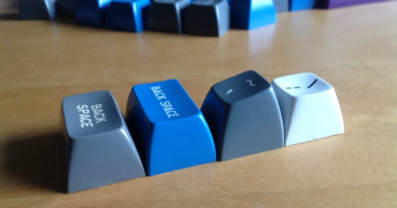
I picked out several Honeywell caps of each colour. Here's the white section:
IMG_8149.JPG
IMG_8149.JPG (1012.81 KiB) Viewed 9296 times
My eyes still say WFK.

Harder to see are the blacks. So here they are overexposed on purpose:
IMG_8113.JPG
IMG_8113.JPG (566.18 KiB) Viewed 9296 times
Definitely not TAR, which is a deep brown. NN is the closest black we've got. The Honeywells are impressively dark, even with lighting that should be identical.

Now for the greys.
IMG_8159.JPG
IMG_8159.JPG (349.28 KiB) Viewed 9296 times
The Honeywell has a lot of grey caps, so I pulled these from far ends of the keyboard. They do seem to differ a bit. The bottom one in this picture is a bit yellowed, and looks quite like GDC or even GO.
IMG_8157.JPG
IMG_8157.JPG (793.9 KiB) Viewed 9296 times
A darker shot:
IMG_8153.JPG
IMG_8153.JPG (895.83 KiB) Viewed 9296 times
The greys are mostly a more neutral shade, closer to GPA I think than GD. Though not so far away from Round 4's SPH alphas, really. You can see the Honeywells are paler when they're side by side, but it's not the worst:
IMG_2229s.jpg
IMG_2229s.jpg (81.01 KiB) Viewed 9296 times
R4 SPH below a Honeywell. And what they're like above:
IMG_2226s.jpg
IMG_2226s.jpg (223.19 KiB) Viewed 9296 times
Finally, the reds:
IMG_8150.JPG
IMG_8150.JPG (946.97 KiB) Viewed 9296 times
The differences between these are quite difficult to make out, thanks to cameras using RGB. (Red is basically black as far as the green and blue channels are concerned.) Here's another version, taken with a different camera:
IMG_2227.JPG
IMG_2227.JPG (333.89 KiB) Viewed 9296 times
To me, RAS still has the edge in real life. Although these shots lean towards RAC. Both are a little richer than pure RA red, a nice touch I think.

And here's a peek of the Rounds 4 and 5 combinations to come:
IMG_2224.JPG
IMG_2224.JPG (303.32 KiB) Viewed 9296 times
Honeywell grey, black and red sitting on my custom 60%. No, they do not fit. But they're already not a million miles away from SA, in font as well as profile.
IMG_2225.JPG
IMG_2225.JPG (533.74 KiB) Viewed 9296 times
I'm looking forward to mixing these up for real!

User avatar
7bit

14 Nov 2013, 22:23

Great job!
:ugeek:

Here is how I see things:
grey: GPA
white: WFK or WA
red: RAS
black: NN, though it seems to be super very dark grey instead of just black.

User avatar
jdcarpe

14 Nov 2013, 22:24

7bit wrote:Great job!
:ugeek:

Here is how I see things:
grey: GPA
white: WFK or WA
red: RAS
black: NN
That's what it looks like to me, as well. I would go with WFK for the white.

User avatar
Muirium
µ

14 Nov 2013, 22:35

Indeed, I'm pretty sure about WFK white and NN black. GPA grey and RAS red are the hard ones, but those are my precise picks. Glad to see it's come through in the photos now, too.

As for legends: NN on the white caps, and WFK for everything else. The Honeywells did indeed start out as white legends (as seen beneath) but developed their creamy text over the last 30 years! I like them either way.

mintberryminuscrunch

14 Nov 2013, 22:41

xoj0mc5h_.jpg
xoj0mc5h_.jpg (487.03 KiB) Viewed 9159 times
Last edited by mintberryminuscrunch on 14 Nov 2013, 23:33, edited 2 times in total.

User avatar
Muirium
µ

14 Nov 2013, 22:48

I like! A little highlight on the source of each of those samples would be nice, too. (Some of the caps vary quite a bit, the greys especially.)

WFK's still looking good, a bit closer than WA. And GPA looks a dead match. Red's tricky, though. Maybe RAC instead of RAS? (They are my #1 and #2 picks in person.) Or RN? The sample stripe seems to be a bit of a gradient on those…

User avatar
Halvar

14 Nov 2013, 23:05

jdcarpe wrote:
7bit wrote:Great job!
:ugeek:

Here is how I see things:
grey: GPA
white: WFK or WA
red: RAS
black: NN
That's what it looks like to me, as well. I would go with WFK for the white.
Yes, me too. So looking forward now to seeing how the grey turns out.

Great pictures Muirium, thanks for going through all the trouble to show this to us.

User avatar
Muirium
µ

14 Nov 2013, 23:30

Halvar wrote:So looking forward now to seeing how the grey turns out.
Grey is especially interesting to all of us with Round 4 SPH. I'm wondering if it's worth cheating a little and going with same grey as last time for maximum mix and matching's sake. Authentic Honeywell grey is pretty close to SPH. But I do prefer the creamy 1983 originals.
Great pictures Muirium, thanks for going through all the trouble to show this to us.
You're welcome. This is just the kind of stuff I like to get right. And it was less bother than clearing off my desk in the first place! Oy…

User avatar
Muirium
µ

14 Dec 2013, 15:41

Here's the entire Signature Plastics ABS colour sample set, shot against white in neutral daylight for accuracy, in case it's useful to anyone.

The greys:
IMG_9026.jpg
IMG_9026.jpg (388.05 KiB) Viewed 8864 times
The strong colours:
IMG_9023.jpg
IMG_9023.jpg (403.76 KiB) Viewed 8864 times
And then grouped alphabetically by their code:
IMG_9064.jpg
IMG_9064.jpg (387.31 KiB) Viewed 8864 times
IMG_9065.jpg
IMG_9065.jpg (365.2 KiB) Viewed 8864 times
IMG_9066.jpg
IMG_9066.jpg (339.13 KiB) Viewed 8864 times
(Yes, YCA should be with YCB etc. but I only spotted that mistake after the set left my hands. Incidentally, YCA is quite translucent. It does look different to every other code in the deck.)

User avatar
Daniel Beardsmore

14 Dec 2013, 16:52

YCA is supposed to be glow-in-the-dark, no?

This is the wiki list from ijprest's measurements: [wiki]Signature Plastics ABS colours[/wiki] which appear at first glance to look roughly the same. I knocked up a simple linear template arrangement for the colour sample pages (i.e. separates out the HTML/wiki markup from the data), but it might benefit from some sort of logical arrangement. I was only interested in getting the data filed and accessible.

User avatar
Muirium
µ

14 Dec 2013, 18:27

Glow? Damn it, I never thought to look at them in the dark! It definitely looked distinct from all the others. Pictures don't do it justice, it had a pearly depth to it.

Post Reply

Return to “Gallery”