Windows' consolas has grown on me after I have used it more.
On keys, I think that smaller letters look better.
Favorite keyboard? Pfftcht, how about favorite font?

-
webwit

- Wild Duck
- Location: The Netherlands
- Main keyboard: Model F62
- Favorite switch: IBM beam spring
- DT Pro Member: 0000
- Contact:
It doesn't use its own rendering but Windows rendering (which I presume you run), and that is different on other people's computers because you can adjust it to your liking (Control Panel -> Fonts -> Adjust ClearType). I heard people complain about too bold fonts, too thin fonts, etc., while you can adjust it yourself.
-
typhson

- Location: Germany
- Main keyboard: choc mini
- Main mouse: cm spawn
- Favorite switch: dirty reds
- DT Pro Member: -
Font on the Choc Mini must be Arial?
For me it is awful in written text, but I think in single capital Letters on Keycaps it does look verry clean.
I like it, especially in these gold brown on dark brown Caps..
For me it is awful in written text, but I think in single capital Letters on Keycaps it does look verry clean.
I like it, especially in these gold brown on dark brown Caps..
-
rainb1ood

- Location: Florida, USA
- Main keyboard: Filco Majestouch 2 Tenkeyless MX Brown
- Main mouse: Logitech G500
- Favorite switch: Cherry MX Brown
- DT Pro Member: -
-
itlnstln
- Location: San Antonio, TX
- Main keyboard: Noppoo Choc Mini
- Favorite switch: Cherry Brown
- DT Pro Member: -
FireFox and IE9 use DirectWrite, not ClearType. DirectWrite is an abortion. In order to have IE9 and FF render "correctly," hardware acceleration needs to be turned off.
That's why I use Chrome. For added effect, I also use Mactype (a GL++ -like renderer): http://code.google.com/p/mactype/
BTW, my favorite font is Helvetica. Mactype renders Helvetica (and many other fonts) properly in Windows unlike ClearType.
That's why I use Chrome. For added effect, I also use Mactype (a GL++ -like renderer): http://code.google.com/p/mactype/
BTW, my favorite font is Helvetica. Mactype renders Helvetica (and many other fonts) properly in Windows unlike ClearType.
-
harrison

- Location: Surrey, BC, CANADA
- Main keyboard: Ducky 9008G2
- Main mouse: Logitech Performance MX
- Favorite switch: Cherry MX Brown
- DT Pro Member: -
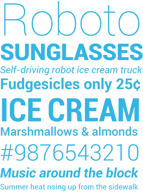
Google took a LOT of flak from the font community regarding Roboto. I like the look of it as well, but the opinions about it out there are pretty aggressive.


-
ripster
- Location: Ugly American
- Main keyboard: As Long As It is Helvetica
- Main mouse: Mickey
- Favorite switch: Wanna Switch? Well, I Certainly Did!
- DT Pro Member: -
Yep Arial, it's all here:typhson wrote:Font on the Choc Mini must be Arial?
For me it is awful in written text, but I think in single capital Letters on Keycaps it does look verry clean.
I like it, especially in these gold brown on dark brown Caps..
http://geekhack.org/showthread.php?2817 ... nt-Lesson/
-
TexasFlood

- Main keyboard: Rosewill RK-9000 original cherry blue
- Main mouse: Microsoft trackball
- Favorite switch: cherry blue
- DT Pro Member: -
Really? Still posting geekhack links?
-
TexasFlood
- Main keyboard: Rosewill RK-9000 original cherry blue
- Main mouse: Microsoft trackball
- Favorite switch: cherry blue
- DT Pro Member: -
What, favorite? For me probably arial, or helvetica, for work stuff anyway.
-
ferociousfingerings
- Location: USA - Louisiana
- Main keyboard: dirty HP w/ domes
- Main mouse: g700 (formerly mx518)
- Favorite switch: idk
- DT Pro Member: -
In accordance with this font-thread's obligatory 'comic sans' references, i shall share this comic-sans-related link.

-
Biernot
- Location: Germany
- DT Pro Member: -
Tahoma/8... without any antialiasing - die, blurry fonts, die. (http://www.sharpfonts.co.cc/ for Nobel Prize.  )
)
(Courier New is OK, too.)
(Courier New is OK, too.)
-
RC-1140

- Location: Germany
- Main keyboard: Unicomp Terminal Emulator
- Main mouse: Razer Mamba
- Favorite switch: Buckling Spring
- DT Pro Member: -
In the last time I slowly started to like Terminus, if I'm forced to work without a graphical environment. Otherwise I still prefer antialiased fonts.
I don't really like the Courier family, as I don't like looking on serifs. In print I prefer serifs though. But even then I don't like Courier…
Edit: D'oh! I like looking on serifs. I meant to say that I dislike them on LCDs.
I don't really like the Courier family, as I don't like looking on serifs. In print I prefer serifs though. But even then I don't like Courier…
Edit: D'oh! I like looking on serifs. I meant to say that I dislike them on LCDs.
Last edited by RC-1140 on 02 Oct 2012, 00:35, edited 1 time in total.


-
bhtooefr

- Location: Newark, OH, USA
- Main keyboard: TEX Shinobi
- Main mouse: TrackPoint IV
- Favorite switch: IBM Selectric (not a switch, I know)
- DT Pro Member: 0056
- Contact:
Consolas and DejaVu Sans Mono/Menlo (Menlo being a fork of DVSM) are my favorite fixed-width typefaces.
Segoe UI is a nice UI typeface... although it's actually pretty meh on ClearType, even though it was DESIGNED for ClearType. Looks much better on an engine that goes for sub-pixel precision, like RISC OS or OS X's renderers, than on an exact pixel boundary renderer such as ClearType.
Segoe UI is a nice UI typeface... although it's actually pretty meh on ClearType, even though it was DESIGNED for ClearType. Looks much better on an engine that goes for sub-pixel precision, like RISC OS or OS X's renderers, than on an exact pixel boundary renderer such as ClearType.
-
ne0phyte

- Toast.
- Location: Germany
- Main keyboard: HHKB Pro 2
- Main mouse: Mionix Avior 7000
- Favorite switch: Topre 45g, MX Blue
- DT Pro Member: 0003
To revive this thread..
My two favorite monospace fonts for programming are Envy Code R VS:

and the Proggy programming fonts:


My two favorite monospace fonts for programming are Envy Code R VS:
and the Proggy programming fonts:
-
bhtooefr
- Location: Newark, OH, USA
- Main keyboard: TEX Shinobi
- Main mouse: TrackPoint IV
- Favorite switch: IBM Selectric (not a switch, I know)
- DT Pro Member: 0056
- Contact:
The problem with Envy Code R VS is the l/1 problem. Hard to tell at a quick glance, which is which.
(Still, otherwise a nice looking typeface.)
(Still, otherwise a nice looking typeface.)
-
ne0phyte
- Toast.
- Location: Germany
- Main keyboard: HHKB Pro 2
- Main mouse: Mionix Avior 7000
- Favorite switch: Topre 45g, MX Blue
- DT Pro Member: 0003
I agree, but I never really had a problem with that. I usually don't have numbers and characters mixed (as variable, method or class name etc) so for me it doesn't matter.
-
Daniel

- Location: Blackforest Germany
- Main keyboard: Various
- Main mouse: Kensington Slimblade + MX518
- Favorite switch: Cherry MX Blue and Black + BS
- DT Pro Member: 0028
I like the X11 core fonts (http://en.wikipedia.org/wiki/Fixed_%28typeface%29), in 6x13:
-Misc-Fixed-Medium-R-SemiCondensed--13-120-75-75-C-60-ISO8859-1
-Misc-Fixed-Medium-R-SemiCondensed--13-120-75-75-C-60-ISO8859-1
-
typhson
- Location: Germany
- Main keyboard: choc mini
- Main mouse: cm spawn
- Favorite switch: dirty reds
- DT Pro Member: -
Since today i was using courier new in my sourcecode editor.
I tried now the severels monospaced fonts mentioned here, and a few others, but after all I stucked on SourceCodePro:
It's not bitmaped, but verry smooth to read imo. I quote a developer of adobe, who tells about problems concerning
monospaced fonts (which are the same I had, and which SourceCodePro should't have that much)
What else? Normal fonts: SourceSansPro is also smart, I think, but nothing special. However, I read today the first time about Roboto explicitly, I saw it here and there, and it was mentioned early in this thread, but i didn't notice it really
I like it too :thumbs
I tried now the severels monospaced fonts mentioned here, and a few others, but after all I stucked on SourceCodePro:
- SourceCodeSplash.png (38.32 KiB) Viewed 5105 times
monospaced fonts (which are the same I had, and which SourceCodePro should't have that much)
To my eye, many existing monospaced font suffer from one of three problems. The first problem that I often notice is that, many monospaced fonts force lowercase letters with a very large x-height into a single width, resulting in overly condensed letter forms which result in words and text with a monotonous rhythm, which quickly becomes tedious for human eyes to process. The second problem is somewhat the opposite of the first: many monospaced fonts have lowercase letters that leave too much space in between letters, causing words and strings to not hold together. Lastly, there is a category of monospaced fonts whose details I find to be too fussy to really work well in coding applications where a programmer doesn’t want to be distracted by such things.
What else? Normal fonts: SourceSansPro is also smart, I think, but nothing special. However, I read today the first time about Roboto explicitly, I saw it here and there, and it was mentioned early in this thread, but i didn't notice it really
I like it too :thumbs


-
bhtooefr
- Location: Newark, OH, USA
- Main keyboard: TEX Shinobi
- Main mouse: TrackPoint IV
- Favorite switch: IBM Selectric (not a switch, I know)
- DT Pro Member: 0056
- Contact:
Bumping to note that I find I'm liking TI Uni a lot as a monospace font.
Bundled with the tools for TI calculators. Looks better on OS X than Windows, but looks decent on Windows too.
Bundled with the tools for TI calculators. Looks better on OS X than Windows, but looks decent on Windows too.