Was perusing the Crypto Museum and happened upon this striking (though probably difficult to come by) beauty:
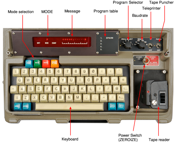
From http://www.cryptomuseum.com/crypto/stk/race/index.htm
There, it's called an "Off-line electronic cipher machine". Doesn't say much about the keyboard, but I love the single legends, and the text buttons look downright 7bit-worthy.
Has anyone seen more about these classified devices in terms of keyboards, either caps or switches?
Cipher machines
- Eszett
- Location: Germany
- Main keyboard: Filco Majestouch 2 TKL DE MX blue
- Main mouse: Logitech MX Master 2S
- DT Pro Member: -
That you take a pilcrow for a mushroom reminds me to the Israeli psy-trance group called Infected Mushroom, where everything is mushroom, even street lamps, he he.
- Daniel Beardsmore
- Location: Hertfordshire, England
- Main keyboard: Filco Majestouch 1 (home)/Poker II backlit (work)
- Main mouse: MS IMO 1.1
- Favorite switch: Probably not whatever I wrote here
- DT Pro Member: -
- Contact:
Pilcrow → 
- Halvar
- Location: Baden, DE
- Main keyboard: IBM Model M SSK / Filco MT 2
- Favorite switch: Beam & buckling spring, Monterey, MX Brown
- DT Pro Member: 0051
It would make sense for it to be a pilcrow as the machine types to some kind of tape, but I've never seen a pilcrow that looks anything like that, with that kind of round head. Shouldn't it be more like an inverse P?
- kbdfr
- The Tiproman
- Location: Berlin, Germany
- Main keyboard: Tipro MID-QM-128A + two Tipro matrix modules
- Main mouse: Contour Rollermouse Pro
- Favorite switch: Cherry black
- DT Pro Member: 0010
- matt3o
- -[°_°]-
- Location: Italy
- Main keyboard: WhiteFox
- Main mouse: Anywhere MX
- Favorite switch: Anything, really
- DT Pro Member: 0030
- Contact:
I see r2d2 cap too big for a very small person.
- fifted
- Location: WA, USA
- Main keyboard: Plover-equipped Ergodox
- DT Pro Member: -
Thanks for the bell key tip; one mystery down!
I thought it interesting that the period and comma are bottom-aligned, and the single quote top-. It looks a little wonky from a design standpoint but does help readability, I guess.