Yep, I agree with the "less is more" principle

Perhaps a blue set
a la solarized color scheme?: but frankly i'd go for a PBT DSA set (which would mean lighter base color and darker font AFAIK) ... as i have a Poker 2 (and a faceU replica ordered) and somehow this type of caps seem to go better with the "minimalist" approach of a 60% keyboard layout.
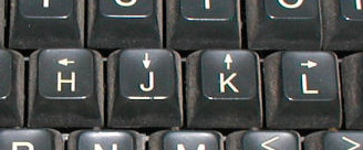
Starting from the same <-, -> etc. symbols under h, l ... perhaps a good idea would be to have relevant
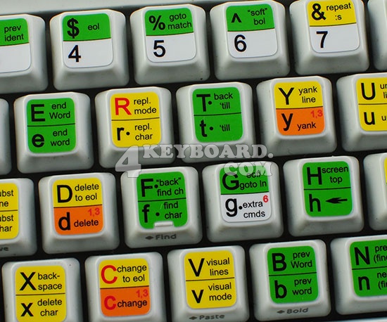
symbols to the lower right of each key letter, instead of small descriptive text: so, as you say, the capital letter aligned left and up, and the symbol, in a second color, to the lower right (like for greek, hebrew or russian keyboards), but with vim-functionality-symbols instead of country specific alphabet. Or, better, keep the small "function" text but also have some kind of additional symbol marker (a small square, or circle etc.) which would highlight the role of that key (as operator, motion etc.) basically the roles highlighted in the left description column of: