Page 16 of 19
Posted: 19 Aug 2018, 14:16
by davkol
It's the
Phantom PCB with a custom-made plate. The only other PCB that enables a similar layout is Clueboard AFAIK.
Posted: 19 Aug 2018, 16:23
by ollir
snacksthecat wrote: ↑701c wrote: ↑
I actually kind of like it
It has choices in visual aesthetics that I find very easy to disagree with, but I can't say it's downright ugly. What I mean is that if there are people who like it, I can believe them if they say so and get on with my life after hearing it.
Posted: 19 Aug 2018, 17:25
by digital_matthew
This keyboard may not be as obnoxious as some of the others posted in this thread, but it's ugly through-and-through. It's the Logitek MK710 "Performance". I thought that crappy glossy black plastic had lost the battle with natural selection, but here it is again. The overall shape is as disappointing as a rainy weekend, and just look at that oh-so-high-quality pad printing on the keys. Models I built as a kid had more durable decals. And don't get me started on the key feel. Like waiting in line at the department of motor vehicles, keytravel is endless and soul-sucking. It's like typing on unrequited love...
Posted: 20 Aug 2018, 21:07
by kekstee
There's something new on my desk. Who could say no to a gift like this?
- 20180820_0006.jpg (937.12 KiB) Viewed 18666 times
Posted: 20 Aug 2018, 21:54
by ThePewster
Posted: 21 Aug 2018, 00:03
by Findecanor
The ugliest thing about that keyboard is the case it is in IMHO.
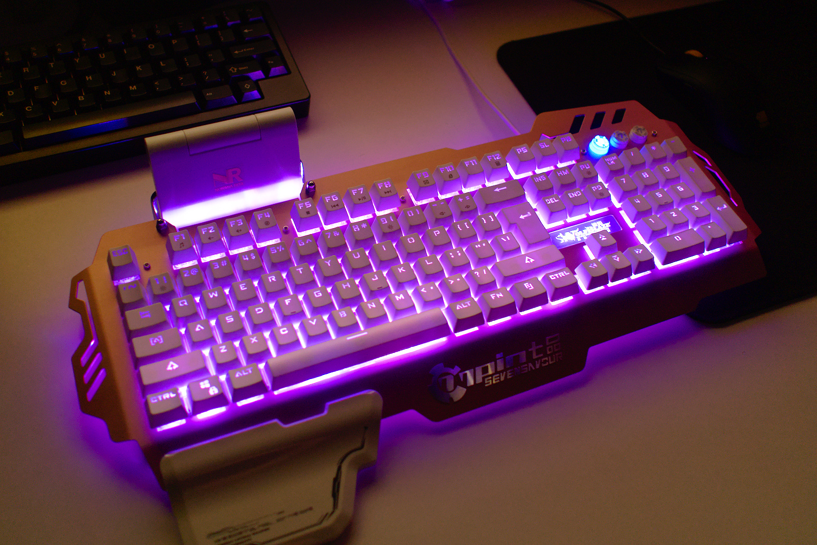
A lit-up trackpad is just vile. That should be outlawed. Especially in any hue of blue.
The backlighting is otherwise just a custom RGB scheme, as illustrated on the screen.
Posted: 21 Aug 2018, 00:05
by samuelcable
ThePewster wrote: ↑
This one isn't bad at all its just in a overpriced as hell laptop
Posted: 21 Aug 2018, 11:24
by vometia
ThePewster wrote: ↑
I actually really like that: nice and colourful. Still wouldn't buy one though.
Posted: 21 Aug 2018, 12:15
by ThePewster
Spotted on r/mk sub-reddit.

Posted: 21 Aug 2018, 13:39
by Muirium
Overlooking the GAMERFONT INDUSTRIAL HEADSHOT legends, the only thing wrong with that is the numpad. Such excess, so tasteless!
Posted: 17 Oct 2018, 15:43
by Pumaeggs
[quote=" I can't think of another keyboard that shows Plumber's Crack...[/quote]
jesus christ i never thought of it that way. you're totally right though it is kinda aesthetically unappealing
Posted: 17 Oct 2018, 15:47
by samuelcable
Pumaeggs wrote: ↑[quote=" I can't think of another keyboard that shows Plumber's Crack...
jesus christ i never thought of it that way. you're totally right though it is kinda aesthetically unappealing[/quote]
Can't think of any ergonomic keyboards that don't look unappealing, they are usually utilitarian
Posted: 31 Oct 2018, 16:00
by Excelso
andru96 wrote: ↑looking awesome and beautiful keyboard..


Regards,
SPAMMY LINKS
Is this some sort of specially desgined spam bot?
Posted: 31 Oct 2018, 16:18
by Muirium
Report spam. Don’t quote it!
Posted: 31 Oct 2018, 16:24
by Excelso
kekstee wrote: ↑There's something new on my desk. Who could say no to a gift like this?
20180820_0006.jpg
I'm looking for a keyboard like this for a future project I may don in the not so distant future. I haven't found yet the perfect color scheme and "extra wings" perfect combination for it.
Posted: 31 Oct 2018, 16:25
by Excelso
Muirium wrote: ↑Report spam. Don’t quote it!
I wasn't really sure about it, sorry.
Posted: 31 Oct 2018, 16:34
by Muirium
No worries. I hit the report button when I saw your post, but the spammer was already reported. An admin will sort them out.
Edit your post with the quote to destroy the links. Because links are all forum spam is for.
Posted: 01 Nov 2018, 10:35
by Elrick
digital_matthew wrote: ↑ The overall shape is as disappointing as a rainy weekend, and just look at that oh-so-high-quality pad printing on the keys.
The unfortunate thing is now they are producing absolute GARBAGE membrane based keyboards.
Only keyboard that just 'passes' with usability, is their new/old G810 series with updated ROMER-G switches. Only keyboard currently produced from Logitech, that can be used.
Pity their Mice models are far superior compared to their keyboard section.....
Posted: 01 Nov 2018, 14:19
by Lanrefni
Elrick wrote: ↑digital_matthew wrote: ↑ The overall shape is as disappointing as a rainy weekend, and just look at that oh-so-high-quality pad printing on the keys.
The unfortunate thing is now they are producing absolute GARBAGE membrane based keyboards.
Only keyboard that just 'passes' with usability, is their new/old G810 series with updated ROMER-G switches. Only keyboard currently produced from Logitech, that can be used.
Pity their Mice models are far superior compared to their keyboard section.....
Yeah,I really wish Logitech would up their game and make keyboards that match the quality of their mice.
Posted: 01 Dec 2018, 13:46
by Drclick

Keyboard for left-handed people

Posted: 01 Dec 2018, 14:15
by Muirium
The TKL, at least, is quite smart. Though for full-size, I wouldn’t copy tradition’s mistake of heaping both on the same side of the alpha block. Symmetry is real!
Posted: 01 Dec 2018, 14:29
by Findecanor
I think the cursor keys and nav cluster belong together with the Backspace and Return keys so that some editing operations can be done with one hand.
If the former are moved to the left side, then there'd better be duplicates there of the latter.
Posted: 01 Dec 2018, 14:33
by depletedvespene
Drclick wrote: ↑Keyboard for left-handed people
Not ugly per se, but rather poorly designed. If you move the nav cluster and/or the numpad, you DO need to put quite some tought to the adjustments that will be needed; heck, in the second unit, the numpad is mirrored but the nav cluster is left as is. ⇒⇐
Posted: 01 Dec 2018, 17:05
by madrobby
I hate this keyboard so much. It's both aesthetically unpleasing, with the TouchID sensor in the top right looking different than the touch area to the left of it, the keycaps attracting fingerprints like crazy, and the awful cursor keys that have different sizes. The tiniest of dust particles stand out like daggers pointing into your eyes as light is reflected onto them by the shiny metal surface and they contrast with he black caps.
Additionally, the labels are centered on the alphanumeric keys, but left/right bottom aligned on modifiers. WTF.
The TouchBar itself is the spawn of Satan. It looks like a long key—but obviously it doesn't actually depress. At least they could have made the contrast better instead of dark gray buttons on black. Who the hell came up with that? The "keys" (lol) on the TouchBar are already only half the size of normal keys, and extremely hard to hit without looking as obviously there's no haptic feedback.
I know some people like the design, but I think it's actually ugly. Why not have the modifiers and alpha in slightly different hues? Why not more useful icons for the TouchBar (it would be much easier to discern the functionality with icons that have color in it?). The TouchBar virtual keys are really small and hard to tell apart in a short glance, never mind that they randomly change position, sometimes while you try to hit them they literally move out of the way of your finger. It's a tantalizing torture of touch typing terror.
And don't even get me started on the key feel, which is like typing on bubble wrap that's been glued down on wet cardboard.
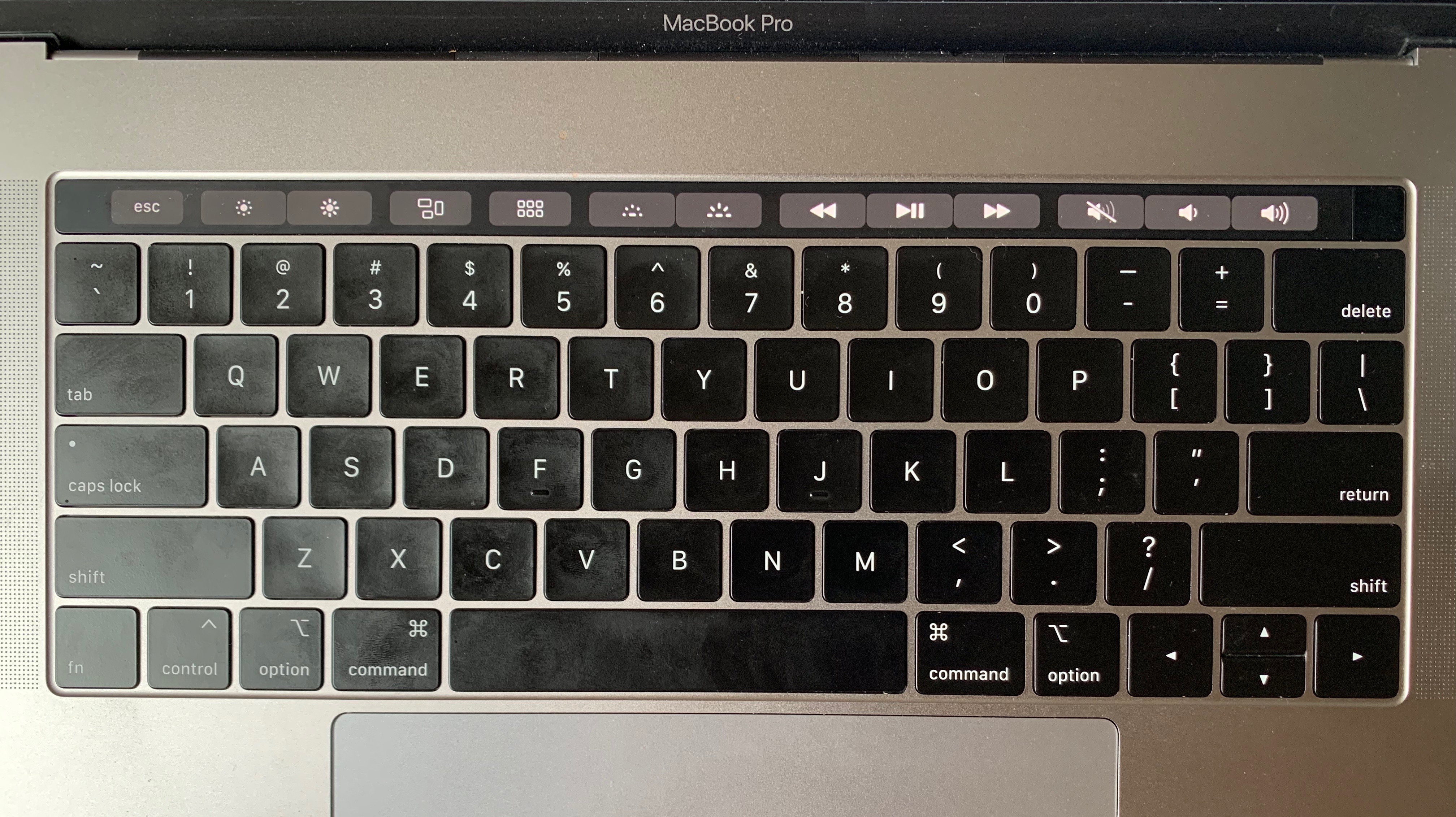
- IMG_1661.jpeg (2.53 MiB) Viewed 18040 times
Posted: 01 Dec 2018, 19:41
by sh1
I tried typing on one of these at the store. I really don't understand it at all. Maybe my fingers could figure it out after some period of adjustment. I don't know...
Posted: 02 Dec 2018, 01:36
by Elrick
Drclick wrote: ↑
Keyboard for left-handed people
The 108 version is quite Lovely and I'm a Right Hander

.
Posted: 02 Dec 2018, 01:43
by samuelcable
I dont say this often but I agree with elrick
Posted: 15 Dec 2018, 20:37
by leoc
Elrick wrote: ↑Keyboard for left-handed people
The 108 version is quite Lovely and I'm a Right Hander
.
It's really a keyboard for right-handed people, because the Model M is a keyboard for left-handed people. 35 years ago, when most MS-DOS users had scarcely heard of a mouse, the Model M was a keyboard for right-handers: why not put the extra clusters next to the user's strong hand? Since then the mouse has become more popular, and two pretty large key clusters to the right of the aphanumeric cluster, plus generous spacing, is just too much stuff in the mouse's way. (One thing that does still very much favour right-handers is the standard ZXCV clipboard shortcuts, which on a QWERTY layout are easy to do with the left hand while the right hand is operating the mouse.)
Which isn't to deny that it feels weird to look at the layout: it's a bit like looking at a
left-handed Stratocaster up close.
Posted: 15 Dec 2018, 21:15
by vvp
I used to use mouse with my left hand because of the access to the arrows and keypad with my right hand. I also used Ctrl-Ins, Shift-Ins and Shift-Del instead of Ctrl-{CXV} because of that.
Posted: 16 Dec 2018, 04:04
by madrobby
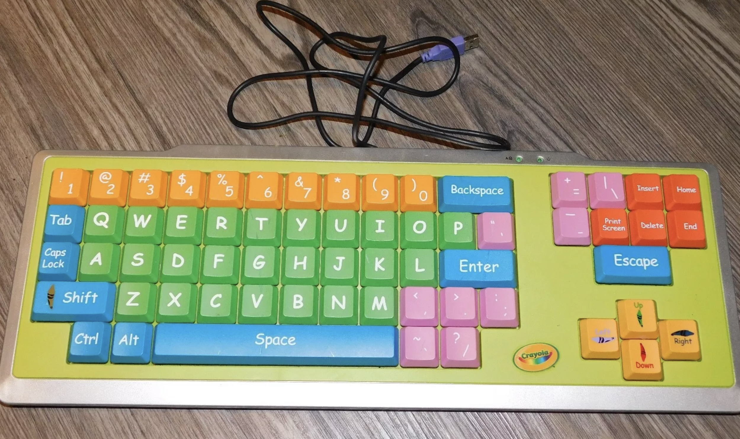
- B600D905-1327-42AD-BDC8-17938CACA4B8.jpeg (2.97 MiB) Viewed 18864 times