There are three main elements to this:
1. the quality and consistency of the physical moulding of the keycap geometry itself
2. the quality and consistency of the dye sublimation of the keycap legends, and
3. the consistency and precision of the placement of the keycap legends on the keys.
(EDIT: Actually, there's really a fourth... the consistency of the colours of the keycaps, even from the same batch. They seem to be extremely inconsistent in some cases, even now.)
As of 2021, with both the "New Model M" and the "Mini M" now in the wild, all three of these aspects have visibly improved. However, whilst the dye sublimation is now pitch black, razor sharp, and pretty much faultless to my eyes, the other two remain quite problematic, as far as I am concerned. There were several noticeable imperfections in the moulding of the keys on my New Model M and several of the custom additional keycaps I bought for it, which is something I can't really help Unicomp solve, they just have to get their QC in order. The key legend alignment on the other hand is something that they seem not only to have messed up quite a bit at the production stage (with many legends being squint or placed at inconsistent distances from the edges of keycaps), but also at the pre-printing stage. In other words, it isn't just a one-time error of precision, it's also a baked-in problem with the files that they are using to print their keycaps... so every single Unicomp keyboard currently being produced with the layout I have direct experience of has some keys with obviously incorrect legend placement.
I am but one man, with only one Unicomp keyboard in my collection (hopefully soon to be none, because I am looking to either sell or return it at this point due to my frustrations). All I can comment on with confidence is the ISO UK layout. Most of the rest of what I know is tangential to that, so is out of scope for me at this initial point. However, it would be nice if Unicomp could also take the requisite few minutes to fix similar issues in their other layouts as well, which I would not be surprised to discover the existence of if I were to look. If you have noticed similar issues in another Unicomp layout (recently enough that you believe it to remain unresolved), please let me know in this thread.
I have been trying to get this fixed for over a month now, along with various other issues that I found with their latest full-size keyboard model which they are seemingly not interested in correcting based on the increasingly irritating exchange I have been having. That said, I nonetheless intend to reach out to them once again to push for this to be dealt with once and for all; after all, it would only take a couple of minutes to fix these things, and they can continue using the corrected files in perpetuity, which will improve every single board they produce from said files.
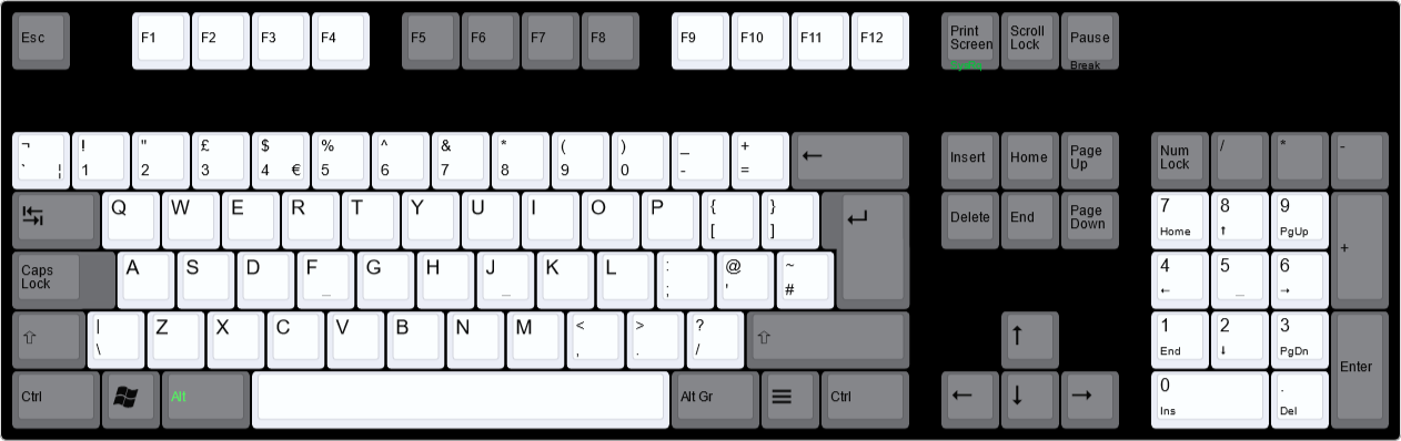
The ISO UK layout that is currently being utilised by Unicomp requires, at the very least, the following corrections:
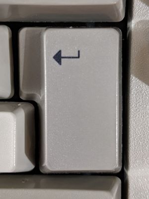
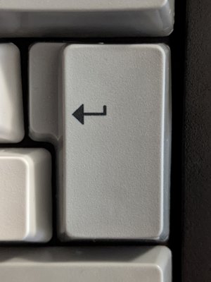
• "Return" arrow legend on ISO Return/Enter key should be moved upwards such that the arrow points outwards to the centre of the stepped part of the key, instead of out toward the lower part of this stepped section as it is on your standard key map. I believe that whoever created the current UK legend map file simply removed the text from some other European layout which has text at the top above the arrow legend, e.g. the "Invio" on the Italian layout, without correcting the position of the arrow by moving it upwards. This is not correct.
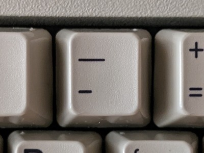
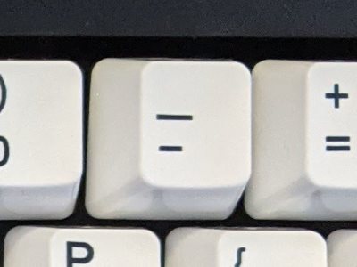
• On the -_ key, the "_" legend is aligned too far down and the "-" legend is aligned too far up, bringing them too close together and too far from the edges of the keycap. The very same problem occurs on the =+ key as well.
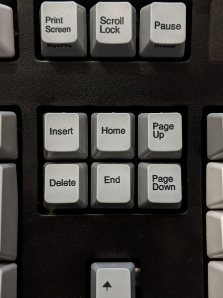
• "End" text legend on End key vertically centred on the keycap, like the neighbouring keys. On Unicomp's standard map, they for some reason have it too far up, as if there were a second line of text below it, but there isn't. Unicomp told me that this was recently corrected on their ANSI US layout, but not on the ISO UK one.

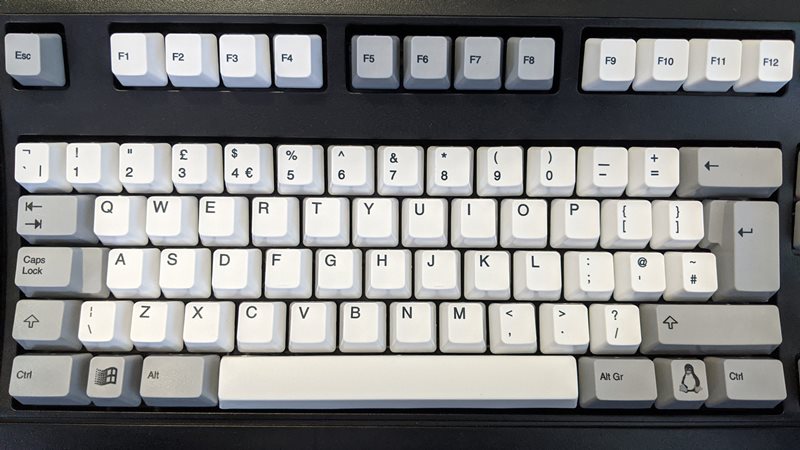
• The entire top row (the "Function" key row, Esc, etc.) seems to be off-centre, the legends being further down than they should be. It's like they're meant to be centred but they aimed wrong, so I'm not sure if this one is just a production inaccuracy or if they are actually wrong in the source file.
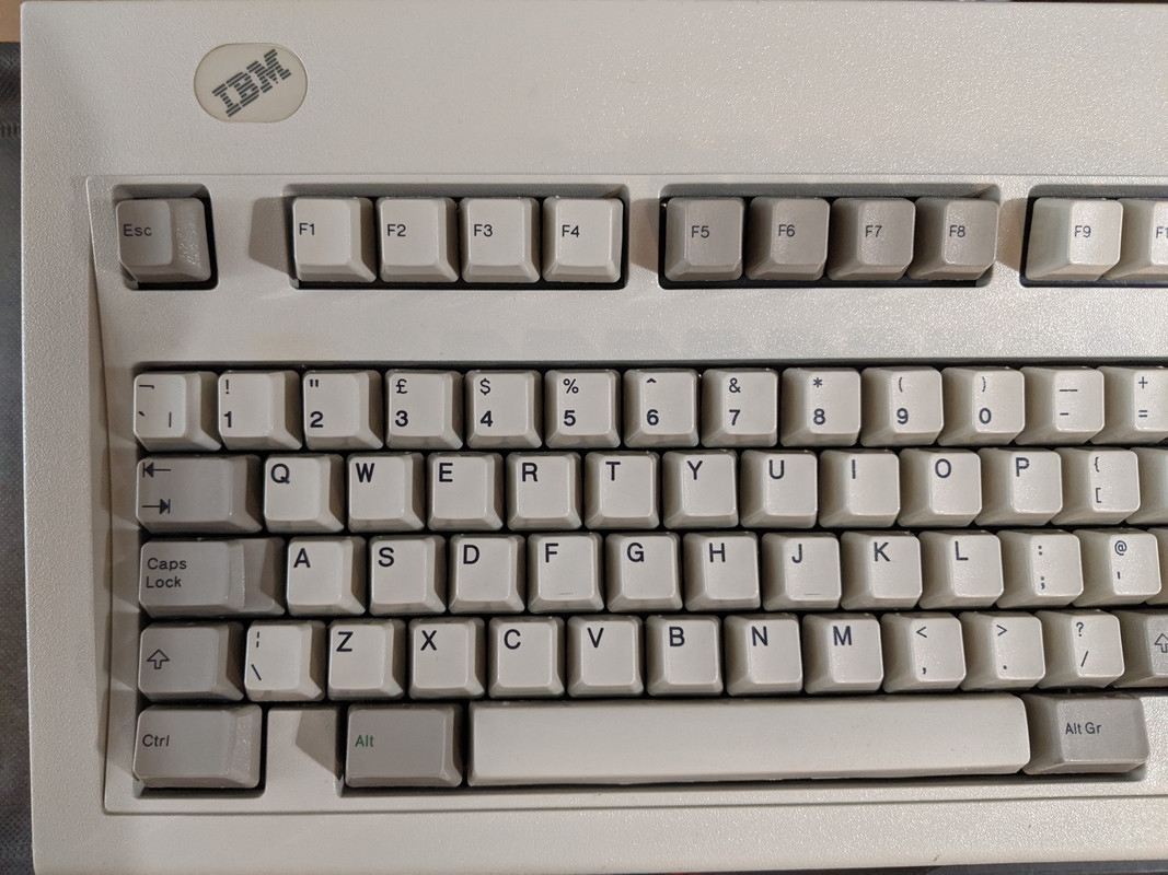
• Similarly, all legends across the entire layout should be more consistently and more tightly left-aligned, and in cases where a legend is near the top of a keycap as tightly aligned to the top as it is to the left. In many cases, alphanumeric keys on my New Model M had legends drifting further into the keycap than they should, either horizontally, vertically, or both. In general, the alpha keys had legends printed noticeably further from the corner of the keycap than any of the classic IBM boards in my collection (as of now, I have three of those and parts of a fourth). On some keys, it is again unclear whether the inaccuracy is a production issue or a source file issue; look at the left Shift key, for example (which I think is severe enough to be a source file issue).
I think ideally, it would be good to approach Unicomp with this information, presented as clearly as possible on a support ticket, and try to convince them to fix it. It's something that should only really take minutes, assuming they have editable map files they can update by simply nudging elements around by a few pixels here and there. Hell, if they'd listened to me a month ago when I mentioned this as part of the wider issue of the various niggles with my New Model M order, they could probably have corrected the issue faster than I wrote this post. As it stands, the only offer they made was that I would have to place an order for a "custom" fully printed keycap set and detail the "custom graphics" I wanted. I would like some slight tweaks to get a nice layout for myself, so I am probably willing to do this for that reason, but I am dismayed that it seems to be deemed necessary for me to do the legwork and pay an extra tenner plus an undetermined customisation fee of anything up to $50 just to coax them into producing a standard UK keycap set that isn't all wonky.
Absolute worst case scenario is they basically tell me to stick it up my arse with a clockwise twist. Second-worst and probably more likely scenario is that they treat this exclusively as a "custom" keycap set, expect me to pay them a customisation fee and extra $10 for a "custom" rather than standard layout (even though this is by definition the standard layout they should be using already, if they're ostensibly producing "Model M" keyboards). Best-case scenario is they actually fix it, and this becomes the new standard UK layout for the foreseeable future.
If you spot anything else you think might be wrong in the actual source file for this layout, or in any other current Unicomp layout, do post away with your findings!