
To me it looks like a ugly imitation of Cherry fonts, and why did they go for horizontal centered letters!? Still: since it's possible to doubleshot pbt, maybe better set will be coming!


Ze Germans do it like that.Dgsbllx wrote:.....I don't recall seeing a caps with a downwards arrow?


Sort of like a kid who's pirated Photoshop and got excited downloading some awesome free fonts.Muirium wrote:Well, it's no worse than Vortex's current keys:
Those alone were enough to put me right off ordering a Poker 2.
Hopefully their work will improve once the design department moves out of the local high school. Fingers crossed for you, Vortex!


They already wasted so much money on these. Can't image they want to spend money on proper legends (if all the other manufacturers are an indication)Grond wrote:Maybe we could try and contact them for a costum order? We could send them svgs so they don't legends up...

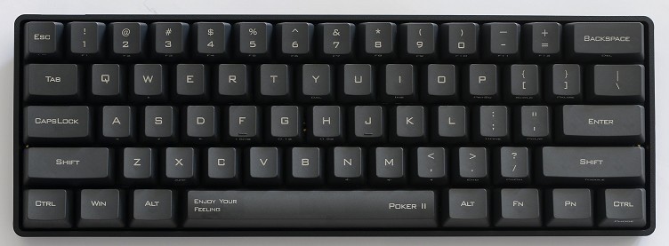
Can't you just be happy and "enjoy your feeling"?webwit wrote:
This font is worse than Comic Sans. Consider its origin. Take a font from outdated sci-fi, when they thought that advanced computers could do nothing more than produce square angled fonts, and that this looked hip and advanced. They took that and then added the rounded corners back. The infancy and kitsch factor are mind-boggling. Considering their new PBT doubleshots, it's clear that they will never get it right, they don't have a clue.
that's what blanks are forTrev wrote:
Can't you just be happy and "enjoy your feeling"?
7bit = mintberry!matt3o wrote:I'm a bit confused... is mintberry = 7bit?

Please remember that this is produced in the heartland of China. Hence typographic accuracy is not paramount with their objectives, anymore than it would be for you in producing their language font on a key-set within your non-chinese country.webwit wrote:Considering their new PBT doubleshots, it's clear that they will never get it right, they don't have a clue.
They're not producing these as charity work for some dying language. It's a for-profit product, catering to a massive English-speaking market.Elrick wrote:Please remember that this is produced in the heartland of China. Hence typographic accuracy is not paramount with their objectives, anymore than it would be for you in producing their language font on a key-set within your non-chinese country.webwit wrote:Considering their new PBT doubleshots, it's clear that they will never get it right, they don't have a clue.
They are still trying which is better than ignoring our fast disappearing language across this planet.


