Unicomp does it again (Large-print keycaps)

User avatar
bhtooefr

19 Dec 2013, 13:09

http://pckeyboard.com/page/FeaturedProducts/UWZBP4A

Image

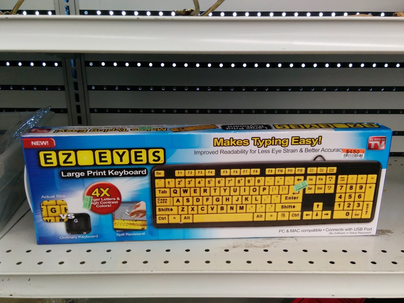
Excuse me while I throw up in my mouth a little.

User avatar
Broadmonkey
Fancy Rank

19 Dec 2013, 14:32

I guess it's marked at weak sighted and old people. I can't really see who else would be their targeted group.

User avatar
matt3o
-[°_°]-

19 Dec 2013, 14:34

would you please note icon/text alignment of left and right shift...

User avatar
Broadmonkey
Fancy Rank

19 Dec 2013, 14:36

... and Ctrl!

User avatar
snoopy

19 Dec 2013, 14:39

the target audience that used buckling spring keyboards back in the day gets older... :D

User avatar
Muirium
µ

19 Dec 2013, 14:41

Sadly so. But can't they touch-type by now?

I like numpad Enter. Or rather

E
n
t
e
r

Vertically printed legends are dangerously close to being dopey no matter how good they are. (Dumb with our horizontal writing system, but they make sense for Japanese etc. of course.) This one's reaching for the stars of ugh!

User avatar
Broadmonkey
Fancy Rank

19 Dec 2013, 14:50

Sadly the biggest misunderstanding in this community is that everybody can touch type!

User avatar
Ekaros

19 Dec 2013, 15:16

Broadmonkey wrote:Sadly the biggest misunderstanding in this community is that everybody can touch type!
Yeah, I never got the backlight... I mean they keyboards still have marks for the home position and they aren't that hard to lose on desk...

User avatar
snoopy

19 Dec 2013, 16:04

This thing will look awesome on someones desk next to this:

Image

User avatar
Muirium
µ

19 Dec 2013, 17:49

Broadmonkey wrote:Sadly the biggest misunderstanding in this community is that everybody can touch type!
Not everyone. But surely a very significant overlap with those who still demand a Model M in this day and age. Do hunt and peckers really care about their keyboard?

User avatar
bhtooefr

19 Dec 2013, 18:07

Actually, my mom could've used this keyboard, but this really is a bad implementation. That's my main problem with it.

(She would often have her face inches from a Model M looking for keys.)

User avatar
nathanscribe

19 Dec 2013, 18:33

There are several high-visibility and large-print keyboards available and they are indeed aimed at the visually impaired. This is not pretty by a long shot, but it's not the worst one out there. I think the biggest problem with it is the high contrast black-on-white scheme - most of the visually impaired I've worked with preferred a dark background and vivid but non-white text colour.

User avatar
scottc

19 Dec 2013, 18:49

I know that this is probably intended for people who have reduced eyesight, but I can't help but think of this:

Image

grave00

28 Jan 2014, 03:39

PU and PD are really strutting their stuff.

User avatar
Ekaros

30 Jan 2014, 14:20

Also why isn't the right alt next to the space, in spot where it should be?

User avatar
robo

06 Mar 2014, 17:22

I suppose it's somehow fitting that a company devoted solely to keeping alive a 1980's keyboard also has the industrial design prowess of (much of) the 1980's personal computer industry...

davkol

22 Mar 2014, 21:00

Ekaros wrote:Also why isn't the right alt next to the space, in spot where it should be?
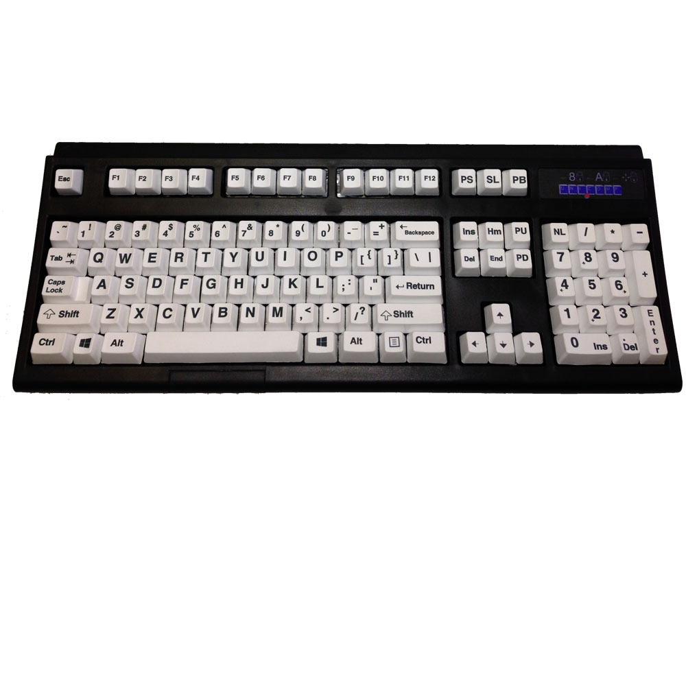
Because the "new" oblivious design meant to merge winkeyless and modern layouts.

Oops, people obviously don't post in this subforum too often.

User avatar
Grond

22 Mar 2014, 21:04

Broadmonkey wrote:I guess it's marked at weak sighted
Of course it is. If you're not blind, you're going to turn blind by just having this keyboard on your desk.

davkol

22 Mar 2014, 21:08

BACKSPACE LEGEND IS TOO SMALL!

Also, I like the "Hm" keycap.

User avatar
Grond

23 Mar 2014, 10:00

I still believe they COULD improve. They own a unique technology, the original machinery, and the legacy of the best known pc keyboard ever. I can't hepl but thinking they could innovate their products in a way that does not seem like a desperate attempt to appeal a niche of the niche market without any effort. And anyway, not even a keyboard for the vision impaired deserves to be that ugly.

User avatar
Muirium
µ

23 Mar 2014, 10:20

Unfortunately, I get the impression that Unicomp is a small company terrified that it will only get smaller as its clients move on.

Innovation is the way out of their hole. But a risk is a risk. They're probably just going to glide in a death spiral, convinced it's the most responsible thing to do.

User avatar
bhtooefr

26 Mar 2014, 05:40

You guys, I saw this thing at Goodwill:

Image

I think it might actually look better than the Unicomp abomination. Just.

User avatar
Muirium
µ

26 Mar 2014, 10:30

Those tiny shifted symbols are just cruel. Make the numbers smaller instead: it's already got a numpad for goodness sake! Also yellow…

Actually, I sense a sadist at work.

1391401

16 May 2014, 14:22

Image

lally

03 Jul 2014, 05:05

This but no TKL. *sigh*

Miko

05 Jul 2014, 23:29

bhtooefr:

Oh, a classic, non-iso enter. Sweet.


@lally: At the End of the year they are promising a TKL. The marketing geniuses It was announced this on April the 1st (but it was dated with 2nd). However they insist it is not a Aprils fools. Recently somebody over at Reddit posted some mail exchange stating they are serious.

Post Reply

Return to “News”