Page 56 of 73
Re: (Model MF) Remodeling the Model M
Posted: 05 Jan 2017, 05:16
by Techno Trousers
Ooh, yeah, I'd love a couple of those, for sure!
Posted: 05 Jan 2017, 05:44
by Mr.Nobody
@ Techno Pants,
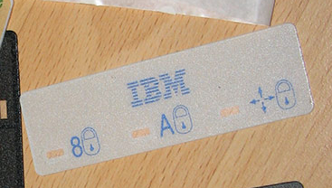
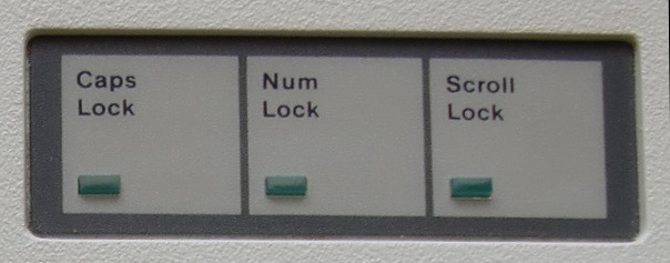
I took it apart,there are actually red green and blue LED indicators under the case.
Re: (Model MF) Remodeling the Model M
Posted: 05 Jan 2017, 05:48
by Techno Trousers
Mr.Nobody wrote:@ Techno Pants,
I took it apart,there are actually red green and blue LED indicators under the case.
Sure, that's the way
they did it, but thanks to wcass and his white LEDs+gels, we won't have to work nearly so hard to pimp out our MFs.

Posted: 05 Jan 2017, 07:37
by Mr.Nobody
Yes, it's easier to switch Gels...
Amber LED+industrial grey+black overlay=classy looking!
Green and Amber conveys a stronger vintage feeling maybe because originally monochrome monitors used to adopt these two colors.
Posted: 05 Jan 2017, 09:10
by giokkk
lot_lizard wrote: emdude wrote: That M13-style overlay looks pretty spiffy on the industrial case.
It looks like the same overlay on the M13 too, did giokkkk use a graphic or template to have it made?
Agreed... I think he found the picture somewhere, along with a link to Webwit's stash at one point at least

You are right lot_lizard,
it was taken from and old FS thread on Deskthority:
f-o-r-s-a-l-e-f58/my-diy-model-m-industrial-t2328.html
Furthermore,
nfc did a mod using some low emission amber led, I'll have to check still which type of led he used:
workshop-f7/ibm-model-m-industrial-home ... t1748.html
Posted: 05 Jan 2017, 10:57
by andrewjoy
Amber , All the Amber !
Posted: 05 Jan 2017, 11:00
by seebart
Yeah I remember that pic from the Duck sale, man I'd love to get one of these for my M's:
- 8.jpg (80.01 KiB) Viewed 7258 times
Posted: 05 Jan 2017, 12:11
by Ir0n
Ooo I like those black LED covers
Posted: 05 Jan 2017, 17:20
by wcass
I'm sure that I can replicate the artwork ... need to check "graphic overlay" vendors to see if we can find one to do a low volume run at a reasonable price.
Posted: 05 Jan 2017, 17:27
by lot_lizard
wcass wrote: I'm sure that I can replicate the artwork ... need to check "graphic overlay" vendors to see if we can find one to do a low volume run at a reasonable price.
I have someone down the road from me that I contacted initially on the phone, and sent an email but never heard back. I sent him the original image URL (that was obviously broken). He said that 50+ would be "reasonable". This is exactly what they do (small custom work... mostly for medical equipment). If you worked up the graphic for it, I would recontact. If you Google "custom led overlay", they would be the second search result
http://www.dyna-graphics.com/graphic-overlays
Re: (Model MF) Remodeling the Model M
Posted: 05 Jan 2017, 19:02
by Techno Trousers
That would be excellent. Maybe add a small and tasteful MF logo to the overlay?
Posted: 05 Jan 2017, 19:04
by lot_lizard
Techno Trousers wrote: That would be excellent. Maybe add a small and tasteful MF logo to the overlay?
I thought it would be fun in a corner as well. Problem with that is we limit the scope of interest. We'll see
Posted: 06 Jan 2017, 06:20
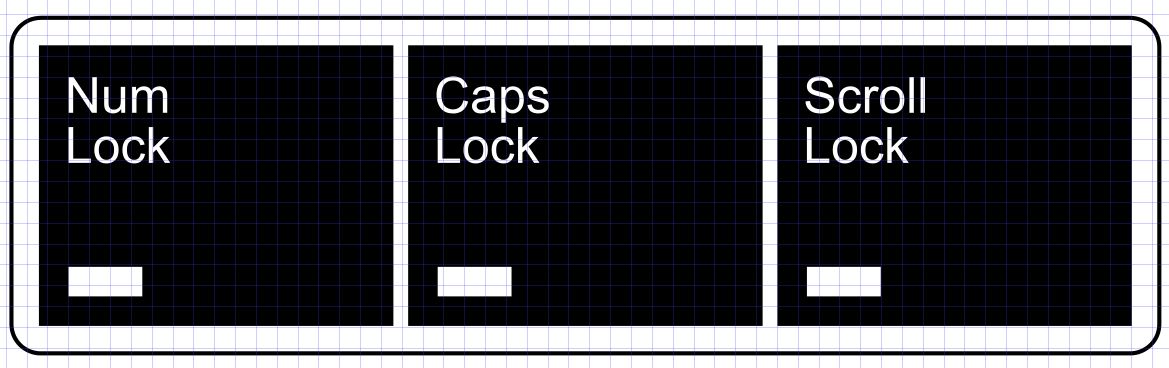
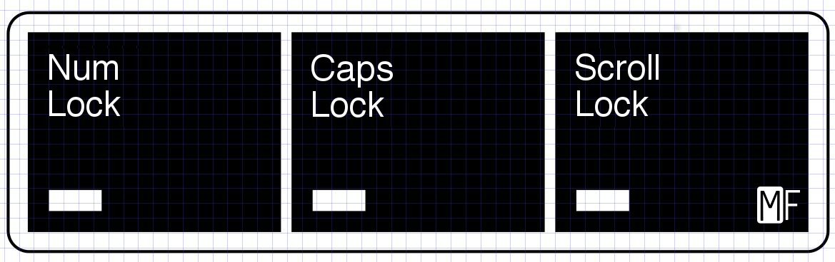
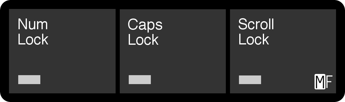
by wcass
This is just normal Ariel. What font would you like to see? Also, what border/fill combos?
- LED Cluster.jpg (71.3 KiB) Viewed 7184 times
Posted: 06 Jan 2017, 06:35
by emdude
I think some sort of dark/desaturated blue and pebble color combination would look good with blue-label Model Ms.
It might also be neat to get the relatively plain overlay of the 42H1292 Model Ms (with centered LEDs) in the pebble/dark gray style, with borders, of earlier Model Ms.
Re: (Model MF) Remodeling the Model M
Posted: 06 Jan 2017, 07:32
by Techno Trousers
I suppose the original font was Helvetica? I'd like to see how that compares to the Arial. Like lot_lizard said about the logo, we need to be careful to keep broad appeal. That said, I'd be interested in seeing these combos:
Dark gray with black border
Black with dark gray border
Black on black (?) Basically like the original
Each of the above combos with white text and amber text. Not sure if the amber text will look good, but it seems worth a try since we all seem to be in agreement that we <3 the amber LED look with industrial cases.
Posted: 07 Jan 2017, 02:10
by lot_lizard
Had a little package waiting on me at the house. They look great WCass. Anxious to try all the LED configurations out this weekend in our designated little areas on the PCB you made. This is the fun stuff

Posted: 07 Jan 2017, 02:46
by DMA
wcass wrote: What font would you like to see? Also, what border/fill combos?
I vote for Comic Sans. Yellow/Magenta would work juuust fine.
Posted: 07 Jan 2017, 03:29
by micrex22
Techno Trousers wrote: I suppose the original font was Helvetica?
IBM used a (then common) Helvetica
variant that featured balanced rounding and slim text. At first I thought it only existed in a physical type, but I have (!) very few ThinkPads that used this less common Helvetica variant! So it does exist digitally somewhere. When I get time I can snap photos to show the extreme differences between the normal (harsh edged) Helvetica and the
specially-picked-by-Paul-Rand-Helvetica-that-I-wish-I-knew-the-name-of.
Posted: 24 Jan 2017, 05:08
by lot_lizard
WCass... mind mocking up something like this for later? It would be the minority case I think, but I would like in the something I have planned in the future for the dark giokkk badge. The font would be
Helvetica if you could. The second image is an example of what I am shooting for I think for a limited run.
- LED%20Cluster.jpg (249.64 KiB) Viewed 6946 times
- LED%20Cluster.jpg (35.08 KiB) Viewed 6946 times
EDIT: And while we are at it... I suppose it makes sense to consider the AT LED font. It's a bit mincy for my taste, but some might prefer
- 5TjKq.jpg (99.16 KiB) Viewed 6930 times
Posted: 24 Jan 2017, 11:56
by andrewjoy
micrex22 wrote: Techno Trousers wrote: I suppose the original font was Helvetica?
IBM used a (then common) Helvetica
variant that featured balanced rounding and slim text.
Why do people fuck with perfectly good fonts .
And why do people think its ok to use a serif font on a screen ! And a none serif font in a book, they are different for a reason you know
Posted: 24 Jan 2017, 12:06
by DMA
andrewjoy wrote: Why do people fuck with perfectly good fonts .
Because HelveticaNeueW02-45Ligh that's why.
I still vote for Comic Sans - huge benefit is that it's so ugly there's only one variant.
andrewjoy wrote: And why do people think its ok to use a serif font on a screen ! And a none serif font in a book, they are different for a reason you know
What, you mean Times New Roman is NOT a good onscreen font???
Sans-serif in a book looks OK in titles, actually. Hell, sans-serif looks great anywhere horizontal space is cheap!
Posted: 24 Jan 2017, 12:10
by seebart
Preference really isn't it? Of course there is common usage for various reasons.
Posted: 24 Jan 2017, 13:29
by E TwentyNine
andrewjoy wrote: micrex22 wrote: Techno Trousers wrote: I suppose the original font was Helvetica?
IBM used a (then common) Helvetica
variant that featured balanced rounding and slim text.
Why do people fuck with perfectly good fonts .
IBM was flipping HUGE on user experience on all fronts back in the day. If they screwed with it I'd bet they had studies to back up why they did it.
Posted: 24 Jan 2017, 14:15
by ohaimark
They wanted to differentiate their brand, most likely.
Posted: 24 Jan 2017, 14:51
by E TwentyNine
ohaimark wrote: They wanted to differentiate their brand, most likely.
Nothing that simple.
Re: (Model MF) Remodeling the Model M
Posted: 24 Jan 2017, 14:55
by Techno Trousers
DMA wrote:
I still vote for Comic Sans - huge benefit is that it's so ugly there's only one variant.
Let's try Papyrus too! It'll give it that
Avatar look.
Posted: 26 Jan 2017, 16:02
by lot_lizard
Not that anyone would, I feel I should tell folks because they might do something silly with their XT or BigFoot as part of our phase 1 GB if you salvaged them for barrels for the MF. Do not plan on disposing of them, or parting them out further in any way. We would like to wait to announce something later where they are potentially repurposed, and you will would be very happy if you held onto them. I know that is vague, but it is meant to be until more research is done. Just thought a heads up might save someone from a bad decision
Posted: 26 Jan 2017, 21:50
by lot_lizard
Thanks Wingpad... They look great. Very well run buy
- IMG_0547.JPG (1.09 MiB) Viewed 6827 times
Re: (Model MF) Remodeling the Model M
Posted: 27 Jan 2017, 03:12
by Techno Trousers
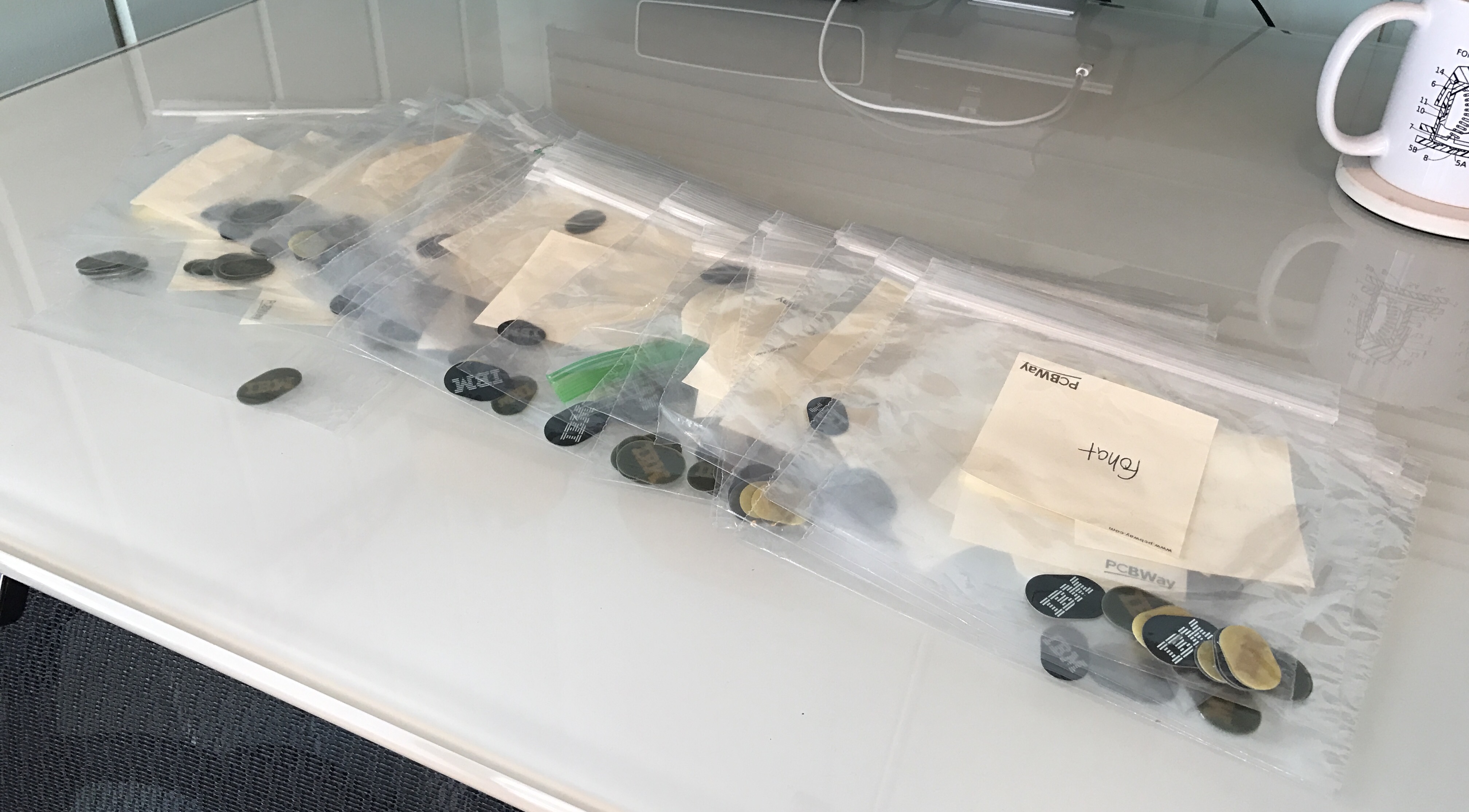
Fohat's right on top!

Posted: 28 Jan 2017, 11:04
by lot_lizard
Something just came to me... Pending the timing for the delivery of all the products to me, I think I might have time print up a mini version of the tool I made for reattaching the springs to the flipper paddles. Mine did 10 at a time and worked quite well (no design changes needed really), but we could print a single spring version pretty easy that would require only a little bit of filament per tool. I would just need to create STLs for it.
Each tool (jig) needs just two parts:
- the base to hold the flipper securely in alignment
- the plunger used to compress the spring onto the flipper paddle peg
There were quite a few of you that ordered replacement springs (5k total). I would just throw in your parts box if you did, and publish the STLs for others who didn't. Mentioning in the workshop thread because I am just brainstorming and not committing to anything yet. A few of you PM'd me during the buy about being concerned about reattaching the springs, so I believe there would be interest. Let me know if that is actually the case