I only consider something "sexy" if it's possible for me to have sex with it. Maybe I'm crazy, but I never consider phones, cars, computers or keyboards to be "sexy". I've seen plenty of sexy girls, but I have no idea how to fuck a keyboard.GuilleAcoustic wrote: ↑OMG, this is beautiful ! Why on Earth do I find this SEXY ?
Data General Dasher replica
-
mr_a500
- DT Pro Member: -
-
GuilleAcoustic

- Location: France
- Main keyboard: IBM Model F XT
- Main mouse: CH Products Trackball Pro
- Favorite switch: capacitive buckling spring
- DT Pro Member: -
Made my day !mr_a500 wrote: ↑I only consider something "sexy" if it's possible for me to have sex with it. Maybe I'm crazy, but I never consider phones, cars, computers or keyboards to be "sexy". I've seen plenty of sexy girls, but I have no idea how to fuck a keyboard.GuilleAcoustic wrote: ↑OMG, this is beautiful ! Why on Earth do I find this SEXY ?
-
Muirium

- µ
- Location: Edinburgh, Scotland
- Main keyboard: HHKB Type-S with Bluetooth by Hasu
- Main mouse: Apple Magic Mouse
- Favorite switch: Gotta Try 'Em All
- DT Pro Member: µ
Yeah, I never say sexy about inanimate objects either. The only ones that are purposefully fuckable aren't exactly sexy.
Until the sexbot apocalypse of course. Sweet, sweet times.
Until the sexbot apocalypse of course. Sweet, sweet times.
-
facetsesame

- Mad Dasher
- Location: UK
- Main keyboard: Ducky Legend
- Main mouse: CST L-Trac
- Favorite switch: MX red for linear, white for click
- DT Pro Member: 0092
I knew the pics would generate a reaction, but 
This is what started this topic
I had no idea the caps had angled stems. The dimensions you quote are very similar to SP SA row 3, though perhaps the top surface is slightly larger on SA. I wonder, does the lensed ALPHA LOCK count as triple shot?
The broken cap is painful to see (not as painful as for you, I fear ) but really valuable to see the contrast between the surface and "fresher" exposed edge. The variation in tint on the sides looks similar, too.
So, if you can bear any more requests, will you accept receipt of SP's ABS blue colour chips and try another round of pics with 'em? A colour match for the case top plate would also be nice
This is what started this topic
facetsesame wrote:the multi-tone blue Dasher video and printing terminals, produced by Data General in the 1970s for their Nova minicomputers, really captured my imagination as some of the best looking computer terminals I'd ever seen.
Thanks so much for these, they're invaluable to the cause!mr_a500 wrote: ↑(..yes, I know the photos are mostly out of focus. I have poor lighting and no tripod. That's my excuse and I'm sticking with it.)
You can clearly see the yellowing. The weird thing is that it's hard to get the colour right in pictures. The colours that are picked up in photos are not the same as seeing them in real life. They're always off slightly. (or is it my eyes? or the optic nerve? Maybe I have brain damage. Who knows.)
I had no idea the caps had angled stems. The dimensions you quote are very similar to SP SA row 3, though perhaps the top surface is slightly larger on SA. I wonder, does the lensed ALPHA LOCK count as triple shot?
The broken cap is painful to see (not as painful as for you, I fear
So, if you can bear any more requests, will you accept receipt of SP's ABS blue colour chips and try another round of pics with 'em? A colour match for the case top plate would also be nice
Thank you particularly for this! Hopefully this would be an easier feature to replicate ;omr_a500 wrote:

I really think this profile isn't something we should try to replicate!mr_a500 wrote:

-
Muirium
- µ
- Location: Edinburgh, Scotland
- Main keyboard: HHKB Type-S with Bluetooth by Hasu
- Main mouse: Apple Magic Mouse
- Favorite switch: Gotta Try 'Em All
- DT Pro Member: µ
Why? Looks quintessentially Facet to me. Great big slab of a case. Tall sphericals. Dasher blue.
Typing on uniform profile tall sphericals on angled stems is something I know from the Honeywell, and the side zones of my beamsprings. Not really my style. I prefer a good sculpt over uniform rows. The upper rows feel like they're lazy, lying back like that all the way up there.
Typing on uniform profile tall sphericals on angled stems is something I know from the Honeywell, and the side zones of my beamsprings. Not really my style. I prefer a good sculpt over uniform rows. The upper rows feel like they're lazy, lying back like that all the way up there.
-
facetsesame
- Mad Dasher
- Location: UK
- Main keyboard: Ducky Legend
- Main mouse: CST L-Trac
- Favorite switch: MX red for linear, white for click
- DT Pro Member: 0092
Yes yes yes. Just not quite so steep and tall on the case, that's all. The height at the front seems a bit much. The back's just craazy. You could probably fit a beam spring assembly in there.Muirium wrote: ↑Great big slab of a case. Tall sphericals. Dasher blue.
I wonder if we could come up with a case design that includes the lip?
-
pyrelink

- Location: USA
- Main keyboard: HHKB 2
- Main mouse: CST L-Trac
- Favorite switch: Capacitive Buckling Spring
- DT Pro Member: -
If I am being honest besides the caps, that lip is probably the greatest thing about this keyboard. It makes it look more then just a box sitting on your desk. It makes it look like the staple of your workspace. An immovable object of power and control.facetsesame wrote: ↑I wonder if we could come up with a case design that includes the lip?
Maybe I am reading too much into it... but seriously. We need that lip.
-
Nuum

- Location: Germany
- Main keyboard: KBD8X Mk I (60g Clears), Phantom (Nixdorf Blacks)
- Main mouse: Corsair M65 PRO RGB
- Favorite switch: 60g MX Clears/Brown Alps/Buckling spring
- DT Pro Member: 0084
The lip is really awesome, but I think it's a bit difficult to manufacture cheap, maybe you could simply take a slightly bigger plate as bottom and spackle that fillet to the side walls.
-
facetsesame
- Mad Dasher
- Location: UK
- Main keyboard: Ducky Legend
- Main mouse: CST L-Trac
- Favorite switch: MX red for linear, white for click
- DT Pro Member: 0092
Thanks for all the ideas!
My fixation was the top down view, with the plate wrapped by the large radius corners, and was nearly going to let the lip go!
I can imagine the two plate plus spackle (with a specially made tool to finish the edge) and multiplate acrylic as a "lower resolution" interpretation working well. I haven't seen 3D printing on this scale before but it's interesting. Vacuum formed 3-4mm ABS sounds glorious but especially expensive, with enough demand maybe we could do it!
Another option that I rarely hear talked about in keyboard contexts is cast aluminium. I spoke with someone in UK last year about bespoke casting (in an non-keyboard context) which suggested it wouldn't be absurdly expensive to make a keyboard case-sized item. I need to follow this up once I have a rough design to quote against!
Milled MDF with a metal top plate may also be an option, and roughly period correct.
How wide do you reckon the top plate border should be? Enough to fit in 1.5u of caps, or would 1u be more sensible? ...I have a feeling we're going to be asking for someone's help again!
-
chzel

- Location: Athens, Greece
- Main keyboard: Phantom
- Main mouse: Mionix Avior 7000
- Favorite switch: Beamspring, BS, Vintage Blacks.
- DT Pro Member: 0086
The SSK has about 1.25u border left and right and it is fine aesthetically! For a hefty case like that I think 2u on the sides and 1.5u top and bottom would be nice.
-
spopepro
- Main keyboard: Phantom Custom
- Main mouse: RAT7
- Favorite switch: Panda Clear
- DT Pro Member: -
Probably no dice on me getting to the keyboards at the computer history museum. My contact could get me in and get the boards, but I wouldn't be able to touch them at all. That's probably not worth the time then. It's all on you mr_a500.
Even though I know that you're being sent some SP chips to compare, if we are really serious about getting a good match, it might be worth it to try and track down some standardized plastic chips, like these. Standard chips like these are expensive, so finding a set to borrow would be ideal. It would make matching a whole lot easier than trying to specify an area on an unevenly aged cap. And save you from having to part with the cap.
I'm all about a cast case. I've started to look into it for other projects. It should be relatively economical, except for: 1) much of the cost is in the pattern, and you should have a pattern maker and foundry help you because not all foundries pour all pattern types, and 2) shipping cast aluminum (or what I would love: cast bronze) is going to be sooo much money. Might even end up more than the cost of the part itself depending on transit. A good foundry will be able to provide finish and machining options for things like threaded standoffs. There's also the case of who is going to spend the time in solidworks (and, um, who has a legal copy...).
-
niomosy
- DT Pro Member: -
Wow, I guess I should check here more often. I've been wanting the Dasher D100/200 color scheme in keycaps for quite a while. Nice to see that might come to fruition here.
Also, Data General has some sweet blue color schemes rocking in the 70s. Just check out their S/130 control panel.
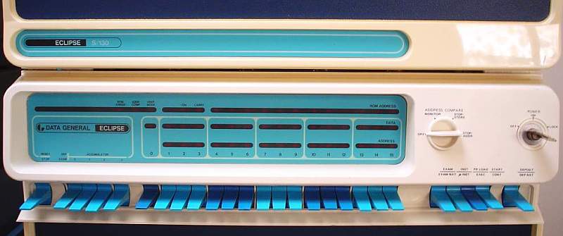
Also, Data General has some sweet blue color schemes rocking in the 70s. Just check out their S/130 control panel.
-
facetsesame
- Mad Dasher
- Location: UK
- Main keyboard: Ducky Legend
- Main mouse: CST L-Trac
- Favorite switch: MX red for linear, white for click
- DT Pro Member: 0092
Thanks very much for your efforts! It doesn't seem worth it if the best you can do is look back and forward between chips and keys. With any luck we should have another specimen or two though.spopepro wrote: ↑Probably no dice on me getting to the keyboards at the computer history museum. My contact could get me in and get the boards, but I wouldn't be able to touch them at all. That's probably not worth the time then. It's all on you mr_a500.
I don't know where to begin on borrowing these chips, it would be a nice option though.spopepro wrote: ↑Even though I know that you're being sent some SP chips to compare, if we are really serious about getting a good match, it might be worth it to try and track down some standardized plastic chips, like these. Standard chips like these are expensive, so finding a set to borrow would be ideal. It would make matching a whole lot easier than trying to specify an area on an unevenly aged cap. And save you from having to part with the cap.
Depending how aged the caps seem to be it may be worth finding a compromise between how the caps actually look these days and they would have looked at the time - something that will require further scouring for contemporary pictures (fraught with more colour difficulties) and hopefully the opinion of someone who knew - and remembers - them well (opinions!)
Alternatively getting a good match from a nicely preserved keyboard (via chips or directly) might make more sense.
Thanks for this insight! Designing the pattern is probably my biggest concern, at the moment the only way I could make this happen would be to make up 2D drawings of what I had in mind and work with the foundry to realise it. Some do seem to be set up to work this way, but presumably this comes at additional cost. The shipping costs would inevitably be impressive compared to typical (normal!) cases, but perhaps this could be alleviated a bit through group shipping.spopepro wrote: ↑I'm all about a cast case. I've started to look into it for other projects. It should be relatively economical, except for: 1) much of the cost is in the pattern, and you should have a pattern maker and foundry help you because not all foundries pour all pattern types, and 2) shipping cast aluminum (or what I would love: cast bronze) is going to be sooo much money. Might even end up more than the cost of the part itself depending on transit. A good foundry will be able to provide finish and machining options for things like threaded standoffs. There's also the case of who is going to spend the time in solidworks (and, um, who has a legal copy...).
Hi, glad to hear you're interested! I'm really keen to see this through to a result.niomosy wrote: ↑Wow, I guess I should check here more often. I've been wanting the Dasher D100/200 color scheme in keycaps for quite a while. Nice to see that might come to fruition here.
Also, Data General has some sweet blue color schemes rocking in the 70s. Just check out their S/130 control panel.
That Eclipse has a very nice front panel! For a long time I've wanted to have a front panel to play with (thought not so much the responsibilities of owning, storing and maintaining a minicomputer!). If I could just find a killer app to justify using one regularly these days. Maybe this could be our round 2
-
facetsesame
- Mad Dasher
- Location: UK
- Main keyboard: Ducky Legend
- Main mouse: CST L-Trac
- Favorite switch: MX red for linear, white for click
- DT Pro Member: 0092
Pulses have been travelling back and forth between myself and 74S181, who takes care of no less than three Data General Novas and their associated peripherals, including a Dasher D2 video terminal. I am very grateful for this photo showing a colour chip comparison in daylight:
- image1.JPG (429.65 KiB) Viewed 5455 times
74S181 wrote:The closest match is BBQ for the function keys, could be a little darker. I found no real good match for the alphanumeric keys. In my opinion, BE is the closest candidate.
The colors on the picture look quite different to the real ones.
74S181 wrote:BFK is a little "too blue". For the function keys, BBJ is a good match under artifical light. The photo has been taken under daylight.
-
SL89

- ‽
- Location: Massachusetts, USA
- Main keyboard: CODE 104
- Main mouse: Logitech M570
- Favorite switch: Cherry MX Green
- DT Pro Member: 0095
BBQ looks spot on for the mods. Can we say the same under artificial light?
BFK looks too cerulean, BO looks closer but too saturated tho. Maybe time for a custom color?
BFK looks too cerulean, BO looks closer but too saturated tho. Maybe time for a custom color?
-
Muirium
- µ
- Location: Edinburgh, Scotland
- Main keyboard: HHKB Type-S with Bluetooth by Hasu
- Main mouse: Apple Magic Mouse
- Favorite switch: Gotta Try 'Em All
- DT Pro Member: µ
Cerulean indeed. BFK looks like a Californian sky. While Dasher alphas look more like the hazier, frostier blues in our occasional clear skies up here in Scotland. There's a difference all right.
BE is closest, but not perfect. Custom colours then?
BE is closest, but not perfect. Custom colours then?
-
Muirium
- µ
- Location: Edinburgh, Scotland
- Main keyboard: HHKB Type-S with Bluetooth by Hasu
- Main mouse: Apple Magic Mouse
- Favorite switch: Gotta Try 'Em All
- DT Pro Member: µ
Aye. BBQ looks good for the mods. But for best colour matching, pull the caps and compare colours against the base, where there's the least yellowing. Like I did for Round 5 once upon.
(I should point out, with all the new caps news of recent days especially, that I'm more of an adviser on this set than a likely customer. I'd like to see Dasher done right. I wouldn't mind a set of my own either. But So Many Caps! I may well be MXed for life.)
(I should point out, with all the new caps news of recent days especially, that I'm more of an adviser on this set than a likely customer. I'd like to see Dasher done right. I wouldn't mind a set of my own either. But So Many Caps! I may well be MXed for life.)
-
spopepro
- Main keyboard: Phantom Custom
- Main mouse: RAT7
- Favorite switch: Panda Clear
- DT Pro Member: -
I'm slightly surprised BBQ was a match. I would have thought it too green. A touch richer BE would be cool.
facetsesame: If it's of interest, if 74S181 would take a straight down shot of the keys with sufficient resolution, I could start making vector traces to see how far off from existing legends these are, and if it's worth it try and get some customized.
facetsesame: If it's of interest, if 74S181 would take a straight down shot of the keys with sufficient resolution, I could start making vector traces to see how far off from existing legends these are, and if it's worth it try and get some customized.
-
facetsesame
- Mad Dasher
- Location: UK
- Main keyboard: Ducky Legend
- Main mouse: CST L-Trac
- Favorite switch: MX red for linear, white for click
- DT Pro Member: 0092
I wasn't expecting such a close match to BBQ, the practically-green shade of Miami and PuLSE!
I agree that on this evidence a custom shade would be best for the alphas, a richer BE I reckon would be just right.
With any luck, mr_a500 will also have some chips late next week and we'll be able to compare two Dasher D2s.
Beyond this, I think it's worth running this by someone with an idea of what the colours originally looked like. I have someone in mind, just hope they are interested!
What an interesting proposition! With SP it would be prohibitive to have many new legends made, and I'd be satisfied with Gorton Modified which is somewhat similar. Nevertheless it could be very useful indeed to have this reference - and very good of you to offer this, thank you! The question will be asked, unless mr_a500 is interested taking this on!spopepro wrote: ↑facetsesame: If it's of interest, if 74S181 would take a straight down shot of the keys with sufficient resolution, I could start making vector traces to see how far off from existing legends these are, and if it's worth it try and get some customized.
-
mr_a500
- DT Pro Member: -
OK, I have the colour samples and took a quick photo - under 6500K fluorescent (cloudy today):
For the modifiers, BBJ looks closest (or possibly darker BBQ), but needs a bit saturation and darkening. As expected, BE is closest for the main keys & numeric keypad but needs to be slightly darker.
For the modifiers, BBJ looks closest (or possibly darker BBQ), but needs a bit saturation and darkening. As expected, BE is closest for the main keys & numeric keypad but needs to be slightly darker.
-
facetsesame
- Mad Dasher
- Location: UK
- Main keyboard: Ducky Legend
- Main mouse: CST L-Trac
- Favorite switch: MX red for linear, white for click
- DT Pro Member: 0092
Thanks Mr A! I reckon it's clear where we need to aim with colours now, but custom matches would be preferable if possible. How do you feel about the high res overhead shot requested by spopepro?
Sorry I haven't been around with updates. I will get the promised layout/kit candidates up this week!
Sorry I haven't been around with updates. I will get the promised layout/kit candidates up this week!
-
facetsesame
- Mad Dasher
- Location: UK
- Main keyboard: Ducky Legend
- Main mouse: CST L-Trac
- Favorite switch: MX red for linear, white for click
- DT Pro Member: 0092
Here we go! These are overly ambitious in their scope and so may not meet user preferences for what they aim to cover (104/5 ANSI/ISO, equivalent TKL, Poker et al, Brownfox, Leopold, Ergo Dox, Kinesis Advantage, 7bit numpad...)
F1 to F12 could be side printed or left blank (or potentially given a Boring Joe's double shot option).
Languages, specialities and sundries could be incorporated or added separately. Ideally blanks would be available too.
What have I missed out, and what shouldn't have been there in the first place?
Mods
Alphas
F1 to F12 could be side printed or left blank (or potentially given a Boring Joe's double shot option).
Languages, specialities and sundries could be incorporated or added separately. Ideally blanks would be available too.
What have I missed out, and what shouldn't have been there in the first place?
Mods
- KLE mods first try 2015-07-05.png (91.05 KiB) Viewed 5265 times
Spoiler:
- KLE alphas first try 2015-07-05.png (70.35 KiB) Viewed 5265 times
Spoiler:
-
Muirium
- µ
- Location: Edinburgh, Scotland
- Main keyboard: HHKB Type-S with Bluetooth by Hasu
- Main mouse: Apple Magic Mouse
- Favorite switch: Gotta Try 'Em All
- DT Pro Member: µ
Those mods are quite compelling. Well, if it's SA. What's the family again? Seeing "Row 0" on the diagram is giving me the willies…