Hello there,
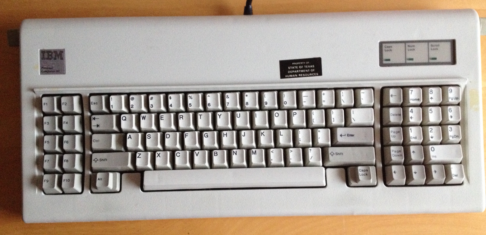
I am interested in buying a few keycaps from Unicomp for my Model M (red ESC for example).
I just wanted to know if the font matches the original font of a Model M or if there are visible differences...
Unicomp Keycap Font
-
Nuum

- Location: Germany
- Main keyboard: KBD8X Mk I (60g Clears), Phantom (Nixdorf Blacks)
- Main mouse: Corsair M65 PRO RGB
- Favorite switch: 60g MX Clears/Brown Alps/Buckling spring
- DT Pro Member: 0084
The font is the same, the legends are noticeably more fuzzy, though. Not bad if you use them on their own, but mixed with original caps it stands out.
-
Muirium

- µ
- Location: Edinburgh, Scotland
- Main keyboard: HHKB Type-S with Bluetooth by Hasu
- Main mouse: Apple Magic Mouse
- Favorite switch: Gotta Try 'Em All
- DT Pro Member: µ
Nuum's quite right. They're not great when mixed. Even the colour's a bit off: Unicomp mods are a bit too creamy.
Let's play Spot the Unicomps!
A fun game for all the family. (Apart from the owner!)
Mind, not even IBM was really all that consistent over the years. My SSK in this picture is wearing 100% IBM originals.

Some are the SSK's 1992 originals. Some are from a ~1984 XT. Look at the function row! Things changed a lot over the years.
Let's play Spot the Unicomps!
A fun game for all the family. (Apart from the owner!)
Mind, not even IBM was really all that consistent over the years. My SSK in this picture is wearing 100% IBM originals.
Some are the SSK's 1992 originals. Some are from a ~1984 XT. Look at the function row! Things changed a lot over the years.
-
fohat

- Elder Messenger
- Location: Knoxville, Tennessee, USA
- Main keyboard: Model F 122-key terminal
- Main mouse: Microsoft Optical Mouse
- Favorite switch: Model F Buckling Spring
- DT Pro Member: 0158
IBM was quite inconsistent in the weight and placement of legends.
I harvested a couple of sets from 1980s originals that had very dark legends crammed up into the very top left corners, almost to the point where top surface started breaking over to the side slope.
I harvested a couple of sets from 1980s originals that had very dark legends crammed up into the very top left corners, almost to the point where top surface started breaking over to the side slope.
-
Redmaus

- Gotta start somewhere
- Location: Near Dallas, Texas
- Main keyboard: Unsaver | 3276 | Kingsaver
- Main mouse: Kensington Slimblade
- Favorite switch: Capacitative Buckling Spring
- DT Pro Member: -
- Contact:
I spot ctrl!
Yeah the gray caps I got from unicomp are pretty shit. Some keys feel clunky and some don't even press right. When I put on my IBM SSK original caps they all press perfect and legends are super sharp
-
Muirium
- µ
- Location: Edinburgh, Scotland
- Main keyboard: HHKB Type-S with Bluetooth by Hasu
- Main mouse: Apple Magic Mouse
- Favorite switch: Gotta Try 'Em All
- DT Pro Member: µ
Wrong. That Control is original! I should probably take a better picture… if these bloody clouds break up. That was back in winter when photography is all but useless up here.


-
Redmaus
- Gotta start somewhere
- Location: Near Dallas, Texas
- Main keyboard: Unsaver | 3276 | Kingsaver
- Main mouse: Kensington Slimblade
- Favorite switch: Capacitative Buckling Spring
- DT Pro Member: -
- Contact:
Pm me mu I might have something.
