- font.png (91.49 KiB) Viewed 7294 times
Ideas?


no it doesn't need to be, if it is would be better but not a requirement.
Tomorrow I'll finalize the template and make some tests (with Gill as well).
everything will be revealed soon, hint: start saving your money!
no comment
wow, those are all fantastic! Thanks madhias.madhias wrote: These are some of my favourites, but not condensed as shown in your example, matt3o. Only a condensed typeface can go in the upper left corner i think. The normal or extended ones should go right in the middle, and we had that probably a lot in the past (Granite, all SA caps from SP). Nevermind, i quite like these:
thanks for your suggestion, but I can't really enter that worldtragacuerdas wrote: I truly recommend that you go ask the question at http://www.typophile.com/


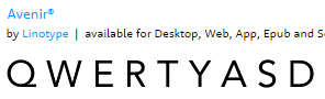
Avenir would have one of my votes as well. Similiar but nicer to the Futura Filco uses.